
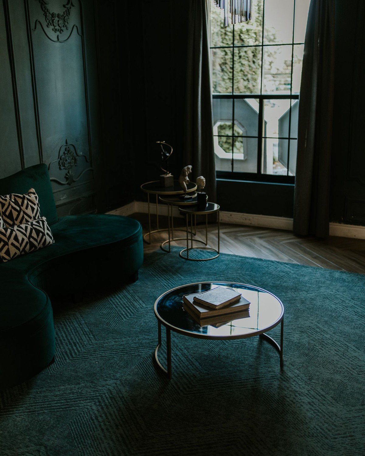
A color drenching living room takes a single paint color and refuses to stop at the walls. The ceiling gets it, the skirting gets it, the doors, the radiator, sometimes the bookcase and the sofa join in — and the result is not a room with colored walls but a room carved out of one rich, continuous color. Where an accent wall shouts, a drench wraps. It blurs the edges where wall meets ceiling, hides awkward architecture, and makes even a small, boxy space feel deliberate and calm.
This guide collects 38 color drenching living room ideas photographed in real rooms: the full one-color treatment, deep green and navy drenches, warm terracotta and chocolate, soft sage and blush, plus the practical moves — sheen strategy, lighting, testing, and the rooms where drenching is honestly the wrong idea. Every idea names its style, best use, and price feel, and each is described as its photograph actually looks; where a photo shows a close relative of a true drench, the text says so.
Use the quick-pick table to shortlist by effort and cost, then read the color families in any order. One warning before you start: a color drenching living room is the most forgiving bold move in decorating, but the color does all the work, so choosing it deserves the testing routine in idea 32. Pick the color like you mean it, and the room will do the rest.
Quick-Pick Table
| Idea # | Name | Best For | Effort | Cost |
|---|---|---|---|---|
| 1 | Walls, Ceiling, and Trim All in One Color | The complete look in one move | Moderate | $$ |
| 2 | The Fifth Wall: Drench the Ceiling, Too | Low ceilings made to feel taller | Moderate | $$ |
| 3 | Doors, Radiators, and Skirting That Disappear Into the Color | Rooms with awkward doors and radiators | Easy | $ |
| 4 | A Bookcase Wall Drenched Into the Background | Built-ins and shelving walls | Moderate | $$ |
| 5 | A Fireplace Wall Drenched From Hearth to Ceiling | Fireplace rooms needing one strong gesture | Moderate | $$ |
| 6 | Deep Green Drenching: Forest, Emerald, Evergreen | Garden-facing and period living rooms | Moderate | $$ |
| 7 | Navy Blue Drenching, From Walls to Sofa | Evening rooms and media spaces | Moderate | $$ |
| 8 | Burgundy and Plum: The Jewel-Box Room | Formal sitting rooms and snug spaces | Moderate | $$ |
| 9 | Teal Drenching With Peacock Depth | Rooms with good daylight | Moderate | $$ |
| 10 | Charcoal and Near-Black Drenching | Art, media, and evening rooms | Moderate | $$ |
| 11 | Slate Blue and Denim Drenching | Family rooms that want calm, not cold | Moderate | $$ |
| 12 | Olive and Moss: The Earthy Middle Ground | North light and plant-filled rooms | Moderate | $$ |
| 13 | Terracotta and Clay Drenching | Sunny rooms and rustic-modern schemes | Moderate | $$ |
| 14 | Mustard and Ochre Drenching | Cheerful family living rooms | Moderate | $$ |
| 15 | Chocolate Brown: The Cocooning Neutral | Calm, grounded, grown-up rooms | Moderate | $$ |
| 16 | Sage Green: The Gentle First Drench | First-time drenchers and bright rooms | Easy | $ |
| 17 | Blush Pink Drenching That Stays Grown-Up | Warmth without darkness | Easy | $ |
| 18 | Warm White and Cream: Drenching in Neutrals | Lovers of calm, bright rooms | Easy | $ |
| 19 | Tone-on-Tone: Paint and Wallpaper in the Same Color | Adding depth without a dark color | Moderate | $$ |
| 20 | A Sofa Upholstered to Match the Walls | The full cocoon effect | Advanced | $$$ |
| 21 | Curtains Drenched to Match the Walls | Bay windows and tall drapes | Moderate | $$ |
| 22 | Rugs, Cushions, and Throws in One Color Family | Softening an existing drench | Easy | $ |
| 23 | Double Drenching: Two Adjoining Tones, One Room | Large rooms and open-plan zones | Advanced | $$ |
| 24 | Lighting a Drenched Room So It Glows, Not Glooms | Any dark drench after sunset | Moderate | $$ |
| 25 | A Color-Drenched Reading Nook | Alcoves, window seats, and single chairs | Easy | $ |
| 26 | Drenching a Small Living Room — and Why It Works | Box rooms and small flats | Moderate | $$ |
| 27 | North-Facing Rooms: Warm Drenches That Beat Grey Light | Cold, grey, north-facing light | Moderate | $$ |
| 28 | A Drenched Media Wall Behind the Television | TV walls and film nights | Moderate | $$ |
| 29 | Sheen Strategy: Matte Walls, Glossier Trim | Making one color read as many | Moderate | $$ |
| 30 | Partial Drenching: One Wall, the Woodwork, Done | Testing before the whole room | Easy | $ |
| 31 | Rental-Friendly Drenching You Can Reverse | Renters and the commitment-shy | Easy | $ |
| 32 | Test Before You Commit: Big Swatches and Sample Boards | Anyone spending real money on paint | Easy | $ |
| 33 | Drenching an Open-Plan Room Without Losing Its Zones | Kitchen-living and studio spaces | Advanced | $$ |
| 34 | Art, Mirrors, and Metallics on Drenched Walls | Finishing touches that lift dark walls | Easy | $ |
| 35 | Flooring That Grounds a Drench: Dark Wood, Pale Oak, Pattern | Planning from the floor up | Moderate | $$ |
| 36 | Taking the Drench Through the Door: Halls and Adjoining Rooms | Connected rooms and sight lines | Moderate | $$ |
| 37 | When NOT to Drench a Living Room | Rooms that fight the treatment | Easy | $ |
| 38 | Drenching Around Period Features: Cornice, Panelling, and Beams | Victorian and older homes | Advanced | $$$ |
The Full Drench: One Color, Every Surface
Color drenching is a technique before it is a color. These five ideas cover the mechanics of the true drench — every surface sharing one paint — the foundation students of interior design would recognize from panelled, single-tone rooms of earlier centuries, updated for modern plaster and radiators. Master these moves and every color family that follows is a change of tin.
1. Walls, Ceiling, and Trim All in One Color
Style: Modern classic | Best for: the complete look in one move | Price feel: Medium
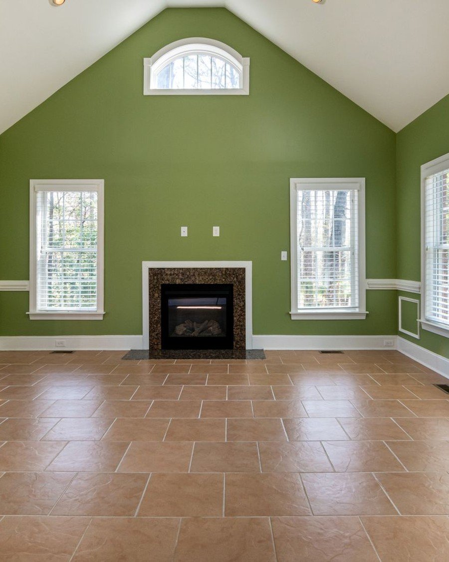
What it is: This empty room proves the principle before a single cushion arrives: one saturated green carried across every wall, into the corners, and around the fireplace, so the space reads as a single volume of color — the true drench, the version every other idea modifies. Tall windows stop punching holes in the walls, the black fireplace joins the composition, and the pale vaulted ceiling reads as a deliberate lid.
How to do it:
- Choose one color; buy it for every surface at once
- Paint walls, skirting, frames, and doors the same shade
- Ceiling same color, or one tone lighter
- Furniture arrives after the paint — it should work empty
Pro tip: Photograph the empty room when the paint dries — if it looks intentional bare, the color is right.
Avoid this: Avoid leaving any door or skirting white — it reads as unfinished, not chosen.
2. The Fifth Wall: Drench the Ceiling, Too
Style: Bold cocooning | Best for: low ceilings made to feel taller | Price feel: Medium
What it is: The ceiling is the surface every visitor feels and nobody studies, which is why drenching it changes everything. Here a curved ceiling washed in amber-orange closes over a dark wall like the inside of a lantern. A color drenching living room that includes the ceiling loses its ‘box with a lid’ feeling — tall rooms feel grander, low rooms intentionally snug.
How to do it:
- Extend the wall color over the ceiling, no tape line
- Use the flattest ceiling finish to hide its flaws
- Lower a too-tall ceiling visually with a deeper tone
- Raise a low one by keeping the overhead tone mid
Pro tip: Paint the ceiling first, walls second. Spatter lands on unfinished walls, and ceilings are the worst to touch up.
Avoid this: Avoid a glossy ceiling unless the plaster is perfect; raking light reports every trowel mark.

3. Doors, Radiators, and Skirting That Disappear Into the Color
Style: Seamless tailored | Best for: rooms with awkward doors and radiators | Price feel: Low
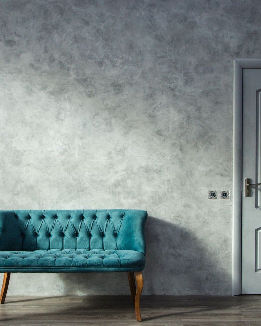
What it is: Doors, skirting, and radiators are where a drench usually dies — left white ‘because that’s how they come.’ Paint them, and they vanish. This pale grey room shows the soft version: one calm mottled surface, a toning pale door at its edge, a teal bench supplying the single contrast. In a deep color drenching living room, the same trick swallows five awkward doors without a murmur.
How to do it:
- Paint doors both faces plus frame in the room’s color
- Use heat-tolerant trim paint on radiators
- Match trim sheen to wall sheen for true invisibility
- Swap white sockets for painted or metal covers in tone
Pro tip: A wall-colored door needs a beautiful handle — brass or black — to keep the flatness feeling expensive.
Avoid this: Avoid half-painted doors. The white edge flashes every time the door opens.
4. A Bookcase Wall Drenched Into the Background
Style: Library mood | Best for: built-ins and shelving walls | Price feel: High
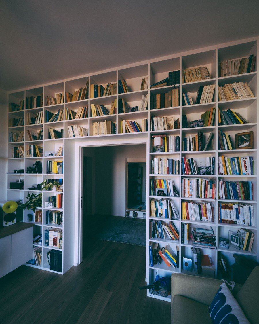
What it is: A wall of books is the busiest surface in any home, and drenching the shelves calms it instantly. Here floor-to-ceiling white shelves wrap around a doorway, painted to merge with the pale walls, so hundreds of spines become the room’s only pattern. In deep green or burgundy, the same wall turns a color drenching living room into a library — shelves disappear, books float.
How to do it:
- Run shelving floor to ceiling and wall to wall
- Paint shelves inside and out the exact wall color
- Carry color onto wall sections between and above shelves
- Style with breathing room — drenched bookcases hate clutter
Pro tip: Leave one shelf bay deliberately sparse — a single object or plant. On a drenched wall, emptiness reads as luxury.
Avoid this: Avoid different-shaded shelf back panels — the mismatch glows at glancing angles.
5. A Fireplace Wall Drenched From Hearth to Ceiling
Style: Dramatic focal | Best for: fireplace rooms needing one strong gesture | Price feel: Medium
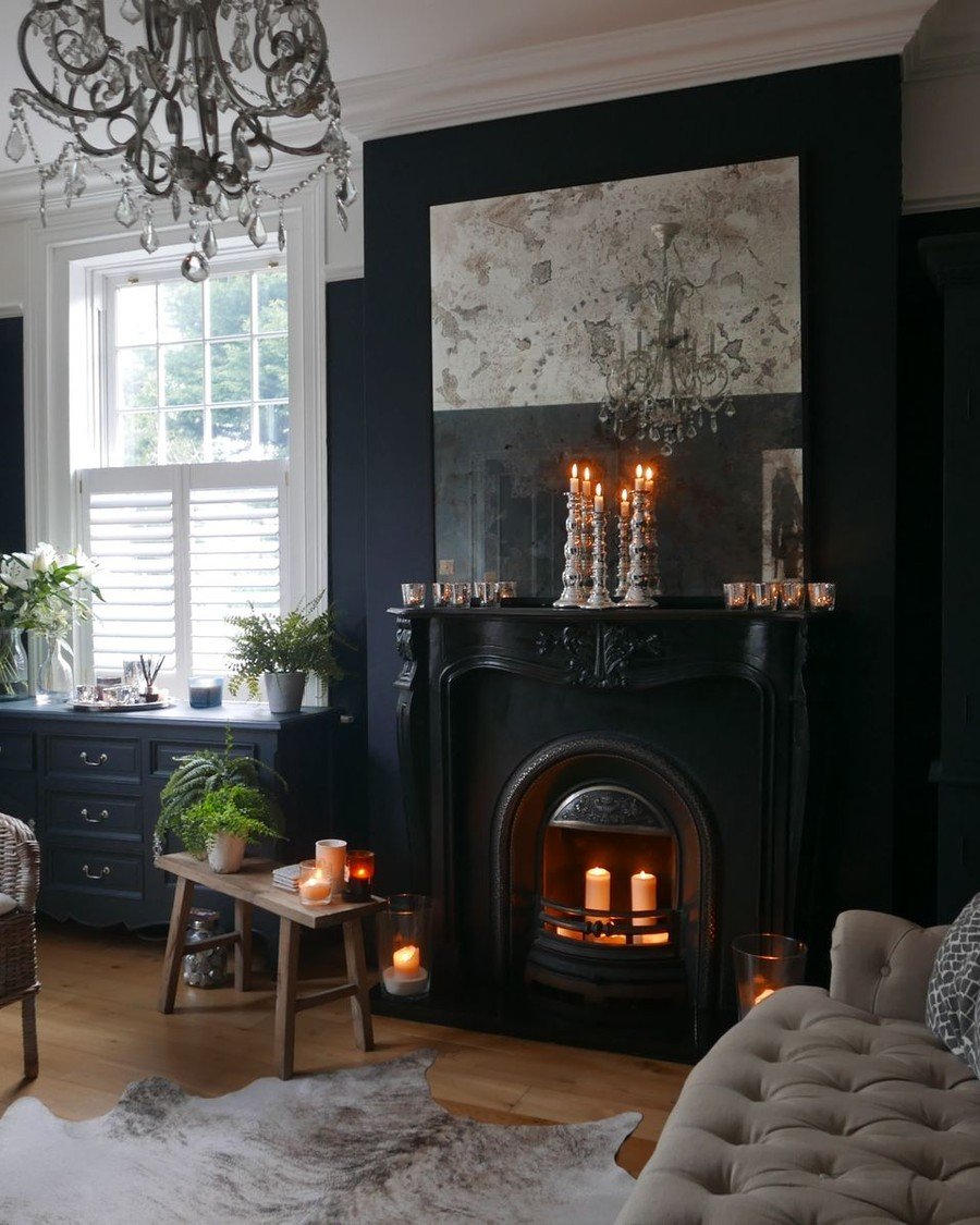
What it is: A fireplace already owns its wall; drenching simply admits it. Here the chimney breast, surround, and mantel are all black, the fire lit inside them, candles echoing the flame — one dark, glowing gesture. It is the most forgiving first drench in this guide: a small wall, a huge statement, and a color drenching living room built around it needs little else.
How to do it:
- Paint breast, surround, and mantel in one heat-safe shade
- Take color hearth to ceiling, not just around the firebox
- Repeat the shade once — cushions, a throw, a frame
- Keep hearth styling minimal: flame and candlelight are the decor
Pro tip: Black is the classic, but the room’s own color is quieter — the fireplace joins the drench instead of competing.
Avoid this: Avoid ordinary emulsion inside the firebox. Use heat-resistant paint, or leave the fireback bare.
Deep and Moody: The Signature Drenching Colors
Dark colors are where drenching earned its reputation. A deep shade on one wall can look like an apology; wrapped around the whole room, it looks like a decision. These signature families — greens, blues, burgundy, teal, charcoal — turn a color drenching living room into the cocoon people photograph at dusk.
6. Deep Green Drenching: Forest, Emerald, Evergreen
Style: Botanical luxe | Best for: garden-facing and period living rooms | Price feel: High
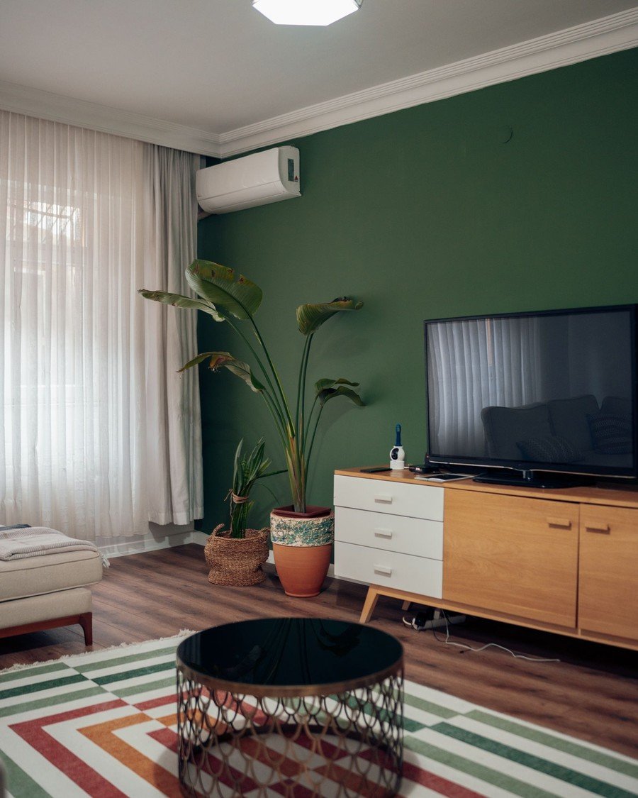
What it is: Deep green is the color that launched a thousand drenches, and this room shows why: one forest-green wall behind the television, plants leaning into it, a striped rug answering below. By day the green stays alive; by lamplight it goes almost black. A color drenching living room in deep green flatters wood, leather, brass, and every plant you own.
How to do it:
- Pick a green with a blue or black base
- Carry green onto skirting and the TV wall’s returns
- Answer with warm wood, tan leather, at least three plants
- Light it warm — 2700K keeps green from going cold
Pro tip: Green tolerates mediocre daylight best. If your light is unreliable, deep green forgives what navy punishes.
Avoid this: Avoid yellow-based greens on every wall — wrapped around a room they turn sallow by evening.
7. Navy Blue Drenching, From Walls to Sofa
Style: Tailored nautical | Best for: evening rooms and media spaces | Price feel: High
What it is: Navy is drenching’s tailored suit: crisp, calm, impossible to make scruffy. This room commits properly — a deep navy wall, a navy sofa against it, framed prints floating in the blue like windows. Because navy sits close to black at night, a color drenching living room in this shade feels formal at dinner, cinematic at the television.
How to do it:
- Choose navy with a hint of black; royal blues date fast
- Match the sofa or largest chair to the wall tone
- Break blue with pale art, cream textiles, warm wood only
- Test at night — noon-perfect navy can go flat black
Pro tip: Navy plus brass is the cheapest expensive-looking pairing in decorating — swap one fitting to brass and the room upgrades.
Avoid this: Avoid navy in small north-facing rooms without warm lighting; it turns genuinely cold.

8. Burgundy and Plum: The Jewel-Box Room
Style: Opulent vintage | Best for: formal sitting rooms and snug spaces | Price feel: High
What it is: Burgundy is the jewel-box move: a deep red that makes a room feel like the inside of a wine glass. This wall commits completely — carved panel moulding painted the same red as the field around it, ornament appearing and disappearing as light moves, above a dark green sofa. A color drenching living room in burgundy or plum is unapologetically evening-minded: candlelight and low lamps.
How to do it:
- Use a blue-based burgundy or plum, never orange-based red
- Paint panelling and moulding the same red, detail and all
- Furnish dark and soft: velvet, leather, dark wood
- Keep floors dark or patterned — pale floors float oddly
Pro tip: Burgundy suits rooms used mostly after dark — judge the tester by lamplight only; daylight lies about this color.
Avoid this: Avoid burgundy with bright white — the contrast turns festive in the wrong way, valentine not vintage.

9. Teal Drenching With Peacock Depth
Style: Rich mid-tone | Best for: rooms with good daylight | Price feel: High
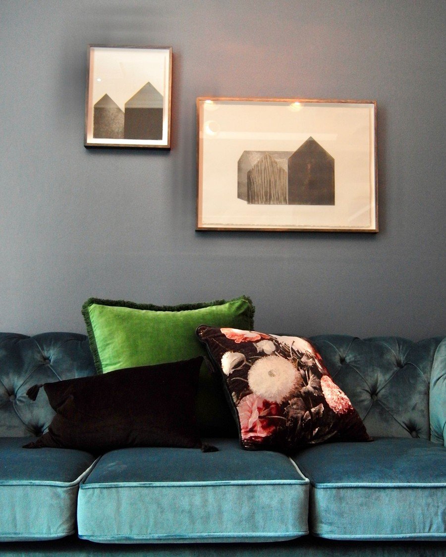
What it is: Teal is the peacock of the palette — half blue, half green, rich from every angle. This velvet sofa shows its character: saturated, changeable, luxurious before it reaches the walls. Across a whole color drenching living room, teal behaves like deep green with better daylight manners — it holds its own at noon and glows at dusk.
How to do it:
- Balance the blue-green ratio to your light: greener north
- Paint walls and woodwork teal; ceiling one tone paler
- Partner with walnut, brass, and cream — never chrome
- Repeat the exact teal in one textile for intent
Pro tip: Teal is the easiest dark drench to live with — people who fear tiring of a color keep it a decade.
Avoid this: Avoid near-matching blues and greens against teal. Near-misses look like mistakes; contrasts look like choices.
10. Charcoal and Near-Black Drenching
Style: Gallery dramatic | Best for: art, media, and evening rooms | Price feel: High
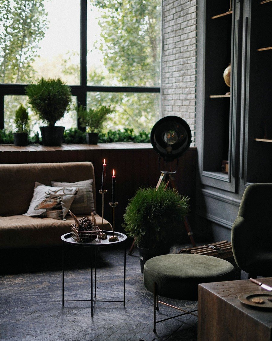
What it is: Charcoal is the drench for people who think they don’t like color. This moody room — tall windows veiled in daylight, a brown sofa sunk in shadow, dark shelves swallowing their contents — shows how a near-black wrap turns an ordinary room into a private club. A color drenching living room in charcoal is the great backdrop: art, skin, and firelight look better against it.
How to do it:
- Choose charcoal with a warm or green undertone, never blue-black
- Drench walls, ceiling, woodwork; keep floors mid-toned
- Plan three pools of warm lamplight before buying paint
- Add one large pale anchor — a rug or sofa
Pro tip: Charcoal shows every scuff. Choose a scrubbable matte made for dark colors, and keep labelled leftovers for touch-ups.
Avoid this: Avoid charcoal in day-reading rooms without serious lighting. Wonderful at night; gloomy at noon.
11. Slate Blue and Denim Drenching
Style: Relaxed mid-blue | Best for: family rooms that want calm, not cold | Price feel: Medium
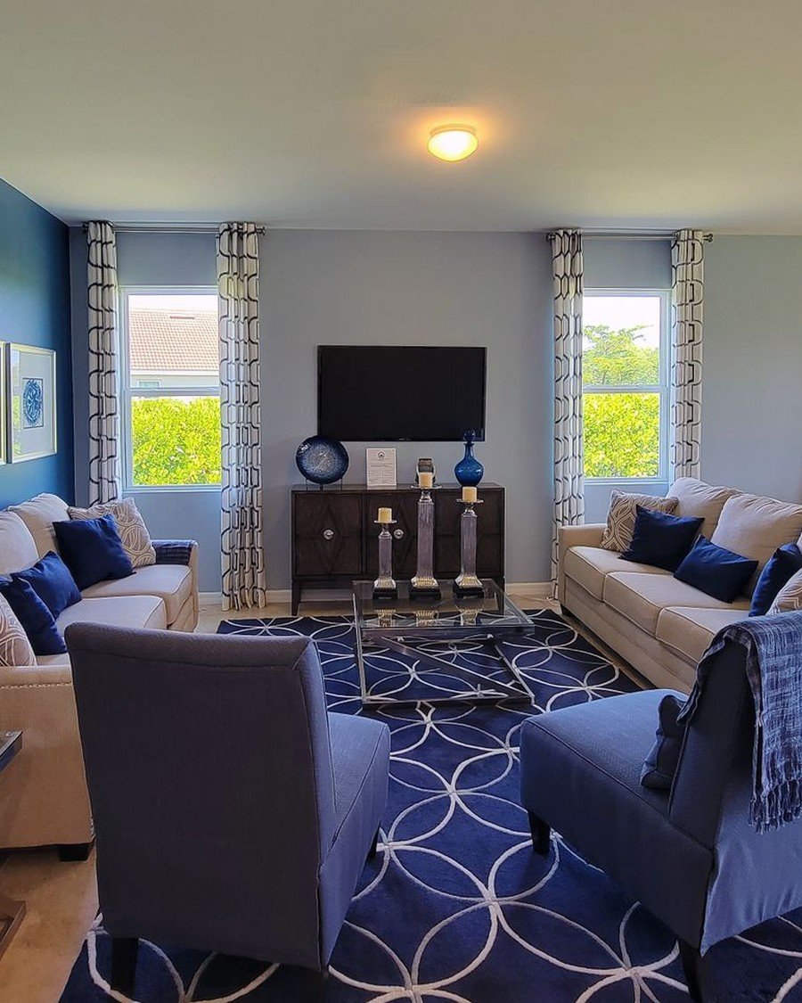
What it is: Between navy and grey sits slate — the denim of paint colors, and the friendliest blue drench. This room carries the family through navy armchairs and a bold blue patterned rug under pale walls; on the walls themselves, the same tones make a color drenching living room that feels calm, not dramatic — ideal when one room is office, playroom, and sitting room in a day.
How to do it:
- Pick a slate with a grey base — tailored, not nautical
- Carry it over walls and woodwork; textiles a tone deeper
- Warm with mid wood and off-white, never bright white
- Use confidently in bright rooms — slate needs daylight
Pro tip: Slate is the safest drench for the resale-wary — it photographs as ‘neutral with personality.’
Avoid this: Avoid slate in grey-furnished rooms — blue-grey on grey collapses into one long sigh.
12. Olive and Moss: The Earthy Middle Ground
Style: Organic muted | Best for: north light and plant-filled rooms | Price feel: Medium
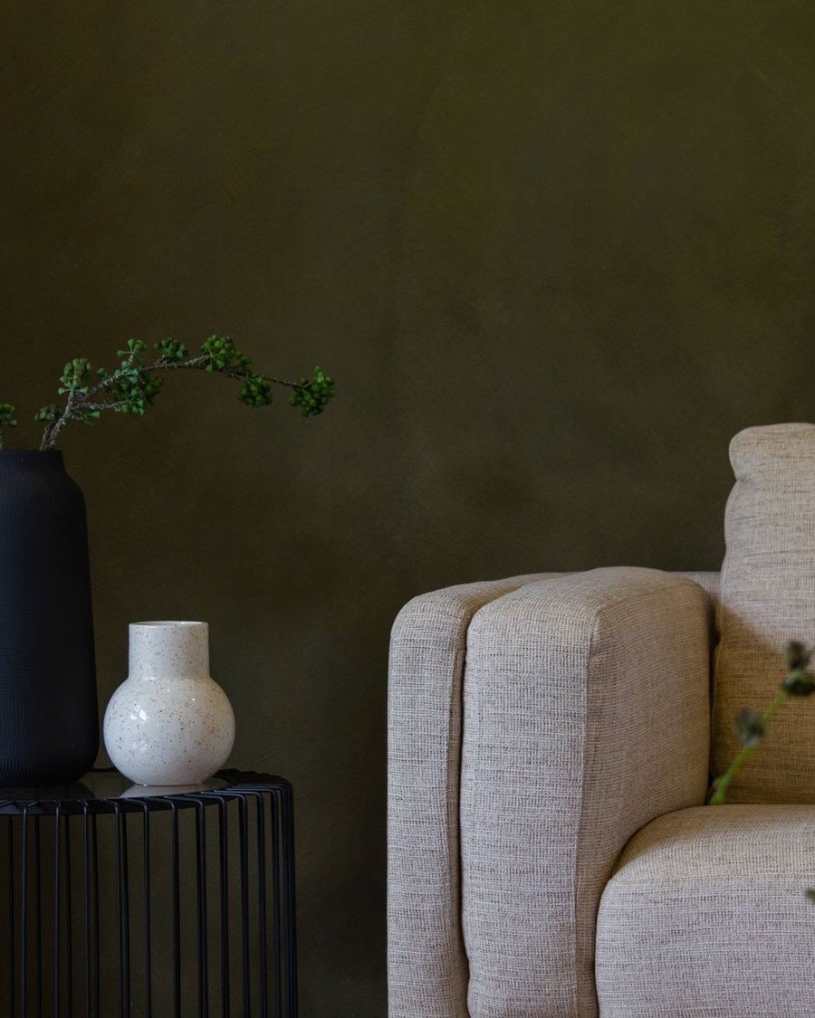
What it is: Olive is where green goes to be grown-up. This quiet vignette — an olive wall, a cream armchair, a dark vase, one trailing plant — has sage’s softness with twice the depth, and stretched across a whole color drenching living room gives a room that feels grown, not decorated. Olive flatters terracotta, rattan, linen, and every wood ever milled.
How to do it:
- Test olive in your actual light — it swings green-brown fast
- Pair with cream textiles, terracotta pots, dark wood
- Keep metals warm: aged brass, bronze, never chrome
- Let plants repeat the family at a lighter value
Pro tip: Olive adopts existing furniture — warm neutrals you cannot name will all belong.
Avoid this: Avoid olive under cool white bulbs — it turns swampy; warm 2700K light keeps it botanical.
Warm and Sun-Baked Drenches
Not every drench is a cave. Terracotta, mustard, chocolate, and sage wrap a room in warmth rather than darkness, flattering the wood, leather, and brass living rooms already own. If the moody section felt brave, start here — these behave like a permanent golden hour.
13. Terracotta and Clay Drenching
Style: Mediterranean earthy | Best for: sunny rooms and rustic-modern schemes | Price feel: Medium
What it is: Terracotta is bottled Mediterranean light. This room lays it on thick — a rust-textured wall panel beside plaster tones, a cream sofa, rust cushions answering the wall — a permanent sunset. Across a whole color drenching living room, terracotta and clay give warmth without darkness: the drench of choice for rooms that face away from the sun.
How to do it:
- Layer two clay tones: deeper walls, paler ceiling
- Use limewash or textured paint for sun-baked movement
- Furnish cream, sand, dark wood; black only as punctuation
- Add real clay — pots, tiles, a jug
Pro tip: Terracotta forgives imperfect walls — its natural home is rough plaster, so texture reads as character.
Avoid this: Avoid terracotta with pink-toned woods like cherry — the reds argue. Test against your floor first.

14. Mustard and Ochre Drenching
Style: Retro warm | Best for: cheerful family living rooms | Price feel: Medium
What it is: Mustard is the extrovert of the palette, and this apartment room shows its range: a big marigold sofa holding court against pale geometric wallpaper. Taken onto the walls, mustard and ochre make the sunniest drench there is — late afternoon in August, all year round. It pairs with more existing furniture than you would expect.
How to do it:
- Choose ochre over lemon — depth keeps it sophisticated
- Balance yellow with black, walnut, or deep green accents
- Keep large textiles cream or linen to rest the eye
- Use boldly in dull-light rooms; mustard makes its own sunshine
Pro tip: Mustard is the one drench where same-family patterned wallpaper can replace paint on one wall without breaking the spell.
Avoid this: Avoid mustard with orange-toned pine — yellow on yellow-orange becomes a sauna brochure.

15. Chocolate Brown: The Cocooning Neutral
Style: Warm minimal | Best for: calm, grounded, grown-up rooms | Price feel: Medium
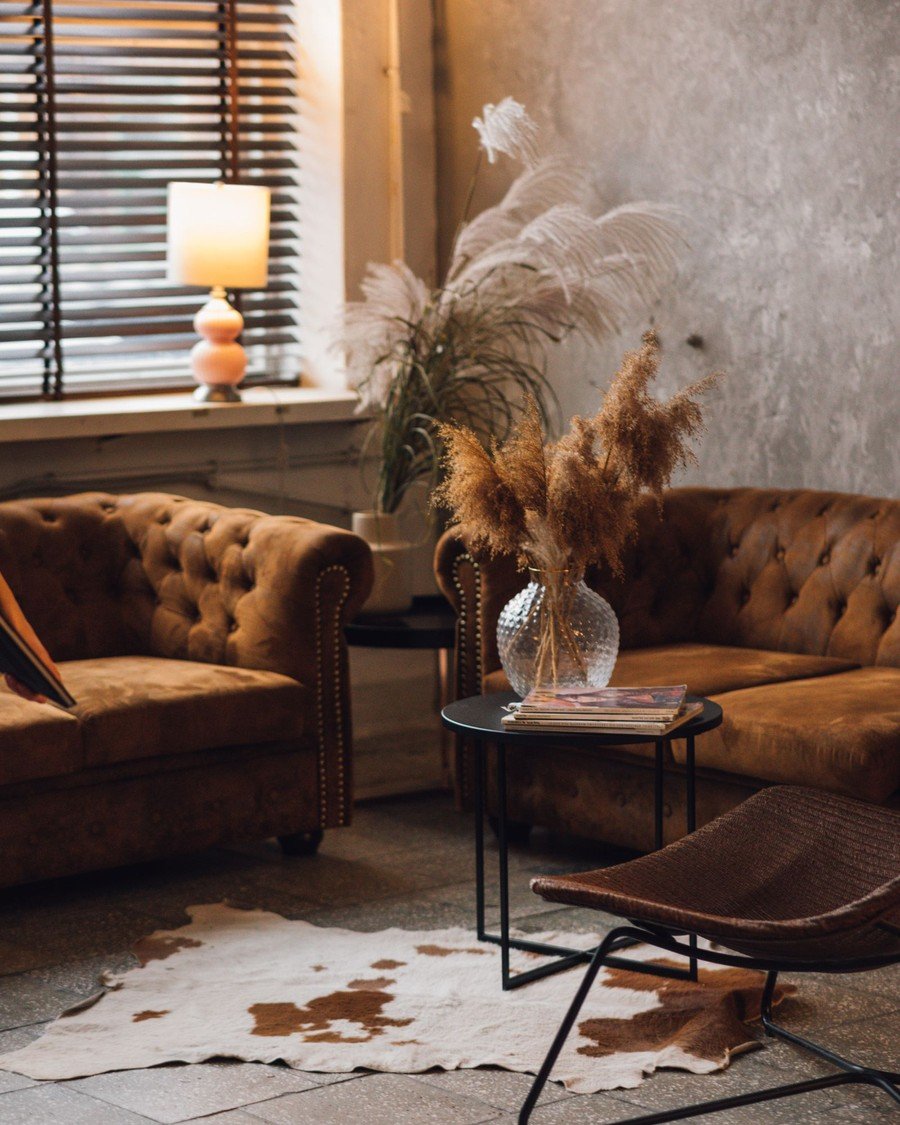
What it is: Chocolate brown is the cocoon that isn’t a color commitment — a neutral with the volume turned up. These leather Chesterfields, the cowhide rug, and the pampas grass show the palette at work: caramel to espresso in one pile. A color drenching living room in chocolate feels like a grand hotel library — hushed, grown-up, permanently autumn.
How to do it:
- Layer browns deliberately: walls deepest, textiles lightest
- Add texture everywhere — leather, hide, wool, rough plaster
- Light it low and warm; chocolate dies under white light
- Use cream sparingly as the single pale note
Pro tip: Chocolate walls are the best backdrop for art with pale mounts and gold frames — the wall behaves like a frame.
Avoid this: Avoid chocolate with black furniture — too close to separate, the room becomes indistinguishable lumps.
16. Sage Green: The Gentle First Drench
Style: Soft botanical | Best for: first-time drenchers and bright rooms | Price feel: Low
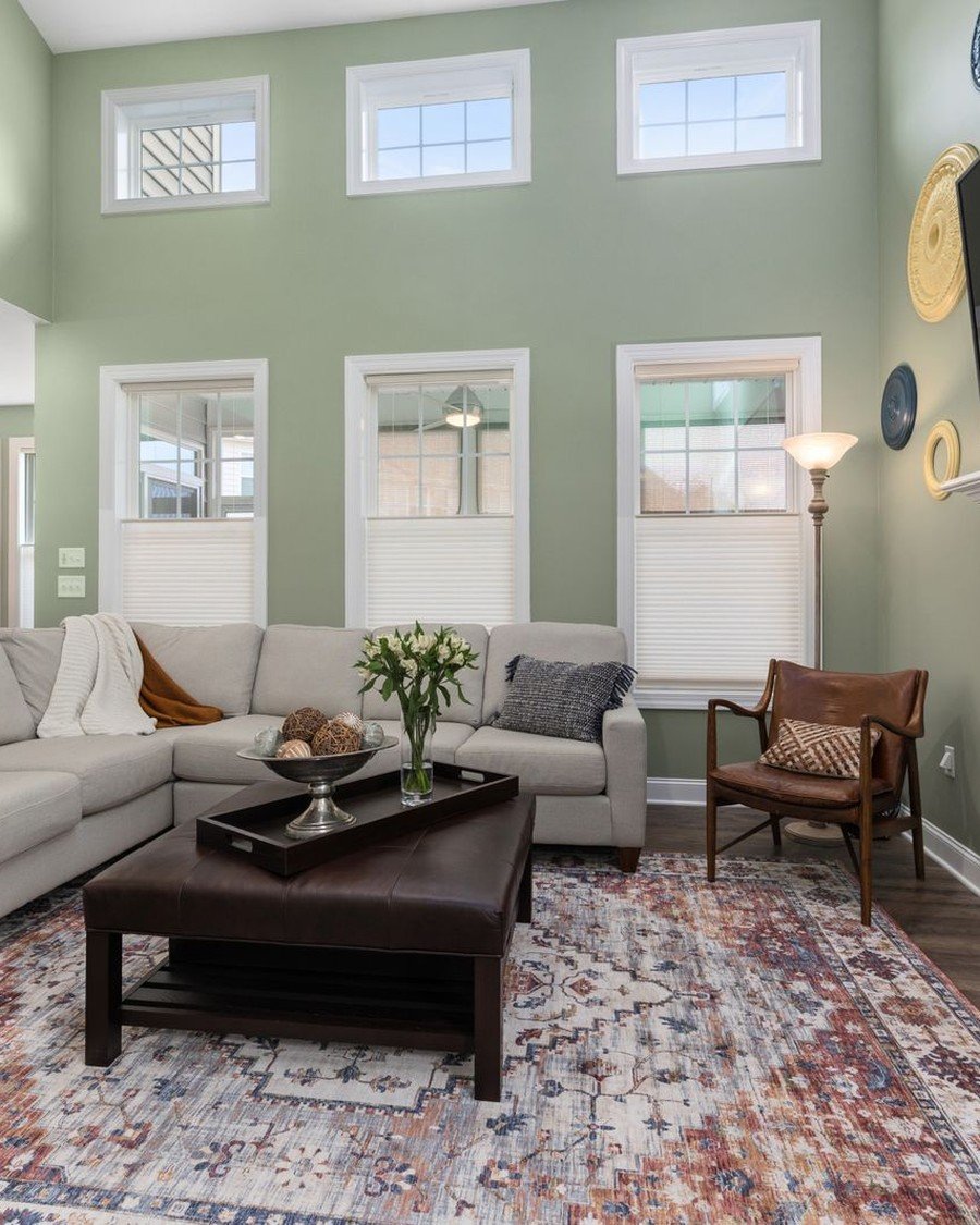
What it is: Sage is the gentle first drench — the effect without the adrenaline. This tall-windowed room wears sage on its walls with a grey sofa and patterned rug, and looks calm, fresh, and expensive. A sage color drenching living room keeps one foot in the neutral camp while delivering the wrapped, intentional feeling — the drench most recommended to first-timers.
How to do it:
- Pick a sage grey enough to stay soft in bright light
- Carry it over walls and woodwork for the wrapped effect
- Furnish in grey, cream, pale wood — sage loves quiet
- Add a deeper green plant or cushion as the palette’s floor
Pro tip: Sage is the easiest drench to reverse emotionally — it sits happily under future schemes as a ‘green neutral.’
Avoid this: Avoid sage with yellow-toned cream upholstery — it curdles. Choose stone, putty, or cool white.
Soft, Pale, and Neutral Drenches
Drenching is about one color everywhere, not about darkness. A pale color carried across walls, ceiling, and woodwork gives the same seamless, tailored effect at the opposite end of the light scale — the version of the color drenching living room that suits bright, south-facing spaces and cautious beginners.
17. Blush Pink Drenching That Stays Grown-Up
Style: Soft romantic | Best for: warmth without darkness | Price feel: Low
What it is: Blush drenching works when treated as a neutral, not a nursery. Here a pale pink wall meets a pale pink sofa with nothing cute in sight — softness, daylight, and a woman reading in the middle of it. A blush color drenching living room flatters skin, firelight, and warm metals, turning by evening to the rosy glow of candlelit plaster.
How to do it:
- Choose a blush with a brown or grey base, never candy
- Match sofa or chairs to the wall tone for the wrap
- Ground it with dark wood, black frames, a deep rug
- Keep accessories sculptural and few; blush hates clutter
Pro tip: Blush flatters everyone — photographs taken against it make people look healthier.
Avoid this: Avoid blush with silver and cool grey — it turns saccharine. Warm metals keep it grown-up.

18. Warm White and Cream: Drenching in Neutrals
Style: Quiet tonal | Best for: lovers of calm, bright rooms | Price feel: Low
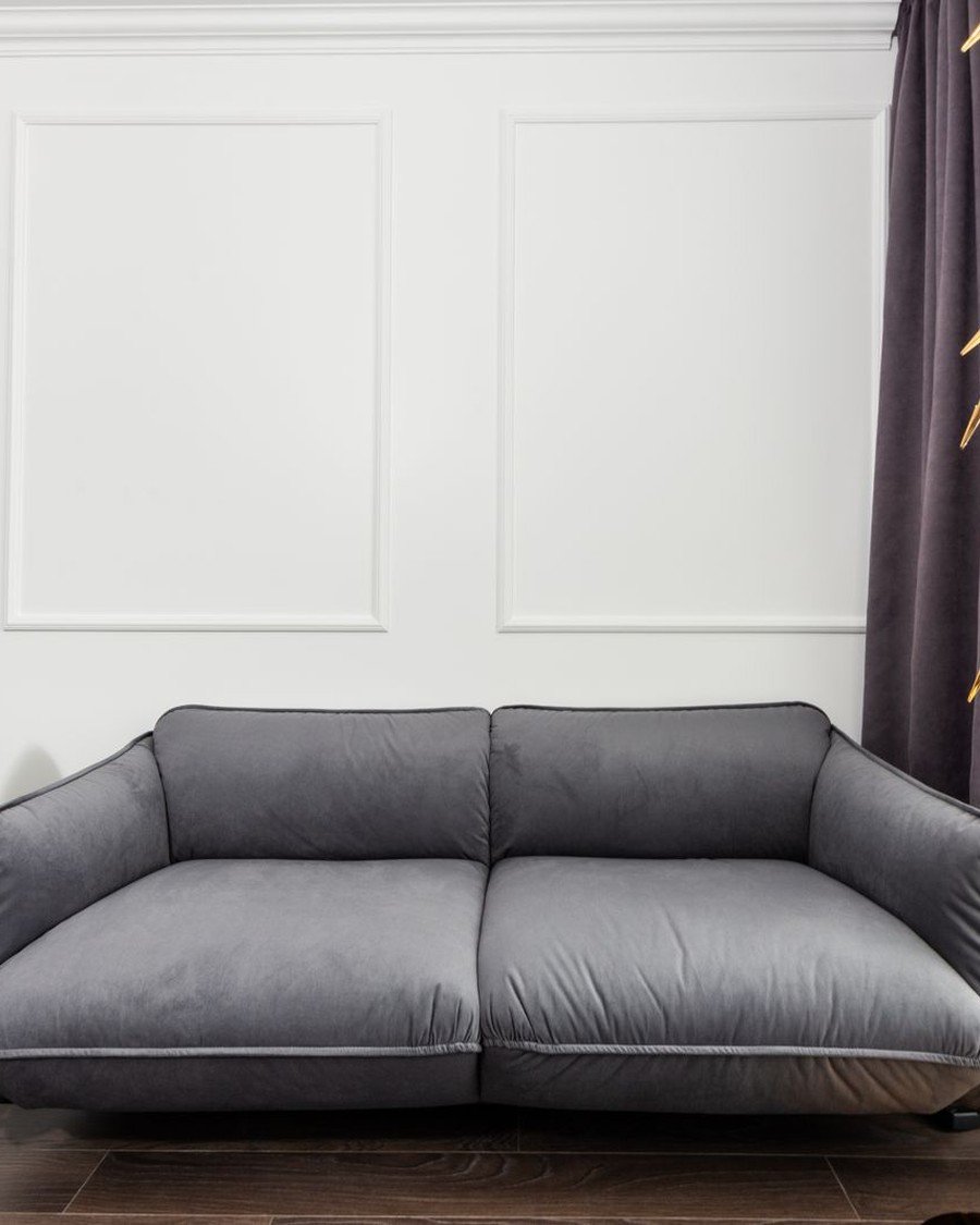
What it is: Drenching is a technique, not a saturation level — this room proves it in white. Picture-frame moulding, walls, and trim in one warm white, a grey sofa in front: the architecture does the decorating, and the room feels tailored, not empty. A warm white color drenching living room suits cautious beginners, bright rooms, and landlords who allow color only when it is magnolia’s smarter cousin.
How to do it:
- Use one warm white on walls, trim, and ceiling alike
- Add moulding if walls are flat — white needs architecture
- Layer whites in textiles: linen, wool, boucle, all different
- Keep the floor mid-toned so the room has a horizon
Pro tip: In an all-white drench, vary finishes — matte walls, satin trim — so light itself draws the room’s outlines.
Avoid this: Avoid mixing warm and cool whites — side by side, one reads yellow, the other dirty.
19. Tone-on-Tone: Paint and Wallpaper in the Same Color
Style: Textured subtle | Best for: adding depth without a dark color | Price feel: Medium
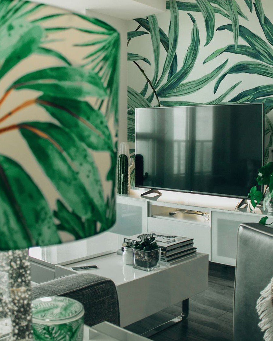
What it is: Paint is not the only drench. This room wraps itself in green palm-leaf wallpaper — wall after wall, the television absorbed into the foliage — single-color immersion with pattern doing the texture work. Tone-on-tone paper and paint in one family is the oldest drenching trick there is: Victorian rooms matched paper, paint, and fabric from one dye story.
How to do it:
- Choose paper whose ground color matches a paint exactly
- Paint woodwork, doors, ceiling in the paper’s ground color
- Paper every wall or none — one wall is an accent
- Keep furniture quiet; let pattern be the room’s only print
Pro tip: Have the wallpaper’s ground color scanned at the paint counter — a perfect match makes paper-paint seams vanish.
Avoid this: Avoid large-scale patterns in small, low rooms — the pattern advances and the walls come with it.
Making It Cohesive: Furniture, Fabric, and Light
Paint is only half the immersion. When the big soft pieces — sofa, curtains, rug — join the color family, a painted room becomes a true color drenching living room, the enveloping scheme that students of color theory would call a monochromatic harmony. These ideas cover the matching, the doubling of tones, and the lighting that keeps it glowing.
20. A Sofa Upholstered to Match the Walls
Style: Immersive luxe | Best for: the full cocoon effect | Price feel: High
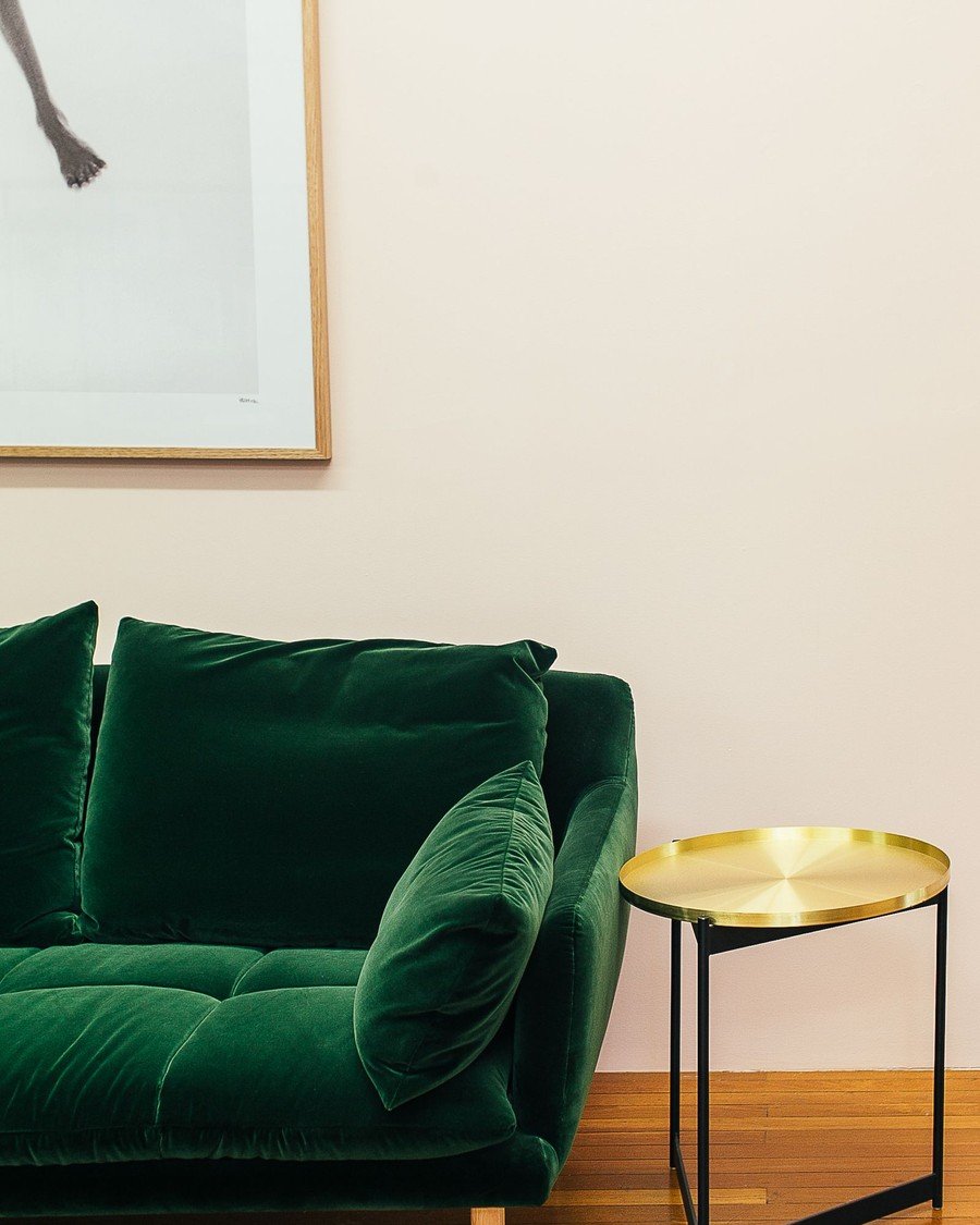
What it is: The boldest drench paints the furniture too — the practical version buys it. This emerald velvet sofa against a cream wall is the start: one huge piece carrying the room’s color at full strength. In a true color drenching living room the sofa matches the walls so closely it seems to grow out of them — part camouflage, part sculpture.
How to do it:
- Order the sofa fabric first; match wall paint to it
- Velvet and linen take dye-rich colors best
- If the match is imperfect, go a shade deeper on walls
- Keep cushions in the family, varied only by texture
Pro tip: Most paint counters will scan a fabric swatch — take a cushion cover in and ask for a match.
Avoid this: Avoid a sofa that nearly matches the wall — near-matches vibrate like a dye-lot accident.
21. Curtains Drenched to Match the Walls
Style: Soft seamless | Best for: bay windows and tall drapes | Price feel: Medium
What it is: Curtains are the drench’s soft architecture. These green sheers — daylight pouring through, plant shadows across the fabric — show what happens when window dressing joins the color story: the light enters already tinted. Curtains in the wall color close the last pale gap in the wrap, and floor-to-ceiling drapes can fake an extra drenched surface.
How to do it:
- Match curtain fabric to the wall color, a half-tone deeper
- Hang high and wide to cover wall, not just window
- Choose linen or velvet — fabrics that hold dye richly
- Line dark curtains so sunlight doesn’t bleach them unevenly
Pro tip: If exact-matching fabric eludes you, dye plain cotton or linen curtains at home — the cheapest perfect match in decorating.
Avoid this: Avoid white sheers under dark curtains — the pale layer flashes and un-drenches the window.

22. Rugs, Cushions, and Throws in One Color Family
Style: Layered tonal | Best for: softening an existing drench | Price feel: Low
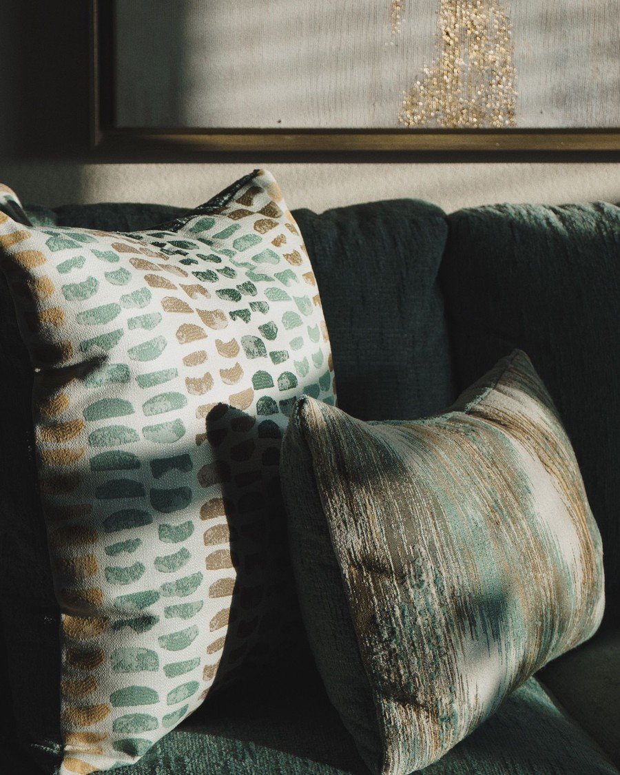
What it is: Textiles are where a drench gets its texture: a dark green sofa heaped with cushions — pattern, stripe, and plain, all reading green. A color drenching living room stays livable because cushions, throws, and the rug vary the color’s value and surface while never leaving the family. One hue, five fabrics, zero boredom.
How to do it:
- Collect cushions in three values: lighter, same, deeper
- Mix one pattern, one stripe or check, and plains
- Add a throw in the deepest tone at the sofa’s end
- Choose the rug inside the family, patterned for real life
Pro tip: Buy cushion covers in your color family in the sales each year — the palette deepens gradually, never ‘done once.’
Avoid this: Avoid one ‘pop of contrast’ cushion — in a drench, a foreign color just looks lost.
23. Double Drenching: Two Adjoining Tones, One Room
Style: Graduated depth | Best for: large rooms and open-plan zones | Price feel: High
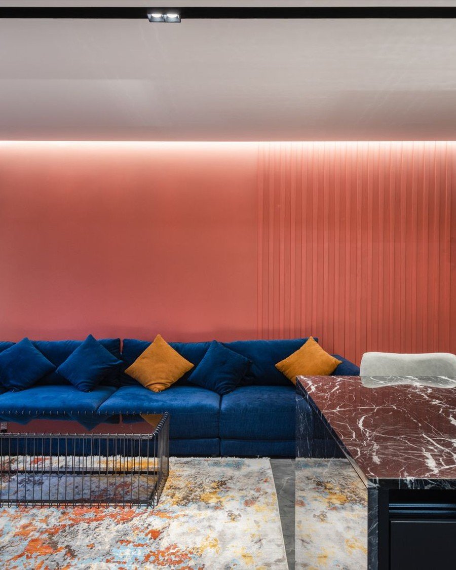
What it is: Double drenching uses two colors that touch — here a coral-pink panelled wall behind a deep blue sectional, orange cushions striking the match. Both colors appear at full strength, and nothing else may be a third color except wood, white, and metal. Done well, a double-drenched color drenching living room has a painting’s energy with a single color’s cohesion.
How to do it:
- Pick two colors from opposite moods: one warm, one cool
- Give each a territory: walls to one, furniture to the other
- Bridge them with one small repeated accent, like these cushions
- Keep everything else wood, cream, black, or metal
Pro tip: Choose the pair from a painting, fabric, or sunset you love — artists and nature have tested the combinations.
Avoid this: Avoid two equal darknesses fighting for the walls — unclear territories read as indecision.
24. Lighting a Drenched Room So It Glows, Not Glooms
Style: Atmospheric | Best for: any dark drench after sunset | Price feel: Medium
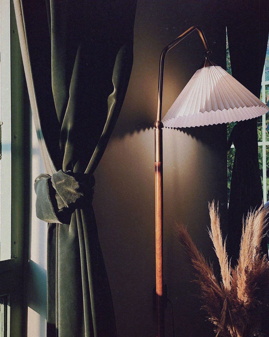
What it is: A drenched room lives or dies by its lighting, and this corner shows the rescue: a pleated floor lamp burning warm against dark green, turning ‘too dark’ into ‘atmospheric’. Dark walls absorb light instead of bouncing it, so a color drenching living room needs half again as many sources as a pale one — layered low, warm, aimed at walls and corners.
How to do it:
- Plan three layers: table lamps, floor lamp, one wall light
- Use warm bulbs throughout — 2700K or lower, dimmable
- Aim one light up a drenched wall to show its depth
- Put lamps in far corners to open the space at night
Pro tip: The five-lamp rule: a drenched room wants about five light sources for the evening. Most have two.
Avoid this: Avoid a single central ceiling light — it makes an interrogation pool surrounded by gloom.
25. A Color-Drenched Reading Nook
Style: Intimate corner | Best for: alcoves, window seats, and single chairs | Price feel: Low
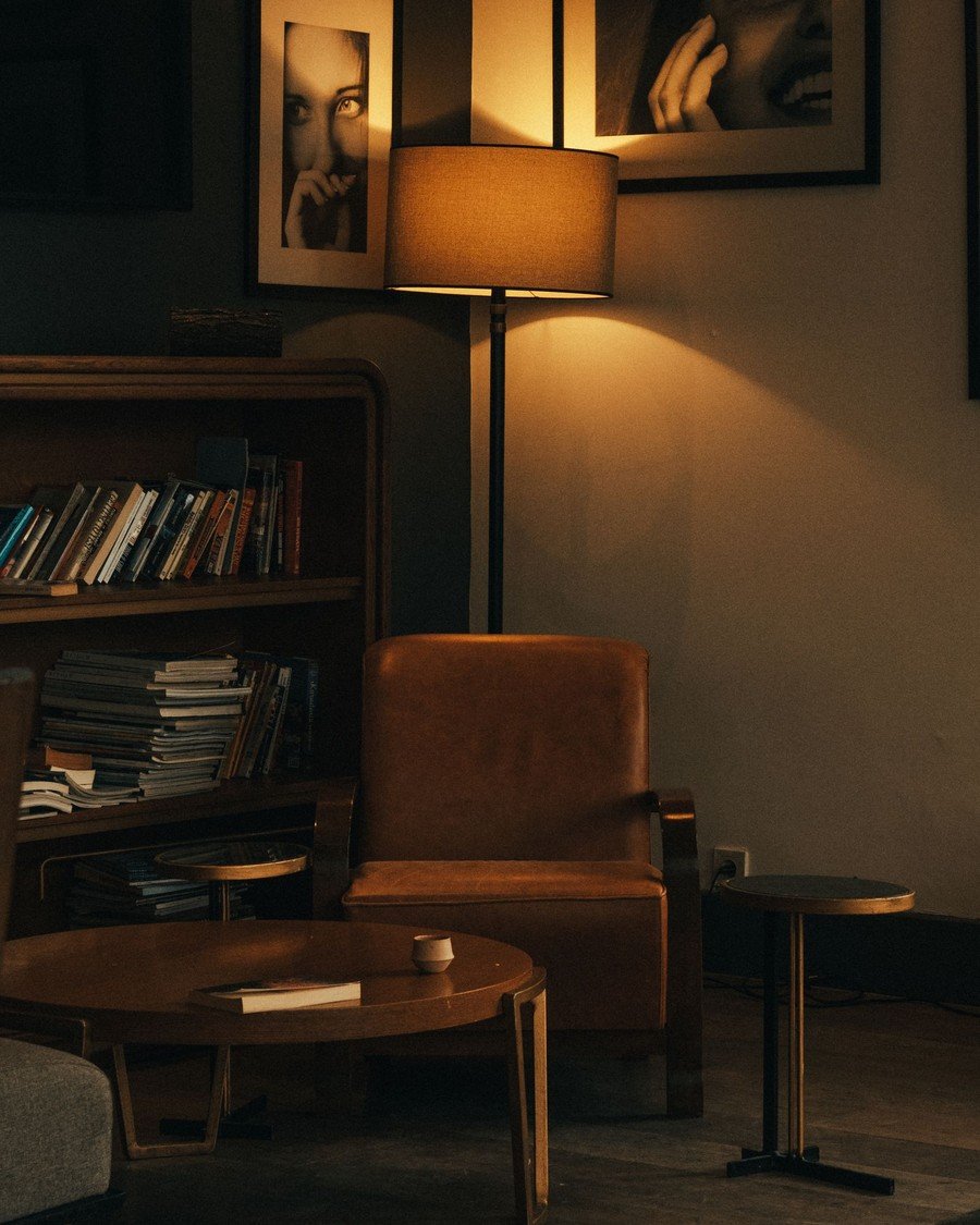
What it is: Every home deserves one corner of retreat, and drenching makes it in an afternoon. This nook — dark bookcase, leather chair, a lamp pooling light where a reader sits — is a room within a room, painted in shadow. It is also the perfect pilot for a full color drenching living room: one corner, one deep color, minimal risk.
How to do it:
- Define the nook: color on two walls, or wall plus ceiling
- Give it one perfect chair, one lamp, one small table
- Paint any shelves in the nook the same color
- Keep the palette two tones deeper than the main room’s
Pro tip: A nook in the main room’s color, two shades deeper, looks designed, not accidental — the room’s inner sanctum.
Avoid this: Avoid lighting a nook from the room’s main lights — without its own lamp it becomes storage.
Hard Rooms, Smart Moves
Small rooms, grey light, renters’ rules, a television that will not hide — the rooms that seem to disqualify a drench are usually the ones it helps most. These six tackle the problem rooms one by one, including halfway versions that borrow the effect without full commitment — much as the schemes in our guide to living room accent wall ideas borrow drama one wall at a time.
26. Drenching a Small Living Room — and Why It Works
Style: Space-blurring | Best for: box rooms and small flats | Price feel: Medium
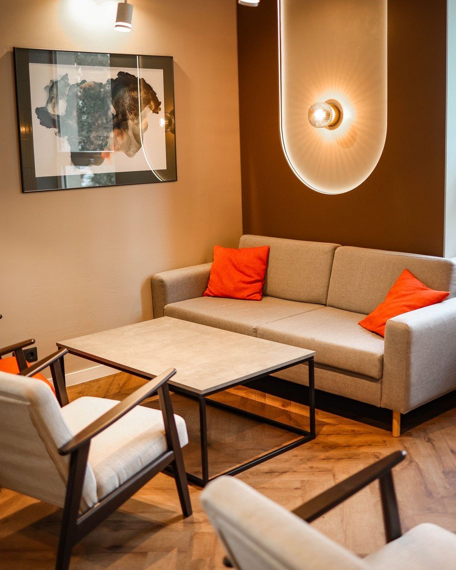
What it is: Conventional wisdom says small rooms need pale colors. Drenchers know better: this compact room wraps warm brown around its walls and a glowing niche, and the boundaries blur instead of announcing themselves. With walls, trim, and ceiling in one color, the eye finds no edges to measure — a small color drenching living room feels boundless, not boxed — and intentional.
How to do it:
- Drench everything — partial color leaves edges to measure
- Choose mid-to-deep tones; pale small rooms look unfinished
- Keep furniture low and leggy so floor shows through
- Try a gloss ceiling — it bounces light, doubling the glow
Pro tip: In small rooms, paint the door’s back too — it’s the wall you see most from the sofa.
Avoid this: Avoid bulky, skirted furniture in a small dark drench — pieces must float, or the color closes in.
27. North-Facing Rooms: Warm Drenches That Beat Grey Light
Style: Light-correcting | Best for: cold, grey, north-facing light | Price feel: Medium
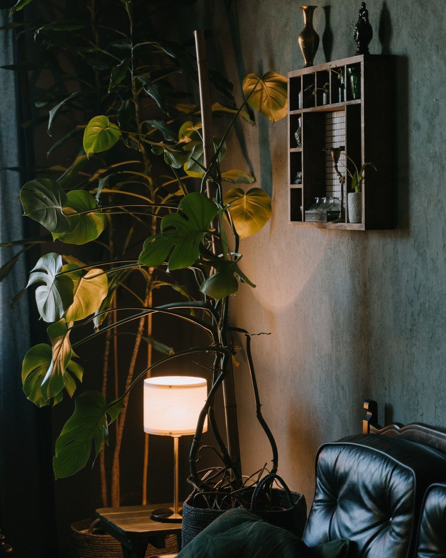
What it is: North-facing light is grey and merciless to cool colors — this corner shows the drench answer: a warm-leaning dark green-grey wall, a big plant thriving in soft light, a small lamp on at midday. The fix is not fighting greyness with white, which goes grubby, but warm-based colors. In olive, terracotta, or ochre, a north-facing color drenching living room feels like dusk in a conservatory.
How to do it:
- Choose colors with yellow, red, or brown bases
- Avoid blue-based shades entirely; north light makes them icy
- Add lamps on timers so the room glows before dark
- Mirror opposite the window spends weak light twice
Pro tip: Check your tester board at 9am on a cloudy day — that is a north room’s truth; other hours flatter it.
Avoid this: Avoid cool grey in a north-facing room — decorating’s most depressing combination, and the hardest to rescue.
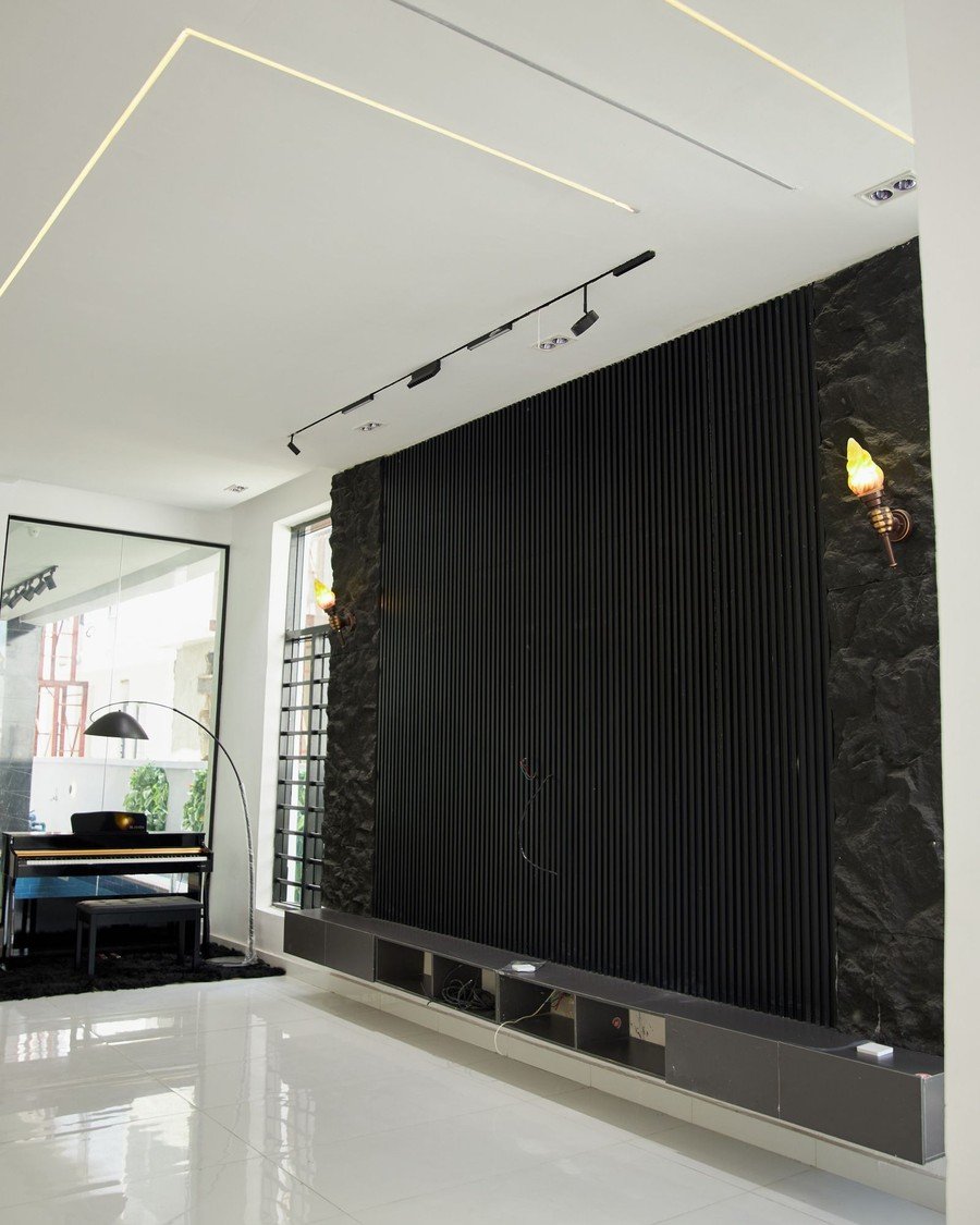
28. A Drenched Media Wall Behind the Television
Style: Cinema mood | Best for: tV walls and film nights | Price feel: Medium
What it is: The television wall is where living rooms look unfinished — a black rectangle floating on a pale wall. This media wall makes the whole elevation the screen’s frame: black slats floor to ceiling, a glossy white floor throwing light back. Drenched dark, it absorbs the screen’s glow, hides cables and brackets, and turns film night into cinema — the most functional drench in this guide.
How to do it:
- Paint or panel the whole TV wall in the deepest tone
- Route cables in-wall or in same-color trunking
- Add bias lighting behind the screen for your eyes
- Keep the unit below low, dark, and handle-free
Pro tip: Slatted panels add the texture a dark flat wall needs, and hide the screen’s edges better than paint.
Avoid this: Avoid gloss on a media wall — every window and lamp reflection lands on the screen.
29. Sheen Strategy: Matte Walls, Glossier Trim
Style: Crafted finish | Best for: making one color read as many | Price feel: Medium
What it is: Sheen is the drench’s secret dimension. Look closely: a matte deep green wall, a burgundy velvet sofa, a brass lamp gleaming between them — three surfaces, three finishes, one chord. The classic strategy pairs matte walls with glossier woodwork in the identical color: the trim catches light, architecture draws itself, and a color drenching living room gains depth without a second color.
How to do it:
- Use matte or flat paint on walls for depth
- Use satin or gloss, same color, on doors and trim
- Reserve highest gloss for one hero: a door, a cabinet
- Test sheen pairs on one board — gloss reads darker
Pro tip: Gloss trim over matte walls is the historic method — in lamplight the woodwork outlines the room like a drawing.
Avoid this: Avoid gloss on large walls unless the plaster is flawless — sheen spotlights every lump.

30. Partial Drenching: One Wall, the Woodwork, Done
Style: Cautious color | Best for: testing before the whole room | Price feel: Low
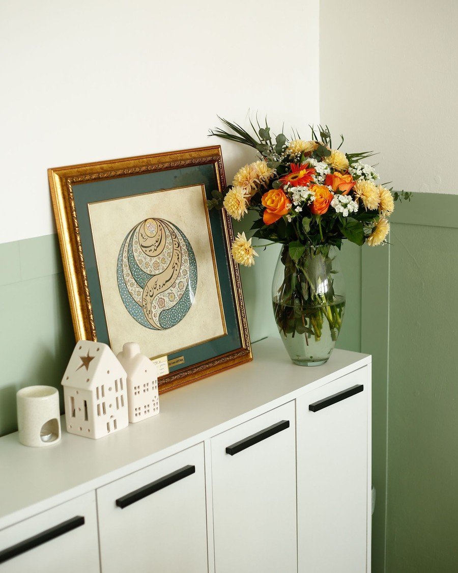
What it is: Not ready for the full wrap? The partial drench takes the color up to a line and stops with total confidence. This room runs sage up the wainscot and lets white breathe above — sideboard styled, art hung across the join, nothing apologetic. Half-height drenching protects chair-bashed walls, keeps the upper half light, and delivers a real color drenching living room effect at half the paint.
How to do it:
- Stop at a rail or a taped line at 90–120cm
- Carry color over skirting and woodwork below the line
- Hang art across the join — it marries the halves
- Ceiling white, or the palest tone of the lower color
Pro tip: Chalk line and tape give a crisp modern stop; a chair rail a traditional one. Both beat freehand.
Avoid this: Avoid stopping mid-wall without a rail or art across the join — an unchosen-looking line ruins it.
31. Rental-Friendly Drenching You Can Reverse
Style: Reversible bold | Best for: renters and the commitment-shy | Price feel: Low
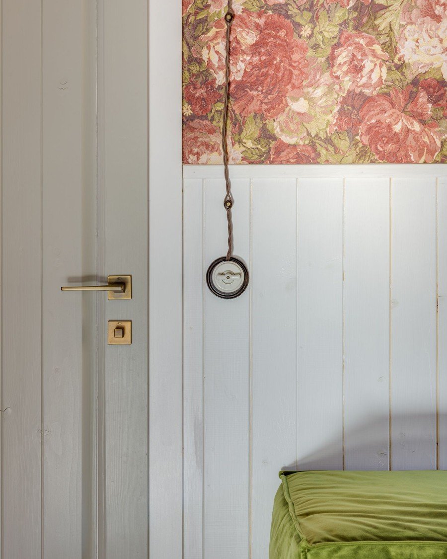
What it is: Renters can drench too — reversibly. This room’s prettiest feature, the pink floral panel above white wainscot, is the sort of peel-and-stick treatment that peels off with a hairdryer, deposit intact. The rental color drenching living room is built from layers that leave no trace: paper, fabric, restorable woodwork, furniture carrying the color.
How to do it:
- Use peel-and-stick wallpaper in your color on main walls
- Drench with furniture: sofa cover, curtains, a big rug
- Paint only what you can restore — get terms in writing
- Photograph every wall before starting, for the deposit
Pro tip: A huge rug in the room’s color does half the drench’s work in a rental.
Avoid this: Avoid ‘temporary’ products on unsound walls without a test patch — peel-and-stick can take paint with it.
Judgment Calls: Testing, Limits, and Restraint
The difference between a drench that looks expensive and one that looks like a mistake is rarely the color — it is the testing beforehand and the judgment about where to stop. Finish with these: how to test like a professional, how to carry color through connected spaces (the flow matters as much as in any of these green living room ideas), and the cases where the right call is not to drench.
32. Test Before You Commit: Big Swatches and Sample Boards
Style: Methodical | Best for: anyone spending real money on paint | Price feel: Low
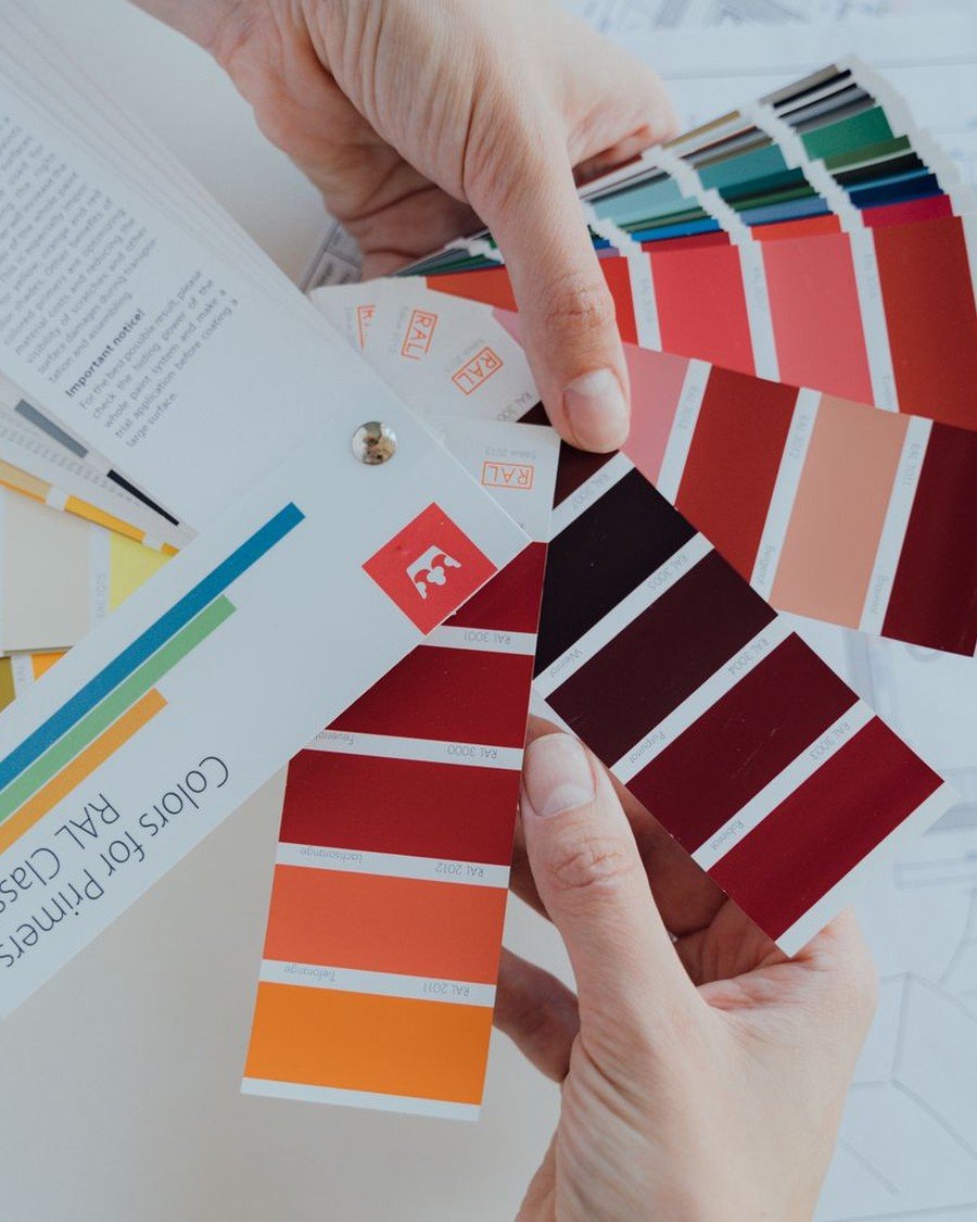
What it is: Every regret in this guide began as a tester pot judged on a white card. The hand in this photo does it properly: swatch cards, compared in the room itself. Colors intensify across four walls and a ceiling, and a color drenching living room amplifies them — the shade that looks perfect on the stick arrives louder than ordered, unless you test at scale.
How to do it:
- Paint two-coat swatches at least A3 size, on boards
- Move boards around the room; live with them two days
- Choose one shade quieter than instinct — drenching amplifies
- Test the exact finish too; sheen changes the shade
Pro tip: Photograph your color board beside its nearest rival at dusk. The camera is brutally honest about undertones.
Avoid this: Avoid judging testers under shop lights or from the printed card — both lie.
33. Drenching an Open-Plan Room Without Losing Its Zones
Style: Zoned color | Best for: kitchen-living and studio spaces | Price feel: High
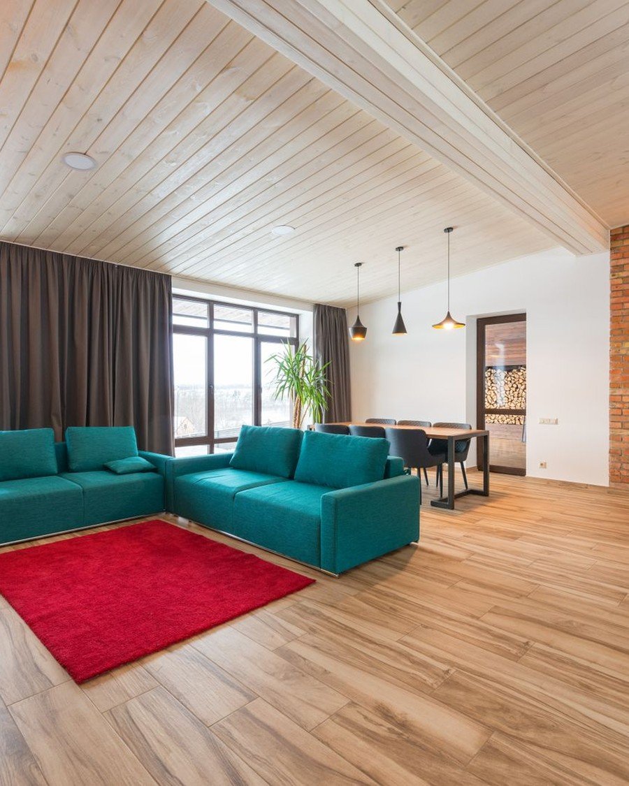
What it is: Open-plan rooms resist drenching because one color must serve kitchen, dining, and sofa at once. This space shows the carrier method: teal sofas anchoring the living zone on light wood floors, the family echoing toward the dining end, so color — not walls — draws the zones. In a wide open color drenching living room, either commit paint to every zone or let furniture mark the living area.
How to do it:
- Decide: full paint drench everywhere, or color carried by furniture
- Give the living zone the strongest statement in family
- Repeat the color at the far end in one object
- Keep cabinetry neutral or in-family, never a rival color
Pro tip: A rug is the zone-maker — it gives the living area a ‘floor’ of color where walls can’t reach.
Avoid this: Avoid drenching only the living end — a saturated box floating in a white hall.
34. Art, Mirrors, and Metallics on Drenched Walls
Style: Curated contrast | Best for: finishing touches that lift dark walls | Price feel: Low
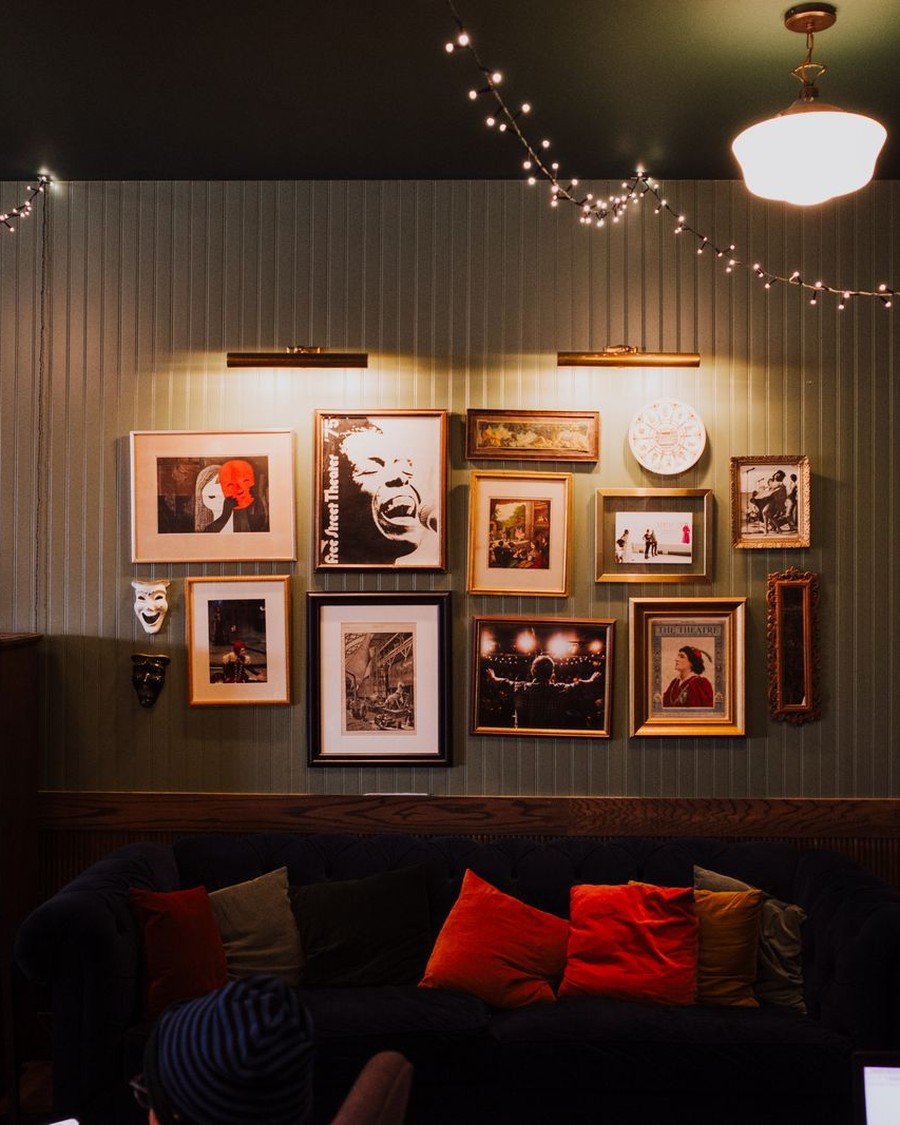
What it is: Dark drenched walls are the best picture-hanging surface in the world, and this wall of frames proves it — gilt, wood, and black frames crowded over a dark sofa, every picture lit like a small altar. On a color drenching living room wall, art doesn’t hang on the color; it glows out of it. Mirrors multiply lamps, and modest prints look borrowed from a gallery.
How to do it:
- Hang art lower than habit suggests — dark walls reward intimacy
- Light pictures individually; one picture light per cluster
- Mix frame finishes freely; the wall unifies everything
- Place one mirror to catch a lamp or window’s light
Pro tip: Arrange the gallery on the floor and photograph it — dark walls hide nail holes poorly. Plan once.
Avoid this: Avoid glare traps — a print opposite a window reflects the window, not the art.
35. Flooring That Grounds a Drench: Dark Wood, Pale Oak, Pattern
Style: Foundational | Best for: planning from the floor up | Price feel: Medium
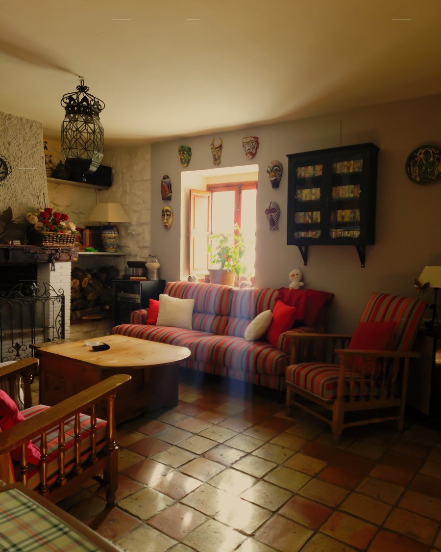
What it is: A drench stands on its floor. This room’s terracotta tiles show the warm end of the partnership — the floor continuing the walls’ sun-baked story, plaid sofas settling in like they’ve always lived there. In any color drenching living room the floor is the second-largest surface: dark wood grounds a pale drench, pale oak lifts a dark one, pattern mediates between strong walls and furniture.
How to do it:
- Match floor undertone to walls’: warm with warm, cool with cool
- Dark drench, light floor — or the reverse; avoid both dark
- Soften a fighting floor with a large in-family rug
- Test paint boards standing on your actual floor
Pro tip: If you change nothing else, stain the floor one tone deeper — pale walls look deliberate, dark walls grounded.
Avoid this: Avoid orange-toned floors with pink or red drenches — the undertones clash at floor level.
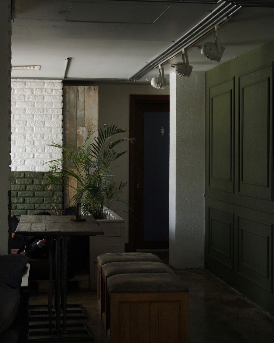
36. Taking the Drench Through the Door: Halls and Adjoining Rooms
Style: Flowing color | Best for: connected rooms and sight lines | Price feel: Medium
What it is: The bravest line in a drench is the one through the doorway. This dark green panelled hall — built-in bench seating, track lights washing the color — is what happens when the color refuses to stop at the door. Carrying the drench into halls turns a decorated room into a designed home, and in a color drenching living room the view through the door becomes a feature, not an apology.
How to do it:
- Carry the color through the hall at full or half strength
- Paint hall woodwork, doors, and stair string in family
- If full carry-through is too much, repeat color in hall art
- Keep ceilings consistent across the threshold for flow
Pro tip: The view from your sofa through the open door is seen a thousand times a year — compose it like a picture.
Avoid this: Avoid a new color at the threshold — competing drenches shrink both rooms.
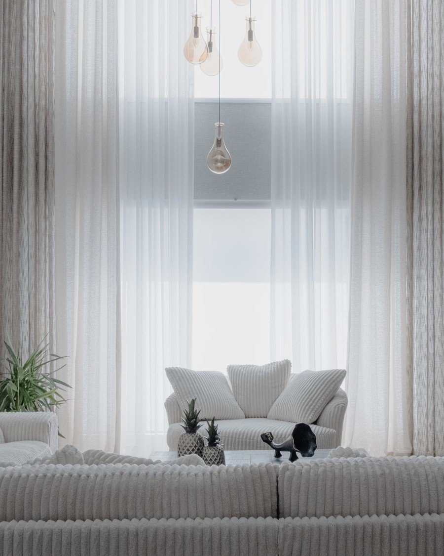
37. When NOT to Drench a Living Room
Style: Honest restraint | Best for: rooms that fight the treatment | Price feel: Low
What it is: Honesty section: some rooms should never be drenched. This bright white living room — sheer curtains glowing, pale sofa, daylight doing the decorating — is one of them: a room built around a view or light too precious to mute. Drenching is a tool, not a religion — glorious where atmosphere matters more than daylight; where daylight is the point, leave the walls alone.
How to do it:
- Ask first: is this room’s best feature its light or view?
- Skip drenching rooms used for color-critical work
- Leave beautiful original plaster or brick undrenched
- In doubt: drench the night room, spare the day room
Pro tip: If visitors praise the room while looking out the window, the room is a frame — don’t out-paint the picture.
Avoid this: Avoid drenching to fix what color can’t — bad layout, no storage, and tired furniture survive paint.
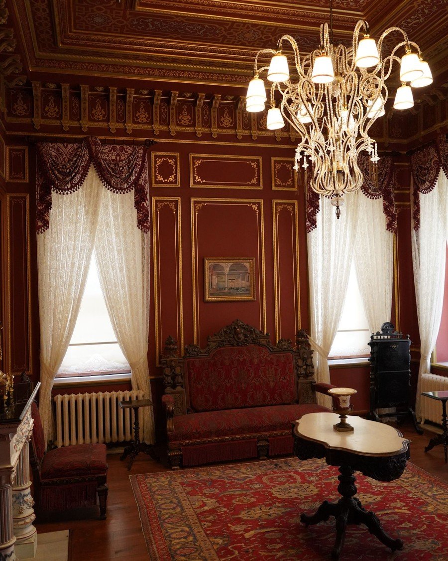
38. Drenching Around Period Features: Cornice, Panelling, and Beams
Style: Heritage bold | Best for: victorian and older homes | Price feel: High
What it is: Period rooms were the original drenches — this heritage interior, with carved panelling, gilded detail, a crystal chandelier, and a red carpet, was one saturated gesture centuries before the term. The modern move is to join the architecture, not fight it: paint new plaster and repairs in the historic family, gloss the cornice, keep the beams dark. A color drenching living room with period features should look inevitable.
How to do it:
- Paint infill plaster and new woodwork to the historic palette
- Keep original beams, cornice, panelling — clean, don’t cover
- Use glossier finishes on period woodwork, as originals did
- Take colors from the house’s era — heritage ranges exist
Pro tip: Take your cue from one original element — a tile, a stained-glass pane, a carpet border — and build around it.
Avoid this: Avoid strong modern colors over original features without advice — listed buildings have rules, and old walls breathe.
Buying & Materials Guide: What to Buy for a Color Drenching Living Room
A color drenching living room is a paint project, not a building project, which is why it delivers so much transformation per dollar. The decisions that matter are the paint itself — type, finish, and quantity — and the unglamorous supplies that decide whether the finish looks sprayed-on or regretted. Work through this guide once and the painting itself is two or three days of work.
For the paint, choose a quality water-based emulsion (latex) for walls and ceiling, and a tougher trim paint — eggshell, satin, or gloss — for woodwork and radiators. Dark, saturated colors need more pigment and usually one extra coat, so buy the better base: most brands sell deep colors in a deep-base, high-hiding formula, and it is worth it. A grey-tinted primer under deep green, navy, or burgundy can save an entire coat. The liveliest schemes in this guide owe as much to preparation as to color — the same lesson our dopamine decor roundup keeps teaching: commit fully, prepare properly.
Use the reference table below as a pocket checklist for the core supplies behind these color drenching living room projects.
| Material / Item | Look For | Used For |
|---|---|---|
| Paint (walls & ceiling) | Quality matte or eggshell emulsion; deep-base formula for dark colors | Roughly 1 litre per 10–12 m² per coat |
| Trim paint | Satin, eggshell or gloss, same color code | Skirting, doors, frames, radiators — the drench’s joining pieces |
| Primer / undercoat | Grey-tinted for dark colors; stain-block for radiators and wood | Saves a coat on deep shades and stops bleed-through |
| Tester pots | At least 3 candidate shades, 100 ml each, plus white foam boards | Big movable swatches (idea 32) |
| Rollers & sleeves | Medium-pile 9-inch sleeves; a mini roller for radiators | Even coverage without flashing or texture stripes |
| Brushes | Angled 2-inch brush for cutting in; small brush for trim and radiator fins | The edges sell a drench — all brushwork |
| Painter’s tape & film | Low-tack tape, masking film or dust sheets | Protects floors, sockets, anything un-drenched |
| Filler, caulk & sandpaper | Flexible caulk, fine filler, 120- and 240-grit paper | Dark color shows every crack — prep is half the finish |
Budget tiers keep the project honest. Under $150: a partial or rental-friendly drench — one wall plus woodwork, or a reading nook — from a single 2.5-litre tin (ideas 25, 30, 31). $150–$450: the classic full-room drench: two tins of wall paint, one of trim paint, primer, rollers, and tape (ideas 1 to 19). Above $450: large or open-plan rooms, double drenching, high-gloss finishes, and the paint-plus-textiles version where curtains and cushions join in (ideas 20 to 23 and 33). Whichever tier your color drenching living room falls into, spend on paint and primer; save on rollers and tape.
One last buying rule: buy all the paint for a room in a single batch, and one tin more than the calculator says. Deep colors are mixed per batch, and a drench shows a half-shade difference between wall and woodwork mercilessly — the seamlessness is the whole point. Keep the batch number; it is your insurance for every future touch-up.
Frequently Asked Questions
What exactly is color drenching?
Color drenching means painting every surface in a room — walls, ceiling, skirting, doors, radiators, sometimes built-ins — in a single color, so the room reads as one continuous envelope of color. A color drenching living room takes that technique into the main sitting space: no white ceiling, no contrasting trim, just one considered color doing all the work.
How much does it cost to color drench a living room?
Paint is the only real cost. A standard living room takes 5–7.5 litres of wall paint (two to three coats of a deep color) plus a litre of trim paint — roughly $150–$450 in materials depending on paint quality and room size. Testers, primer, rollers, and tape add a little; professional labor, if hired, is usually two to three days.
Will a dark drench make my living room feel smaller?
Usually the opposite. With wall, ceiling, and skirting all one color, the eye cannot find the corners, boundaries blur, and a small room reads larger and calmer. What makes a dark room oppressive is not darkness but contrast clutter — white ceilings, pale floors, busy trim. A drench removes exactly that clutter, which is why idea 26 recommends it for box rooms.
What is the best paint finish for color drenching?
Matte or flat emulsion on walls and ceiling gives the deepest, most velvety color and hides imperfect plaster. Woodwork in eggshell or satin in the identical color adds a whisper of difference that reads as craftsmanship. Reserve gloss for one accent — a door or bookcase — unless chasing the lacquered look, which demands near-perfect walls. Keep the wall finish consistent throughout.
How do I choose the right color for a drench?
Start from the light, not the paint chart. North-facing rooms need warm-based colors (ideas 12, 13, and 27); bright rooms can carry cooler, deeper shades. Then test: paint large boards, live with them two days in daylight and lamplight, then commit (idea 32). Saturated mid-tones — deep green, teal, terracotta — are the most forgiving first drenches; near-black and brights the least.
Can renters color drench?
Yes, with the reversible versions in idea 31: one wall plus its woodwork in an agreed color, peel-and-stick wallpaper in a saturated tone, or a ‘soft drench’ of curtains, a rug, and cushions in one color family. Get the landlord’s permission in writing for anything painted, choose colors one coat of white can cover, and keep the original paint code — your future self, holding a deposit, will thank you.
Bringing It Home: Commit to One Color
Every room in this guide began the same way: somebody stopped choosing colors and chose one. Pick the family that fits your light and your nerve — deep green for the cocoon, terracotta for the warmth, sage for the gentle start — test it big, prep like it matters, and then paint everything: walls, ceiling, woodwork. A color drenching living room rewards commitment like few decorating projects do.
Measure twice, test for two days, and let one beautiful color do the work of twenty decorating decisions. From all of us at Decor Beam: happy drenching.
