
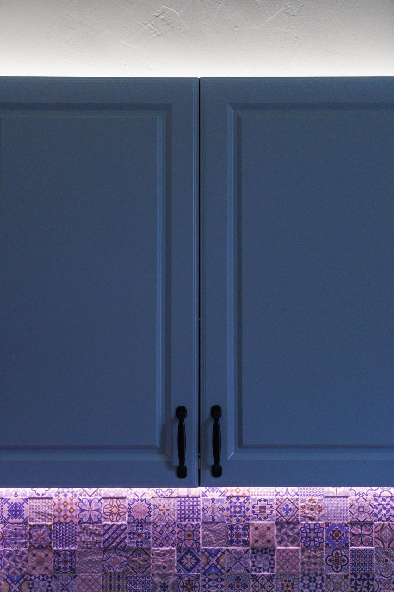
Some kitchens and bathrooms are perfectly nice and completely forgettable. And then there are the ones you remember years later — not because of the cabinets or the bath, but because of the tiles. Statement tile ideas are built on a simple truth: tiles cover more visual ground than almost anything else in a kitchen or bathroom, so when they carry pattern, colour or texture, the whole room gets a personality for free. A patterned floor, a handmade-look backsplash or a wall of emerald green can do what a full refit does, at a fraction of the cost and upheaval.
This guide rounds up 28 statement tile ideas that genuinely steal the show — 14 for kitchens, 14 for bathrooms — from encaustic-look floors and checkerboard classics to zellige, terrazzo and mosaic feature walls. A tile is a humble thing on its own; it is the repetition across a whole floor or wall that turns it into theatre. The thinking is the same as behind a bold living room accent wall: one brave surface, everything else calm. Each idea below tells you what it is, how to do it, a pro tip, and the mistake to avoid, so you can steal the look without stealing the problems.
One rule before we start: a statement tile should be the loudest voice in the room, and everything else — cabinets, worktops, sanitaryware, towels — should speak more quietly. Pick your one moment of drama, commit to it fully, and let the rest of the room support it. Half-hearted statements just look like accidents.
Quick Picks: The Fastest Ways to Make Tiles the Star
In a hurry? These eight ideas deliver the most drama for the least disruption. The full list of 28 follows, with kitchens first and bathrooms after.
| Idea | Best For | Room | Price Feel |
|---|---|---|---|
| Patterned encaustic-look floor (idea 1) | Plain kitchens that need a soul | Kitchen | Medium |
| Checkerboard floor (idea 3) | Period homes and farmhouse kitchens | Kitchen | Low–Medium |
| Zellige backsplash (idea 2) | Texture lovers, soft light | Kitchen | Medium–High |
| Blue-and-white Mediterranean tiles (idea 5) | Sunny, holiday-at-home kitchens | Kitchen | Medium |
| Floor-to-ceiling colour (idea 15) | Small bathrooms that feel boxy | Bathroom | Medium |
| Emerald tiles with brass (idea 16) | Luxe hotel-at-home bathrooms | Bathroom | Medium–High |
| Terrazzo tiles (idea 27) | Pattern without fussiness | Bathroom | Medium |
| Moroccan mosaic wall (idea 28) | One unforgettable feature wall | Bathroom | High |
Kitchen Statement Tile Ideas
1. Patterned Encaustic-Look Floor Tiles
Style: Mediterranean soul | Best for: plain kitchens that need character | Price feel: Medium
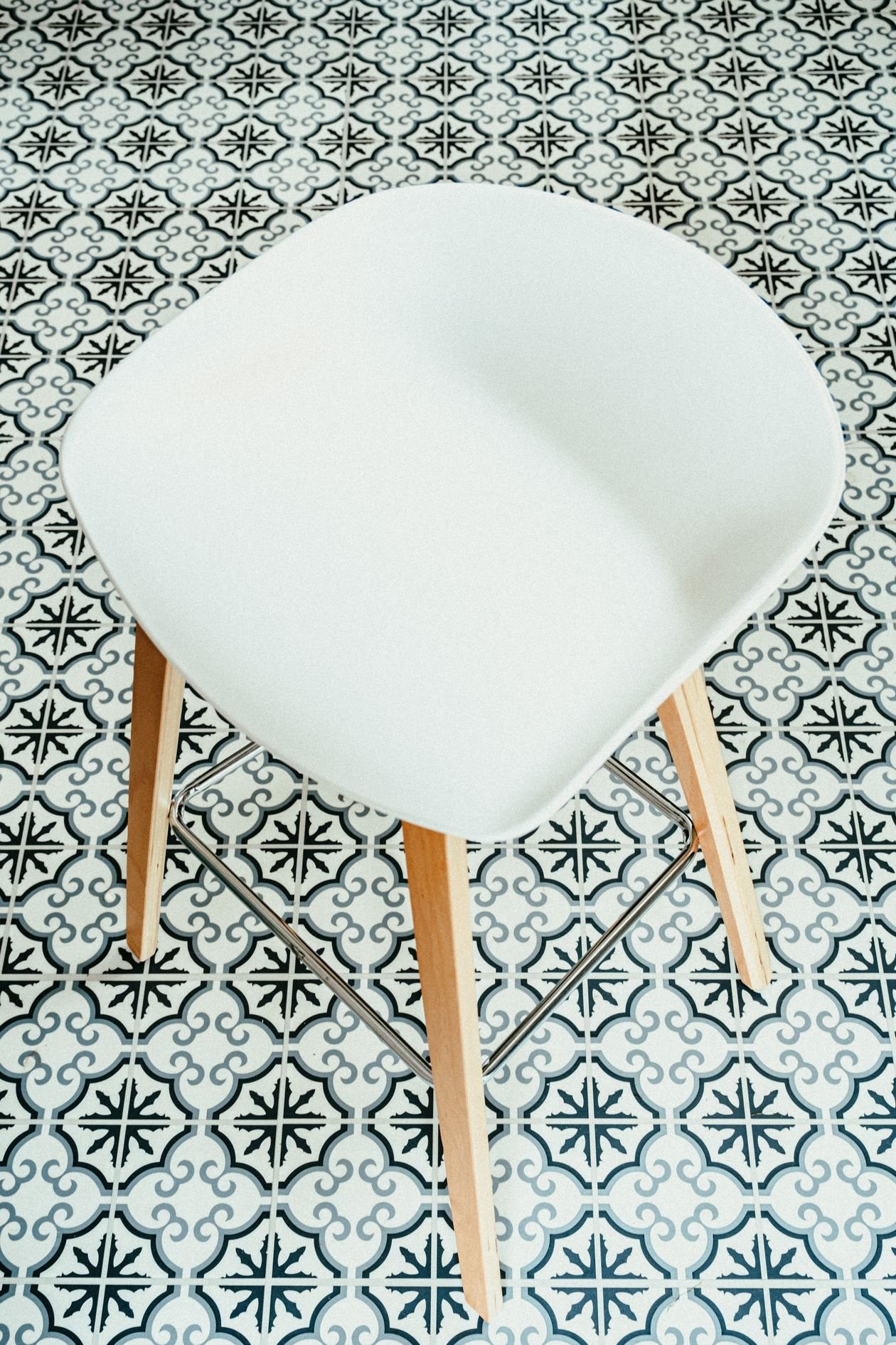
What it is: A floor of patterned tiles — stars, florals and geometrics in inky blue, charcoal and warm white — laid where a plain floor would disappear. Porcelain encaustic-look tiles copy the cement originals at half the price and none of the sealing fuss. In the kitchen in this photo, the decorative floor does all the talking while the chair and cabinetry stay simple, which is exactly the balance to copy.
How to do it:
- Keep cabinets plain and pale so the floor stays the only pattern
- Choose a pattern scale that suits the room: bigger motifs for bigger kitchens
- Lay a border of plain tiles around the edge for a rug-like finish
- Order 10–15% extra — patterned tiles get cut and matched at every edge
Pro tip: Lay out a 1m square of tiles on the floor and live with it for a day before committing; pattern reads very differently at floor distance than in your hands.
Avoid this: Avoid pairing a patterned floor with patterned curtains, rugs or upholstery — one pattern per sight line is the rule.
2. Handmade-Look Zellige Backsplash
Style: Artisan shimmer | Best for: kitchens that get beautiful natural light | Price feel: Medium–High
What it is: Zellige is the Moroccan handmade tile whose edges wobble, whose glaze pools and thins, and whose surface catches light differently on every single piece. Run it across a whole backsplash and a plain kitchen suddenly glows. The close-up in this photo shows the appeal: no two tiles match, and that imperfection is the entire point.
How to do it:
- Choose glazed ceramic zellige-look tiles if real handmade zellige stretches the budget
- Use a grout colour close to the tile so the surface reads as one shimmering field
- Take the tiles right up to the ceiling or the underside of open shelves — no half measures
- Fit under-cabinet lighting; zellige rewards light like nothing else
Pro tip: Shuffle tiles from several boxes before laying, so colour variation spreads evenly instead of arriving in patches.
Avoid this: Avoid real unglazed zellige behind a hob — it drinks grease. Glazed or porcelain-look versions wipe clean.
3. Classic Black-and-White Checkerboard Floor
Style: Timeless farmhouse | Best for: period homes, galley kitchens, hallways that lead in | Price feel: Low–Medium
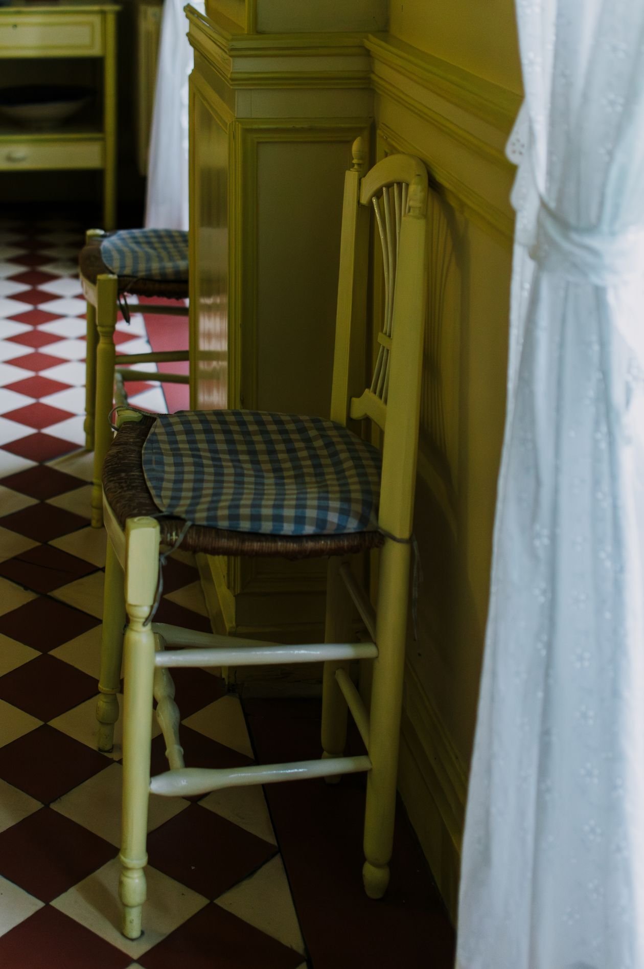
What it is: The checkerboard floor has been stealing shows since long before open-plan living: alternating black and white squares that make even a modest kitchen feel deliberate and grand. In the kitchen in this photo it grounds classic chairs and cabinetry with graphic confidence — formal enough for a period house, playful enough for a family kitchen.
How to do it:
- Scale the squares to the room: 30cm tiles in small kitchens, 45cm or more in large ones
- Lay on the diagonal to make a narrow kitchen feel wider
- Use honed or matt finishes — gloss shows every crumb and looks dated
- Soften the formality with wood, plants and warm metals elsewhere
Pro tip: A charcoal-and-cream board reads softer than true black-and-white and hides dirt far better in a working kitchen.
Avoid this: Avoid tiny checkerboard tiles on a big floor — the pattern turns to visual noise and makes the room buzz.
4. Geometric Patterned Backsplash
Style: Modern graphic | Best for: white kitchens that feel flat | Price feel: Medium
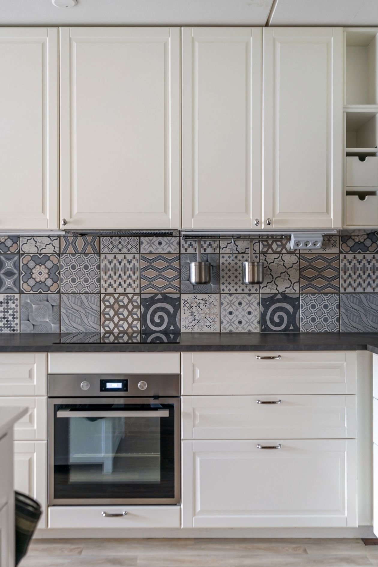
What it is: A backsplash of repeating geometric shapes — cubes, diamonds, hexagons — that turns the strip of wall between worktop and cabinets into the kitchen’s artwork. The white kitchen in this photo keeps every cabinet and appliance quiet so the geometric tile wall carries the whole design. It is the fastest full-stop transformation a plain kitchen can get.
How to do it:
- Pick a two- or three-colour pattern; more colours, more chaos
- Align the pattern’s centre point with the hob or sink for a deliberate focal point
- Carry the tiles across the whole run of wall, not just behind the hob
- Choose grout to either sharpen the geometry or soften it — dark grout sharpens, matching grout softens
Pro tip: Photograph your sample layout from the kitchen doorway — that is the view you will actually live with.
Avoid this: Avoid geometric tiles plus busy worktops; a marble-veined worktop and a geometric backsplash fight for the same job.
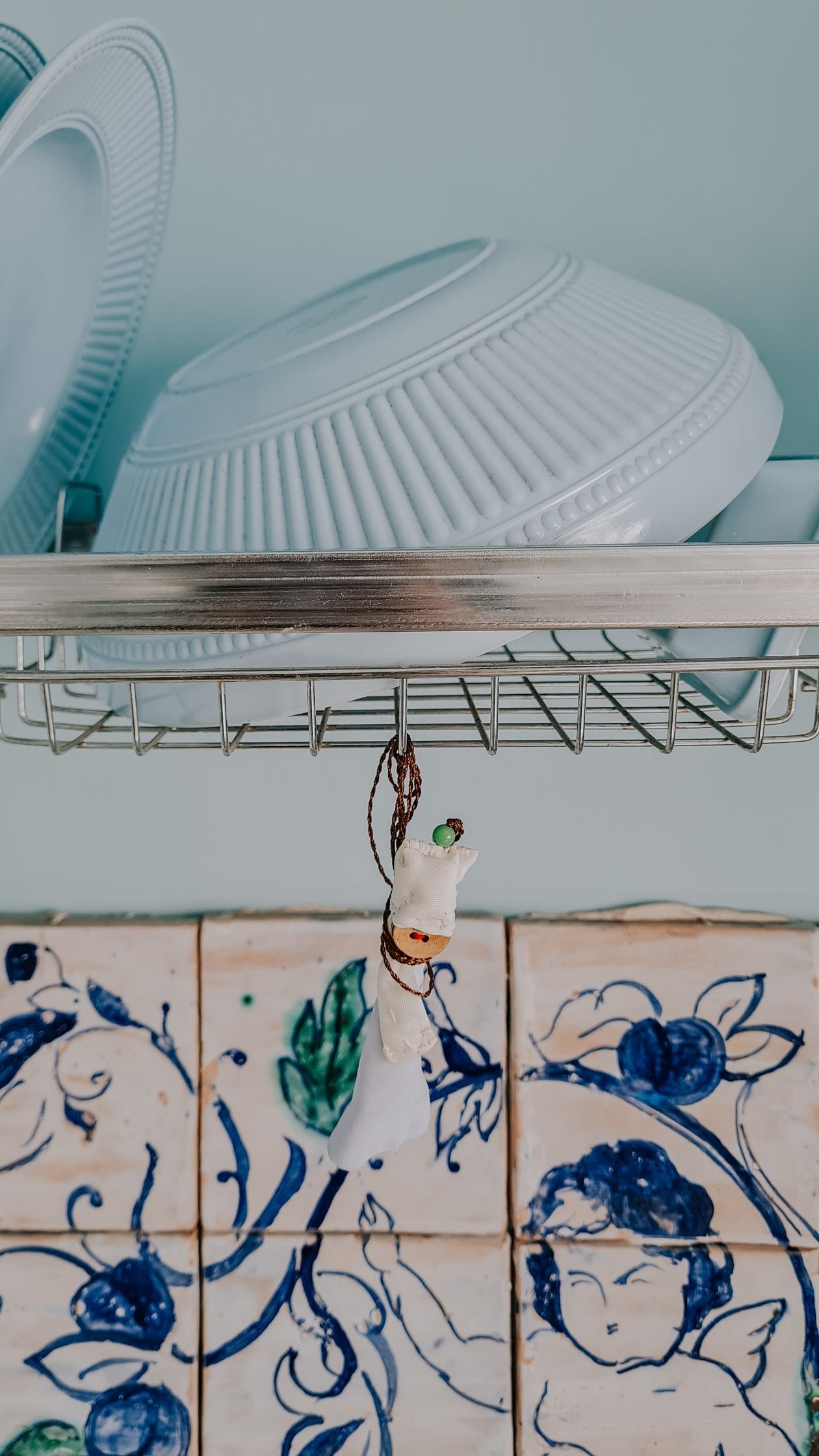
5. Blue-and-White Mediterranean Tiles
Style: Holiday at home | Best for: sunny kitchens, coastal and cottage styles | Price feel: Medium
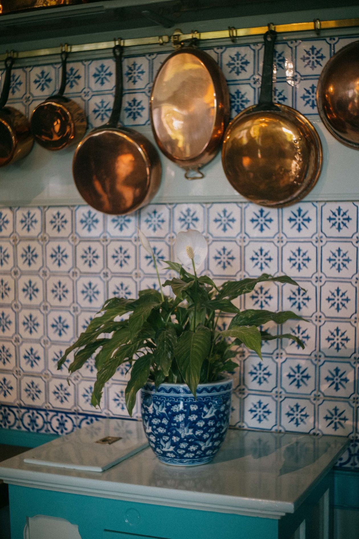
What it is: Blue-and-white patterned tiles carry the whole Mediterranean in their glaze — Portuguese azulejos, Greek island kitchens, long lunches. Run them up a backsplash or a full wall, add copper, wood and a plant or two, and the kitchen feels like a holiday rental you never have to leave. The kitchen in this photo, copper pots against patterned blue tiles, is the mood to steal.
How to do it:
- Mix two or three blue patterns in the same palette for a collected-over-time feel
- Pair with white or pale wood cabinets — never blue cabinets too
- Add warm metals (copper, brass) to stop the blue reading cold
- Keep the floor plain; let the wall do the travelling
Pro tip: A single row of these tiles as a border above plain white tiles gives 80% of the look for 20% of the cost.
Avoid this: Avoid nautical accessories on top — anchors and rope tip Mediterranean into theme park.
6. Mosaic Tile Backsplash
Style: Jewellery for walls | Best for: small backsplash areas that deserve to sparkle | Price feel: Medium–High
What it is: Thousands of tiny tiles on a mesh sheet, adding up to a surface that shimmers, catches light at every angle and makes even a small backsplash feel precious. Mosaic suits the backsplash perfectly: the area is small, so the higher per-metre price stays sane, and the hob’s light show plays across it every evening.
How to do it:
- Choose glass or glazed ceramic mosaic for a kitchen — both wipe clean
- Match grout to the mosaic’s mid-tone so the pattern reads, not the grid
- Run the mosaic full height between worktop and wall cabinets for maximum effect
- Budget for a specialist tiler; mosaics punish uneven walls and rushed work
Pro tip: Mosaic behind open shelves looks expensive but collects dust and grease — keep it behind closed runs or the hob instead.
Avoid this: Avoid natural stone mosaic behind a hob unless it is sealed properly — tomato sauce finds every pore.
7. Mix-and-Match Multicoloured Backsplash
Style: Joyful patchwork | Best for: eclectic kitchens and confident colour lovers | Price feel: Low–Medium
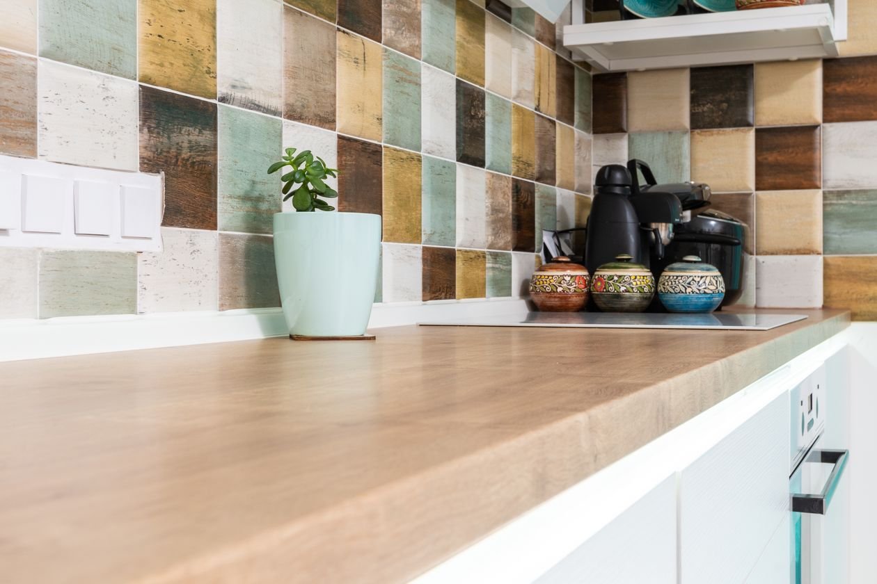
What it is: Instead of one tile repeated, a patchwork: several colours and patterns of the same-sized tile mixed across the backsplash in a loose rhythm. The light kitchen in this photo, with its multicoloured tiled backsplash above a wooden counter, shows how cheerful it looks done well — like a quilt the kitchen wears every day.
How to do it:
- Limit the palette to three or four colours that already agree with each other
- Keep every tile the same size and finish so the mix feels designed, not leftover
- Lay the whole design out on a table first and photograph the arrangement before fixing
- Use plain cabinets and a plain worktop — the patchwork is the pattern budget, spent
Pro tip: End-of-line and sample tiles make this the cheapest statement in the guide; tile shops often sell mixed bundles for almost nothing.
Avoid this: Avoid mixing tile thicknesses — the wall will feel every bump, and so will your eyes.
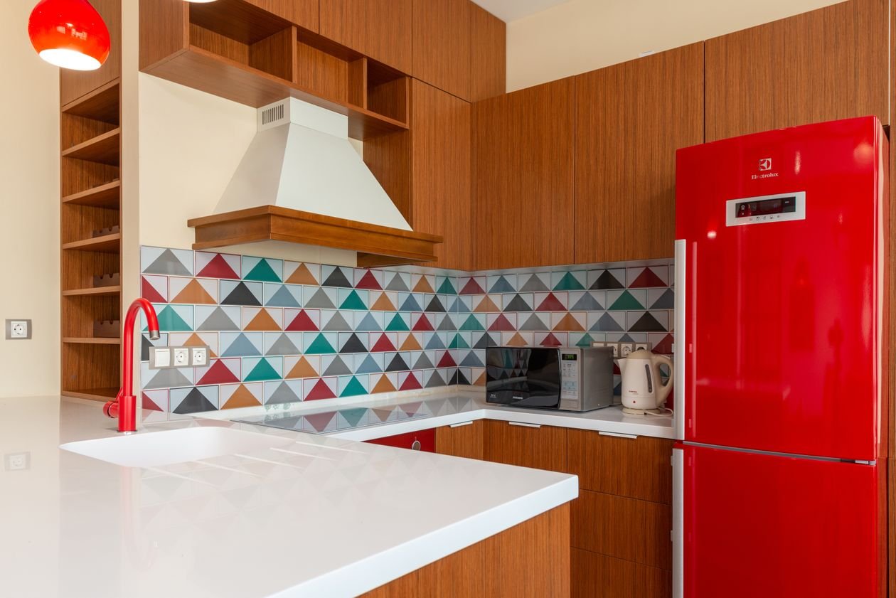
8. Colourful Geometric Tiles with Bold Appliances
Style: Retro pop | Best for: playful households, retro and mid-century kitchens | Price feel: Medium
What it is: Colour blocking at full volume: bright geometric wall tiles teamed with appliances in a clashing-on-purpose colour, like the red range against colourful geometry in this photo. It is the kitchen equivalent of a great outfit — one bold print, one bold colour, nothing apologetic. Smaller kitchens wear it brilliantly because the whole room becomes the statement.
How to do it:
- Choose the appliance colour first, then find tiles that share or deliberately clash with it
- Keep cabinets white or very pale so the colour story stays readable
- Repeat the appliance colour once more — a kettle, a stool, a blind — to make it a scheme
- Stop there: two bold moves per kitchen is the ceiling
Pro tip: If a coloured range cooker is too big a leap, a coloured fridge or even a stand mixer gives the same pop for far less money.
Avoid this: Avoid adding coloured cabinets as well — print plus colour plus cabinets is an argument, not a scheme.
9. Ornate Vintage-Style Tile Wall
Style: Old-world romance | Best for: cottage kitchens, wooden shelves, slow Sunday cooking | Price feel: Medium
What it is: A whole wall of ornate, old-fashioned patterned tiles — the kind you see behind ranges in farmhouse kitchens and Portuguese tavernas. Against wooden shelves and simple appliances, as in this photo, the wall becomes a tapestry: busy, warm and full of stories. It is the opposite of the minimalist kitchen, and gloriously so.
How to do it:
- Commit to the full wall behind the cooker and sink, not a timid strip
- Choose tiles with a matt, aged finish — glossy ornate reads theme-park
- Style with wood, linen, iron and earthenware; keep plastic and chrome out of sight
- Leave the other walls plain painted in a colour picked from the tiles
Pro tip: Genuine reclaimed tiles appear on salvage sites in small batches — perfect for one wall, and the patina cannot be faked.
Avoid this: Avoid modern slab-front glossy cabinets against an ornate wall; the two centuries argue.

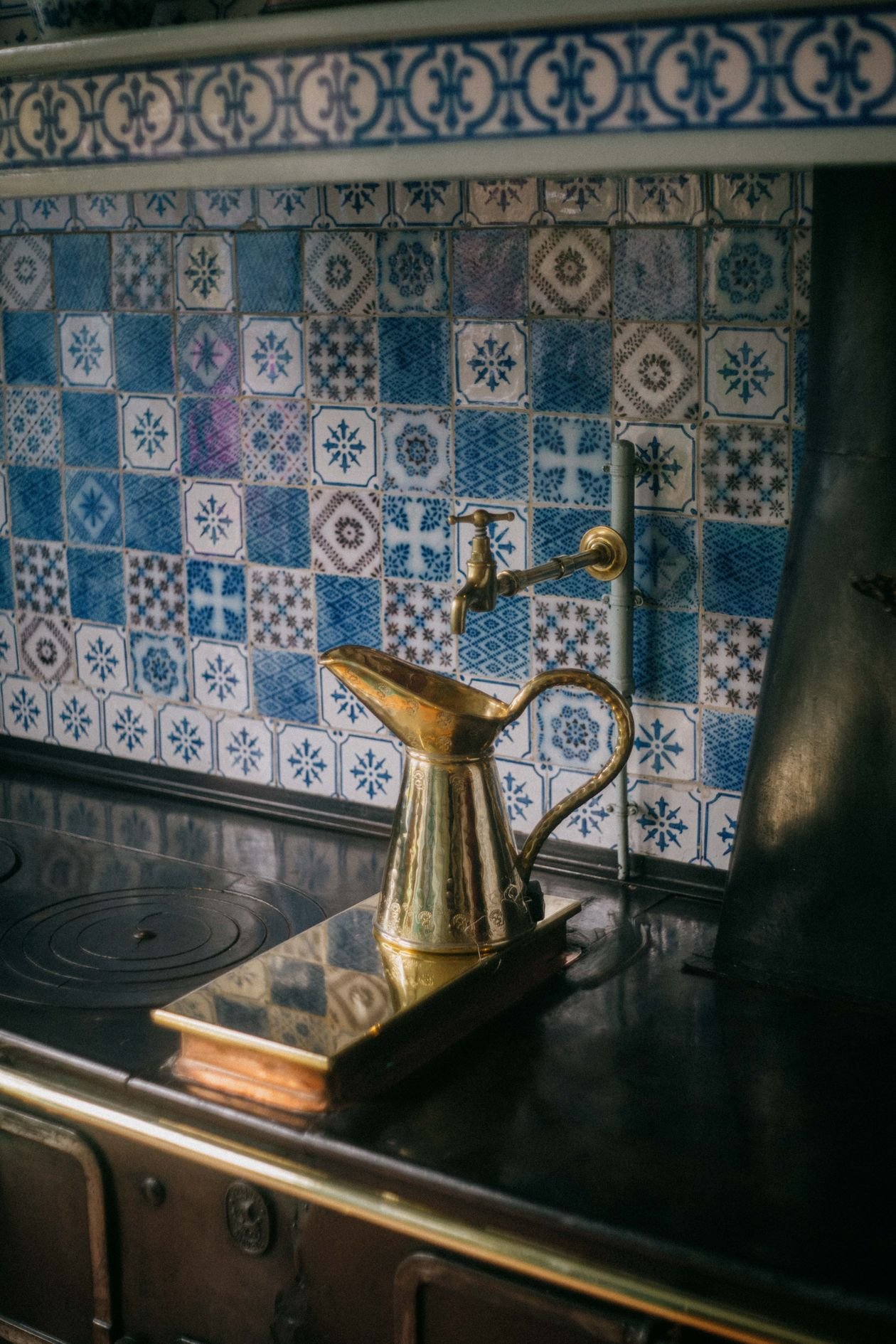
10. Statement Splashback Behind the Range Cooker
Style: One perfect panel | Best for: small kitchens and renters of big tastes | Price feel: Low–Medium
What it is: If a whole wall is too much, concentrate everything into the panel behind the cooker — the one spot every cook stares at daily. Intricate blue-and-white mosaic tiles behind an antique stove, as in this photo, turn that panel into a framed picture. The rest of the kitchen can stay utterly plain; the drama is exactly where the cooking happens.
How to do it:
- Size the panel to the cooker width plus 10cm each side, worktop to ceiling or extractor
- Splurge here: this is the one place a truly special tile earns its price
- Frame it with a border tile or metal trim so it reads as a deliberate picture
- Choose glazed, heat-proof tiles — this panel takes steam, fat and heat daily
Pro tip: A single sample panel of handmade tiles (often sold as a set of 10–20) covers a cooker splashback — check sample sales before full-price boxes.
Avoid this: Avoid continuing the same tile everywhere else as well — the panel works because it is the only picture on the wall.
11. Patterned Tiles with Open Shelving
Style: Layered and lived-in | Best for: display cooks with beautiful bowls | Price feel: Medium
What it is: Open shelves floating across a wall of patterned tiles — the tiles become the backdrop, your bowls and jars the rotating exhibition. The blue patterned tiles in this photo carry the wall while the shelves and their contents layer in front. It is a statement that changes every time you buy a new mug, which is either a delight or a danger.
How to do it:
- Tile the whole wall first, then fit chunky wooden shelves over it
- Choose a tile pattern in a limited palette so shelved objects stay the foreground
- Group shelf items by colour or material, with gaps — styled, not stored
- Keep everyday dusty items in cupboards; shelves are for the pretty and the used-daily
Pro tip: Two shelves beat three: fewer, longer shelves look calmer and hold the big bowls that make the look.
Avoid this: Avoid busy patterned tiles plus busy patterned crockery — choose patterned tiles and plain pots, or plain tiles and patterned pots.
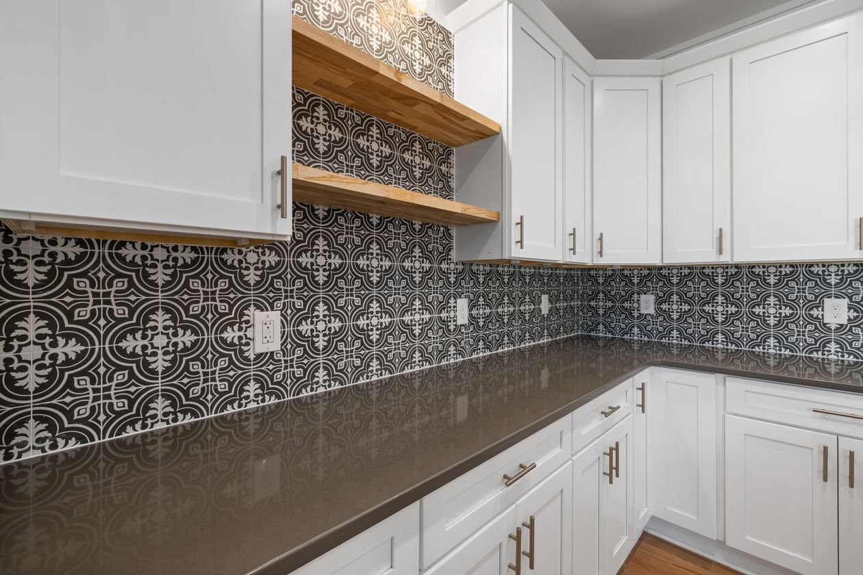
12. Graphic Black-and-White Backsplash
Style: Crisp contrast | Best for: modern kitchens, monochrome lovers | Price feel: Medium
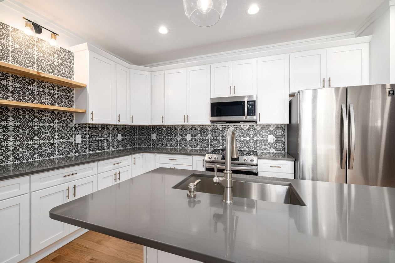
What it is: A backsplash in a bold black-and-white pattern — graphic, confident and completely immune to fashion cycles. The white kitchen in this photo uses its geometric patterned backsplash as the single dark note in a pale room, which is why it lands so hard. Monochrome pattern is the safest statement in this guide: it goes with every cabinet colour you will ever own.
How to do it:
- Anchor the pattern at eye level — centre it on the hob run
- Use it on one wall only; wrap a corner only if the pattern has no direction
- Soften with one warm material — a wooden board, a brass rail, a linen towel
- Pick mid-grey grout: white grout yellow-notes the pattern, black grout overdraws it
Pro tip: Monochrome tiles are the easiest to match years later when you need one replacement box — another reason this is the low-risk statement.
Avoid this: Avoid a second black-and-white pattern on the floor; checks above and pattern below give visitors a headache.
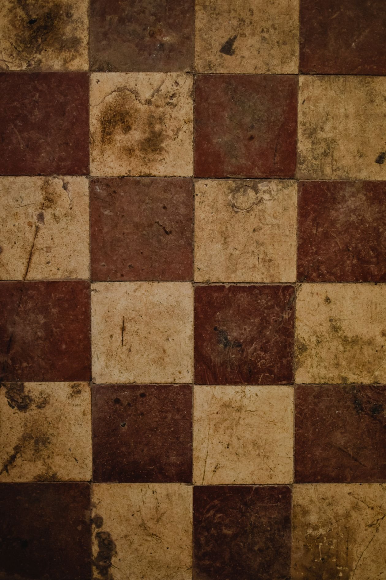
13. Vintage Checkered Floor Tiles
Style: Faded grandeur | Best for: old houses, cafés-at-home, warm minimalists | Price feel: Low–Medium
What it is: Checkerboard’s softer cousin: a vintage checkered floor in brown, beige and cream, worn-looking and warm where black-and-white is crisp and cool. The close-up in this photo shows the charm — squares with history in them. In a kitchen with wood and linen it reads European café; in a hallway it makes every homecoming feel like arriving somewhere.
How to do it:
- Choose porcelain tiles with a pre-aged, matt finish — real vintage cement tiles need sealing and care
- Keep the two colours close in tone for the faded look; high contrast reads new, not vintage
- Pair with warm wood, unlacquered brass and natural fibres
- Grout in warm grey or beige, never bright white
Pro tip: This floor hides crumbs, paw prints and real life better than almost any other — a statement that also does housework.
Avoid this: Avoid cool grey cabinets with it; warm floors want warm company.
14. Patterned Floor, Plain Everything Else
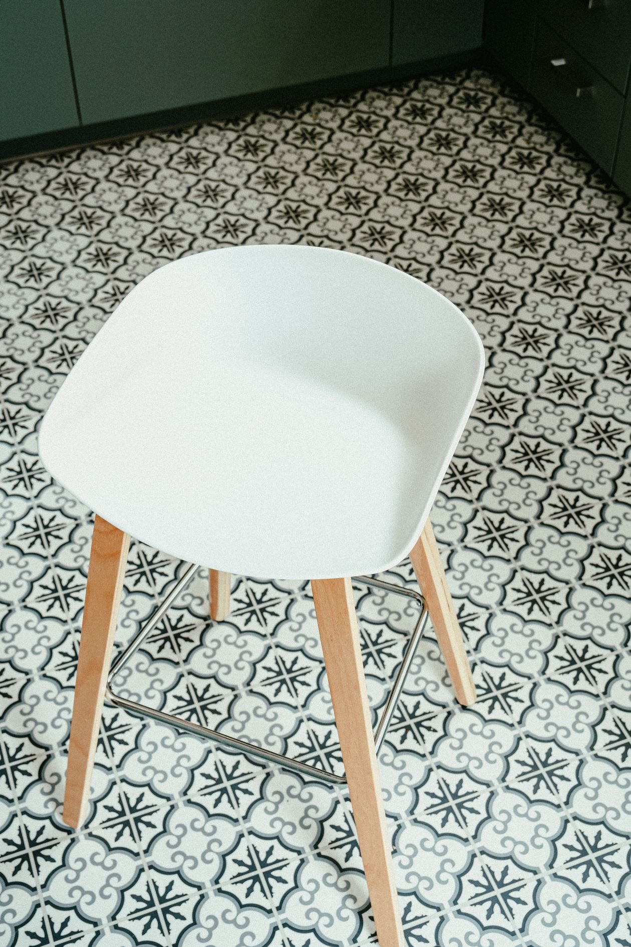
Style: One-move makeover | Best for: tired kitchens keeping their cabinets | Price feel: Medium
What it is: The disciplined version of the patterned floor: a bold black-and-white patterned tile underfoot — like the floor in this photo — while cabinets, walls and worktops all stay deliberately plain. It is the single best answer to “my kitchen is fine but boring”: one surface changes, everything else gets to stay, and visitors assume you renovated.
How to do it:
- Audit the room: if anything else has a pattern (blinds, chairs, rugs), plain it or remove it
- Choose porcelain patterned tiles rated for kitchen floors (slip rating matters)
- Run the pattern under appliances too, or the eye catches the cheat line
- Keep the walls a colour lifted from the tile’s softer tone
Pro tip: Photograph the room in black and white before you start; whatever still shouts in monochrome is a pattern competing with your floor.
Avoid this: Avoid underfloor heating surprises — check the tile and adhesive are rated for it before you fall in love.
Bathroom Statement Tile Ideas
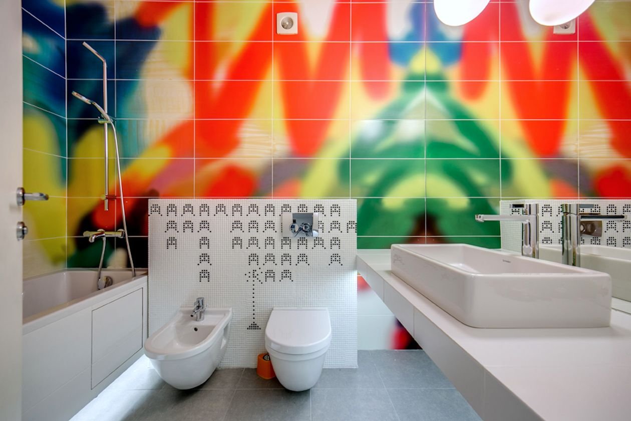
15. Floor-to-Ceiling Colourful Tiles
Style: Total immersion | Best for: small, boxy bathrooms with no natural focal point | Price feel: Medium
What it is: Every wall, one joyful colour story. The bathroom in this photo tiles its walls in vibrant colour around plain white sanitaryware, and the effect is a jewel box: small, saturated and completely unbothered by being small. Tiling everything sounds expensive, but in a tiny bathroom the wall area is small too — this is where the maths of courage works in your favour.
How to do it:
- Take one tile colour (or one tight family of colours) across all walls, floor to ceiling
- Keep the bath, basin and toilet plain white — they become the calm inside the colour
- Choose a contrasting or wood floor to ground the room, or continue tile underfoot in a smaller format
- Light it warmly; saturated colour under cold light turns chilly
Pro tip: Paint the ceiling a soft tint of the tile colour instead of white — the box feels designed rather than cut off.
Avoid this: Avoid mixing two unrelated bold colours wall-to-wall; immersion needs one story, not two arguments.
16. Emerald Green Tiles with Brass Fittings
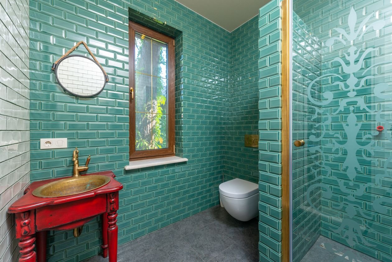
Style: Boutique hotel | Best for: main bathrooms and en-suites that should feel expensive | Price feel: Medium–High
What it is: Deep green glossy tiles plus warm brass is the most reliable luxury combination in modern bathrooms — the green does the drama, the brass does the jewellery. The bathroom in this photo, green tiled walls with gold fixtures, could pass for a five-star hotel suite. Gloss is non-negotiable here: it is the light bouncing off the glaze that makes green feel rich rather than swampy.
How to do it:
- Choose a blue-leaning emerald; yellow-leaning greens turn murky under bathroom light
- Tile the shower and basin wall at minimum — one full wall beats scattered strips
- Repeat brass in taps, shower, mirror frame and one light fitting, then stop
- Add white towels and one plant; green plus white plus brass is the whole recipe
Pro tip: Unlacquered brass ages and spots beautifully against green; lacquered brass stays showroom-bright. Pick the personality you actually want.
Avoid this: Avoid chrome fittings with emerald tiles — the cold metal flattens the green and the whole spell breaks.
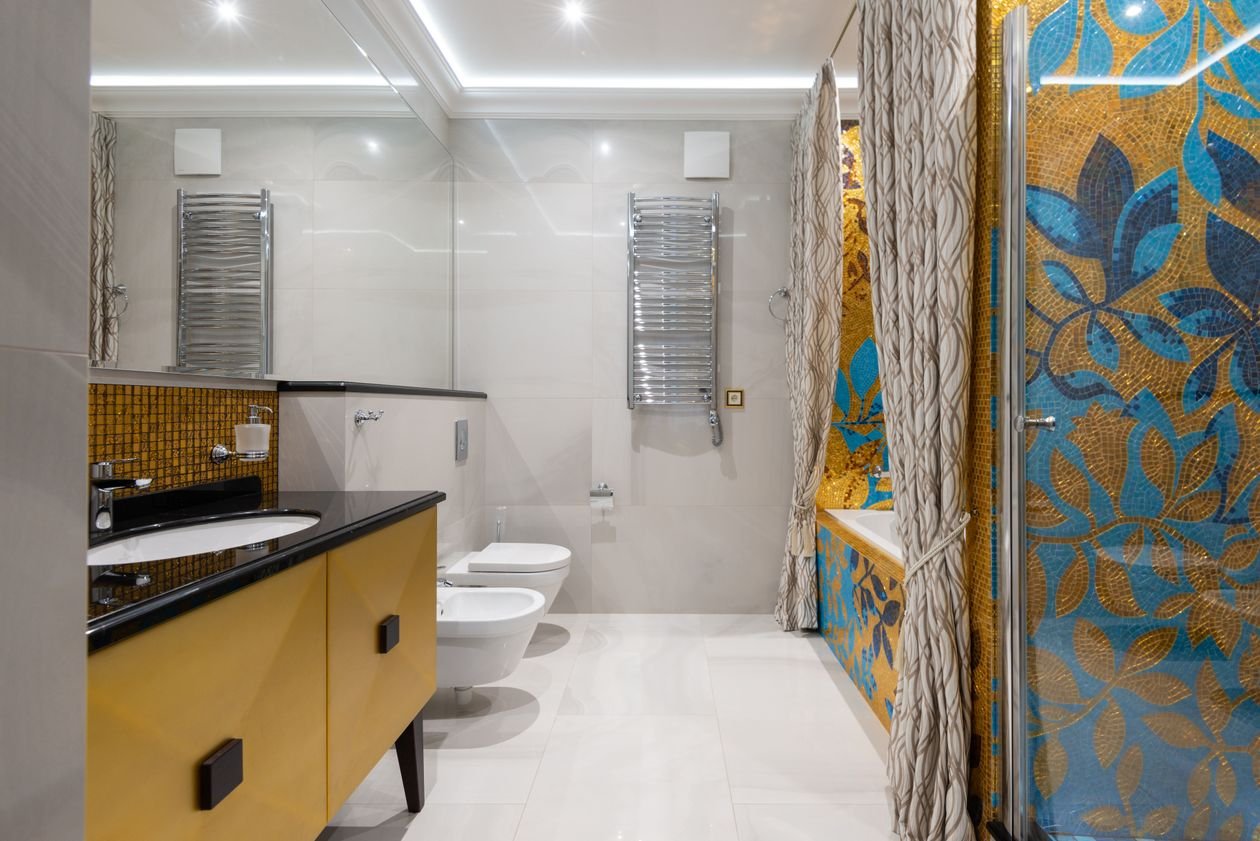
17. Floral Mosaic Feature Wall
Style: Garden indoors | Best for: bathrooms with one long, blank wall | Price feel: High
What it is: A whole wall of floral mosaic — petals, leaves and colour built from thousands of tiny pieces, like the elegant bathroom in this photo. It is the most romantic statement in this guide and the one guests photograph. A mosaic feature wall works on the same principle as the strongest living room wall decor: one big, confident focal point that organises everything else in the room around it.
How to do it:
- Give the mosaic the wall behind the bath or the vanity — a wall you face, not one behind you
- Choose a printed porcelain mosaic-look panel if hand-laid mosaic breaks the budget; modern prints are startlingly good
- Keep every other surface plain and pale, pulled from the mosaic’s background tone
- Light it with a wash of warm light, never a single harsh spotlight
Pro tip: Order a sample panel and view it wet — bathroom mosaics spend half their life damp, and colours deepen beautifully or go muddy. Know which before you commit.
Avoid this: Avoid floral mosaic plus floral towels, curtains and art. One garden per bathroom.
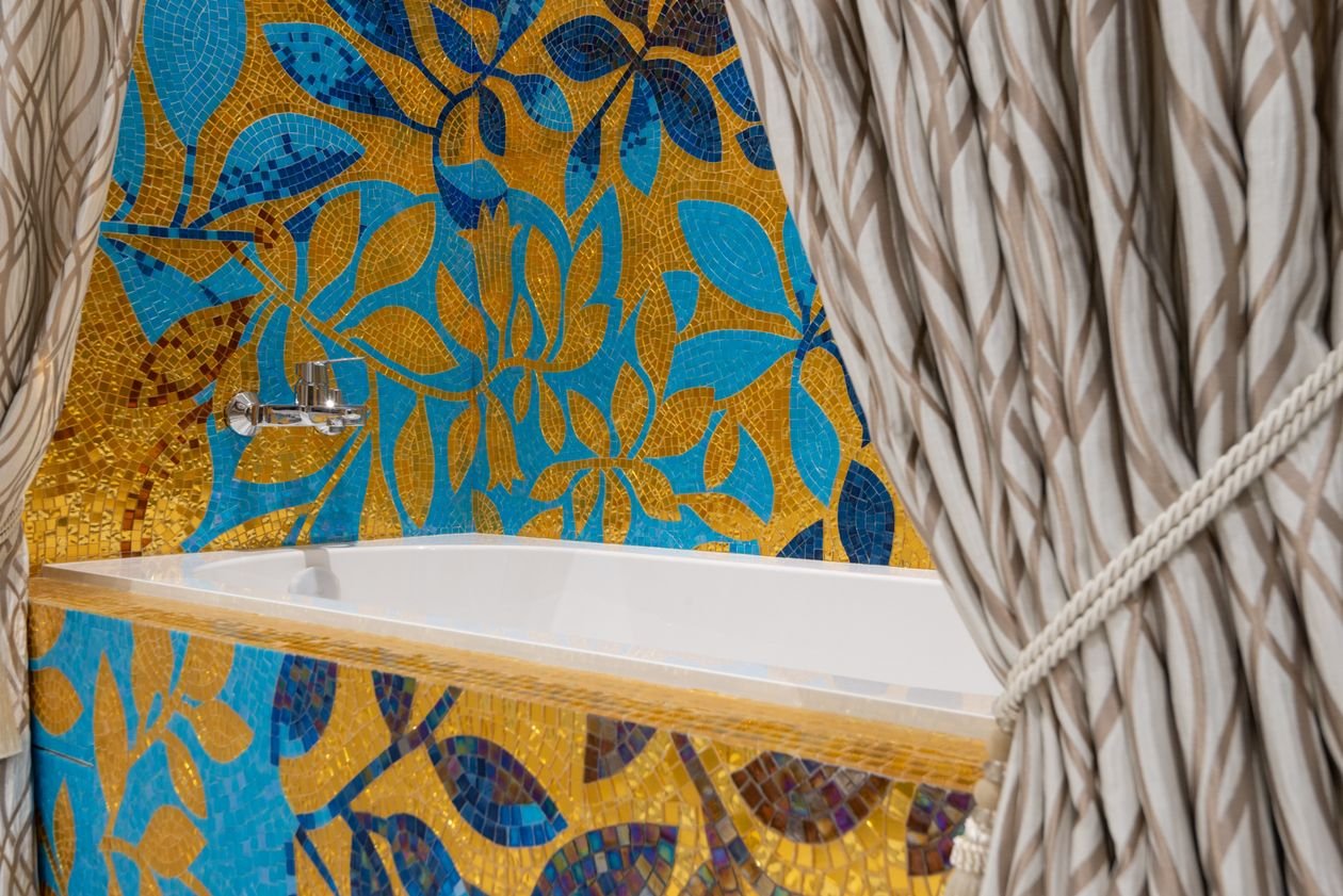
18. Mosaic-Wrapped Bath Surround
Style: Spa with sparkle | Best for: built-in baths with a plain panel and plainer walls | Price feel: Medium–High
What it is: Instead of a whole wall, wrap the bath itself: mosaic across the bath panel and the wall behind it, so the tub sits inside a shimmering frame. The floral mosaic bathtub in this photo shows the full-commitment version. It concentrates cost and impact into the one zone every bather looks at, and it makes a standard built-in bath feel bespoke.
How to do it:
- Run the mosaic from the floor, up the bath panel and onto the wall behind in one continuous field
- Choose small-format mosaic — it turns the bath’s corners without a fight
- Use epoxy or stain-resistant grout; this zone lives wet
- Keep the bath itself plain white so the wrap reads as its frame
Pro tip: A mosaic bath wrap hides a multitude of sins — tired panels, awkward boxing-in, pipes you cannot move.
Avoid this: Avoid glass mosaic on the bath panel where knees and buckets knock it; glazed ceramic takes the knocks better.
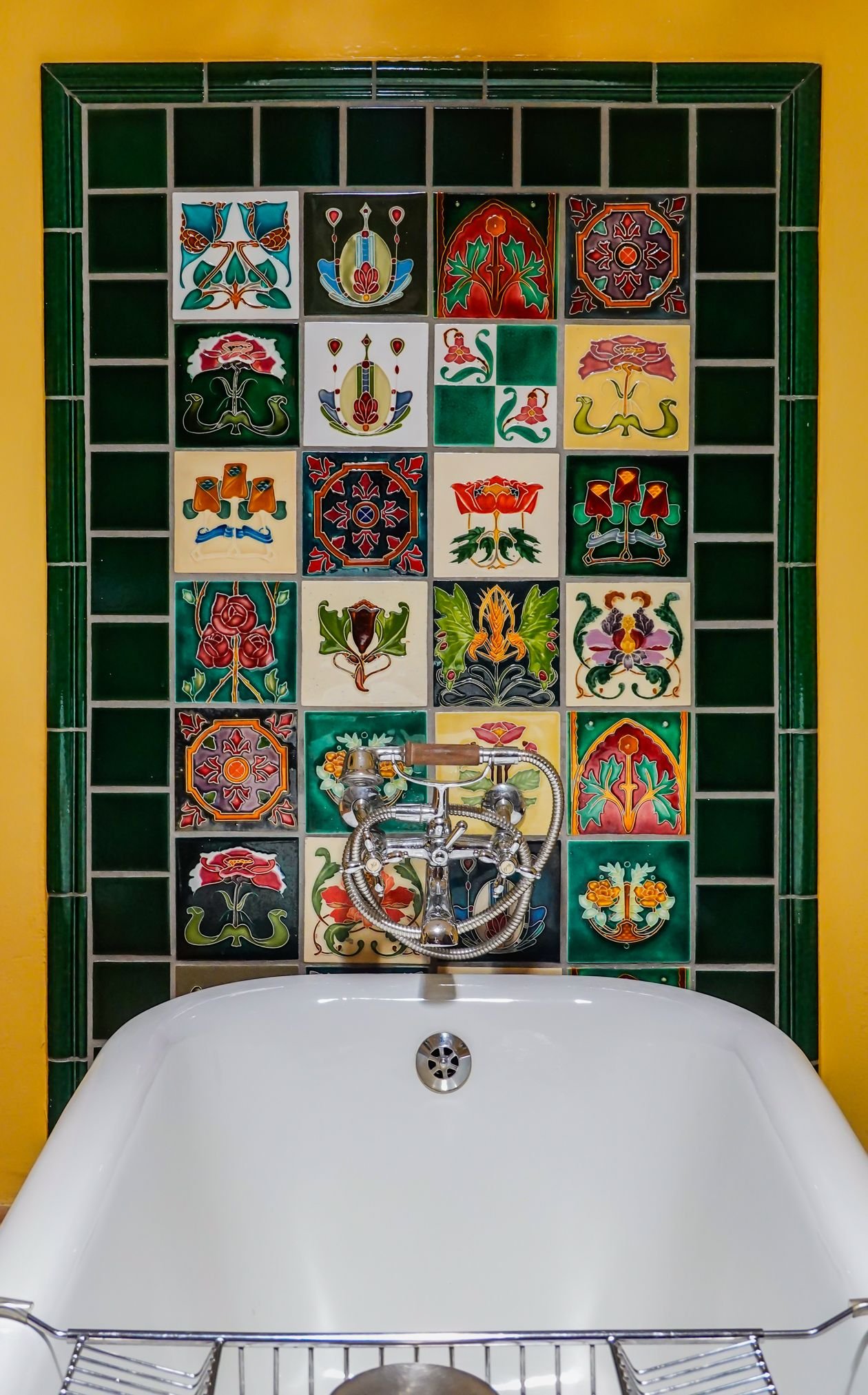
19. Art Deco Vintage Tiles
Style: 1920s glamour | Best for: period homes, fans of symmetry and fan shapes | Price feel: Medium
What it is: Fan shapes, scallops, sunbursts and strong geometry in the jewel colours of the deco era — the art deco bathroom in this photo, with its vintage decorative wall tiles, could be a boutique hotel in 1929. Deco tiles are the statement for people who love pattern with discipline: everything repeats, everything aligns, and the glamour is in the order.
How to do it:
- Choose one deco motif — fan, scallop or sunburst — and repeat it without mercy
- Pair with black, white and one metallic: the classic deco trio
- Echo the geometry in a round or arched mirror and globe lighting
- Keep fittings simple in shape — deco tiles hate fussy taps
Pro tip: Scallop (fish-scale) tiles laid points-down read deco; points-up read mermaid. Choose your century before you lay.
Avoid this: Avoid deco tiles with rustic wood and farmhouse styling — glamour and hay bales do not mix.
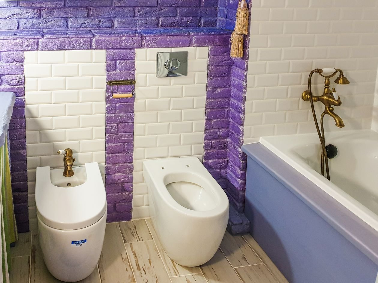
20. Purple Statement Tiles
Style: Brave and joyful | Best for: family bathrooms and anyone bored of grey | Price feel: Medium
What it is: Purple — the colour almost nobody chooses and everybody remembers. The bathroom in this photo pairs vibrant purple and white tiles with plain fixtures, and it works because the purple is confident, not apologetic: a real, saturated shade given whole walls to cover. Lilac whispers; this purple makes speeches.
How to do it:
- Go saturated: violet, grape or plum. Pale purple reads nursery or dated, bold purple reads designed
- Balance with plenty of white — sanitaryware, ceiling, towels — so the colour stays fresh
- Add one black or chrome accent line (mirror, taps) to sharpen it
- Test under your bathroom’s actual light; purple shifts dramatically between daylight and warm bulbs
Pro tip: If full walls scare you, tile the shower enclosure only and paint the rest white — a purple shower is a daily delight and a smaller commitment.
Avoid this: Avoid purple plus gold plus black all at once — it tips from brave into casino very quickly.
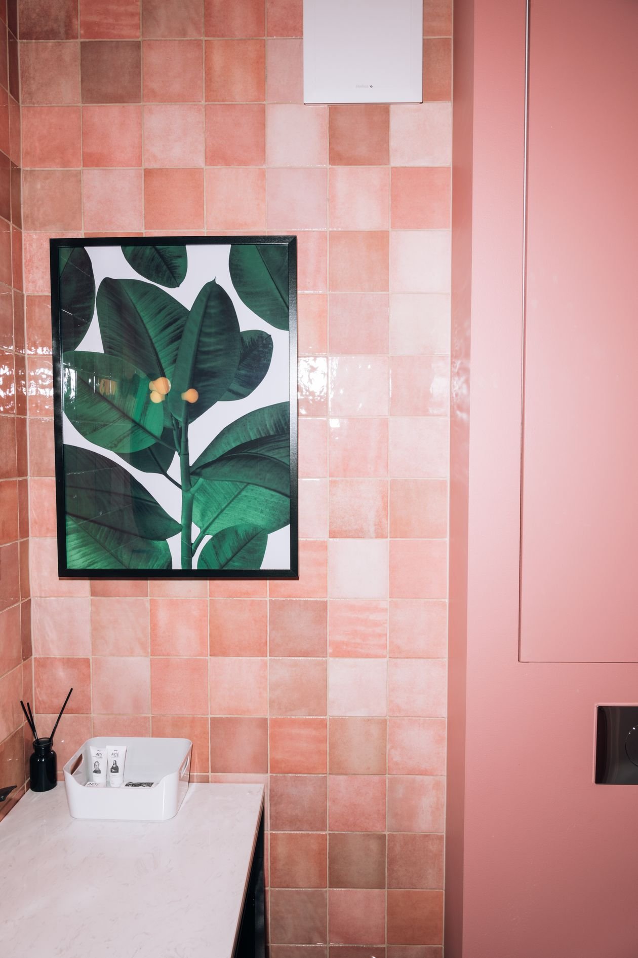
21. Pink Tiles That Read Grown-Up
Style: Soft power | Best for: en-suites, guest bathrooms, anyone who loves a long bath | Price feel: Medium
What it is: Pink done properly: dusty, clay or plaster tones in a glossy or handmade-look tile, against which black, brass or marble do the sharpening. The luxury pink bathroom in this photo shows the grown-up end of the spectrum — serene, warm and flattering to every skin tone that will ever look into its mirror. Pink bathrooms are also, not incidentally, the kindest light to wake up to.
How to do it:
- Choose an earthy pink — blush, clay, rose — never bubblegum
- Add one hard edge: black taps, a black-framed mirror or a marble shelf
- Use large-format tiles or long metro shapes so the colour reads modern, not retro-cute
- Bring in one plant; green is pink’s best friend
Pro tip: Pink tiles plus warm 2700K lighting equals the most flattering bathroom mirror you will ever own. Choose bulbs as carefully as tiles.
Avoid this: Avoid pink on pink on pink — without one dark or metallic counterpoint it turns into a marshmallow.
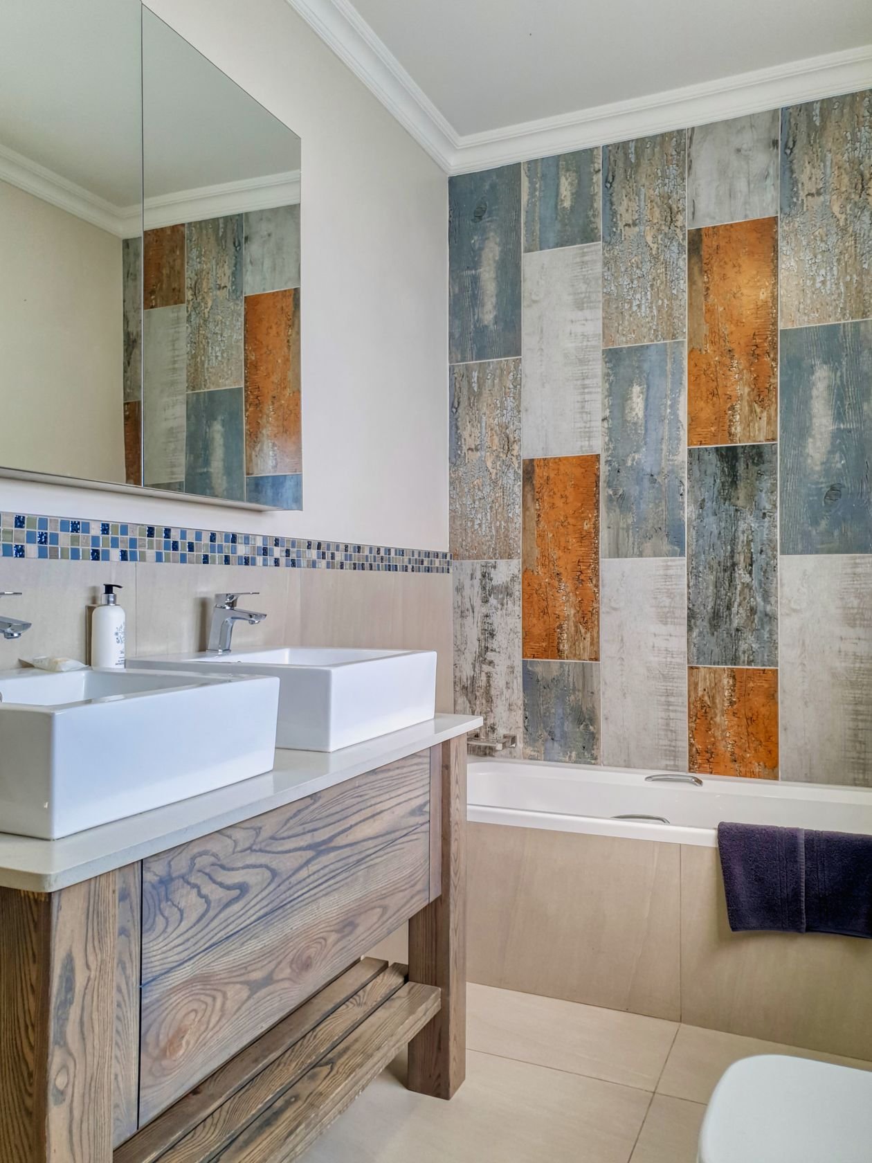
22. Patterned Tile Behind a Double Vanity
Style: His-and-hers wow | Best for: family bathrooms and shared en-suites | Price feel: Medium
What it is: A double vanity already makes a bathroom feel generous; run a wall of patterned tile behind it, mirror to mirror, and it becomes the room’s portrait wall. The contemporary bathroom in this photo, with its unique tile pattern behind double sinks, shows how the pattern unifies two basins into one designed moment instead of two separate ones.
How to do it:
- Tile the full width between the mirrors and up to the ceiling if the budget allows
- Centre the pattern on the midpoint between the basins so it reads symmetrical
- Choose round or arched mirrors to soften a geometric tile — or square mirrors to echo it
- Keep the vanity unit plain and the worktop quieter than the wall
Pro tip: This wall takes splashes all day — choose a glazed tile and mid-tone grout that shrugs off toothpaste.
Avoid this: Avoid two statement mirrors on a statement wall; let one of them be simple.
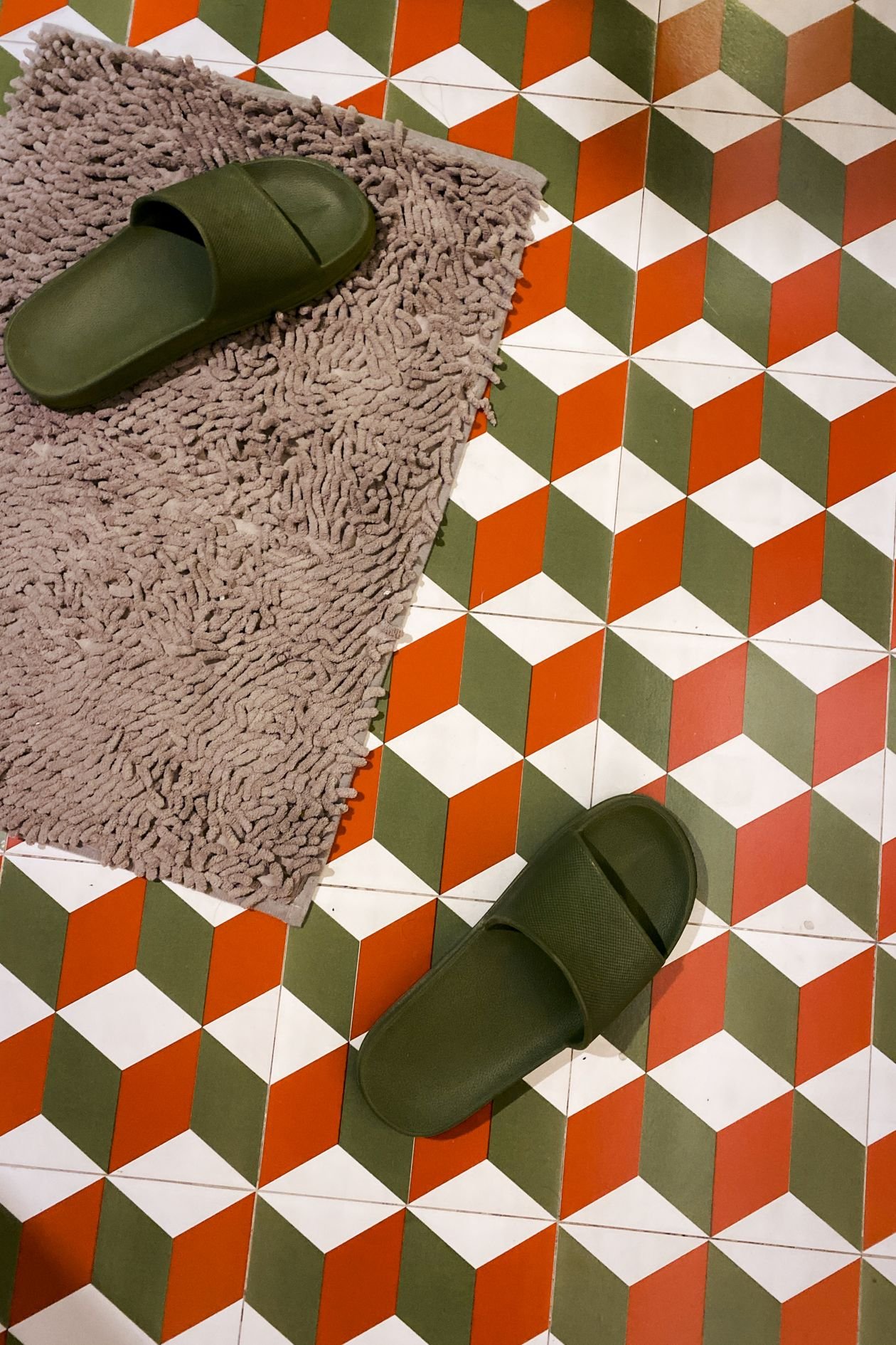
23. Geometric Patterned Bathroom Floor
Style: Look-down lovely | Best for: bathrooms where the walls must stay plain | Price feel: Low–Medium
What it is: When walls are spoken for — windows, mirrors, storage — the floor is your canvas. A geometric patterned floor, seen from above in this photo, gives a plain bathroom a designed soul at the exact place your eyes land every morning. Small bathrooms especially: the floor is most of what you see.
How to do it:
- Choose a small-to-medium pattern scale; bathroom floors are small canvases
- Insist on a proper slip rating — wet bathroom floors are no place for polished porcelain
- Let the pattern run wall to wall with no border in small rooms; borders shrink the canvas
- Keep bath mats plain and pull their colour from the floor
Pro tip: Patterned floors are the great camouflage artists of the bathroom — hair, dust and water spots all but disappear.
Avoid this: Avoid high-gloss patterned floors; the first wet footprint turns the statement into a skating rink.
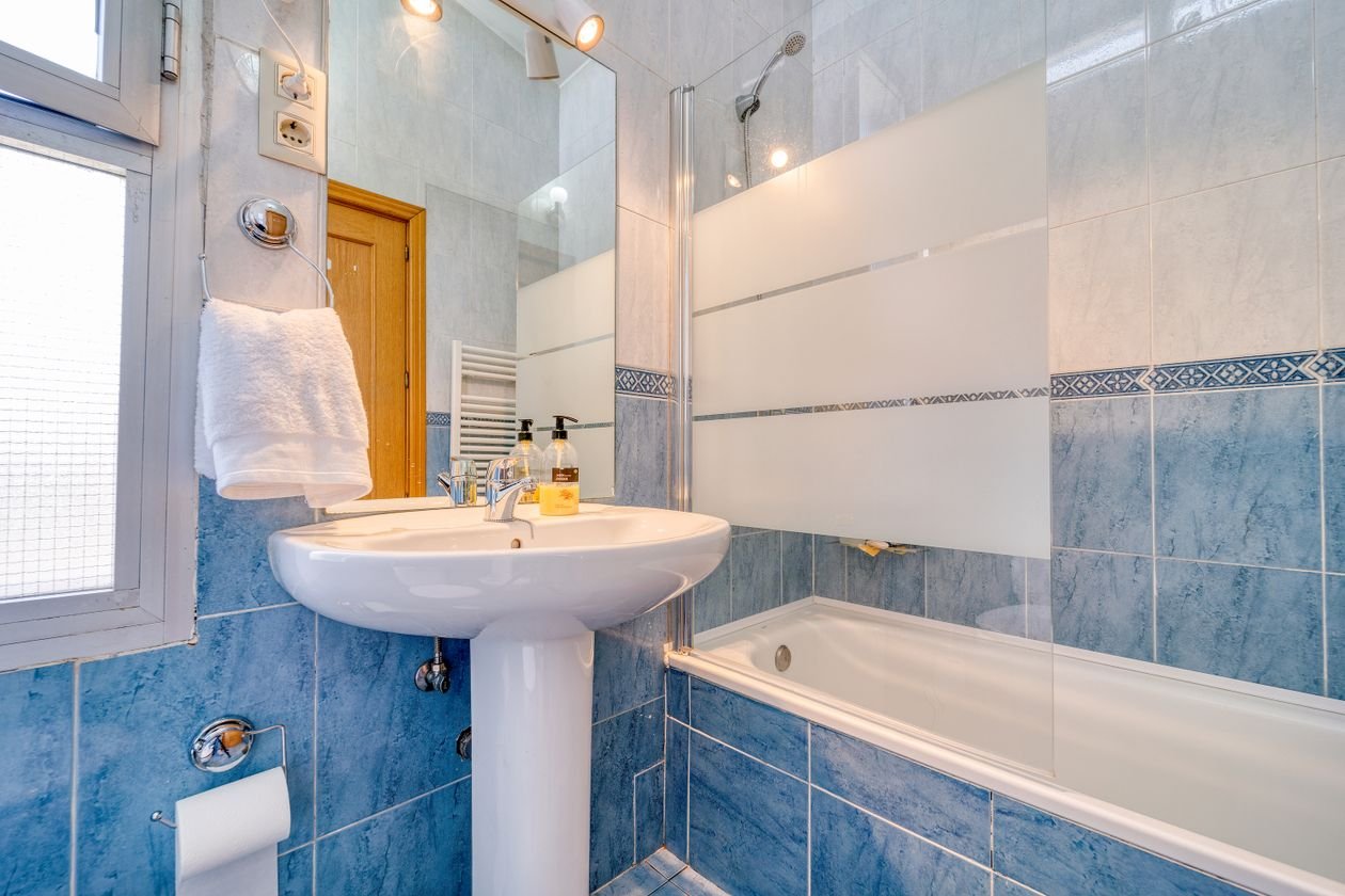
24. Bright Blue Tiles, Head to Toe
Style: Mediterranean dip | Best for: shower rooms and bathrooms that need waking up | Price feel: Medium
What it is: Blue is the bathroom’s home colour, but pale blue is a shrug — this is blue turned up: bright, clear tiles across the walls of a shower or a whole small bathroom, like the vivid blue bathroom in this photo. It feels like swimming in the Mediterranean every morning, which is not a bad way to start a Tuesday.
How to do it:
- Pick a clear, slightly green-leaning blue — it reads water, not nursery
- Gloss finish, always: matt bright blue looks like painted plaster, gloss looks like water
- Break it with white sanitaryware, a white ceiling and pale grout lines
- Add chrome or white fittings; brass fights bright blue unless you want full retro
Pro tip: In a windowless bathroom, bright blue plus strong white light reads as daylight. It is the cheapest window you will ever install.
Avoid this: Avoid navy towels and dark accessories that drag the brightness down; keep textiles white or striped.
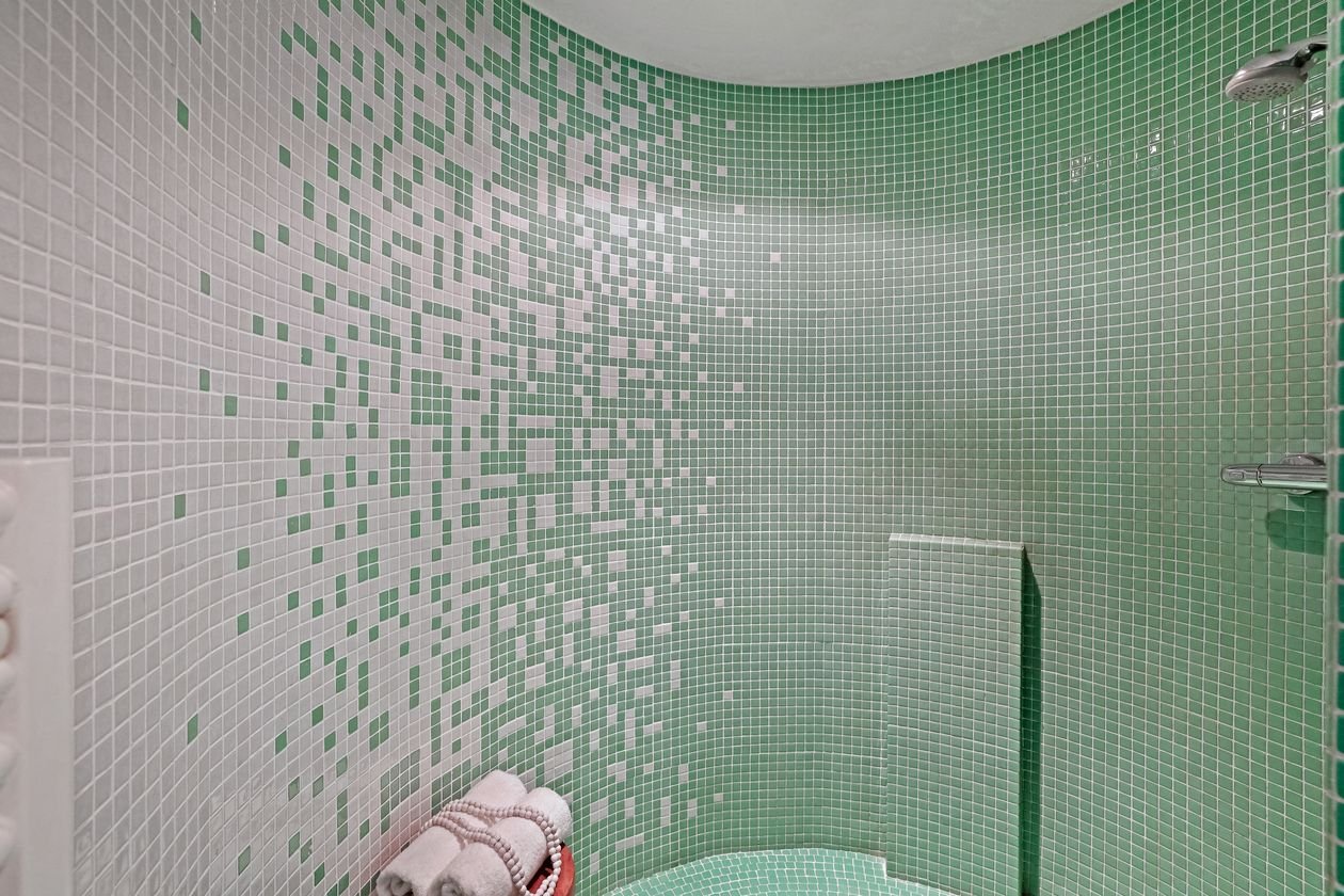
25. Green Mosaic in a Small Bathroom
Style: Small but mighty | Best for: cloakrooms, shower cubicles, under-stairs WCs | Price feel: Medium
What it is: Small bathrooms are where mosaic earns its keep: the tiny pieces suit a tiny room’s scale, and a green-and-white mosaic, like the neat small bathroom in this photo, makes a cupboard-sized space feel like a jewel you step into. Because the area is small, even a pricey mosaic stays within reach — this is luxury at cloakroom prices.
How to do it:
- Tile one zone completely — the shower or the basin wall — rather than sprinkling mosaic everywhere
- Mix two greens or green with white for depth without darkness
- Keep the other walls plain white so the room still breathes
- Use a large mirror; small room plus mosaic plus mirror is the classic jewel-box recipe
Pro tip: Sheet-mounted mosaic installs fast and evenly — in a small bathroom a good tiler can finish the feature zone in a day.
Avoid this: Avoid dark grout with pale mosaic in a small room; the grid closes in and the jewel box becomes a cage.
26. Dark Green Tiles with a Brass Faucet Moment
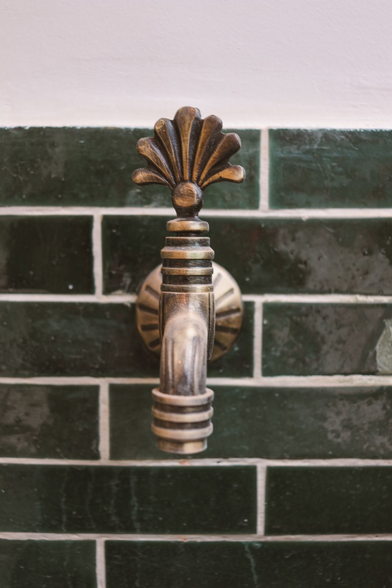
Style: Close-up drama | Best for: cloakrooms and basin walls where details rule | Price feel: Low–Medium
What it is: Sometimes the whole statement is one square metre: dark green tiles behind a basin, a beautiful brass faucet in front of them, nothing else competing. The close-up in this photo is the entire idea — depth of colour, gleam of metal, done. In a cloakroom, where the basin wall is the only wall anyone studies, this concentration beats any amount of spread-out effort.
How to do it:
- Tile the basin wall from worktop to ceiling in the darkest green you dare
- Spend on the faucet: wall-mounted, unlacquered brass if you can — it is the portrait’s subject
- Choose a simple white basin with no pattern or fuss
- Add one warm light at mirror height; this wall deserves a spotlight
Pro tip: Dark green hides water spots and toothpaste splashes better than any pale tile — the drama is also the practical choice.
Avoid this: Avoid a busy mirror frame here; the tap is the jewellery, the mirror is just glass.
27. Terrazzo Tiles, Big Chips and All
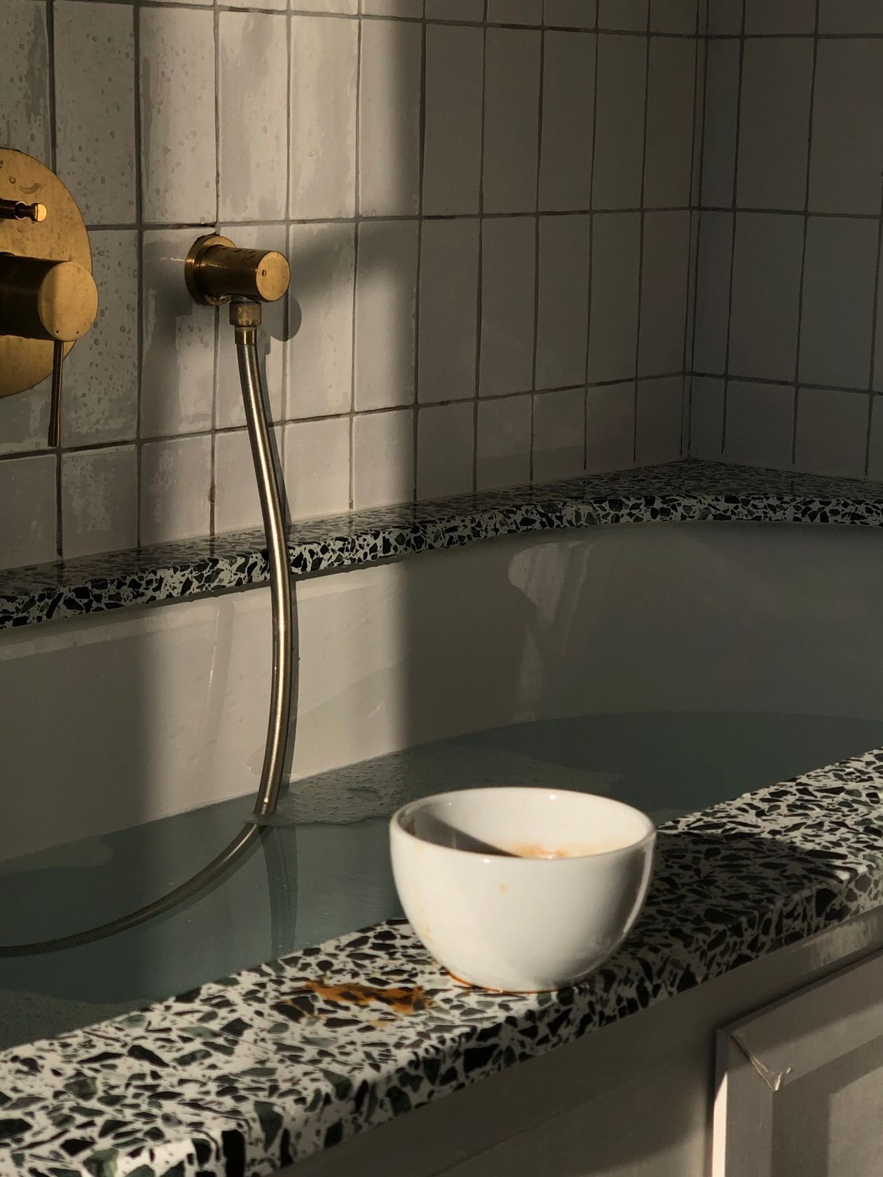
Style: Confetti stone | Best for: pattern-shy households who still want personality | Price feel: Medium
What it is: Terrazzo — marble chips set in stone or porcelain — is pattern for people who fear pattern: random, forgiving and endlessly mixable. The elegant bathroom in this photo uses terrazzo around the bath for a look that is interesting from across the room and calm up close. In tile form it is far cheaper and lighter than poured terrazzo, and it goes on floors and walls alike.
How to do it:
- Choose your chip scale: large chips read bold and modern, small chips read classic
- Pull your room’s accent colour from one of the chips — towels, a stool, a vase
- Use large-format terrazzo tiles on the floor and a smaller cut on walls, or the reverse
- Keep grout lines tight and colour-matched; terrazzo’s charm is its continuity
Pro tip: Terrazzo is the champion at hiding the evidence of family life — crumbs, splashes and hair all vanish into the chips.
Avoid this: Avoid teaming terrazzo with a heavily veined marble worktop; two stone stories in one room is one too many.
28. Moroccan Mosaic Feature Wall
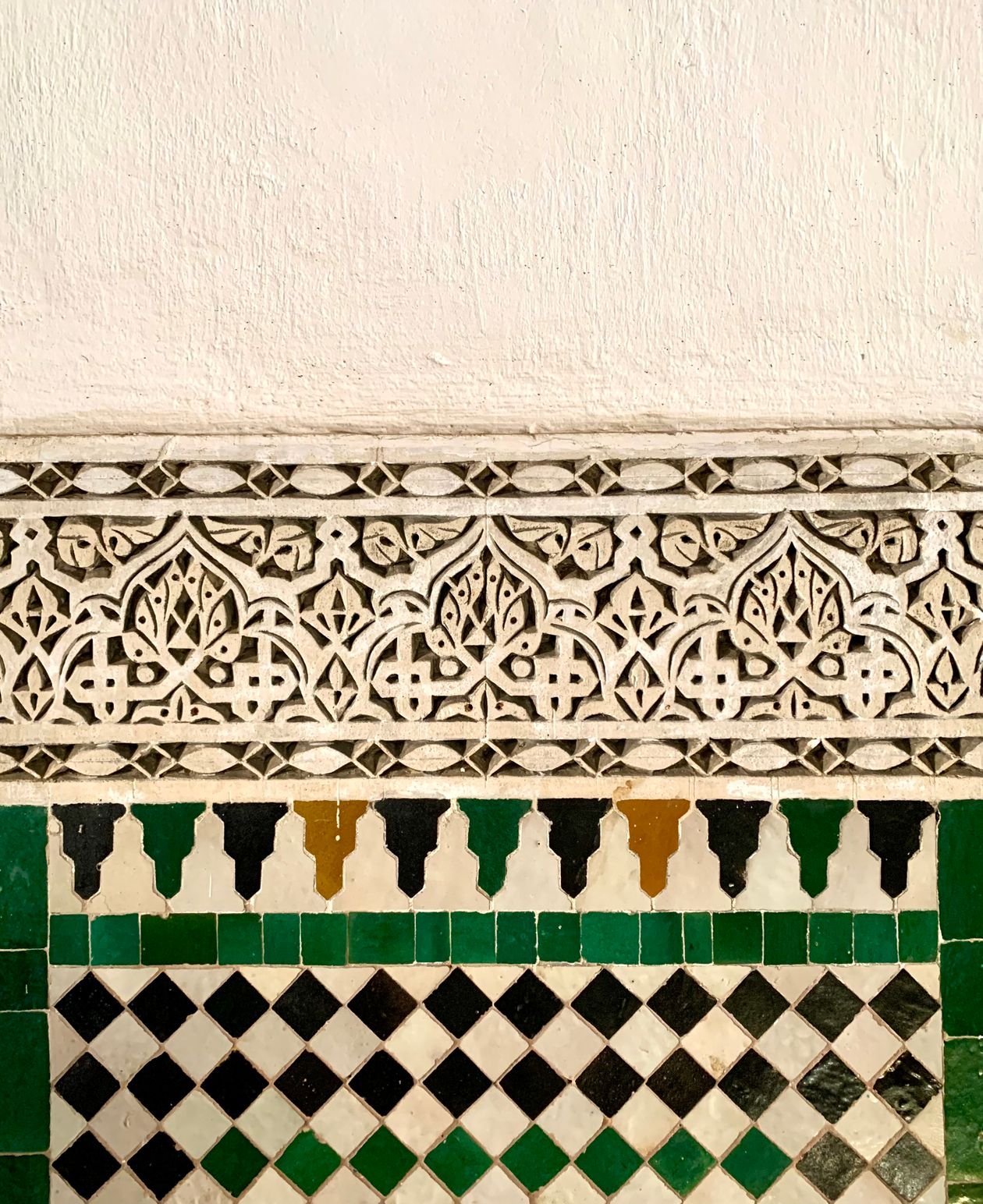
Style: Riad luxury | Best for: one unforgettable wall in a main bathroom | Price feel: High
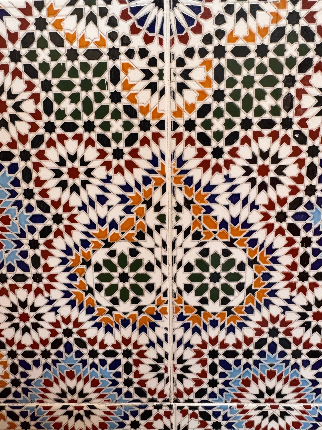
What it is: The full Moroccan treatment: an ornate wall of traditional mosaic tilework, intricate geometry in jewel colours, like the stunning wall in this photo. In a bathroom it turns a daily shower into a small holiday in Marrakech. This is the most labour-intensive idea in the guide and the one people remember a decade later — the definition of stealing the show.
How to do it:
- Choose printed porcelain Moroccan-look tiles for bathrooms — real zellige mosaic needs sealing and suits splash zones only
- Give it the shower wall or the wall behind a freestanding bath, framed by plain tiles or plaster
- Repeat one colour from the wall in towels and a bath mat to tie the room together
- Keep fittings and furniture simple and pale — the wall is a tapestry, everything else is the frame
Pro tip: A framed border of plain tiles around a Moroccan panel sharpens it enormously — tapestries have edges, and so should this wall.
Avoid this: Avoid Moroccan tiles on every wall; a riad courtyard works because the pattern meets plain plaster and sky.
Buying & Materials Guide: What to Buy for a Statement Tile
A statement tile is a design decision and a materials decision at the same time, and the materials half is where budgets and tempers are saved. The good news: tiles are one of the oldest, best-understood building materials on earth. The history of the tile runs from ancient glazed bricks to today’s porcelain, and modern porcelain copies almost any look — cement, marble, handmade clay, terrazzo — while being harder, cheaper and easier to live with than the original. For most of the ideas in this guide, porcelain is the sensible default; save real handmade and natural materials for small areas where their character earns their upkeep.
Buy in the right order. Choose the statement tile first, before cabinets, paint or fittings, because it is the hardest element to change later and the easiest to build a scheme around. Take samples home — never choose from a showroom’s lighting — and view them wet and dry, morning and evening. Then buy everything for the job in one go, from one batch: tile dye lots vary, and a second box bought later may not match the first.
Use the table below as the shopping backbone for almost every statement tile idea in this guide.
| Material / Item | Look For | Used For |
|---|---|---|
| Porcelain statement tiles | Printed patterns (encaustic, terrazzo, Moroccan looks); PEI rating 3+ for floors | Nearly every idea in this guide (ideas 1, 13, 14, 23, 27, 28) |
| Glazed ceramic tiles | Rich colour and gloss; wall use unless rated for floors | Backsplashes and bathroom walls (ideas 2, 4, 16, 24) |
| Zellige or zellige-look tiles | Handmade variation, thick glaze; glazed only behind hobs and in showers | Backsplashes, basin walls (ideas 2, 26) |
| Mosaic sheets | Mesh-mounted; glass or glazed ceramic for wet zones | Bath wraps, small bathrooms, splashbacks (ideas 6, 18, 25) |
| Grout | Colour chosen as a design tool; epoxy or stain-resistant in wet/food zones | Sharpening or softening every pattern |
| Tile trim / edging | Metal or matching ceramic; frames panels and exposed edges | Cooker panels, feature walls (ideas 10, 28) |
| Sealant & sealer | Silicone for joints; sealer for cement, stone and unglazed tiles | Keeping the statement waterproof and stain-free |
| Spare tiles | One extra box from the same batch, stored flat | Future repairs that match perfectly |
Budget honestly in tiers. Under $40 per m²: ceramic and porcelain classics — checkerboard, metro shapes, printed vintage looks (ideas 3, 13). Mid-range: quality porcelain patterns, terrazzo-look and geometrics (ideas 1, 4, 14, 27). Splurge territory: handmade zellige, real mosaic and marble (ideas 2, 17, 28) — deploy these on small, high-impact areas like a cooker panel or a basin wall, where a single square metre does the work of ten. And always add 10% to your tile quantity for cuts, 15% for patterned tiles that need matching.
One buying rule covers the whole guide: the tile is the jewellery, so buy the best tile you can and economise on the plain surfaces around it. Nobody remembers the paint colour behind a great tiled wall — but everybody remembers the wall.
Frequently Asked Questions
How do I choose a statement tile without it dating quickly?
Anchor to classics: checkerboard, Moroccan geometry, encaustic patterns and terrazzo have all been in fashion for a century or more, in waves. Choose pattern and colour from that deep bench rather than this season’s novelty shapes, keep the tiles in a colour family you already love wearing and living with, and let trendier touches live in towels and accessories that cost little to change.
Can statement tiles work in a small kitchen or bathroom?
Better than anywhere. Small rooms have small wall and floor areas, so a bold tile is affordable, and a single strong surface makes a tiny room feel designed rather than compromised. Match the tile scale to the room — small mosaics and mid-size patterns in small spaces — and keep everything else plain so the room reads as one clear idea.
Are patterned tiles hard to keep clean?
Glazed ceramic and porcelain patterned tiles wipe clean exactly like plain ones — the pattern is under or within the glaze. The real cleaning variable is grout: choose mid-tone or stain-resistant grout in kitchens and showers, and the pattern actually hides splashes and crumbs better than a plain pale tile does. Unglazed cement and natural stone are the exceptions; they need sealing and gentler care.
Should grout match the tile or contrast with it?
Both are design tools. Matching grout makes the surface read as one continuous field — best for zellige, colour immersion and calm patterns. Contrasting grout draws the grid and sharpens geometry — best for monochrome, checkerboard and simple shapes in bold colours. Decide by holding grout sticks against your sample tiles; the difference is bigger than any photograph suggests.
Can I tile over existing tiles?
Sometimes. If the existing tiles are sound, flat and well bonded, a suitable primer and adhesive can tile over them — common for backsplashes and feature walls. Floors and shower areas are stricter: added height, weight and waterproofing all matter, and a failed old layer dooms the new one. When in doubt, remove and prepare properly; the statement deserves a sound stage.
How many statement surfaces can one room have?
One. A patterned floor or a bold wall — choose. The single exception is continuing the same tile from wall to floor in one zone (a shower, a bath wrap), which reads as one statement, not two. Everything else in the room should be chosen to support the star: plain, quieter, and picked from the tile’s own colours.
Bringing It Home: Let the Tiles Take the Bow
Every room in this guide started the same way: somebody chose one surface and let it be brave. A floor that behaves like a rug, a backsplash that shimmers like water, a bathroom wall that blooms — none of these need a new kitchen or a new bath around them. They need a decision, a sample viewed in real light, and the discipline to keep everything else quiet. Choose the statement your room has been waiting for, order the extra box, and let the tiles steal the show they were made for.
And when guests ask who designed your kitchen, enjoy the pause before you answer. From all of us at Decor Beam: happy tiling.
