
Your countertops see more of your daily life than almost any other surface in your home, so they deserve a little more thought than a random pile of mail and mismatched appliances. You don’t need a full renovation to feel that shift clearing off three things tonight and adding one tray tomorrow can genuinely change how your whole kitchen feels to walk into. Pick one point from this list and just start there. Your home is where you unwind, cook, and gather the people you love, and it’s worth making even the small corners feel intentional.
My Design Notes
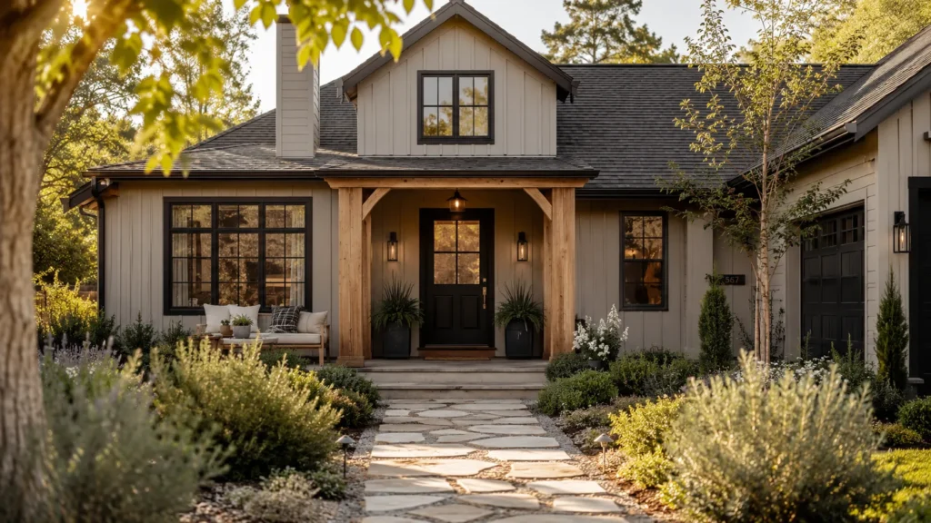
I had a client outside Chicago a couple of years back who was dead set on a true black exterior after falling in love with it on Pinterest. I get the appeal it photographs beautifully. But I walked her through what black actually does in a Midwest climate: it soaks up heat in the summer, and against road salt and slush in the winter, every streak of dust shows up like a spotlight. We compromised on Iron Ore, a deep charcoal from Sherwin Williams, paired with black trimmed windows. She got nearly the same dramatic look she wanted, minus the upkeep headache. That project taught me a rule I still use with every client now: go one shade lighter than your Pinterest inspiration, and you’ll thank yourself in year two when it’s time to touch up.
18Mastering Stunning Exterior House Colors That Elevate Your Home’s Curb Appeal In 2025
1.How To Actually Test A Color Before You Commit
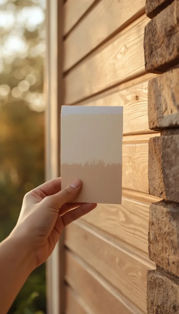
I can’t tell you how many times a client has fallen in love with a swatch at the paint store, painted the whole house, and called me in a slight panic two weeks later because it “looks completely different outside.” Paint reads differently depending on the light hitting it, the time of day, and even what’s growing in your yard. North facing walls pull cooler and grayer. South facing walls warm everything up, sometimes dramatically.
My rule of thumb is simple: buy a sample, paint a poster board (not the actual siding), and move that board around your house over the course of a full day.
- Check it at 8am, noon, and dusk
- Hold it next to your roof, brick, or stone to see how they actually interact
- Step back across the street, since that’s the distance most people will actually view it from
A color that looks perfect in your hand can look completely different forty feet away, and that’s the gap that trips people up most.
2.Warm White And Greige Take Over From Stark White
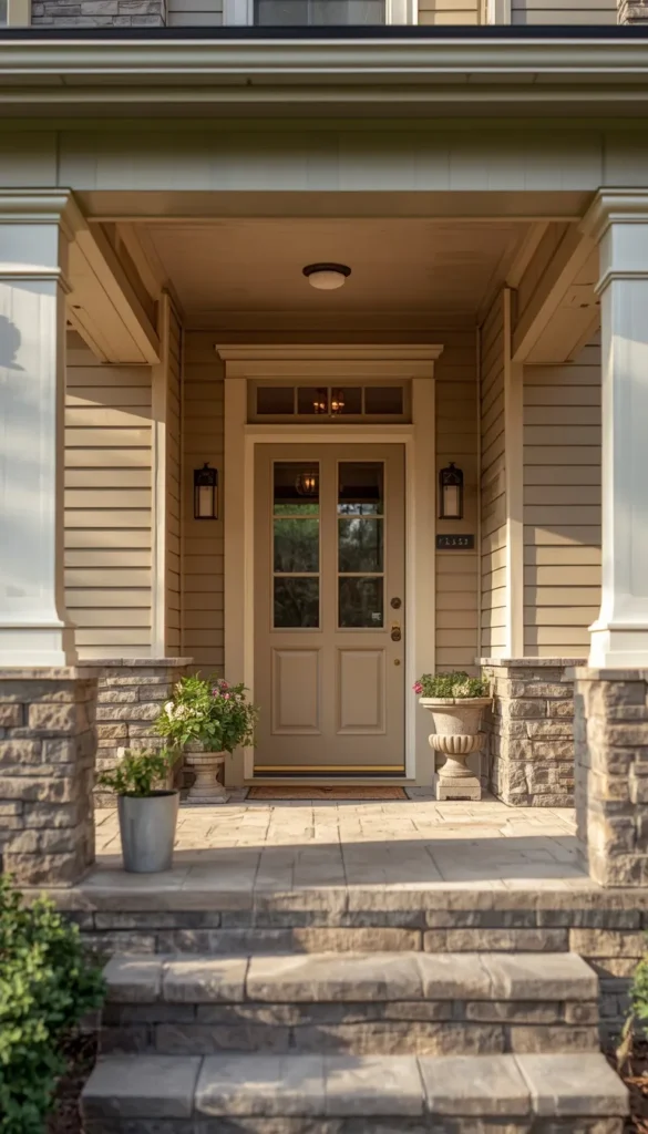
Stark white had its moment, and honestly, I think most of us are a little tired of it. What I’m seeing more of now is a shift toward warm whites and greige tones that feel softer without losing that clean, classic look. Colors like Accessible Beige or Revere Pewter give you that same crisp curb appeal but with an undertone that feels inviting rather than clinical.
The tricky part with greige is the undertone. Some versions lean slightly pink, others lean green or purple depending on the light, and that’s where homeowners get burned. A quick trick I’ve learned is to test greige specifically against your roof shingles and any stone accents, because that’s usually where an off undertone reveals itself first. If it starts looking dingy or muddy by late afternoon, that’s your sign to go a shade warmer.
3.Modern Farmhouse Black And White Combos Still Work, With A Twist
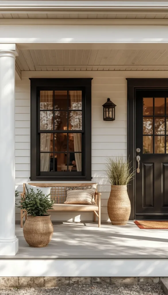
The classic modern farmhouse look, white siding with black trim and black windows, isn’t going anywhere in 2026, but it is evolving. Instead of pure white, I’m steering clients toward warm whites like Alabaster, paired with black or near black trim for that same contrast without the house feeling cold or sterile.
One thing worth knowing going in is that pure white siding shows dirt, pollen, and water stains faster than almost any other color, especially if you’re near trees or live somewhere with hard water sprinklers. It’s a gorgeous look, but it does ask a little more of you in terms of upkeep, usually a power wash once or twice a year to keep it looking fresh.
4.Deep Navy Blue Brings Personality Without Going Too Bold
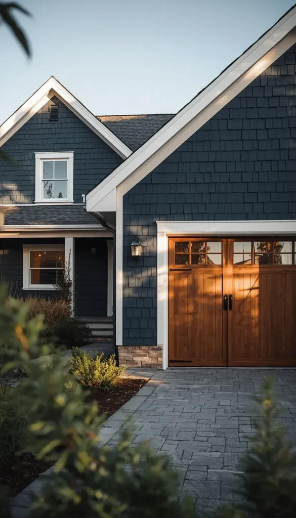
Navy has become one of my favorite recommendations for clients who want something with more depth than gray but aren’t ready to commit to full black. Hale Navy by Benjamin Moore and Charcoal Blue by Sherwin Williams both read as sophisticated rather than loud, and they pair beautifully with natural wood accents, stone, or even just a simple white trim.
What I love most about navy is how it shifts throughout the day. In bright sun it can almost look like a soft charcoal, and at dusk it deepens into something much richer. It’s a color that photographs well year round, which matters more than people realize if you’re thinking about resale down the line.
If you could repaint your home’s exterior tomorrow, what’s the one color you’d finally be brave enough to try?
5. Charcoal And Dark Gray For A Contemporary Sophisticated Look
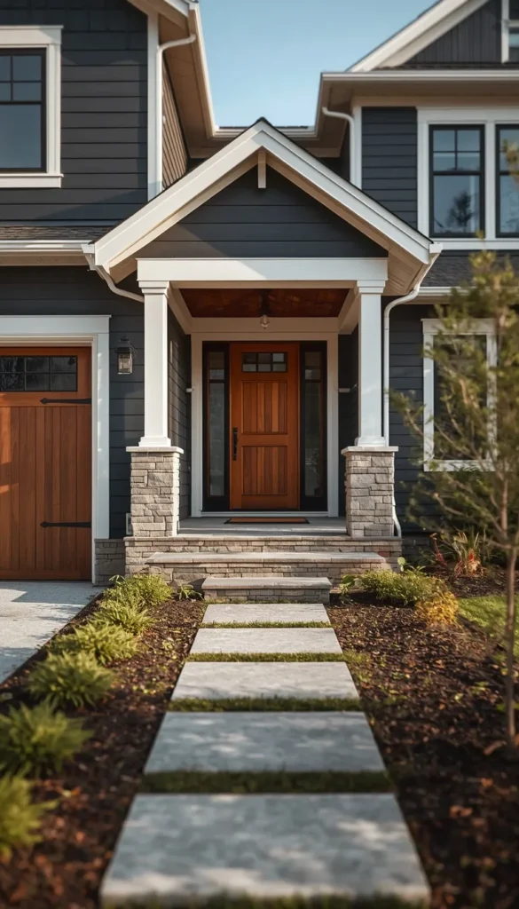
Charcoal is having a real moment right now, and honestly, it deserves it. It sits in that sweet spot between the drama of black and the predictability of medium gray, giving homes a polished, contemporary edge without feeling unapproachable. Iron Ore by Sherwin Williams and Kendall Charcoal by Benjamin Moore are two I keep coming back to both have enough warmth in their undertone to stop them from reading too cold or industrial.
What works especially well with charcoal is playing it against lighter natural elements. Think white trim, warm wood garage doors, or even a light limestone pathway leading to the front door. That contrast is what makes the whole exterior feel intentional rather than just dark.
One thing to watch out for is how charcoal behaves in full sun climates. In states like Arizona or Texas, very dark siding absorbs significantly more heat, which can affect your cooling costs over time. Worth a conversation with your contractor before committing.
6. Sage Green Brings The Outside In
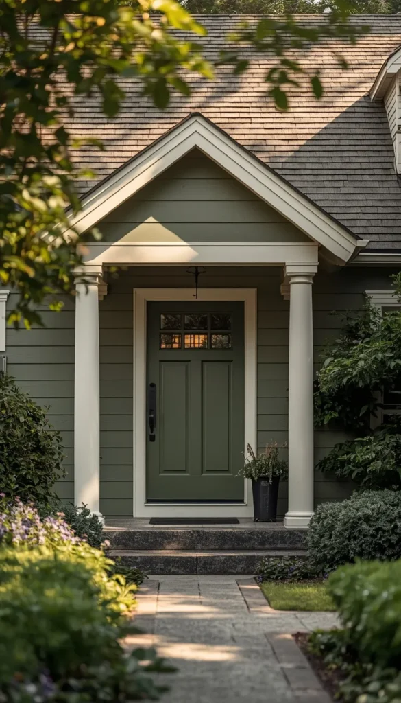
Sage green has quietly become one of the most requested exterior colors I get asked about, and it makes complete sense. It feels rooted, calm, and genuinely timeless in a way that most trendy colors don’t. Evergreen Fog by Sherwin Williams sits at the top of my list here it has just enough gray in it to feel sophisticated rather than loud.
The homes where sage green really shines are those surrounded by mature trees, natural landscaping, or even just a well kept lawn. The color seems to breathe with the environment around it.
- Pair it with warm white trim rather than crisp white, which can make sage look slightly washed out
- Aged brass or matte black hardware on the front door adds a finishing touch that pulls the whole look together
- Avoid pairing with cool gray roofing a warmer weathered wood or brown shingle works much better
The one pitfall I see fairly often is choosing a sage that leans too yellow or too blue. Both read strangely on a full exterior, so always test in natural light before deciding.
Top 6 table should sit right after Point ideas
| Idea | Estimated Price | Maintenance |
|---|---|---|
| Warm White / Greige | $3,000 – $6,000 full repaint | Low |
| Deep Navy Blue | $3,500 – $7,000 full repaint | Medium |
| Charcoal / Dark Gray | $3,500 – $7,500 full repaint | Medium |
| Sage Green | $3,000 – $6,500 full repaint | Low |
| Black Exterior | $4,000 – $8,000 full repaint | High |
| Two Tone Combination | $4,500 – $9,000 full repaint | Medium |
7. Forest Green For Homeowners Ready To Make A Statement
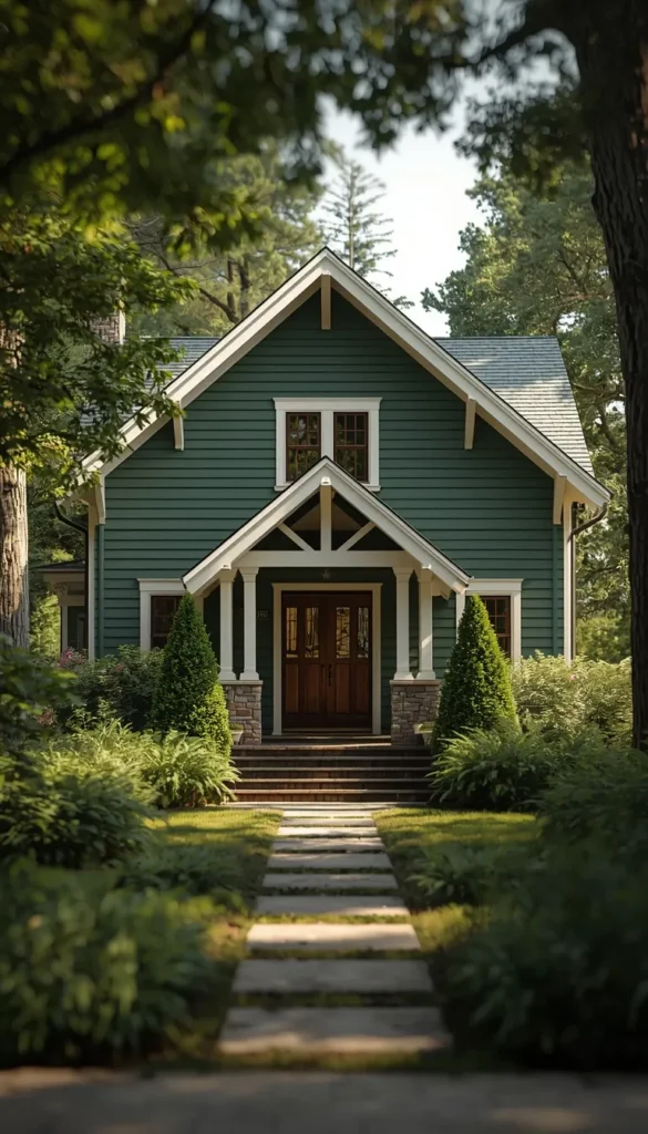
Forest green is the bolder cousin of sage, and it is absolutely gaining ground in 2026. Where sage feels quiet and blended, forest green makes a deliberate choice it says something. Colors like Rookwood Collection Deep Green by Sherwin Williams or Backwoods by Benjamin Moore give that deep, lush richness that photographs stunningly against a white trim or natural wood accents.
I will be honest with you though this is a color that needs the right house and the right setting. On a home with lots of natural surroundings, mature landscaping, or a craftsman style architecture, it looks extraordinary. On a small suburban home with a concrete driveway and minimal greenery, it can feel a little heavy. The surrounding landscape does about forty percent of the work for you with forest green, so take that into account before committing.
8. Terracotta And Clay Tones For Warm Climate Homes
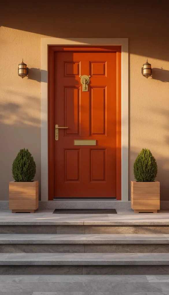
Terracotta is one of those colors that never fully goes away, and right now it is enjoying a genuine revival, especially in the Sun Belt. If you’re in Arizona, New Mexico, Southern California, or anywhere with a warm Mediterranean or Spanish Colonial architectural tradition, a clay or terracotta toned exterior just makes sense it works with the landscape rather than against it.
What I appreciate about terracotta is how forgiving it is in strong sunlight. Unlike some deeper colors that can look almost black in harsh afternoon sun, warm clay tones hold their character beautifully throughout the day.
- Pair with creamy white or warm sand trim, never crisp bright white which creates too sharp a contrast
- Terracotta plays especially well with Spanish tile roofing in rust or charcoal tones
- Natural wood shutters or an arched front door in dark walnut finish elevates the whole look
For homeowners outside warm climates, a muted version of this think something closer to a dusty adobe than a bright terracotta tends to translate better to four season environments.
Are you team warm and cozy greige, or are you ready to make a statement with something darker and bolder?
9. Black House Exterior When You Want Maximum Drama
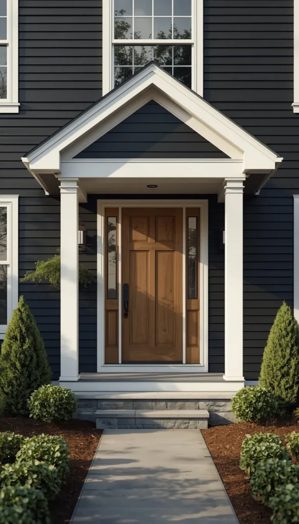
A full black exterior is not for the faint of heart, and I mean that in the best possible way. Done right, it is one of the most striking looks in residential design right now. Wrought Iron by Benjamin Moore and Black Magic by Sherwin Williams are two that I reach for when a client is serious about going dark both have enough depth to feel rich rather than flat.
The honest conversation I have with every client considering this is about maintenance. Black shows dust, pollen, and water streaking more visibly than almost any other color, and in warmer climates the heat absorption is real. Most HOAs also have restrictions on how dark an exterior can go, so checking your community guidelines before falling in love with the idea is a step you do not want to skip.
That said, the black with white trim combination remains one of the most timeless and resale friendly versions of this look. It gives you the drama without the full commitment, and it works across architectural styles from modern farmhouse to colonial.
10. Two Tone Combinations For A Custom Built Look
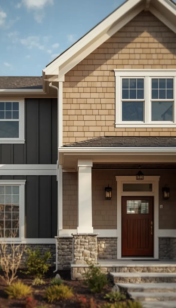
Two tone exteriors are one of those ideas that look effortless when done well and slightly chaotic when done without a plan. The homes that pull this off successfully usually follow one consistent principle the darker tone grounds the lower portion of the house while the lighter tone lifts the upper half visually.
A combination I’ve been loving lately is a warm charcoal on the lower board and batten paired with a creamy white or warm greige on the upper siding. It creates visual weight in the right places and gives even a fairly standard suburban home a custom, architect designed feel.
- Use the roofline or a natural architectural break as your dividing line rather than just splitting the house in half arbitrarily
- Keep trim consistent in one color throughout both tones to tie the whole thing together
- Limit yourself to two siding colors maximum three almost always tips into overwhelming
The biggest mistake I see with two tone exteriors is choosing colors that are too similar in value. If both shades are roughly the same lightness or darkness, the contrast disappears and the whole effect falls flat. You need a clear light and a clear dark for this to read properly from the street.
11. Trim Color Pairing Rules That Most Homeowners Get Wrong
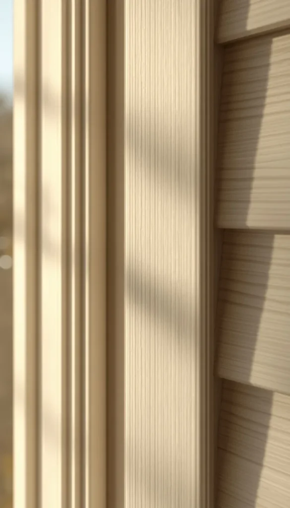
Trim color is the detail that separates a thoughtful exterior from one that just looks painted. And yet it is almost always the last decision people make, usually in a rush. I’d argue it deserves just as much attention as the main siding color, maybe more, because it frames every window, door, and corner of your home.
The most common mistake is defaulting to bright white trim regardless of the siding color. Bright white is cool toned, and when you put it next to a warm greige or a terracotta or even a warm navy, that temperature clash shows up immediately. A better approach is to match the trim’s warmth to the siding’s warmth.
Warm siding colors greige, sage, terracotta, warm white almost always look better with an off white or cream trim rather than a stark white. Cool siding colors true gray, slate blue, charcoal can handle a crisper white trim without that jarring contrast. It sounds like a small distinction but it makes an enormous difference on the full exterior.
12. Front Door Color Strategy That Ties Everything Together
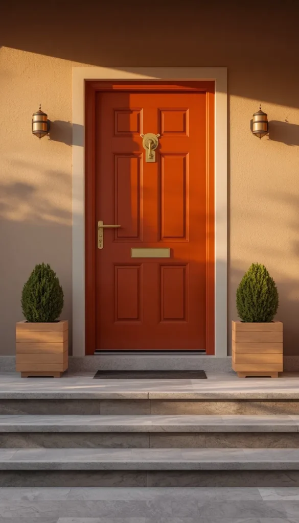
The front door is where you get to have a little fun, and most homeowners either overthink it completely or treat it as an afterthought. I think of it as the jewelry of the exterior it should complement what’s already there rather than compete with it, but it can absolutely have its own personality.
For navy or charcoal exteriors, a brass or deep burgundy door adds warmth and a sense of arrival that feels genuinely welcoming. For warm white or greige homes, I love a deep forest green or a rich terracotta door something that adds contrast without breaking the overall palette.
A quick trick I’ve learned is to pull one accent color already present somewhere on your exterior maybe the stone, the landscaping, or even a porch railing and use that as your starting point for the door color. It creates a cohesion that looks intentional rather than random, and clients are always a little surprised by how much that one small connection elevates the whole front elevation.
Whats the one thing holding you back from updating your homes exterior color right now budget, HOA, or just too many options to choose from?
13. Roof And Siding Color Coordination Most People Overlook
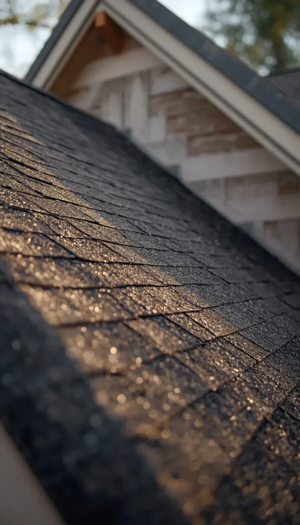
Here is something I notice on almost every exterior consultation I walk into the homeowner has spent weeks choosing their siding color and about fifteen minutes thinking about how it interacts with the roof. The roof covers more visual surface area than almost anything else on your home’s exterior, and if the undertones clash, the whole palette feels slightly off even if nobody can pinpoint exactly why.
The core principle is simple: match warm to warm and cool to cool. A warm greige or terracotta siding wants a roof in weathered brown, warm charcoal, or even a blended earth tone shingle. A cool gray or slate blue siding pairs far more naturally with a blue gray or true charcoal roof. Where I see the most friction is when someone has a reddish brown or orange toned roof shingle a legacy of the early 2000s and tries to pair it with a cool contemporary gray siding. Those two undertones fight each other constantly.
- If you’re replacing the roof and repainting at the same time, choose the roof color first since it’s the larger and more expensive commitment
- Bring an actual shingle sample to the paint store when selecting siding color, not just a photo on your phone
- When in doubt, a medium to dark charcoal roof works with almost every siding color family and is genuinely the safest choice
14. Regional And Climate Considerations That Actually Matter
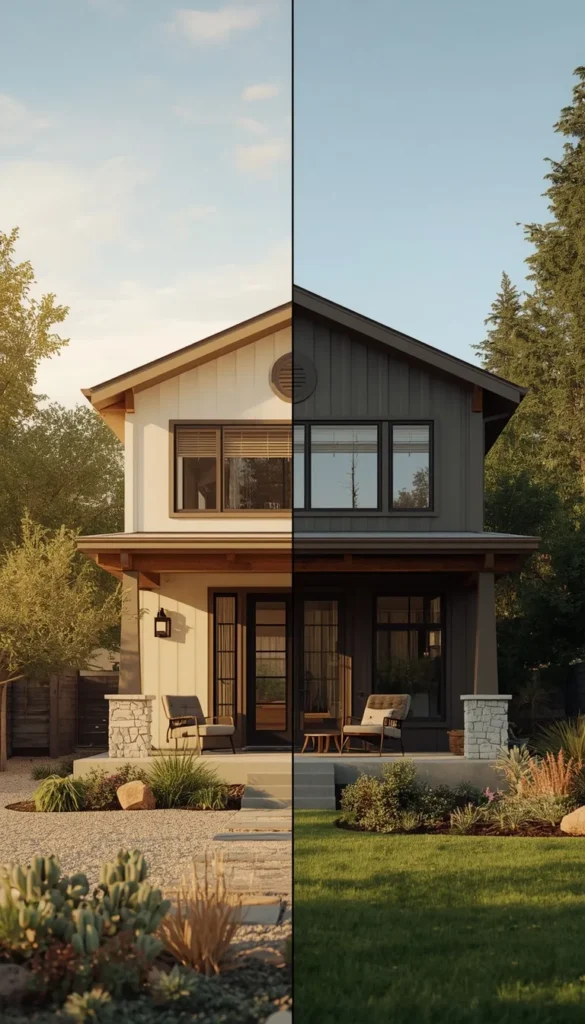
This is the section most online articles skip entirely, and it is one of the most practical things I can share with you. Where you live should have a real influence on the exterior color you choose, not just aesthetically but functionally.
In hot sunny climates like Phoenix, Dallas, or Miami, very dark siding absorbs significantly more radiant heat. Over time that affects both your cooling costs and how quickly the paint itself breaks down. Lighter and mid tone colors hold up considerably better in intense UV environments, and if you do want something dark, investing in a high quality exterior paint with UV resistant pigments is non negotiable.
In the Pacific Northwest where moisture and overcast light are constants, colors that look beautiful in a sunny showroom can read much darker and heavier in real life. I generally recommend going a half shade lighter than you think you need if you’re in a high humidity or low light region. Coastal homeowners also need to factor in salt air, which accelerates paint degradation on any color a premium exterior paint with a mildew resistant formula matters more than the specific hue you choose.
Cold climate homes in the Midwest and Northeast face the freeze thaw cycle, which affects caulking and paint adhesion over time more than the color itself, but darker colors do show salt splash and road grime from snowplows more visibly. Something worth knowing before you fall in love with a deep charcoal in Minnesota.
15. Budget Breakdown For A Realistic Exterior Color Refresh
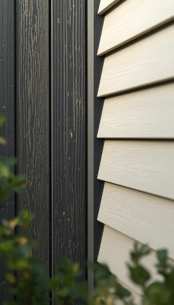
Let’s talk numbers, because this is where a lot of excitement about exterior color trends meets reality. A full exterior repaint on an average American home runs anywhere from $3,000 to $8,000 for professional labor and materials, depending on square footage, number of stories, and condition of the existing surface. If you’re in a high cost of living market like the Bay Area or New York metro, that range climbs higher.
DIY is absolutely an option for single story homes with straightforward surfaces, and you can cut that cost dramatically primarily down to materials, which for a quality exterior paint job typically runs $500 to $1,500. The trade off is time, physical effort, and the reality that prep work like scraping, priming, and caulking accounts for about sixty percent of a professional job’s quality. Most DIY paint jobs that fail do so because the prep was rushed, not because of the color choice.
If you’re looking at new fiber cement or vinyl siding rather than repainting existing surfaces, the investment is considerably higher typically $8,000 to $20,000 or more for a full house but you’re gaining decades of durability and in many cases better color retention than paint alone. For homeowners planning to stay in their home long term, that math often makes sense. For someone thinking about selling in the next two to three years, a fresh high quality paint job almost always delivers a better return on investment than new siding.
16. Maintenance Reality Check For Every Major Color Family
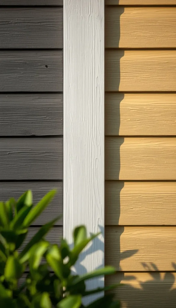
No exterior color is truly zero maintenance, and I think it is worth being upfront about what each color family actually asks of you over time before you commit.
White and light colors are the most forgiving in terms of heat and fading but show biological growth mold, mildew, algae streaks more readily than darker tones. A power wash once a year is usually enough to keep them looking fresh, but skip that for two or three years and the difference is very visible.
Dark colors like black, deep navy, and charcoal fade faster than light colors in UV heavy environments because the pigments that create those deep tones are simply less stable under prolonged sun exposure. A premium exterior paint with a higher price point is genuinely worth it here the pigment quality difference between a $40 gallon and a $75 gallon is much more noticeable on dark colors than on whites or light neutrals.
- Greens and sage tones can develop a slightly bluish or grayish cast as they weather, which some people love and others find jarring worth knowing going in
- Warm whites and greiges tend to be the most forgiving overall in terms of touch ups since minor variations blend naturally
- Terracotta and clay tones hold their warmth well but can show efflorescence white mineral deposits if moisture is getting behind the siding, so proper installation and caulking matters enormously
Looking at your home from the street today, does the exterior color feel like you or is it time for a change?
17. Timeless Versus Trendy How To Choose A Color That Ages Well
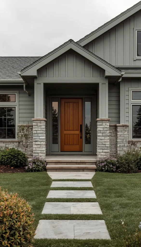
This is probably the question I get asked more than any other, and it is a genuinely important one. Trends in exterior color move slower than interior trends you’re not repainting your house every season the way you might swap out throw pillows so the stakes of choosing something overly trendy feel higher. A color that looks cutting edge in 2026 can start feeling dated by 2030, and if you’re thinking about resale at all, that timeline matters.
The colors that have consistently held their value across decades share a few things in common. They tend to sit in the mid tone range rather than at the extremes of very light or very dark. They have a neutral or near neutral base with just enough personality to feel considered. And they work with rather than against the architectural style of the home.
Greige, warm white, soft charcoal, and muted sage green all fall into that category for me. They feel current right now but they’re not so specific to this moment that they’ll read as a time stamp five years from now. On the other end of the spectrum, very saturated colors bright turquoise, vivid yellow, candy apple red are fun and personal but carry a real risk of feeling tied to a specific era.
- If you love a bold color, consider using it on the front door or shutters rather than the full siding you get the personality with far less long term commitment
- Homes in established neighborhoods with consistent architectural character tend to hold value better when the exterior color respects that context rather than fighting it
- When in doubt, ask yourself how the color will look in a real estate listing photo on a cloudy day that is often the most honest test of whether it will feel timeless or trendy
One thing I always remind clients is that resale value is not just about choosing a safe color it is about choosing a color that is executed well, with quality materials and proper prep. A beautifully painted greige house will always outperform a poorly painted black house, regardless of what is trending.
18. My Final Thoughts On Picking The Right Exterior Color For Your Home
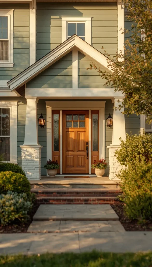
Choosing an exterior color is one of those decisions that feels overwhelming right up until the moment it clicks, and then it feels completely obvious. I have watched clients agonize for months over swatches only to land on the very first color they pulled off the shelf, and I have watched others make snap decisions they regretted within a year. The difference almost always comes down to how much real world testing they did before committing.
My honest advice after years of working on these projects is to slow down on the swatch stage and speed up on everything else. Test your top two or three colors on large boards in actual sunlight. Walk across the street and look at them from a distance. Hold them next to your roof, your driveway, your landscaping. Give yourself at least a full week of observation before you make the call.
And remember that no exterior color exists in isolation. The color you choose will be read alongside your roof, your trim, your front door, your landscaping, and the homes on either side of yours. The best exterior color is not necessarily the most beautiful one in the sample deck it is the one that makes your specific home look like the best version of itself on your specific street.
The 2026 trends point clearly toward warmth, livability, and colors that feel connected to nature and the surrounding environment. Whether that means a soft sage green on a craftsman in the Pacific Northwest or a warm charcoal on a colonial in New England, the through line is the same intentional, considered, and built to last beyond the moment.
Your 2 Minute Exterior Color Decision Map
By Budget
Curb Appeal on a Budget ($3,000 or under)
- Stick with warm white or greige least prep work, easiest touch ups
- One color siding plus white trim keeps labor costs down
- Benjamin Moore Revere Pewter or Sherwin Williams Accessible Beige are widely available and affordable
- DIY friendly on single story homes with minimal surface prep needed
Investment Exterior ($5,000 and above)
- Deep navy, forest green, or two tone combinations reward higher quality paint and professional application
- Budget for primer, caulking, and proper surface prep this is where the money actually goes
- Consider fiber cement siding if repainting more than twice in ten years the long term math shifts
By Lifestyle
Busy Families and Pet Owners
- Avoid true white and full black both show everything
- Warm greige or soft sage hides everyday dust, pollen, and muddy paw prints far better
- Medium tone charcoal is your sweet spot for drama without the upkeep stress
- Choose a satin or low sheen finish easier to wipe down than flat paint
Design Forward Homeowners
- Two tone combinations or forest green make the strongest visual statement
- Invest in the front door color it is the fastest and cheapest way to personalize a bolder exterior
- Test at least three colors on large boards before committing bold colors shift dramatically in different light
Frequently Asked Questions
What Is The Most Popular Exterior House Color In 2026?
Warm greige and soft charcoal are leading the pack right now. Homeowners are moving away from stark white toward tones that feel warmer and more livable without sacrificing curb appeal.
How Much Does It Cost To Repaint A House Exterior In The USA?
The average cost runs between $3,000 and $8,000 for professional labor and materials. Larger homes or those needing significant prep work will sit toward the higher end of that range.
Does Exterior Paint Color Affect Home Resale Value?
Yes, significantly. Zillow research has shown certain colors can swing a sale price by thousands of dollars. Warm neutrals and classic charcoals consistently perform best with buyers.
How Long Does Exterior Paint Last Before Needing A Refresh?
Ideally, a quality exterior paint job lasts seven to ten years. Dark colors in high UV climates may need attention closer to the five to seven year mark.
What Exterior Colors Should I Avoid If I Have An HOA?
Very dark colors, bright saturated tones, and anything outside your HOA’s approved palette can trigger fines or mandatory repaints. Always pull the approved color list before buying a single sample.
Conclusion
Your home is the one place in the world that should feel completely and unapologetically yours and the right exterior color is often the first step in making it feel that way again. You don’t need a full renovation or an unlimited budget to make a real difference. Grab two or three sample pots this weekend, paint some boards, and just live with them for a few days. That one small move will tell you more than any Pinterest board ever could.
