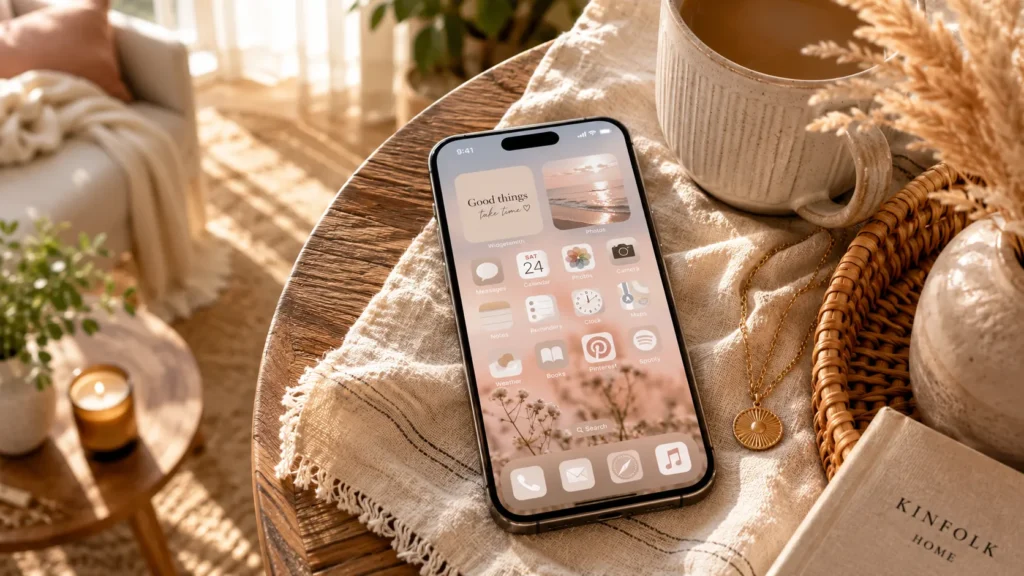
Your phone is the one room in your life you redecorate fifty times a day, so why does it still look like a junk drawer? I design living rooms for a living, and I promise the same rules that make a space feel calm and pulled together work just as well on a six inch screen. Let’s fix that grid of mismatched icons once and for all. Below are thirteen ideas I actually use, plus the honest tradeoffs nobody tells you about.
My Design Notes
I once wrapped up a Modern Farmhouse living room outside Nashville, and my client’s phone was sitting right there on the coffee table, screen glowing with a chaotic mess of neon icons. It didn’t match a single thing we’d just spent three months curating for her walls and textiles.
I joked that her phone hadn’t gotten the moodboard memo, and she laughed but agreed it bothered her too. We ended up sitting on her new sofa for twenty minutes, rebuilding her home screen in the same cream and taupe tones we’d used throughout her living room. It felt almost silly at first, treating a phone screen like a design project, but the effect was immediate.
She tells me it’s the detail her friends notice first when they visit now, right after the living room itself. I’ve started recommending this to nearly every client since, because a home should feel consistent down to the device sitting on your coffee table.
1. Pick One Color Palette and Commit to It
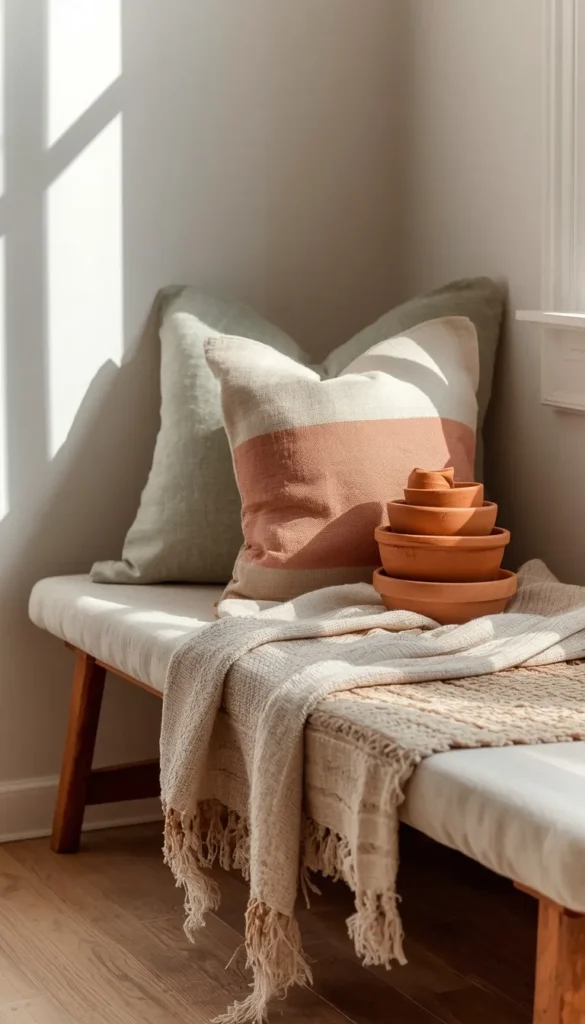
Every good room starts with a palette, and your home screen is no different. Before you touch a single icon, decide on three or four colors you actually want to look at all day. Cream, sage, and terracotta. Black, white, and one accent. Whatever it is, write it down.
The catch: committing to a palette means some of your most used apps will look a little out of place until you recolor their icons, which brings us to the next step.
2. The Custom Icon Method
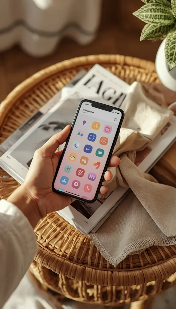
This is the single biggest lever for an aesthetic home screen, and most guides skip it entirely. On iPhone, open the Shortcuts app, tap the plus sign, choose Add Action, search Open App, pick the app you want, then tap the three dots and Add to Home Screen. From there you can upload any icon image and rename it.
On Android, you don’t need Shortcuts. Icon pack apps like Papercut or Minimalist do the heavy lifting, or you can install a launcher like Nova that lets you swap icons directly.
Here’s the part nobody mentions. Custom icons through Shortcuts open a splash screen for about half a second before the real app loads. It’s a small delay, but if you’re someone who wants instant app opens, know that going in.
3. Monochrome and Tonal Layouts
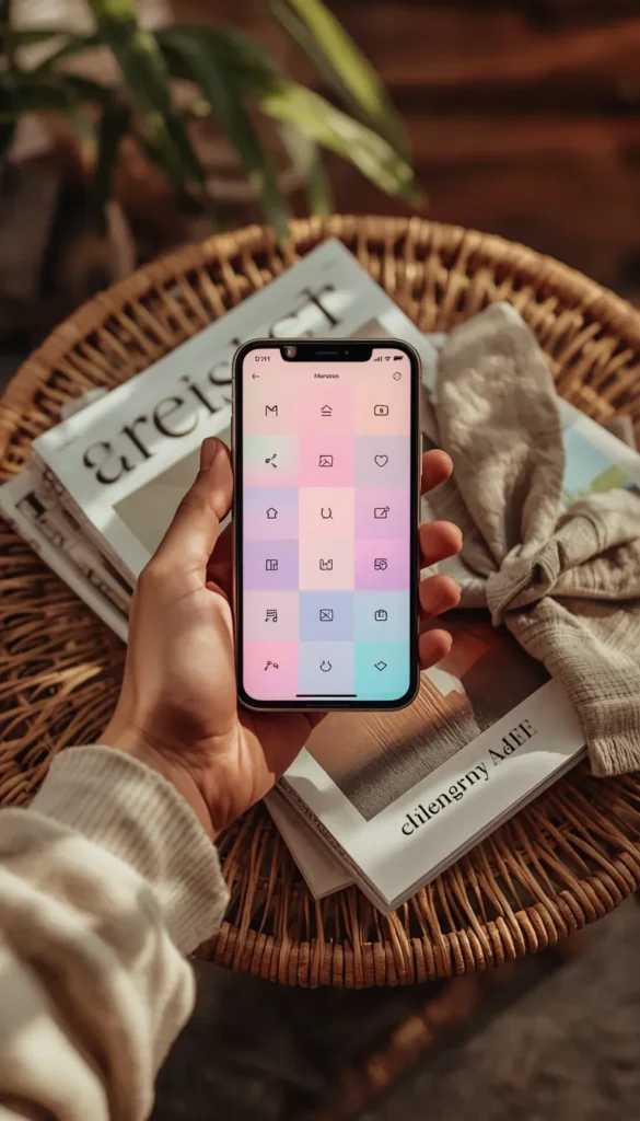
A monochrome layout means every icon lives in shades of one color family, and it’s the fastest way to make a screen look expensive. Think all beige, all sage, all dusty blue. It reads like a designer app wallpaper even though it’s just careful color matching.
I’d recommend starting with a tonal approach instead of true monochrome if you’re new to this. Tonal means you allow a few close shades, like cream, oat, and soft taupe together, rather than forcing every single icon into one exact hex code. It’s more forgiving and honestly easier to maintain.
4. Hide App Names for a Cleaner Grid
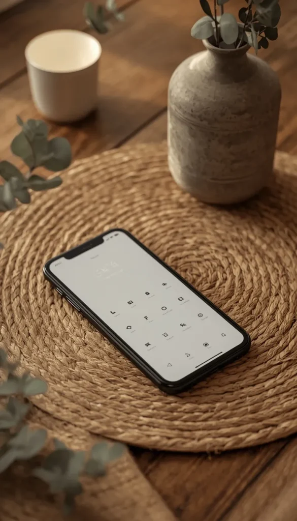
Removing the text labels under your icons instantly makes a home screen feel more like a mood board and less like a spreadsheet. On iPhone this happens naturally once you build custom icons through Shortcuts, since the shortcut names can be left blank or set to a single space.
I need to be straight with you about the downside here. Once names disappear, so does your ability to scan quickly for an app you rarely use. I’ve watched clients spend a full minute hunting for their banking app because every icon looked equally pretty and equally unlabeled. My advice is to only hide names for apps you already know by muscle memory, and keep less familiar ones labeled.
Out of these thirteen ideas, which one do you think your home screen needs most right now?
5. Widget First Layouts
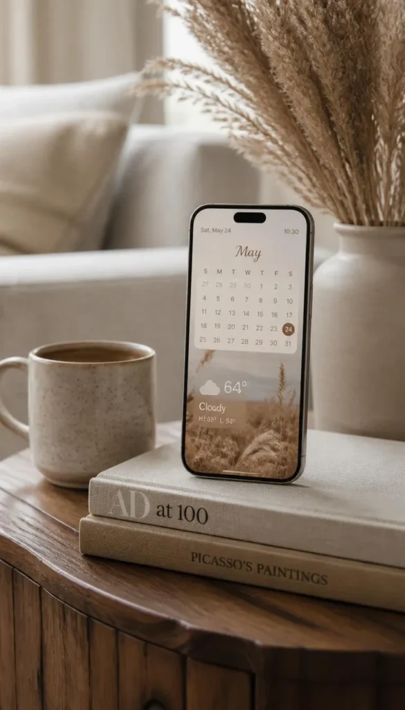
Widgets do more visual heavy lifting than any icon ever will, because they add texture, photos, and real information without extra clutter. Apps like Widgetsmith, Color Widgets, and Photo Widget let you build a calendar, weather, or photo widget that matches your palette exactly.
A layout built around two or three large widgets, with a small cluster of essential icons off to the side, tends to look far more editorial than a screen packed edge to edge with tiny squares. Think of widgets as the statement furniture piece in a room. You don’t need five of them. You need one or two that are genuinely doing something useful.
6. Matching Your Lock Screen to Your Home Screen
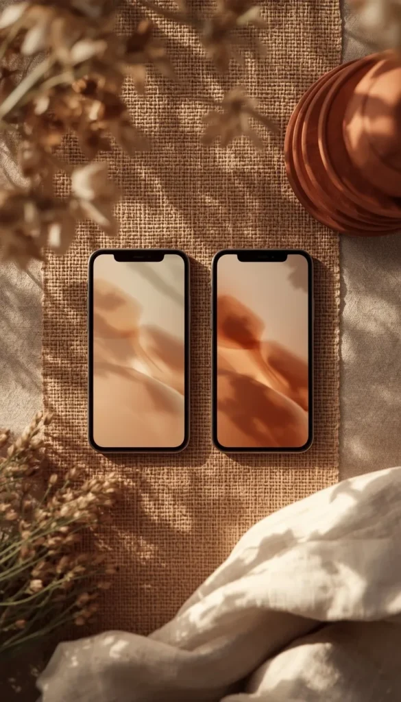
Your lock screen and home screen should feel like they belong to the same house, not two different Pinterest boards. Pick a wallpaper family, whether that’s a specific photo style or a solid tone, and carry it across both screens. If your home screen widgets are cream and rust, your lock screen font and widget color should pull from that same palette.
This is a small move that makes an enormous difference in how put together the whole phone feels the moment you tap it awake.
Top 6organizing phone apps aesthetic ideas
| Idea | Estimated Price | Maintenance |
|---|---|---|
| Custom app icons (Shortcuts or icon pack) | Free DIY, or $2 to $15 for a full icon pack | Medium |
| Widget first layout (Widgetsmith, Color Widgets) | Free, or $2 to $10/year for premium themes | Low |
| Monochrome or tonal icon set | $2 to $6 for a color matched pack | Low |
| Aesthetic folder covers | Free with Shortcuts, or up to $5 with an icon pack | Low |
| Matching wallpaper across lock and home screen | Free, or $5 to $15 for a premium wallpaper app | Low |
| Android launcher (Nova or Niagara) | $5 to $10 one time, some Pro tiers subscription based | Medium |
7. The One Focal Point Rule
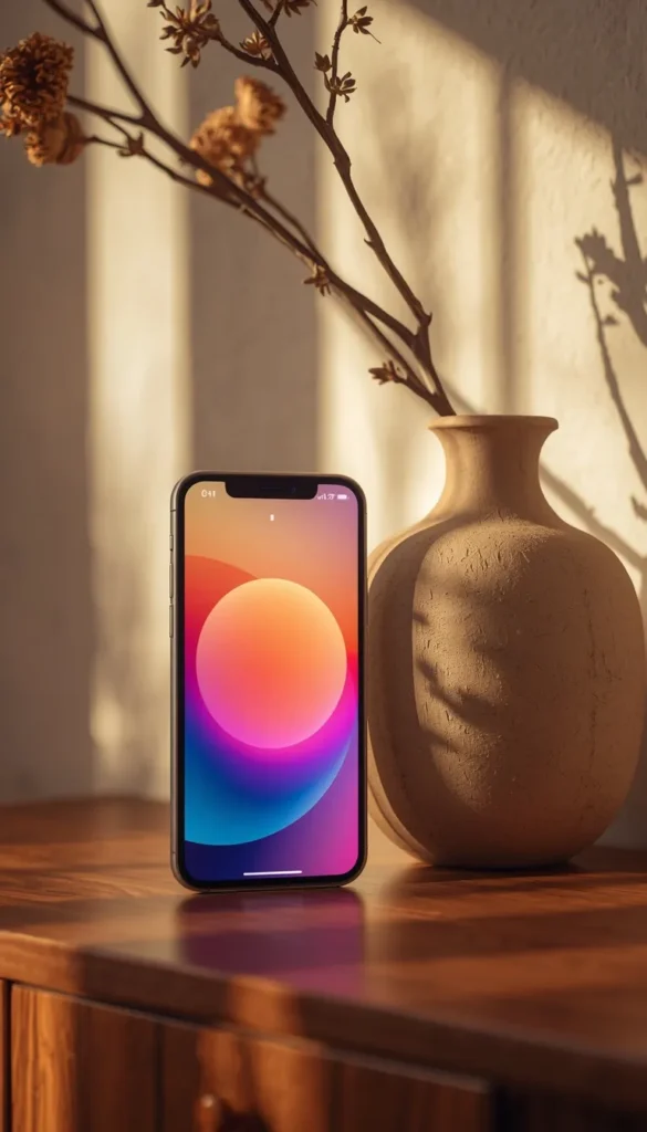
In interior design, a room without a focal point feels flat no matter how nice the furniture is. Your eye doesn’t know where to land. The same thing happens on a home screen packed with twenty equally sized icons.
Pick one focal point. That might be a large weather widget, a photo widget of your dog, or a single oversized app icon. Build everything else around it in smaller, quieter pieces. Your screen will instantly feel intentional instead of just organized.
8. Aesthetic Folder Systems
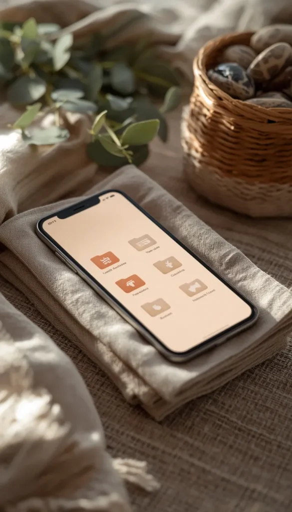
Folders don’t have to be gray circles crammed with icons nobody can see. Custom folder covers, made through the same Shortcuts method or through icon pack apps, let you design a folder that shows a single soft image or color instead of nine tiny icons squished together.
I like grouping folders by how a room might be zoned rather than by strict category. A “morning” folder with your alarm, weather, and coffee ordering app. A “wind down” folder with your reading and sleep apps. It mirrors how you actually move through your day, not just how the App Store labels things.
Be honest, is your home screen closer to ‘Aesthetic First’ or ‘Function First’ right now?
9. Negative Space and Minimalist Grid
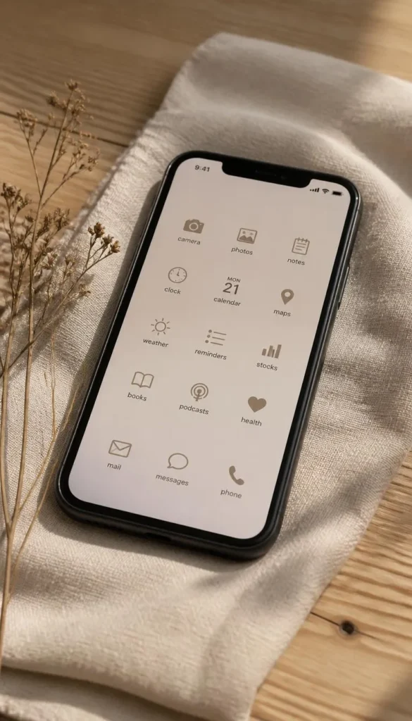
Empty space is doing just as much work as your icons are, and most people are terrified of it. A home screen with four rows of apps crammed to the edges will always feel busier than one with two rows and generous gaps.
Try moving everything to one page and leaving the rest of your screens completely bare except for a single widget. It feels almost uncomfortable at first if you’re used to a packed grid, but it’s the fastest way to make a phone feel calm instead of chaotic.
10. Seasonal Refresh Ideas
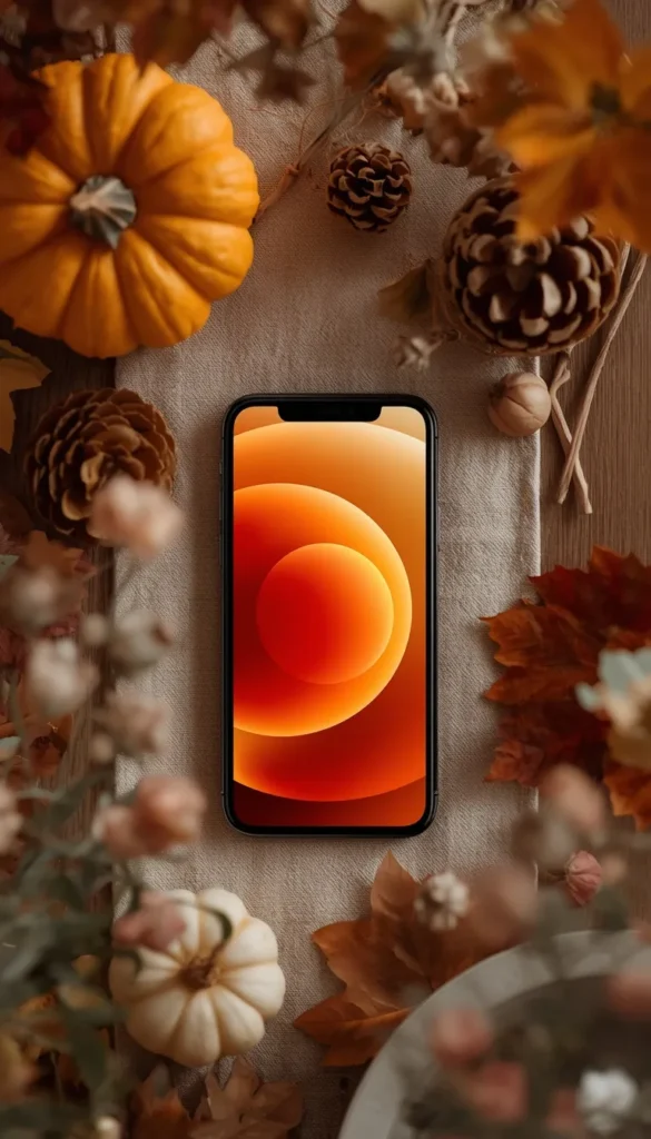
You repaint accent walls and swap throw pillows with the seasons, so why not your phone. A quick seasonal refresh doesn’t require rebuilding your whole system. Swap your wallpaper, nudge your palette a shade warmer or cooler, and update one or two widget photos.
I do this every three months with my own phone, and it takes less than fifteen minutes. It keeps the whole setup feeling current instead of something you built once in 2023 and forgot about.
11. Android Specific Aesthetic Setup
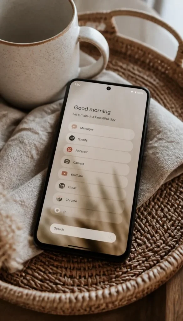
Most aesthetic phone guides are written for iPhone and quietly ignore Android, which is a real gap since Android actually offers more customization once you have the right launcher. Nova Launcher and Niagara Launcher both let you resize icons, adjust grid spacing, and apply icon packs without the workaround steps iPhone requires.
Niagara in particular strips your home screen down to a scrolling list with a few widgets up top, which is worth trying if you want that minimalist look without building custom icons for every single app. Nova gives you more granular control if you want a true grid layout closer to what iPhone users build through Shortcuts.
12. Budget Breakdown Free vs Paid Tools
Here’s what this actually costs, because most articles gloss right over it. Building custom icons through the iPhone Shortcuts app is entirely free, it just takes time. Icon pack apps typically run anywhere from two to six dollars for a full set, and premium widget apps like Widgetsmith and Color Widgets have optional paid tiers for extra fonts, photo slots, and themes, usually under ten dollars.
On Android, Nova Launcher’s free version covers most of what you need, with a one time payment of around five dollars unlocking icon swipe gestures and a few extra customization options. Niagara Launcher works similarly with a modest one time or subscription fee for its Pro tier.
You can absolutely build a fully aesthetic setup for free on both platforms. Paying a small amount just saves you time and unlocks a few extra style options.
13. The Maintenance Reality Check
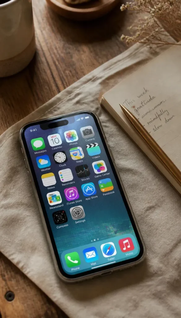
Nobody wants to hear this part, but I’d rather tell you upfront. Custom icons and hidden names occasionally break after a major iOS or Android update, especially if an app changes its own icon or gets renamed by the developer. When that happens, your custom version can revert back to the default overnight.
Notifications are another thing worth knowing about. Some custom icon methods, particularly Shortcuts based ones on iPhone, don’t display notification badges the same way the original app icon does. If you rely on seeing a red badge to remember to check a message, this setup might quietly work against you.
My honest advice is to keep your three or four most functionally important apps, like messages, calendar, and banking, in their original form. Save the full aesthetic treatment for apps where a missed badge or a half second delay genuinely doesn’t matter.
Which Path is Yours?
By Budget
- Starter/Budget: Stick with free Shortcuts icons, a monochrome palette, and default wallpaper. Zero cost, full aesthetic payoff.
- Luxury/Investment: Layer in a paid icon pack, a Widgetsmith Pro subscription, and a matching premium wallpaper set for a fully curated look.
By Lifestyle
- Function First: Keep labels visible, skip hidden names, and lean on widgets over custom icons so you never lose speed.
- Aesthetic First: Go all in on custom icons, hidden labels, and a tight color palette. You’re optimizing for how it looks every time you unlock your phone.
Frequently Asked Questions
Does making my phone aesthetic slow it down?
No, not in any meaningful way. The only real trade off is a half second delay on Shortcuts based icons.
What’s the easiest free way to start organizing my apps aesthetically?
The Shortcuts app on iPhone or Niagara Launcher on Android. Both let you build a full custom layout without spending a dollar.
Will hiding app names delete or uninstall the app?
No. The app stays fully installed, only the label disappears from view.
How long does it take to build a full aesthetic home screen?
Plan on 30 to 60 minutes for icons and widgets combined. Small touch ups after that usually take five minutes or less, especially once your palette is locked in.
Can Android home screens look as polished as iPhone ones?
Yes, and in some cases Android gives you more control. Launchers like Nova let you resize icons and adjust spacing directly, no workaround needed.
Conclusion
Your phone spends more time in your hand than almost anything else you own, so it deserves the same care you’d give a room you actually live in. Pick just one idea from this list tonight, even something as small as building your first custom icon or swapping your wallpaper to match your palette, and notice how different it feels tomorrow morning. Small changes like these compound faster than people expect. So which one are you trying first?
