14 Curating Space Inspo Trends Making Every Home Feel Luxurious
Your home shouldn’t just look good in photos it should feel like you the moment you walk through the door. Most people decorate. The ones with truly beautiful homes? They curate. There’s a real difference between filling a room and intentionally building one, and that’s exactly what these 14 curating space inspo trends are going to show you. Whether you’re working with a sprawling suburban living room or a 600 square foot city apartment, these ideas will help you create spaces that feel genuinely luxurious on any budget.
My Design Notes
A few years back, I worked with a young couple in Austin, Texas who had just bought their first home together a charming but builder-grade 1,100 square foot bungalow with beige walls, harsh overhead lighting, and absolutely zero personality. They came to me clutching a Pinterest board full of Restoration Hardware rooms and a $3,000 total budget. I won’t lie I’ve seen that combination many times, and it can go either way. But this project turned out to be one of my favorites. We didn’t knock down a single wall or replace one piece of flooring. Instead, we focused entirely on curating choosing each piece with intention, layering textures, and letting one strong focal point anchor every room. The living room alone got so many compliments that their neighbors genuinely assumed they’d hired a full-service staging team. The secret? We spent 60% of that budget on exactly two things: the sofa and the lighting. Everything else fell into place around those two decisions. That Austin project is what I keep coming back to whenever a client tells me luxury is out of reach because it really isn’t.
Mastering the Art of Elevated Home Styling: Proven Secrets Every American Homeowner Should Know
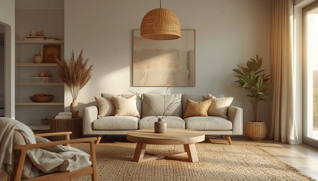
1. Warm Minimalist Decor: Less Stuff More Soul
There’s a version of minimalism that feels cold and punishing bare white walls, one sad plant, and nothing that actually invites you to sit down. That’s not what we’re going for here. Warm minimalism is the sweet spot between “effortlessly clean” and “genuinely livable,” and it’s honestly one of my favorite aesthetics to work with because it photographs beautifully and feels even better in person.
The one rule I always give clients starting here: choose one statement piece per room and build everything else around it. A chunky linen sofa. A sculptural floor lamp. A raw wood coffee table with real character. That single anchor piece does most of the heavy lifting, and suddenly you don’t need seventeen throw pillows to make the room feel complete.
One thing to watch out for is going too neutral too fast. When everything is beige and matte, the room can start to feel like a waiting room. Pull in one warm metal finish brushed brass or aged bronze works beautifully and suddenly the whole space has a pulse.
- Keep surfaces intentionally clear decor should earn its place on every shelf
- Layer two to three natural textures like linen, jute, and raw wood instead of adding more color
- A single oversized art piece reads far more expensive than a crowded gallery wall in a minimalist space
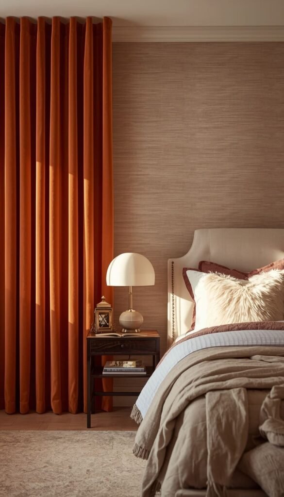
2. Earth Tone Interiors: The Palette That Never Ages
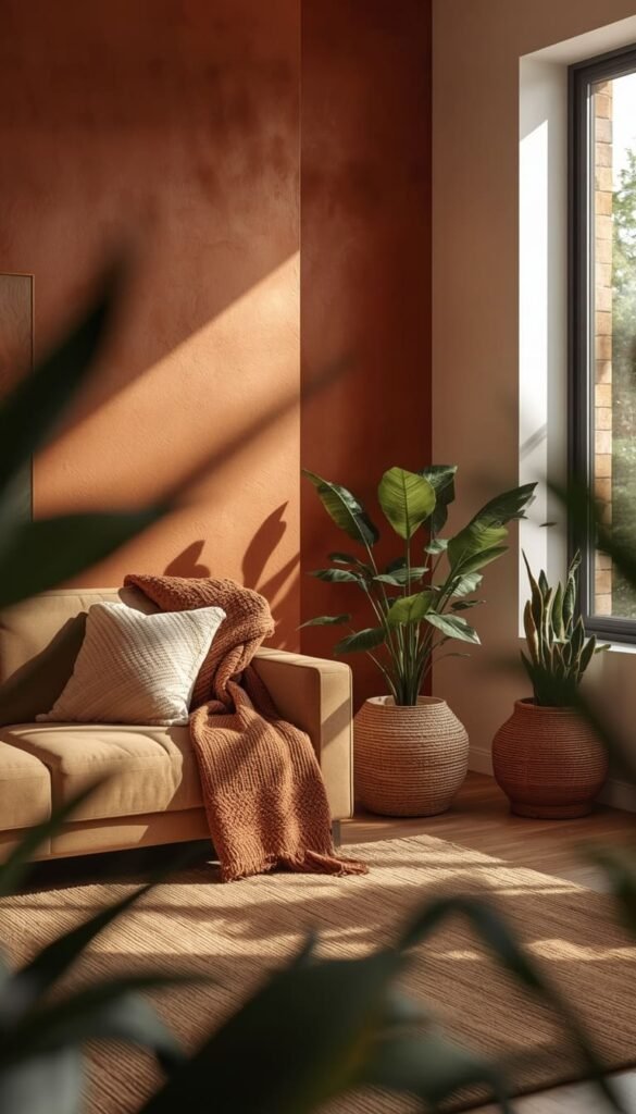
I’ve spec’d a lot of color palettes over the years, and earth tones are the one category I’ve never once seen a client regret. Terracotta, warm taupe, clay, camel, deep olive these colors have a staying power that trendy jewel tones and gray-everything simply don’t. They also photograph well in every lighting condition, which matters more than people realize when you’re trying to sell a home someday.
If you’re starting from scratch with paint, two colors I come back to constantly are Sherwin-Williams “Antique White” SW 6119 and Benjamin Moore “Pale Oak” OC-20. Both have that perfect warm undertone that makes a room feel sun-kissed without reading yellow. A quick trick I’ve learned is to always test your paint sample next to your largest furniture piece not just on the wall because undertones shift dramatically against different fabrics.
The maintenance reality here is genuinely forgiving. Earth tones hide everyday dust and minor scuffs far better than crisp whites, which is a detail nobody tells you until you’re already repainting for the third time.
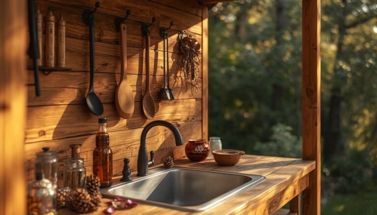
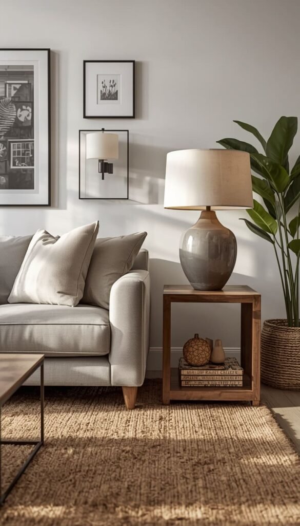
3. Cozy Living Room Ideas: Texture Layering Done Right
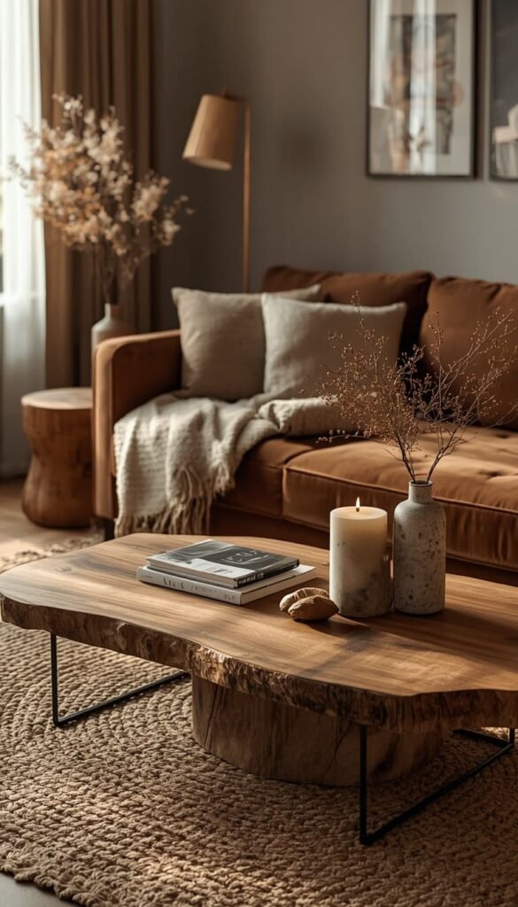
If a room feels flat and forgettable, nine times out of ten the problem isn’t the color or the furniture it’s the lack of texture. Texture is what makes a space feel warm when you walk in, even before you consciously register why. It’s the difference between a room that looks decorated and one that feels genuinely lived in and loved.
My go-to approach is what I call the three-texture rule: always have something soft, something natural, and something slightly rough in the same space. Think a velvet throw, a jute area rug, and a reclaimed wood side table. Those three elements together create a sensory richness that no amount of expensive furniture can replicate on its own.
Now for the honest part. A cream boucle sofa looks absolutely stunning in every mood board and practically every design magazine. But if you have kids, dogs, or really any human beings living in your home, you need to think hard before committing. Light-colored upholstery is genuinely high maintenance. I always suggest clients go one shade deeper than their first instinct a warm mushroom instead of bright ivory, a soft caramel instead of stark white. You get the same luxurious feel with a fraction of the stress.
- A chunky knit throw adds texture and warmth for under $60 at most home stores
- Layer two rugs a flat weave base under a thicker pile for a designer look that also protects your floors
- Swap out lightweight curtains for floor-to-ceiling linen panels to instantly make ceilings feel taller
4. Clean Girl Home Aesthetic: How to Pull It Off Without Feeling Sterile
The Clean Girl aesthetic has taken over Pinterest and TikTok for good reason it’s aspirational without being unapproachable. But I’ve walked into a lot of homes where someone tried to execute this look and ended up with something that felt more like a model unit than an actual home. The difference almost always comes down to one thing: warmth.
The trap most people fall into is choosing cool whites instead of warm whites. There is a real and significant difference between a white that has blue undertones and one that leans slightly cream or greige. Cool whites feel clinical. Warm whites feel expensive. Benjamin Moore “White Dove” OC-17 is my personal go-to for this aesthetic it’s soft enough to feel inviting but clean enough to maintain that crisp, polished look the style demands.
Beyond paint, the Clean Girl home is really about edited abundance. It’s not sparse it’s selective. Every object on display should feel intentional. A small tray corralling your candles and remotes on the coffee table. A single ceramic vase with one stem. Matching storage baskets that hide the chaos without pretending it doesn’t exist. That’s the balance that makes this aesthetic actually work in a real American home.
Top 6 Curating Space Ideas:
| Idea | Estimated Price | Maintenance |
|---|---|---|
| Warm Minimalist Decor | $500 – $1,500 | Low |
| Earth Tone Interiors | $200 – $800 | Low |
| Cozy Living Room Texture Layering | $300 – $1,200 | Medium |
| Statement Lighting Upgrade | $150 – $800 | Low |
| Aesthetic Bedroom Sanctuary | $800 – $2,000 | Medium |
| High and Low Mix (70-20-10 Rule) | $1,000 – $3,500 | Low |
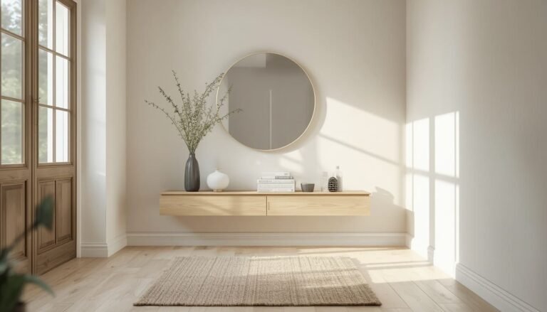
5. Neutral Home Styling: Building a Base That Works Forever
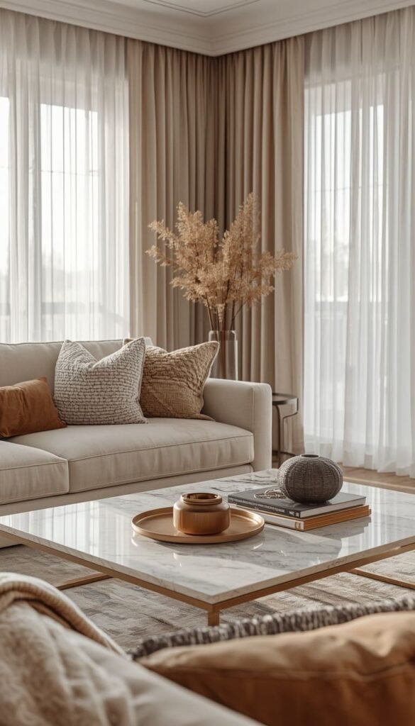
Neutral doesn’t mean boring. I want to be really clear about that because it’s the number one misconception I run into with clients who are afraid to commit to a neutral palette. Done right, a neutral base is actually the most sophisticated design decision you can make and one of the smartest from a purely financial standpoint too.
Here’s something most designers won’t tell you upfront: neutral interiors consistently photograph better for real estate listings and appraise higher in resale situations. I’ve had clients in the Dallas and Charlotte markets who refreshed their homes with a warm neutral palette before listing and saw immediate results. Buyers could visualize themselves in the space because nothing was fighting for attention.
The key is layering your neutrals rather than matching them. Ivory, warm white, soft greige, and camel can all live together beautifully when you vary the textures between them. Where people go wrong is buying everything in the exact same shade that’s when neutral becomes flat and lifeless.
- Stick to a maximum of three neutral tones per room to avoid visual confusion
- Always pull your lightest neutral up to the ceiling to make the space feel taller
- Warm metallics like brushed gold and antique brass stop a neutral room from feeling washed out
6. Small Space Inspiration: Big Luxury in Tight Square Footage
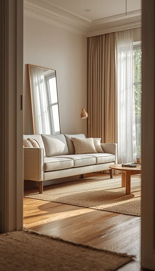
Living in a smaller home or apartment doesn’t mean giving up on a luxurious feel. Some of the most beautifully curated spaces I’ve ever worked on were under 800 square feet. The secret is working smarter with scale, light, and negative space three things that cost very little but make an enormous visual difference.
Scale is the one area where I see the most mistakes in small spaces. People buy furniture that’s too small thinking it will make the room feel bigger. It almost never does. A properly sized sofa in a small living room actually anchors the space and makes it feel intentional. One quick trick I’ve learned is to always measure your room and tape out the furniture footprint on the floor before buying anything it takes ten minutes and saves so much heartache.
Light is your most powerful tool in a compact space. Mirrors placed opposite windows can effectively double the perceived size of a room without touching a single wall. I love a large leaning mirror in a small living room it’s functional, it’s stylish, and it does serious heavy lifting for the overall aesthetic.
A few small space rules I swear by:
- Choose furniture with exposed legs pieces that float off the floor visually open up the room
- Mount your curtain rods close to the ceiling even in rooms with standard height ceilings
- Multi-functional pieces are non-negotiable an ottoman with storage, a sofa with a chaise, a dining table that folds
Which of these 14 trends feels most like you and which one are you tackling first?
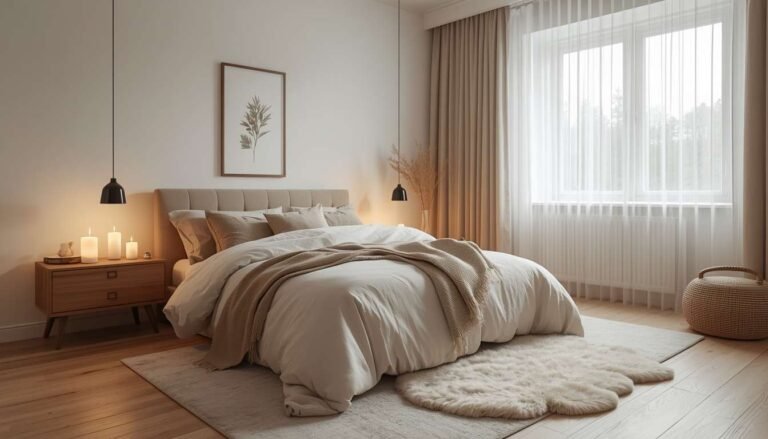
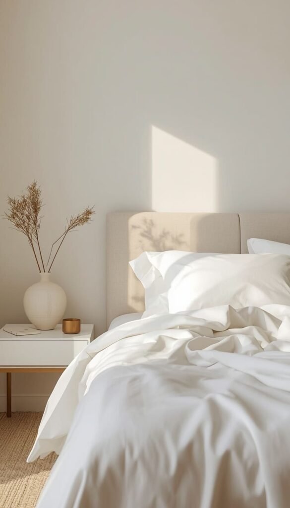
7. Aesthetic Bedroom Decor: Designing Your Sleep Sanctuary
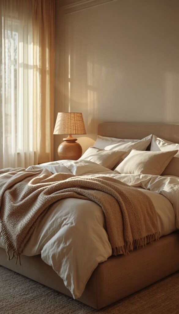
Your bedroom should be the one room in your home that feels completely removed from the noise of everything else. Not just visually calm actually conducive to rest. And yet it’s the room most people treat as an afterthought, decorating it last with whatever budget is left over. I always tell clients to flip that priority, especially if they’re struggling with sleep quality or just feeling generally overwhelmed at home.
The single biggest upgrade you can make to a bedroom and I mean this genuinely is your lighting situation. Overhead lighting in bedrooms is almost always unflattering and too harsh for evening wind-down. Swap it out for layered lighting: a warm bedside lamp on each side, a dimmer on any overhead fixture, and maybe a small accent light behind the headboard or on a dresser. The difference in how the room feels at 9pm is remarkable.
For the aesthetic side of things, bedding is where your budget deserves real attention. You don’t need an expensive bed frame a simple upholstered platform from a mid-range retailer works beautifully. But invest in quality linen or cotton percale bedding in a warm neutral. It photographs like a luxury hotel and actually sleeps better too. Budget-wise, you can build a genuinely beautiful bedroom sanctuary for between $800 and $2,000 if you prioritize the right pieces.
8. Scandinavian Home Decor: What Americans Get Wrong
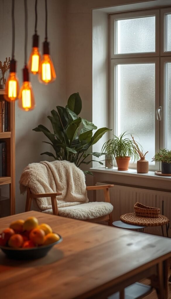
Scandinavian design is one of the most searched and most misunderstood aesthetics in American homes right now. Most people associate it purely with IKEA flat pack furniture, blonde wood, and a lot of white. And while IKEA does Scandinavian design accessibly and honestly quite well, the real soul of this aesthetic goes much deeper than a Billy bookcase and some tea lights.
True Scandinavian design rooted in the concept of hygge, which is essentially the Danish and Norwegian art of coziness and contentment is about creating spaces that feel genuinely restorative. It’s warm. It’s tactile. It prioritizes natural light, natural materials, and a deep sense of calm that goes beyond just “clean looking.”
What Americans tend to get wrong is skipping the warmth entirely and landing in cold Scandinavian territory instead. The fix is simpler than you’d think:
- Bring in sheepskin throws and wool textiles rather than synthetic blankets
- Choose amber-toned Edison bulbs or warm LED alternatives Scandinavian spaces are never harshly lit
- Incorporate living elements like potted plants, branches, or a simple bowl of seasonal fruit nature is central to the aesthetic, not optional
One thing to watch out for is over-buying from a single source. The most authentic-feeling Scandinavian interiors mix a few quality investment pieces with vintage finds and handmade objects. That mix is what separates a curated Scandinavian home from one that just looks like a showroom floor.
9. Chic Apartment Aesthetic: Renter Friendly Luxury Hacks
Renting does not mean settling. This is something I feel strongly about, and I’ve helped enough renters transform genuinely uninspiring apartments into spaces that felt custom and considered to know it’s completely possible without risking your security deposit or violating your lease. The key is knowing which upgrades are temporary, which are removable, and which ones punch way above their price point.
The single most impactful renter-friendly change you can make is window treatments. Most apartments come with plastic blinds that belong in a college dorm. Swap them out carefully, keeping the originals in a closet for floor-to-ceiling linen or velvet curtains hung from a tension rod or removable hooks placed near the ceiling. The room will look completely different. Taller, softer, and infinitely more intentional.
Removable wallpaper has also come a long way in the last few years. The options available now through brands like Tempaper and Chasing Paper are genuinely beautiful and genuinely removable. One textured or patterned wall can completely reframe a bland apartment bedroom or dining area without a single drop of actual paint.
- Peel and stick tiles in a kitchen or bathroom update the space instantly and remove cleanly
- Swap builder grade light fixtures for something with personality just keep the originals boxed and swap back before you move out
- Large area rugs over ugly flooring are non-negotiable they’re also one of the best investments you’ll carry to your next home
10. Mood Board Interior Style: How to Build One That Actually Works
Every beautifully curated home starts as a mood board somewhere on Pinterest, in a physical folder, or in the notes app of someone’s phone at 11pm. But here’s what I’ve watched happen dozens of times: a client builds a gorgeous mood board and then ends up with a room that looks nothing like it. The translation from inspiration to reality is where most people quietly lose the plot.
The problem is almost always scale and proportion. A mood board is flat. A room is three dimensional. That deep navy velvet sofa looks incredible next to those warm brass accents on your Pinterest board, but if your room gets limited natural light, that same sofa will read as nearly black and make the whole space feel heavy. This is why I always ask clients to pull inspiration images that were shot in rooms with similar light conditions to their own.
My process for building a mood board that actually translates is straightforward. Start with your fixed elements flooring, existing furniture you’re keeping, any architectural features like a brick fireplace or wood beams. Then build your board around those anchors rather than starting from a blank slate fantasy. It’s a small mindset shift that makes an enormous practical difference.
A quick trick I’ve learned is the 60-30-10 color rule for mood boards specifically. Sixty percent of your board should show your dominant color or neutral, thirty percent your secondary tone, and ten percent your accent. If your board doesn’t roughly follow that ratio, your room probably won’t feel cohesive either.
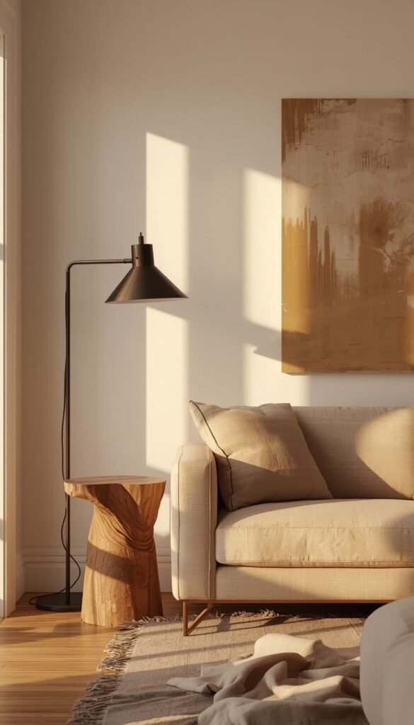
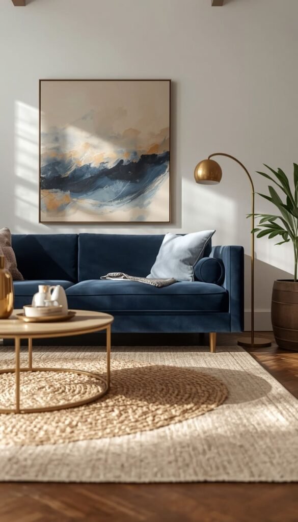
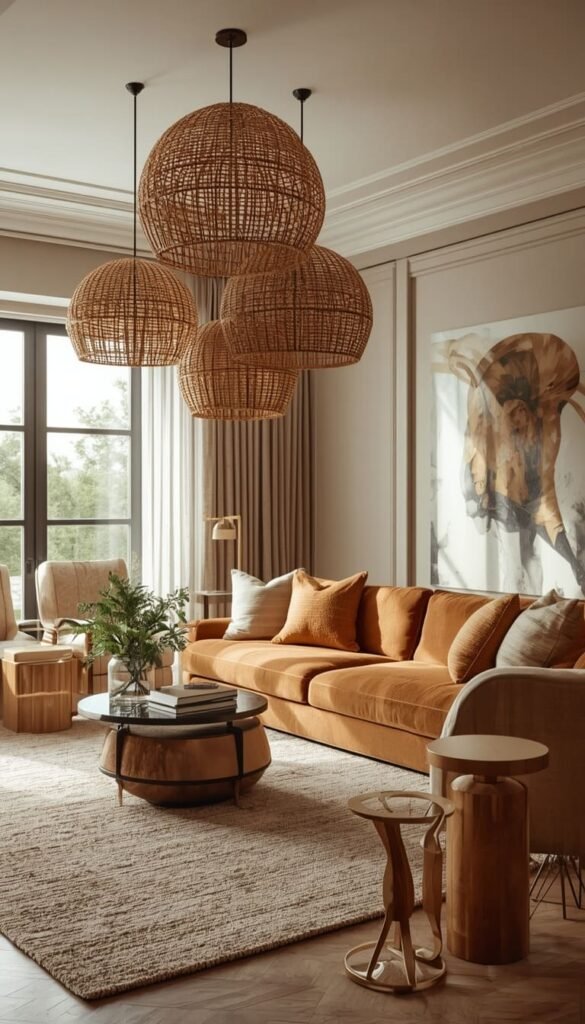
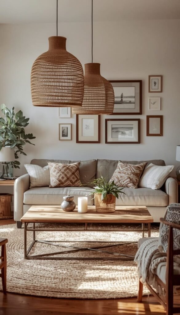
11. Luxury Cozy Interiors: Statement Lighting as the Secret Weapon
If there is one design element that separates a truly luxurious feeling room from one that just has nice furniture, it is the lighting. Always. I’ve walked into homes with $20,000 sofas that felt completely flat because the lighting was an afterthought, and I’ve walked into modest apartments that felt like boutique hotels purely because someone made thoughtful lighting decisions. It is that impactful.
Statement lighting works on two levels simultaneously. It functions as a light source and as a sculptural element essentially a piece of art that you also happen to need. In a living room, a dramatic chandelier or a cluster of pendant lights creates an instant focal point that draws the eye up and makes the ceiling feel like part of the design rather than just the top of the box you live in.
Budget reality here is worth addressing honestly. You do not need to spend $2,000 on a single fixture to get this effect. Some of my favorite finds for clients have come from CB2, Wayfair’s higher end lines, and even the occasional Target run. What matters far more than price is silhouette and finish. A sculptural rattan pendant in the right size reads as far more expensive than a cheap crystal chandelier twice its price.
- In bedrooms, always layer at least three light sources overhead, bedside, and accent
- Dimmer switches cost under $20 and change the entire mood of a room instantly
- Warm bulbs in the 2700K to 3000K range are universally flattering and make every interior feel cozier
12. Dream House Decor: Mixing High and Low Like a Pro
The homes that truly stop you in your tracks are almost never decorated entirely with expensive pieces. The ones that feel the most curated and considered are the ones where someone made smart decisions about where to spend and where to save and executed that mix with enough confidence that you genuinely cannot tell which is which.
I call this the 70-20-10 investment rule and I use it with virtually every client regardless of budget. Seventy percent of your furniture budget goes toward the pieces you touch every day your sofa, your bed, your dining chairs. These need to be quality because they take the most wear. Twenty percent goes toward one or two statement pieces that have real visual impact a great light fixture, an interesting vintage find, a piece of art. The remaining ten percent is where you can have fun at any price point with accessories, candles, books, and small decorative objects.
One thing to watch out for is over-investing in trends. A $1,500 trendy accent chair that feels dated in three years is a much worse decision than a $400 classic silhouette that you’ll love for a decade. I always encourage clients to spend real money on timeless shapes and save the trend experimentation for lower stakes pieces like throw pillows and vases things you can swap out without guilt when the mood shifts.
If you could change just one thing about your living room today, what would it be?
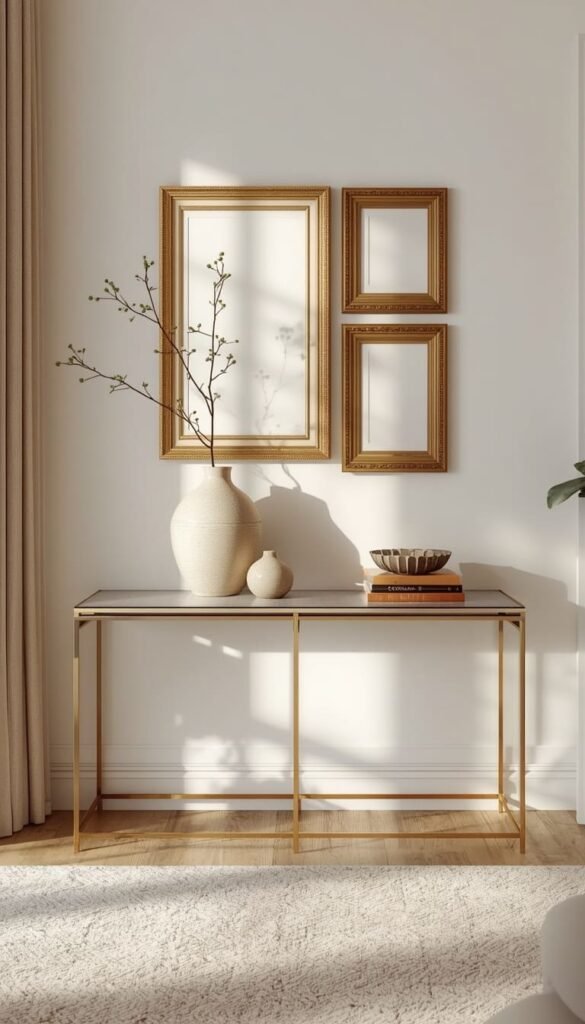
13. Elegant Home Decor: The Art of Intentional Styling
Elegance in a home isn’t about spending more money. It’s about making fewer, better decisions. I’ve seen genuinely elegant spaces put together on incredibly modest budgets, and I’ve seen cluttered, confusing rooms full of expensive things that felt anything but refined. The difference is always intentionality every object in the room earning its place.
The most practical way to bring elegance into your home is to start subtracting before you start adding. Walk through your space and identify anything that doesn’t contribute to the overall feeling you’re trying to create. Outdated knick-knacks, mismatched frames, random furniture pieces that drifted in over the years removing these costs nothing and immediately elevates what remains. Editing is genuinely one of the most underrated design skills there is.
Styling flat surfaces is where elegance either comes together or falls apart. A console table, a coffee table, a bedroom dresser these surfaces are opportunities to create small, considered vignettes rather than dumping grounds for whatever lands there. A quick trick I’ve learned is the odd number rule: group objects in threes or fives, vary the heights within the group, and always include one natural element like a plant, a stone, or a wooden object. It sounds almost too simple but it works every single time.
- Matching frames in a gallery wall read as more polished than an eclectic mix in most traditional and transitional spaces
- Fresh flowers or even a single stem in a beautiful vase add life to a room in a way no artificial alternative truly replicates
- Cohesive hardware throughout a space door handles, cabinet pulls, light switch plates creates a quiet sophistication most guests notice without knowing why
14. The Austin Project and Your Action Plan
That Austin bungalow I mentioned at the start of this article? Here’s how it actually came together and what you can take directly from it into your own home.
The couple had $3,000, a builder-grade space with zero architectural character, and a Pinterest board full of rooms that probably cost $50,000 to furnish. The first thing I did was talk them out of spreading that budget thin across every room. Instead we focused entirely on the living room first, with the philosophy that one beautifully curated space gives you the confidence and the clarity to tackle the rest of your home over time.
We spent $1,100 on a warm gray linen sofa from a mid-range retailer. We spent $680 on two oversized rattan pendant lights that we hung side by side over the seating area instead of using the existing builder fixture. Everything else the jute rug, the throw pillows, the vintage wooden coffee table found at an Austin estate sale, the gallery wall of thrifted frames came in under $1,200 combined. Total spend: just under $3,000. The result looked like something out of a shelter magazine.
The lesson isn’t about that specific budget. It’s about the approach. Curating your space means resisting the urge to do everything at once and instead making each decision count. Start with your anchor piece. Build your texture layers around it. Get your lighting right. Edit ruthlessly. And give yourself permission to do it gradually the most beautiful homes I’ve ever worked on weren’t finished in a weekend.
Your action plan is genuinely simple:
- Pick one room and identify your single anchor piece before buying anything else
- Set a realistic budget and allocate 60 to 70 percent of it to your two or three most used or most seen pieces
- Pull a mood board using only images shot in rooms with similar light to yours
- Subtract before you add edit your existing space first and see what actually needs replacing
- Give it time curating is an ongoing process, not a one weekend project
Your Quick Styling Guide
By Budget
Starter and Budget Friendly ($300 – $1,500)
- Begin with earth tones a single can of warm paint transforms a room for under $150
- Layer textures with affordable finds jute rugs, linen throws, and wooden accents from Target or IKEA
- Swap builder grade light fixtures yourself most replacements take under 30 minutes and cost $80 to $200
- Removable wallpaper for renters starts around $50 per roll and does the heavy lifting instantly
- One oversized mirror from a thrift or discount store beats ten small decorative objects every time
Luxury and Investment ($1,500 – $5,000+)
- Invest in a quality sofa first this is your anchor piece and deserves 40 to 50 percent of your room budget
- Commission or source one genuine statement light fixture this single decision elevates everything around it
- Layer in custom or semi-custom window treatments for a finish no off-the-shelf curtain can replicate
- Allocate budget for one original art piece or a high quality large format print it does what no accessory can
By Lifestyle
Busy Families and Pet Owners
- Choose performance fabrics Crypton or indoor-outdoor upholstery over any light linen or boucle
- Earth tones and medium-depth neutrals hide daily wear far better than whites or creams
- Washable slipcovers on sofas and chairs are a genuinely smart investment, not a compromise
- Skip the white rug entirely a patterned flatweave in warm tones hides everything and cleans easily
Minimalists and Calm Space Seekers
- Edit first remove before you add anything new to the space
- Stick to a maximum of three materials per room for a cohesive pulled together look
- Invest in quality over quantity one $400 ceramic lamp beats six $60 ones every time
- Keep surfaces intentionally bare a single tray corrals essentials without creating visual noise
Frequently Asked Questions
What is the easiest way to start curating my living room on a budget?
Start with subtraction, not addition. Remove anything that doesn’t serve the room’s overall feel, then identify one anchor piece to build around. Most successful budget curations start with a $100 to $300 rug or lighting swap.
How do I make a small apartment look expensive without renovating?
Floor-to-ceiling curtains, large mirrors, and warm bulb replacements do more than any furniture purchase. These three changes combined typically cost under $400 and visually double the perceived size and quality of any space.
What are the best neutral paint colors for a cozy home aesthetic in 2025?
Benjamin Moore Pale Oak OC-20 and Sherwin-Williams Antique White SW 6119 are my top two. Both read warm without going yellow, work in any lighting condition, and photograph beautifully for every style from Modern Farmhouse to Clean Girl.
How often should I refresh my home decor to keep it feeling current?
Ideally, do one small seasonal refresh every three to four months. Swap throw pillows, update a centerpiece, or rotate your art. Full room updates every three to five years keep your space feeling intentional without constant spending.
Is Scandinavian home decor still trending in American homes?
Yes, and it is actually growing stronger in its warmer hybrid form. Americans are moving away from cold stark Scandinavian looks toward hygge influenced interiors that mix natural textures, warm lighting, and lived-in comfort a trend showing no signs of slowing down.
Conclusion
Your home doesn’t need to be perfect to feel luxurious it just needs to feel like you. The difference between a space you tolerate and one you genuinely love coming home to is almost never about budget. It’s about intention. Start today with something small clear one surface, order one paint sample, move one piece of furniture to a better spot. You’ll be surprised how quickly one good decision leads to the next. So tell me what’s the one room in your home that’s been driving you crazy, and what’s been stopping you from fixing it?