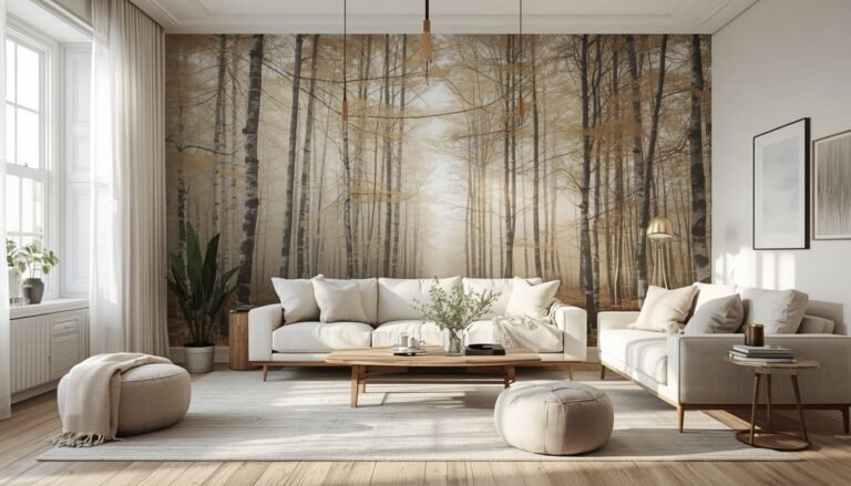
23 Classic Entryway Ideas for a Timeless Welcome
Your entryway is the first thing people see — and the last thing they forget. I’ve walked into hundreds of American homes over the years, and I can tell you this: the ones that leave a lasting impression almost always have one thing in common — a thoughtfully designed entrance that feels both welcoming and intentional. It doesn’t have to be grand or expensive. It just has to be classic. Whether you’re working with a sweeping two-story foyer or a tiny apartment nook, these 23 classic entryway ideas will help you create a space that makes every guest stop and take notice — every single time.
My Design Notes
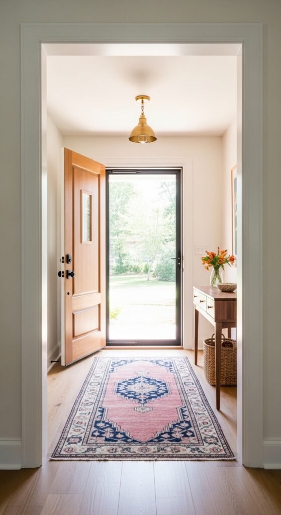
A few years back, I was called in to help a client in suburban Nashville who was completely stumped by her 1990s colonial foyer. It was a generous two-story space — the kind most people dream about — but it felt cold, echoey, and oddly unwelcoming. She had tried filling it with furniture: a massive console, an oversized round table, a huge area rug. It still felt like a hotel lobby. When I walked in, I immediately knew the problem wasn’t what was missing — it was what needed to go. We edited the entire space down to just three intentional anchors: warm Benjamin Moore White Dove on the walls, a vintage Persian runner in dusty rose and navy, and a single unlacquered brass pendant overhead. I still remember her face when she saw it finished. Total spend on changes? Just under $1,800. That project taught me something I now tell every client — a classic entryway isn’t about filling the space. It’s about honoring it.
23 Timeless Strategies to Create a Stunning and Unforgettable Entryway That Leaves a Lasting First Impression
1. The Black and White Checkerboard Floor
There is something about a classic black and white checkerboard floor that never goes out of style. I’ve specified this flooring in projects ranging from 1920s craftsman bungalows in Chicago to brand-new builds in Charlotte, and it always delivers. It grounds the entire entryway with instant visual authority — the kind that says “this home has intention.”
The beauty of this look is that it works across budgets. You have three real options here:
- Budget: Peel-and-stick vinyl tiles (around $2 to $4 per square foot) — a great renter-friendly option that actually looks surprisingly sharp
- Mid-range: Ceramic or porcelain tile ($5 to $12 per square foot installed) — durable, water-resistant, and the most practical choice for busy families
- Splurge: Genuine marble or honed limestone ($20 to $50+ per square foot installed) — absolutely stunning but requires sealing every year and shows every scuff with light-colored grout
One thing to watch out for: white grout is a maintenance nightmare in a high-traffic entryway. I always recommend a warm gray or charcoal grout instead. It gives you the same classic look without the weekly scrubbing.
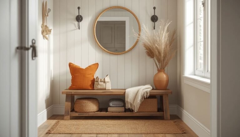
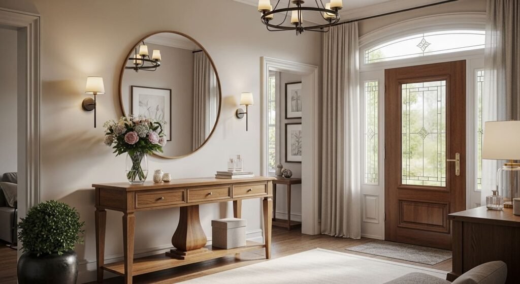
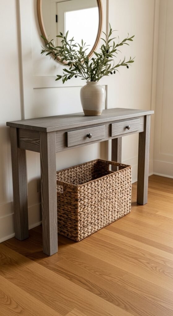
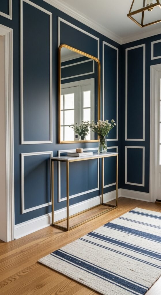
2. A Classic Console Table Done Right
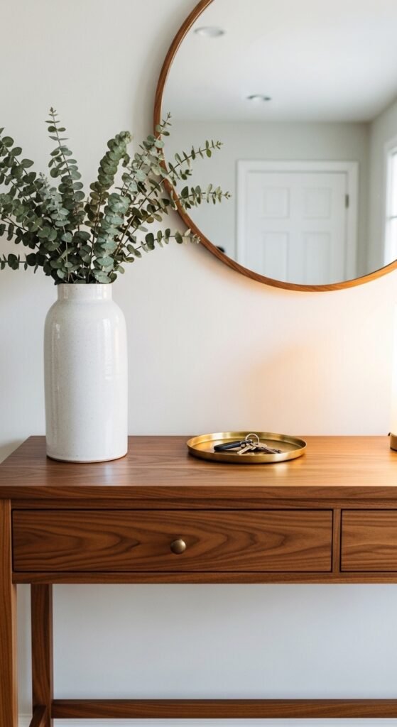
The console table is the heartbeat of any well-designed entryway. But I see homeowners make the same mistake over and over — they buy a beautiful table and then pile it with random stuff until it looks like a lost-and-found bin. A classic console table only works when you style it with intention.
Here is the styling hierarchy I follow with every client:
- Anchor first: One large mirror or artwork above the table — this is your visual centerpiece
- Layer second: A lamp on one end for warmth, a small tray or bowl for keys on the other
- Finish third: One single natural element — a vase with stems, a small potted plant, or a stack of books
Keep the surface at no more than 70% full. That remaining breathing room is what separates a styled entryway from a cluttered one. For a truly timeless look, I lean toward warm wood consoles over glass or metal — they age beautifully and feel instantly inviting the moment you walk through the door.
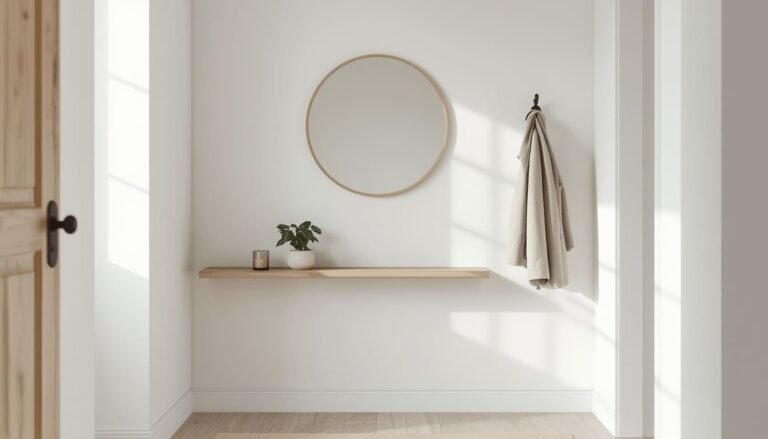
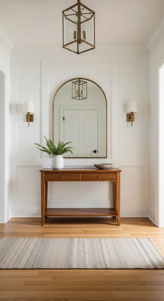
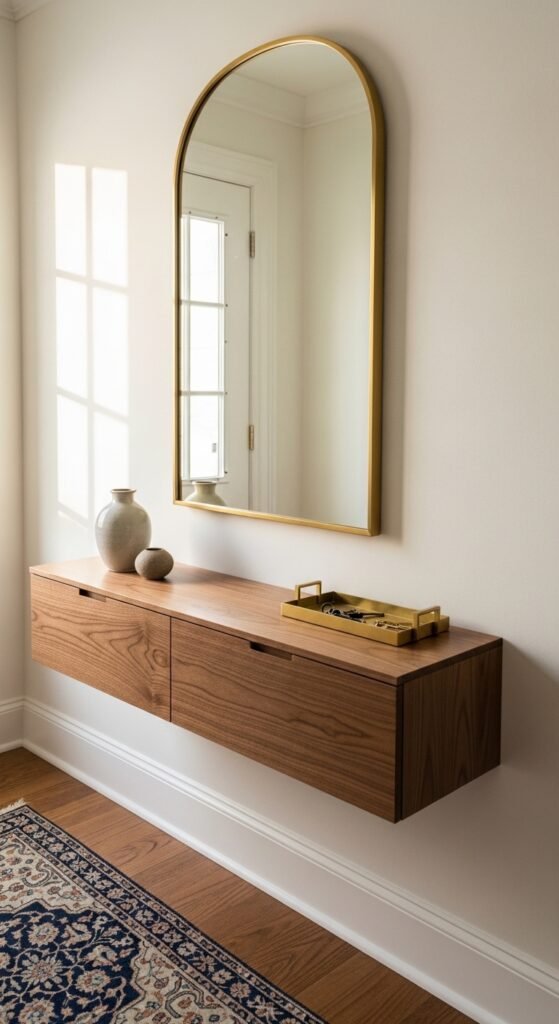
3. The Oversized Mirror Trick
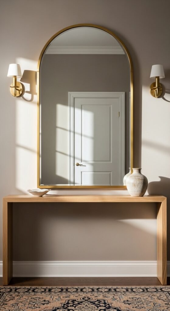
If I could give every American homeowner just one piece of entryway advice, it would be this: go bigger with your mirror than you think you should. I cannot count how many times a client has pointed to a small decorative mirror and said “I think this works” — and every single time, swapping it for something larger completely transformed the space.
An oversized mirror does three things simultaneously. It reflects light and makes the entry feel larger. It gives you a full look at your outfit before you head out the door. And most importantly, it creates an instant focal point that anchors the entire room. For a classic look, I always reach for:
- Arched or rectangular frames in unlacquered brass, matte black, or warm antique gold
- A minimum height of 36 inches — ideally 48 inches or taller for standard ceiling heights
- Placement centered above your console table with 6 to 8 inches of breathing room between the two
A quick trick I’ve learned over the years: if your entryway feels narrow, lean the mirror slightly against the wall rather than hanging it flush. It adds a relaxed, lived-in quality that feels incredibly intentional.
4. Wainscoting and Picture Frame Molding
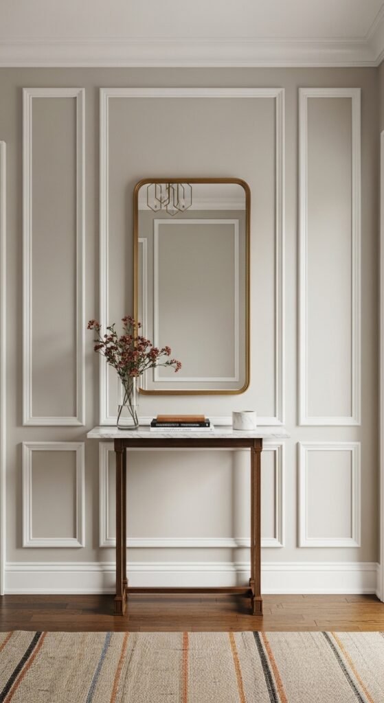
Wainscoting is one of those architectural details that instantly elevates an entryway from ordinary to genuinely refined. It adds texture, visual weight, and a sense of craftsmanship that paint alone simply cannot achieve. And in a high-traffic area like a foyer, it is as practical as it is beautiful — the paneling protects your walls from scuffs, bumps, and the general chaos of daily life.
The classic approach is to run wainscoting to about one-third of your wall height, then paint everything — panels and upper walls — in a soft, warm white like Sherwin-Williams Alabaster or Benjamin Moore Chantilly Lace. This creates a clean, cohesive look that reads as polished without feeling stiff.
If you want the look without the full renovation cost, picture frame molding is your best friend. It is essentially decorative trim applied directly onto a flat wall in rectangular patterns to mimic the look of paneling. A good carpenter can complete an average entryway in a single day for $300 to $600 in labor. The materials themselves — MDF molding strips and wood glue — will run you another $50 to $150 depending on the size of your space. For the DIY-inclined, this is genuinely one of the most rewarding weekend projects you can tackle.
Which of these ideas feels like the smartest first move for your own entryway?
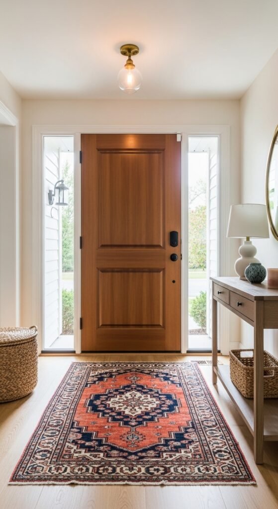
5. A Vintage or Persian Rug That Works Harder Than You Think
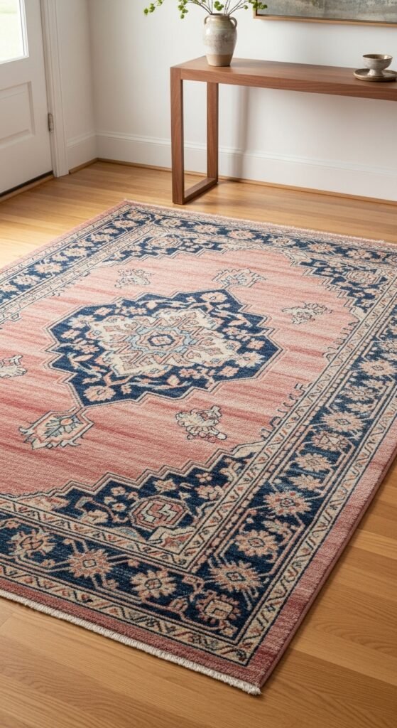
If there is one purchase I push every single client toward in their entryway, it is a vintage wool rug. Not a new synthetic from a big box store — a genuine vintage Persian, Turkish, or Moroccan piece. I know that might sound intimidating, but hear me out. Vintage wool rugs are actually more practical for entryways than most modern options, and here is why.
Wool fibers are naturally soil-resistant and incredibly durable. A well-made vintage rug has already survived decades of foot traffic — your muddy boots are not going to hurt it. The aged, slightly worn look also means that new dirt and wear blend right in rather than standing out. And the colors? Faded vintage dyes in dusty rose, navy, terracotta, and soft ivory go with virtually every classic interior palette.
One thing to watch out for is sizing. A rug that is too small will make your entryway feel disconnected and awkward. I always recommend going larger than feels comfortable — a 3×5 for a small entry, a 4×6 or larger for anything more generous. My favorite affordable sources for vintage rugs right now are Chairish, Etsy vintage sellers, and local estate sales where you can often find stunning pieces for a fraction of retail pricing.
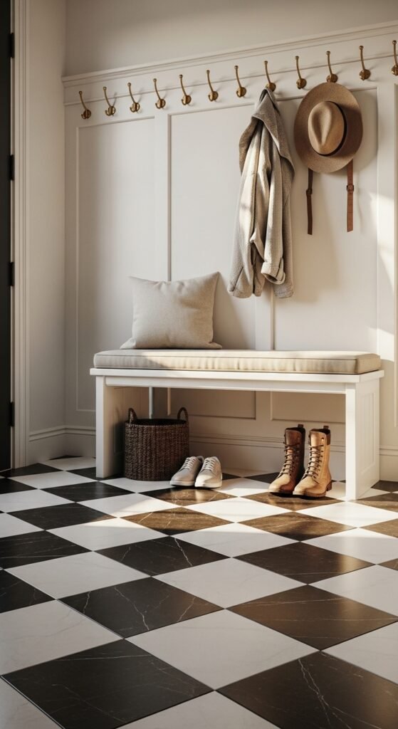
6. A Classic Bench With Hidden Storage
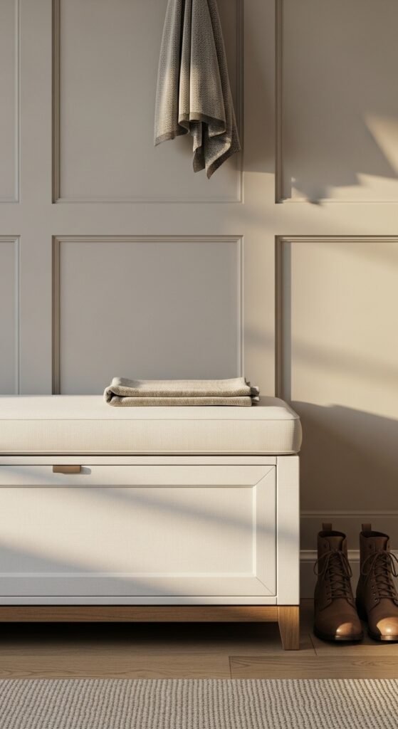
A bench in the entryway is one of those additions that sounds simple but completely changes how a space functions day to day. It gives you somewhere to sit while pulling on boots, a surface to drop bags, and — if you choose wisely — a hidden storage compartment that quietly swallows all the clutter that would otherwise live on your floor.
The styles that age best are clean-lined upholstered benches in neutral linen or leather, simple wooden shaker-style benches with lift-top storage, and cane or rattan benches for homes leaning toward a warmer, more relaxed classic aesthetic. What tends to date quickly are overly ornate carved wood pieces and anything with chrome legs trying to pass as “transitional.”
For families with kids, I always specify a bench with a hinged top. You can fit an impressive amount of shoes, sports gear, and seasonal accessories inside — and the entryway looks completely pulled together from the outside.
Top 6 Classic Entryway Ideas:
| Idea | Estimated Price | Maintenance |
|---|---|---|
| Black & White Checkerboard Floor | $2 – $50 per sq. ft. depending on material | Medium |
| Classic Console Table | $150 – $1,200 depending on wood quality | Low |
| Oversized Mirror | $80 – $600 depending on size and frame | Low |
| Wainscoting & Picture Frame Molding | $350 – $800 installed professionally | Low |
| Vintage or Persian Rug | $100 – $800 for a quality vintage piece | Low |
| Statement Chandelier or Pendant | $200 – $2,500 depending on size and finish | Low |
7. Layered Entryway Lighting That Actually Works
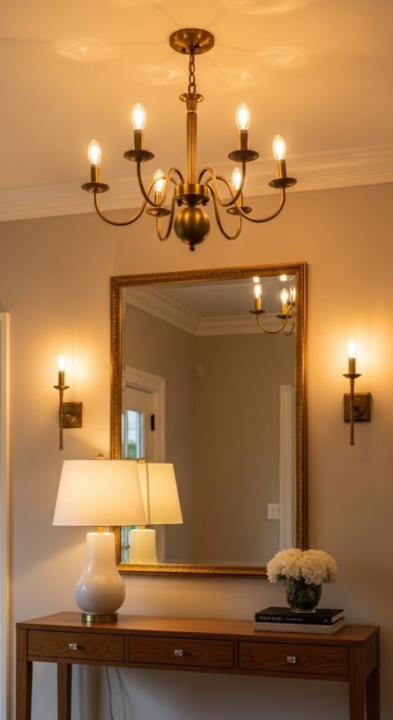
Lighting is the single most underestimated element in entryway design. Most homeowners install one overhead fixture and call it done. But a truly classic, welcoming entryway uses light the same way a well-designed living room does — in layers that work together to create warmth and depth.
The formula I use on every project is simple:
- Layer one — Overhead: A chandelier, pendant, or flush mount fixture that provides general illumination and acts as a visual anchor for the ceiling
- Layer two — Ambient: Wall sconces flanking a mirror or artwork, adding warmth at eye level and eliminating harsh shadows
- Layer three — Accent: A table lamp on your console, which brings the light down low and creates that golden, welcoming glow that makes an entryway feel like a hug when you walk in
You do not need all three layers in every space. A small apartment entryway might only have room for an overhead fixture and a single lamp. But the moment you add that third layer, even in a tiny space, the difference is immediately noticeable. Warm bulbs in the 2700K to 3000K range are non-negotiable for a classic look — cool white light in an entryway feels clinical and cold.
8. A Statement Chandelier or Pendant for Grand Foyers
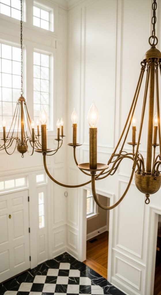
A dramatic light fixture in a two-story foyer is one of the great pleasures of classic American home design. Done right, it is the first thing every guest looks at when they walk through your front door — and it sets the entire tone for your home. Done wrong, it looks like an afterthought hanging awkwardly in too much empty space.
The rule I follow is straightforward: for every foot of ceiling height, you want roughly 2.5 to 3 inches of fixture height. So a 10-foot ceiling calls for a chandelier that is at least 25 to 30 inches tall. For two-story foyers with 18 to 20-foot ceilings, do not be afraid of a fixture that is 4 to 5 feet tall — it will look perfectly proportioned in person even if it feels enormous in the showroom.
My go-to finishes for a timeless look are unlacquered brass, which develops a beautiful patina over time, antique bronze for warmer traditional homes, and matte black for modern classic spaces. One thing to watch out for with very large chandeliers: always have a licensed electrician assess your ceiling junction box before purchase. Standard boxes are not rated for fixtures over 50 pounds, and a grand chandelier can easily exceed that.
9. Wallpaper as a Feature Wall That Makes a Statement
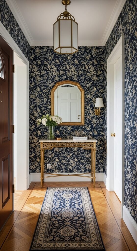
Wallpaper in an entryway is one of those design decisions that pays off in a completely disproportionate way relative to its cost. Because the entryway is typically a small, contained space, you need far less wallpaper than you would in a living room or bedroom — which means you can afford to go bold, go pattern-heavy, and go beautiful without breaking the budget.
For a classic entryway, I consistently reach for a few proven patterns. Chinoiserie prints in navy and white feel timelessly elegant and photograph beautifully. Trellis and lattice patterns add geometric structure without feeling cold. And a classic stripe in varying widths — particularly in a two-story foyer — draws the eye upward and makes ceilings feel even taller than they are.
A quick trick I’ve learned when working with patterned wallpaper in smaller entries: scale matters enormously. A large-scale pattern in a tiny entryway can feel overwhelming and busy. In spaces under 40 square feet, I always recommend a smaller repeat pattern or a texture-forward design like grasscloth or linen weave, which adds depth and warmth without visual noise.
10. Neutral Paint Colors Done Beautifully
Neutral does not mean boring. I want to be very clear about that because I see so many homeowners default to a flat, lifeless beige and wonder why their entryway feels uninspired. The secret to a beautiful neutral entryway is choosing a color with the right undertone for your specific light conditions — and that requires a little more thought than just grabbing the closest white off the shelf.
These are the five neutrals I return to again and again in classic American entryways:
- Benjamin Moore White Dove OC-17: A warm, creamy white that works in almost any light condition and pairs beautifully with wood tones
- Sherwin-Williams Alabaster SW 7008: Slightly warmer than White Dove with a faint yellow undertone — gorgeous in south-facing entries with lots of natural light
- Benjamin Moore Revere Pewter HC-172: A warm greige that adds sophistication without going dark — perfect for transitional and traditional homes
- Sherwin-Williams Accessible Beige SW 7036: My go-to for homes with warm wood flooring — it ties everything together effortlessly
- Benjamin Moore Hale Navy HC-154: For the brave client who wants drama — a deep navy entry is stunning when paired with white molding and brass hardware
Always sample your top two or three choices on the actual wall before committing. Entryway lighting — particularly in homes with limited natural light — can shift a color dramatically from what you saw on the paint chip.
What is the one thing in your entryway right now that instantly bothers you?
11. A Classic Staircase Gallery Wall
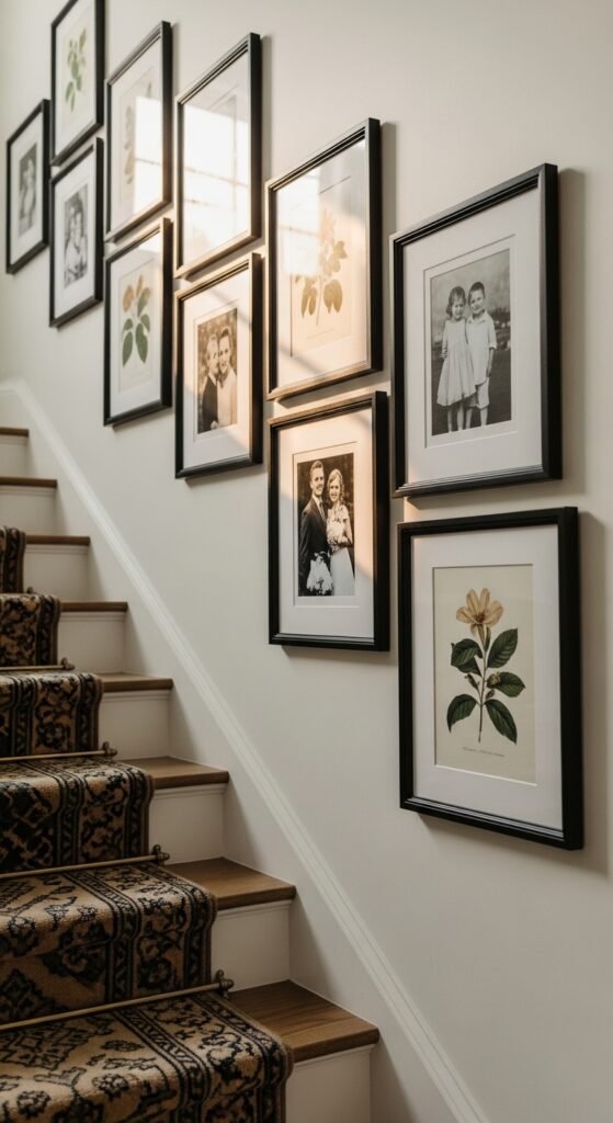
A staircase gallery wall is one of the most personal design statements you can make in an entryway — and one of the most forgiving, because there is truly no single right way to do it. I’ve styled dozens of them across projects in Atlanta, Denver, and the DC suburbs, and the ones that look best always follow a few quiet rules that make the whole arrangement feel intentional rather than chaotic.
First, commit to a consistent frame style or finish. Mixing black frames with gold frames with natural wood frames sounds eclectic but usually reads as messy. Pick one — I prefer a warm antique gold or a clean matte black — and let your artwork provide the variation instead.
Second, lay your arrangement out on the floor before a single nail goes into the wall. This sounds obvious but most people skip it and regret it immediately. Map the spacing, step back, and live with it visually for a few hours before committing.
The artwork itself does not need to be expensive or precious. Some of my favorite staircase gallery walls have included:
- Black and white family photographs in matching frames
- Vintage botanical or architectural prints sourced from Etsy for under $20 each
- A child’s artwork matted and framed properly — it looks incredibly charming alongside more formal pieces
12. Natural Wood and Warm Tones That Never Go Out of Style
There is a reason natural wood keeps appearing in classic entryway design decade after decade — it brings warmth, texture, and an organic quality that no painted or lacquered surface can fully replicate. When I walk into an entryway anchored by a beautiful wood console table or a reclaimed wood floating shelf, it immediately feels like a home rather than a showroom.
For a truly timeless look, I gravitate toward warm-toned woods like walnut, teak, white oak with a natural finish, and Douglas fir. These species age gracefully — they develop a richer patina over time rather than looking tired or dated. A gray-washed or whitewashed finish on oak or pine is also a beautiful choice for homes leaning toward a coastal classic or Scandinavian-influenced aesthetic.
One thing to watch out for is over-matching. An all-wood entryway — wood floors, wood console, wood mirror frame, wood bench — can start to feel heavy and one-dimensional. The trick is contrast. Pair your wood tones with something that pushes back: a wrought iron pendant, a white plaster wall, a brass mirror frame, or a richly patterned rug that pulls out the warm tones without repeating them literally.
13. Classic Coat Hooks and Hat Racks That Pull Their Weight
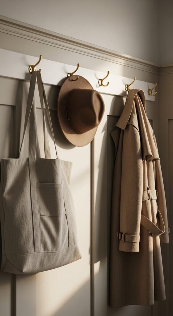
Coat hooks are one of those entryway elements that most people treat as an afterthought — a purely functional add-on that gets picked up at the hardware store on a whim. But the right set of hooks, in the right finish, mounted at the right height, can genuinely elevate the entire feel of a classic entryway. I’ve seen a simple row of unlacquered brass hooks transform a bare hallway wall into something that looks deliberately designed and completely intentional.
For a timeless look, the finishes that consistently hold up are unlacquered brass, oil-rubbed bronze, matte black, and antique nickel. Avoid anything too shiny or overly polished — high-gloss chrome reads as dated very quickly in a classic interior. Mount your hooks at around 60 to 66 inches from the floor for adult coats, and if you have children, add a lower row at 40 to 45 inches so they can actually reach their own jackets independently.
A beautifully simple approach I love for traditional homes is a Shaker-style peg rail running the full length of one wall. It is incredibly functional, holds coats, bags, hats, and dog leashes with ease, and looks like it has always belonged in the house.
14. A Sculptural Table That Breaks the Console Rule
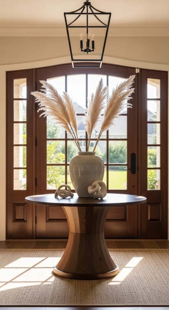
Here is something I tell clients who feel like their entryway is stuck in a predictable formula: you do not always need a console table. Sometimes the most classic and confident design move is to place something completely unexpected at the center of your foyer — a round pedestal table, an angular sculptural piece, or an antique demilune that stops people in their tracks the moment they step inside.
A round table works particularly well in larger, square-shaped foyers where a long console would feel awkward against the wall. Style it simply — a generous vase with branches or seasonal stems, one beautiful object, and nothing else. The restraint is the point.
For smaller entries, a wall-mounted floating shelf or a narrow demilune console in a curved silhouette can provide the same sculptural quality without consuming precious floor space. The key distinction I always make with clients is this:
- A console table says “organized and welcoming”
- A sculptural piece says “this home has a point of view”
Both are correct. It just depends on the story you want your entryway to tell from the very first glance.
15. Greenery and Natural Elements That Actually Survive
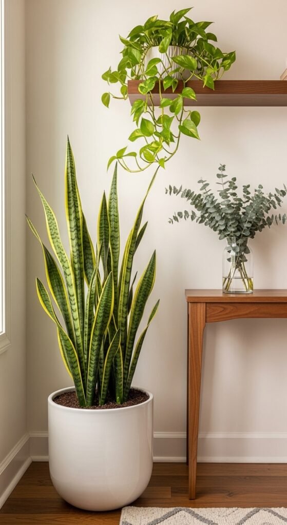
I am a firm believer that every entryway needs at least one living or natural element. It signals care, warmth, and life in a way that no decorative object can fully replicate. But I also have to be honest with you — most entryways are genuinely challenging environments for plants. Low light, temperature fluctuations near the front door, and the reality that nobody remembers to water the plant by the door mean that many beautiful green additions end up as sad, crispy casualties within a few months.
The plants that actually thrive in entryway conditions are:
- Pothos: Nearly indestructible, tolerates low light beautifully, and trails gracefully over a console table or shelf
- Cast iron plant: Lives up to its name — handles low light, inconsistent watering, and temperature swings without complaint
- Snake plant: Architectural, sculptural, and almost impossible to kill — perfect for a classic entryway that needs a vertical element
If you truly cannot commit to a live plant, do not reach for fake greenery from a craft store. Instead, invest in a beautiful vase and rotate seasonal cut stems — eucalyptus, dried pampas, olive branches, or fresh tulips in spring. It costs very little and the effect is genuinely stunning. A quick trick I’ve learned: a single large branch of magnolia or dogwood in a tall floor vase creates more drama and warmth than an entire shelf of small accessories combined.
16. Porcelain Tile for High Traffic Entries
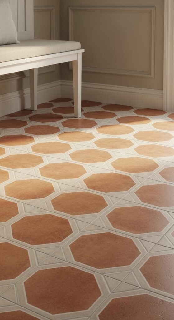
Choosing the right flooring for an entryway is one of the most consequential design decisions you will make in that space — and it is also one of the most permanent. I always steer clients toward porcelain tile for entries that see heavy daily traffic, particularly in regions with harsh winters, rainy seasons, or the general chaos of a busy family household.
Porcelain is denser and less porous than ceramic, which means it resists moisture, staining, and freeze-thaw damage far better than most alternatives. It is also incredibly low maintenance compared to natural stone, which requires regular sealing and careful cleaning products.
The patterns that consistently deliver the most timeless results are:
- Encaustic-style cement look tiles in geometric patterns — incredibly popular right now but rooted in centuries of European design tradition
- Large format porcelain in a warm greige or stone look — clean, sophisticated, and virtually maintenance free
- Classic brick-set or herringbone layouts in a neutral body tile — the pattern does the visual work so the color can stay quiet
One thing to watch out for that nobody talks about enough: light-colored grout in an entryway is a decision you will regret within the first month. Always specify a mid-tone or dark grout in high-traffic entries. Your future self will be genuinely grateful.
If you could upgrade just one piece today, would it be lighting, storage, or flooring?
17. Carving Out an Entryway in an Open Concept Home
This is one of the most common challenges I encounter with American homes built between the 1980s and early 2000s. The front door opens directly into the living room, there is no visual separation, no sense of arrival, and the whole entry experience feels abrupt and undefined. The good news is that you do not need walls or a renovation to fix this. You just need the right design strategy.
The approach I use most consistently is what I call the rug-and-anchor method. Place a distinctly different rug — in pattern, texture, or color — just inside the front door to visually define a landing zone. Then anchor that zone with one piece of furniture: a narrow console table, a small bench, or even a single accent chair placed with its back to the living room. That single piece of furniture creates a psychological boundary that makes the brain read “entryway” even in a completely open floor plan.
A few additional tricks that work beautifully in open concept homes:
- A pendant light or small chandelier hung directly above your defined entry zone signals “this area is different” without any physical barrier
- A small area rug in a contrasting pattern to whatever runs through your main living space creates instant visual separation
- A tall plant or floor lamp placed at the edge of your defined zone acts as a soft architectural divider that guides traffic naturally
The goal is not to build a room — it is to create a moment. That brief pause between outside and inside that every well-designed home provides.
18. Small Classic Entryway Ideas That Maximize Every Inch
Working with a small entryway is not a limitation — it is actually an opportunity to be more intentional and more curated than you could ever be in a larger space. Some of the most jaw-dropping entryways I have ever designed measured under 30 square feet. The secret is ruthless editing combined with very deliberate vertical thinking.
In a small classic entryway, the floor is premium real estate. Every piece of furniture that touches the floor needs to justify its presence completely. This is where wall-mounted solutions become your greatest allies:
- A floating console or wall-mounted shelf keeps the floor visually clear and makes the space feel larger instantly
- Hooks mounted directly to the wall replace a bulky coat rack without sacrificing function
- A narrow mirror — tall and lean rather than wide and short — draws the eye upward and creates the illusion of height
One thing I always tell clients with small entries: do not try to do everything. Pick two priorities — storage or style — and execute them beautifully rather than cramming in five mediocre solutions. A small entry with one stunning mirror, one beautiful rug, and one well-styled floating shelf will always outperform a cramped space stuffed with furniture trying to solve every problem at once.
19. The Classic Entryway Color Palette
Color is where so many otherwise well-designed entryways fall apart. Either the homeowner plays it so safe that the space feels completely forgettable, or they go so bold that the entry feels disconnected from the rest of the home. The sweet spot — and this is something I have refined over years of working with American homeowners across very different regional tastes — is choosing a palette that feels considered, cohesive, and deeply connected to the rooms that flow from it.
For a truly classic American entryway, these are the color relationships that work most reliably:
- Warm white walls with natural wood accents and brass hardware: Clean, timeless, and flattering in almost any light condition — this combination works in everything from a Cape Cod cottage to a Georgian colonial
- Soft greige with black iron details and a patterned rug: Sophisticated and grounded — particularly beautiful in transitional homes that blend traditional and contemporary elements
- Deep navy or forest green walls with white molding and antique gold: Dramatic and confident — best reserved for self-contained foyers where the bold color has clear boundaries
The transition between your entryway color and the adjoining rooms matters enormously. I always pull at least one color from the adjacent space into the entryway — whether through a rug, an accent pillow on a bench, or the artwork on the wall. It creates a visual thread that makes the whole home feel intentionally designed rather than decorated room by room in isolation.
20. Built In Storage That Looks Completely Custom
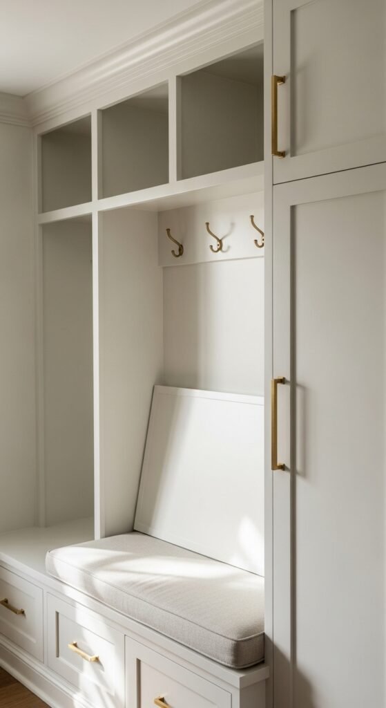
True built-ins are one of the most coveted features in classic American entryway design — and also one of the most expensive. A genuine custom built-in with cabinetry, shelving, and integrated bench seating can easily run $3,000 to $8,000 or more depending on your market and the complexity of the design. But here is what most homeowners do not realize: you can achieve an almost identical look for a fraction of that cost with the right freestanding pieces and a little creative finishing work.
The approach I recommend most often combines IKEA’s HEMNES or PAX cabinet systems with custom hardware, a coat of paint in your chosen wall color, and simple trim work added around the edges to make the units appear built into the wall. When done well — and it genuinely is not difficult — guests consistently assume it is a fully custom installation.
The elements that sell the illusion completely are:
- Painting the cabinets the exact same color as the surrounding walls so they read as architectural rather than furniture
- Replacing stock hardware with high-quality knobs or pulls in unlacquered brass or oil-rubbed bronze
- Adding a simple crown molding detail at the top of the unit where it meets the ceiling
For families with multiple members, I love designing these built-ins with a dedicated cubby or hook section for each person. It sounds almost too practical to be stylish — but a well-executed built-in storage wall in a classic entryway is genuinely one of the highest-impact, highest-satisfaction projects I deliver.
21. Personalized Touches That Stay Timeless
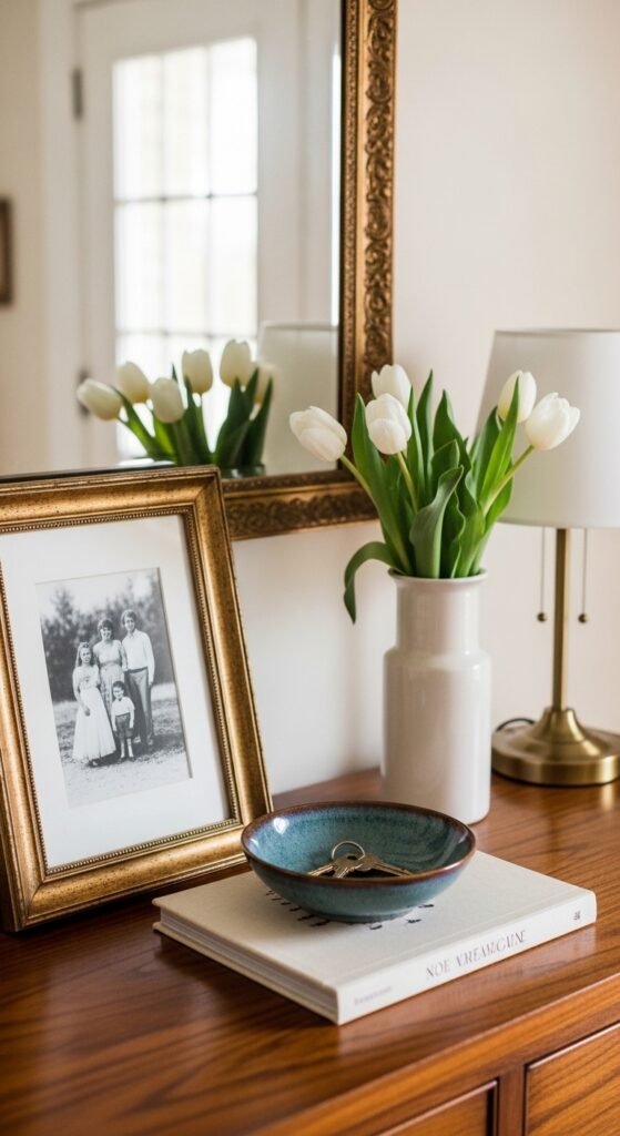
There is a fine line between an entryway that feels personal and one that feels cluttered. I have walked into homes where every surface is covered with meaningful objects — travel souvenirs, family photos, collected trinkets — and instead of feeling warm and inviting, the space feels visually exhausting before you have even taken your coat off. The goal with personalization in a classic entryway is to be selective, intentional, and edited.
The rule I give every client is this: choose two or three deeply personal elements and let everything else stay quiet and neutral around them. A single framed photograph matted beautifully and hung with intention reads as far more meaningful than a dozen photos competing for attention on the same wall.
The personal touches that age most gracefully in a classic entryway are:
- A family heirloom piece — an antique chair, a vintage mirror, or a grandmother’s console table that carries genuine history and patina
- Meaningful artwork — a painting from a trip, a print connected to your family’s heritage, or even a beautifully framed piece of a child’s early artwork
- A single cherished object on the console — a ceramic vase passed down through generations, a sculpture collected on a meaningful journey, or a bowl that simply makes you smile every time you see it
One thing to watch out for is seasonal over-decorating. Swapping every decorative element four times a year can strip an entryway of the consistent identity that makes it feel genuinely classic. Instead, keep your anchors permanent and swap just one or two accent pieces — a vase of fresh stems, a seasonal wreath on the door — to acknowledge the changing seasons without losing your design thread.
Does your entryway feel welcoming when you walk in, or does it still need work?
22. Modern Classic Entryway Ideas That Bridge Old and New
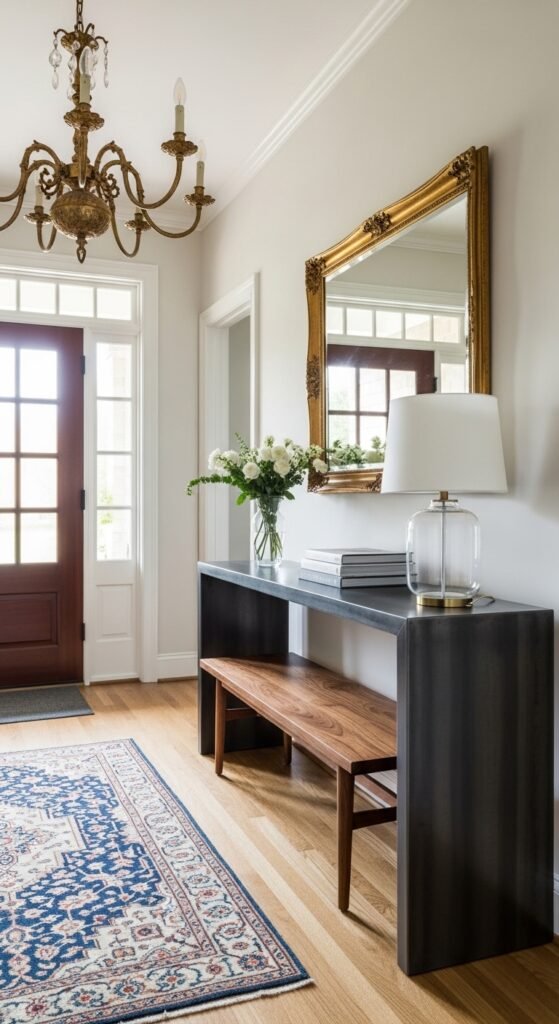
The modern classic aesthetic is honestly one of my favorite design challenges because it requires real restraint and a confident eye. The goal is to honor traditional design principles — symmetry, quality materials, architectural detail — while keeping the overall feel fresh, edited, and very much of the current moment. Get the balance wrong and it tips either into cold minimalism or fussy traditionalism. Get it right and the result is genuinely timeless.
The combinations that work most consistently in American homes are pairing a mid-century modern bench in walnut with a classically framed antique mirror above it. Or placing a clean-lined contemporary console in blackened steel beneath an ornate gilded chandelier. The contrast between old and new creates a tension that feels alive and intentional rather than decorator-safe and predictable.
A few principles I follow when bridging modern and classic in an entryway:
- Let one element be traditional and one be contemporary — never split the room evenly between both aesthetics or it feels unresolved
- Use material quality as your unifying thread — genuine leather, solid wood, natural stone, and hand-forged metal read as timeless regardless of whether the silhouette is traditional or modern
- Keep your color palette tight — a modern classic entryway in two or three carefully chosen neutrals will always feel more sophisticated than one with five competing colors trying to tie the two aesthetics together
The homes I have worked on where this balance is achieved most beautifully are almost always the ones where the client trusted the edit. Less truly is more when you are working at the intersection of two strong design languages.
23. The No Entryway Home Solution
Not every American home was built with a proper entryway — and if you live in a ranch house, a mid-century split level, or a newer open-concept build, you know exactly what I mean. The front door swings open and you are immediately, uncomfortably, standing in the middle of the living room with nowhere to put your coat, your keys, or your wet umbrella. It is one of the most common frustrations I hear from homeowners across the country.
The solution is not to wish for architecture you do not have. It is to create the experience of an entryway through design alone — and done well, it works beautifully. I have transformed dozens of doorless living rooms into homes that feel like they have always had a proper welcoming entry, using nothing more than furniture placement, lighting, and a few carefully chosen accessories.
The framework I use every time starts with three non-negotiable anchors. First, define the zone with a rug placed directly inside the front door — it should be visually distinct from whatever flooring or rug runs through your main living space. Second, place a single piece of furniture with its back to the room: a narrow console, a small bench, or even a graceful accent table. This creates a psychological barrier that the brain immediately reads as a separate space. Third, add one overhead light source directly above that defined zone — a pendant, a small chandelier, or even a plug-in swag light if hardwiring is not an option.
What makes this work is commitment. The moment you start second-guessing the furniture placement or removing the rug because it feels like too much, the illusion dissolves. Lean into the defined zone fully, style it with the same intention you would give a proper foyer, and your home will feel completely transformed from the very first step inside.
Your 2 Minute Entryway Decision Map
By Budget
Starter Entry (Under $500)
- Peel-and-stick checkerboard floor tiles for instant impact
- A vintage Persian rug from Etsy or a local estate sale
- Picture frame molding as a DIY weekend project
- One oversized mirror from HomeGoods or Target
- A simple shaker-style bench with lift-top storage
- Plug-in swag pendant for the no-hardwiring homes
Investment Entry ($500 and Above)
- Genuine porcelain tile in a classic encaustic pattern
- Custom or semi-custom built-in storage with integrated bench
- Unlacquered brass chandelier scaled to ceiling height
- A solid walnut or Douglas fir console table
- Professional wainscoting installation with crown molding finish
- A hand-knotted vintage Turkish or Persian rug in wool
By Lifestyle
Busy Families with Kids and Pets
- Built-in cubbies with one dedicated section per family member
- Porcelain tile floors — avoid light grout at all costs
- Lift-top bench storage to hide the daily chaos beautifully
- Washable vintage wool rug — hides wear far better than synthetics
- Oil-rubbed bronze or matte black hooks — fingerprints disappear
Design Forward Minimalists
- One sculptural table instead of a standard console
- A single oversized mirror as the only wall element
- Wall-mounted floating shelf — keep the floor completely clear
- Two or three carefully chosen personal objects — nothing more
- Tight two-color palette with one material doing all the work
Frequently Asked Questions
What is the most timeless entryway style for an American home?
Classic traditional and transitional styles age the best. Think warm neutrals, natural wood, brass hardware, and a vintage rug — these elements work across decades without ever feeling dated.
How do I make a small entryway look expensive?
One oversized mirror, a floating shelf, and quality hardware will do more than a room full of budget furniture. Edit ruthlessly — less is genuinely more in a tight space.
What flooring is best for a high traffic entryway?
Porcelain tile is my top recommendation every time. It handles moisture, dirt, and heavy foot traffic better than hardwood or carpet — and it looks beautiful for decades with almost zero maintenance.
How much does it cost to decorate an entryway from scratch?
A well-designed entry can come together for $300 to $500 on a tight budget. A mid-range refresh with quality pieces typically runs $1,000 to $3,000 depending on your market and material choices.
Do I need a console table in my entryway?
No — but you do need one anchor piece. A bench, a floating shelf, or even a sculptural round table works just as well. The goal is one intentional focal point, not a specific furniture formula.
Conclusion
Your entryway does not need to be perfect — it just needs to feel like you. Even one small change, whether that is hanging a mirror you have been putting off or finally rolling out that vintage rug sitting in your cart, can completely shift how your home feels the moment you walk through the door every single day. Start with one idea from this list that genuinely excites you, take that first step this week, and build from there. Your home is your sanctuary — it deserves that attention.