
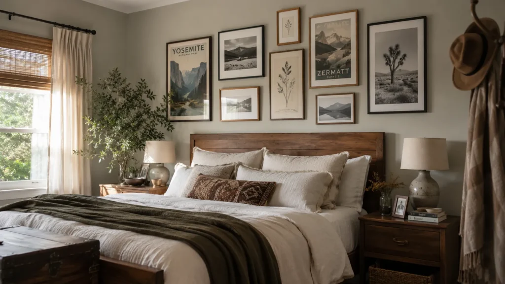
Your bedroom walls are basically a blank canvas begging for a personality upgrade. I’ve walked into hundreds of client rooms over the years, and I can spot a bare wall’s missing potential from the doorway. Posters are still one of the fastest, cheapest ways to make a rented apartment or a college dorm feel like yours, without touching your security deposit. The trick isn’t just picking pretty prints. It’s knowing which styles, sizes, and setups actually pull a room together instead of making it look like a leftover bulletin board.
My Design Notes
I still think about a project I worked on for a first year grad student near UT Austin. She had a strict no nail holes clause in her lease and about $150 to spend on the entire room. We skipped the single big art piece idea and went with a small curated collection instead. Two vintage travel posters, one black and white print, and a mix of thrifted frames that didn’t match on purpose. Everything went up with Command strips, and none of it touched her deposit when she moved out a year later. What made the room work wasn’t the money we spent. It was the restraint. We picked three pieces that actually spoke to each other instead of ten that just filled space. I use that lesson with clients all the time now, no matter their budget.
Stunning Poster Ideas to Elevate Your Room’s Style
1. Vintage and Retro Travel Posters
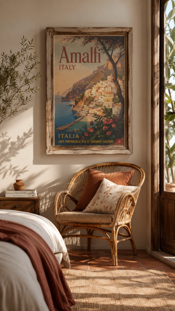
There’s something about an old school travel poster that makes a room feel lived in in the best way. Think faded color palettes, mid century typography, and destinations like Paris, the Grand Canyon, or the Amalfi Coast. These work beautifully in a Modern Farmhouse or Transitional bedroom because they bring in warmth without fighting the neutral tones already in the room.
Size matters more than people think here. A single 18×24 print centered above a dresser reads as intentional. Three small ones scattered with no spacing plan just reads busy. My rule of thumb is to keep travel posters to about two thirds the width of the furniture beneath them.
2. Black and White Photography Prints
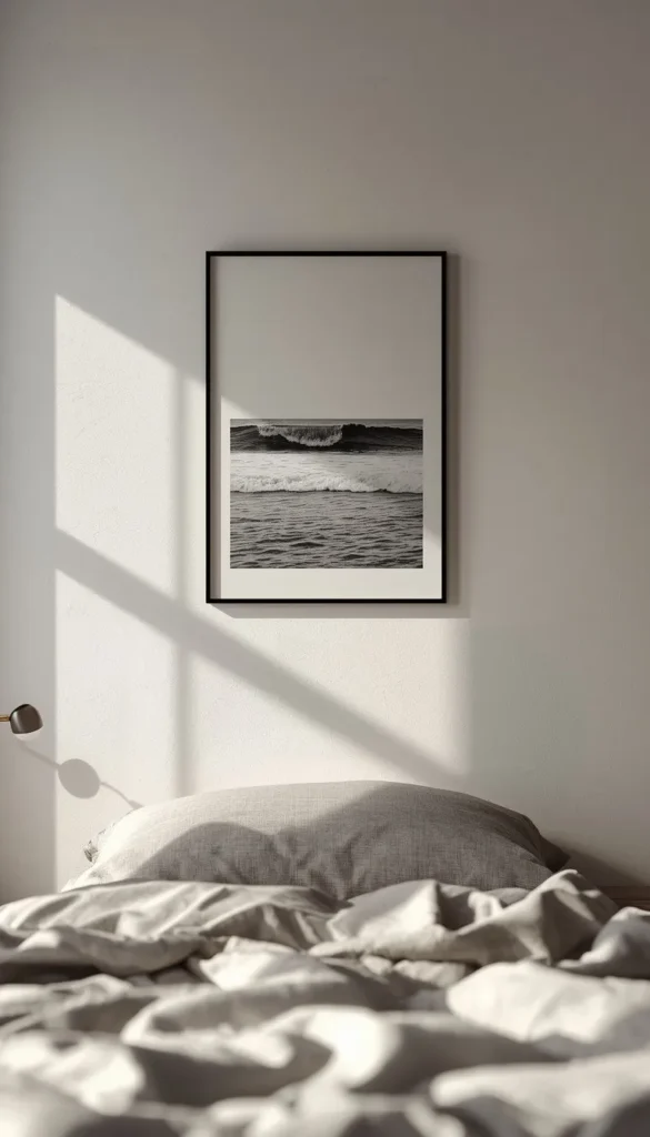
If you want a bedroom that feels calm and a little editorial, black and white photography is the move. City skylines, ocean waves, architectural shots. They all work because they don’t compete with your bedding or rug colors.
Framing is where people either get this right or waste money. A thin black metal frame gives it a gallery feel for under thirty dollars. Going frameless with just poster tape saves money upfront, but the paper tends to curl at the corners within a few months, especially in rooms with a lot of natural light. If longevity matters to you, spend the extra ten dollars on the frame.
3. Botanical and Nature Line Art
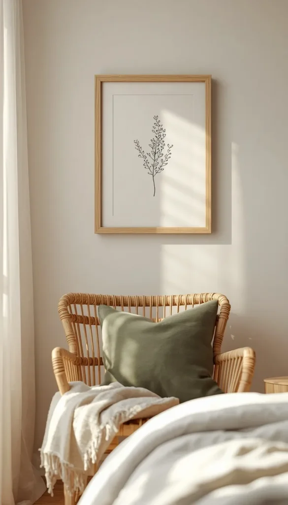
Botanical prints are the easiest way to soften a room that feels too stark or too modern. Simple line drawings of leaves, florals, or branches bring a Scandinavian or Japandi feel without turning the space into a greenhouse.
A trick I use with clients constantly is matching the ink color of the print to one other element in the room, like a lamp base or a throw pillow. It sounds like a small thing but it’s what makes the poster look chosen rather than grabbed off a shelf. Sage greens and warm terracottas tend to pair well with most wood tones common in American bedrooms right now.
4. Abstract Minimalist Prints
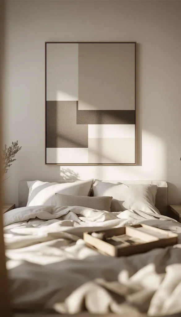
Abstract prints are forgiving. Odd shapes, muted color blocks, gentle gradients, they all sit well in almost any style of room, which is exactly why I recommend them to clients who aren’t sure what their style even is yet.
Budget wise, this category is where you can actually spend less and still look polished.
- A single large abstract print often costs less than three small ones combined
- Print shops and online marketplaces run frequent sales on oversized minimalist art
- A slightly imperfect placement barely shows on abstract pieces the way it would on a photo or portrait
Which one of these thirteen ideas do you already have hanging up somewhere in your home?
5. Music and Band Posters
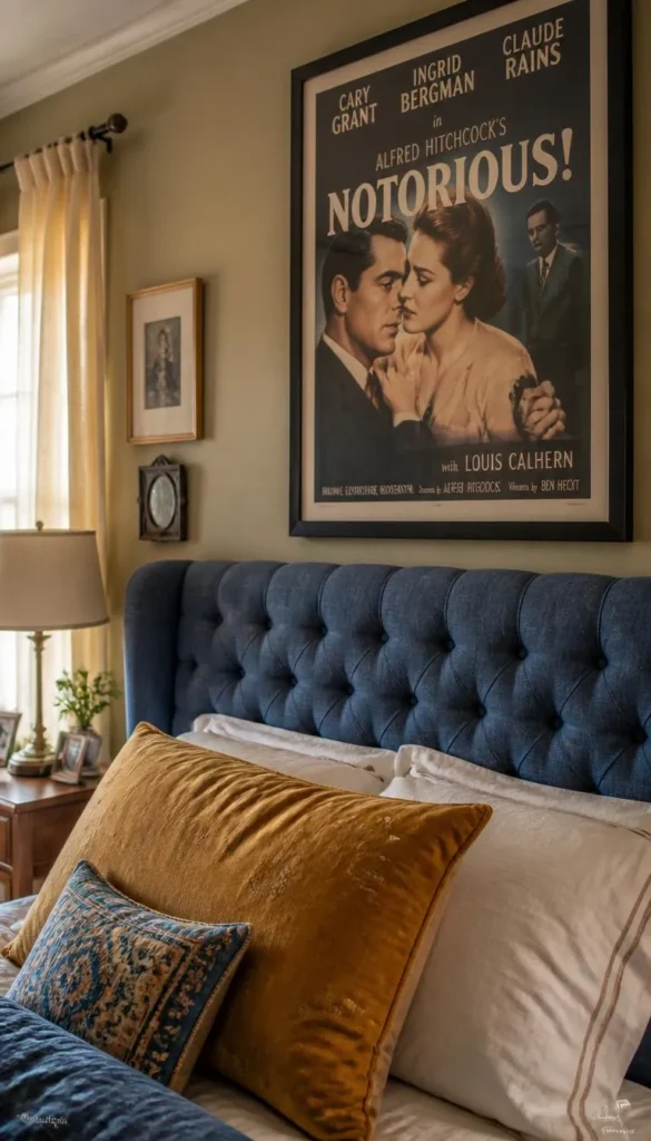
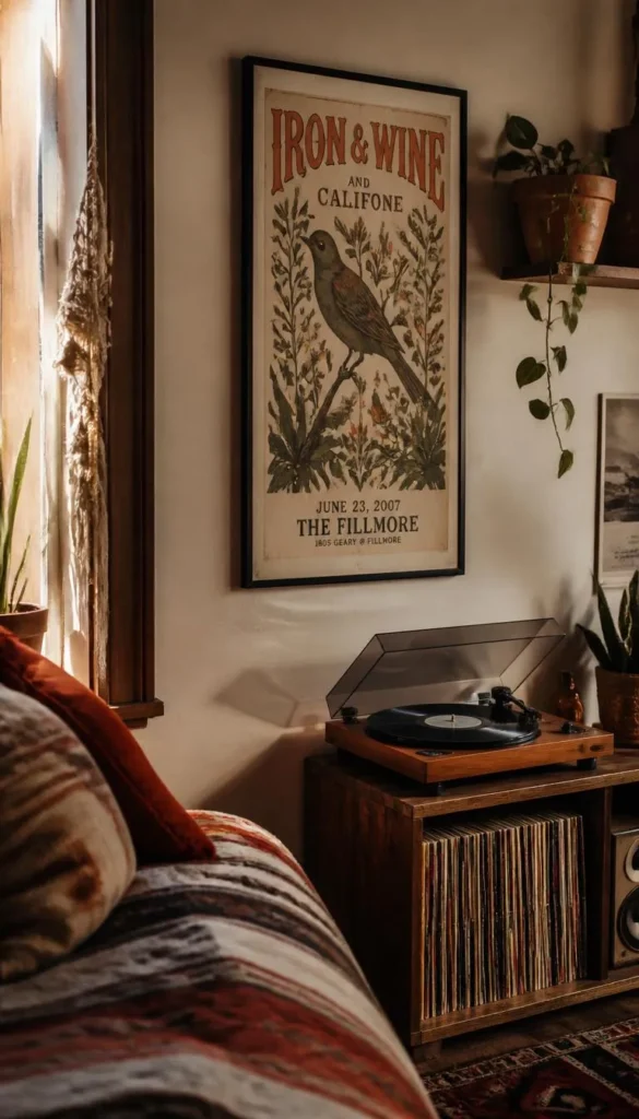
Music posters get a bad reputation because most people picture the classic dorm room wall covered edge to edge with mismatched rock posters and no breathing room. It doesn’t have to look like that. A concert poster from a favorite tour, framed the same way you’d frame any art print, holds its own next to more traditional pieces.
The trick is restraint. Pick one or two posters that actually mean something to you rather than filling the whole wall with band names. Give them space around the edges instead of butting them right up against other frames.
6. Anime and Pop Culture Posters
Anime posters can absolutely look intentional instead of like something taped up in a hurry. The key is treating them the same way you’d treat any other art category, meaning consistent framing and thoughtful placement rather than a cluster taped straight to the wall.
A few things that instantly upgrade an anime or pop culture poster wall:
- Match frame colors across the whole set, even if the art styles vary
- Leave equal spacing between each piece instead of eyeballing it
- Choose one dominant color from the artwork and echo it somewhere else in the room, like a desk chair or curtain
Done this way, it reads as curated fandom rather than clutter, and it holds up fine in a Transitional or eclectic style room.
Top 6 posters for my room ideas
| Idea | Estimated Price | Maintenance |
|---|---|---|
| Vintage Travel Posters | $15 – $35 per print | Low |
| Black and White Photography | $20 – $50 framed | Low |
| Botanical Line Art | $10 – $25 per print | Low |
| Abstract Minimalist Prints | $20 – $60 for a large piece | Low |
| Movie Posters | $15 – $40 per print | Medium |
| Custom and Personalized Prints | $35 – $70 with framing | Medium |
7. Typography and Quote Posters
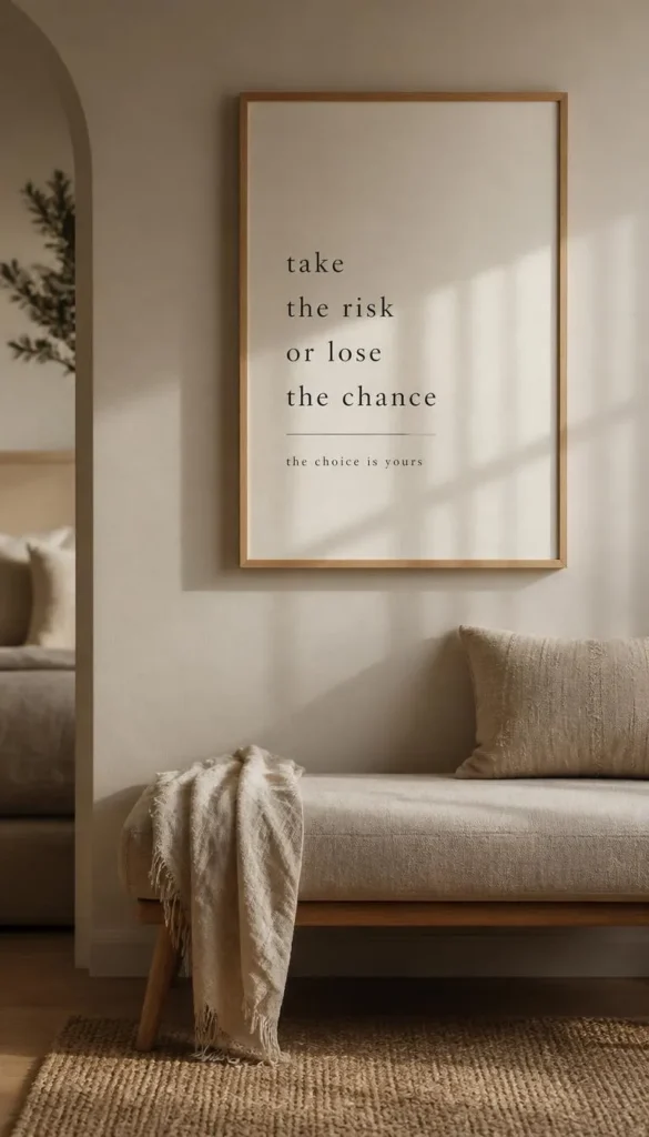
Word based art has a way of setting the tone for a whole room, sometimes more than an image can. A short phrase in a clean, modern font over a neutral background works well above a headboard or reading nook.
One thing I always tell renters specifically is to skip anything that requires nails or adhesive strong enough to peel paint. Command strips rated for the poster’s weight hold up fine for typography prints since they’re usually lightweight paper anyway, and they come off clean at move out without leaving marks behind.
8. City and Map Prints
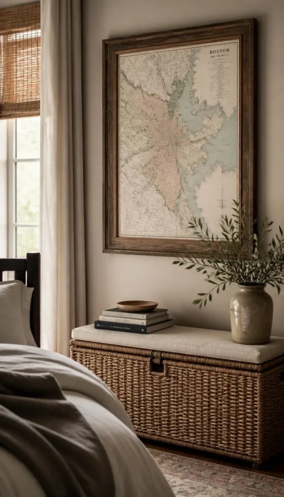
City skyline prints and vintage map reproductions bring in a sense of place, which is especially nice for anyone who moved away from home or has a city they love visiting. They also tend to work in almost any design style since maps and skylines read as neutral, timeless content.
Hanging height actually matters a lot here since these prints often get placed too high just because people assume bigger art belongs higher up. The general rule I use with clients is centering the artwork at about fifty seven inches from the floor, which is standard eye level, regardless of ceiling height. Above a bed, aim for the bottom of the frame to sit roughly six to eight inches above the headboard.
If you had to pick just one wall to redo this weekend, which room would it be?
9. Movie Posters as Wall Art
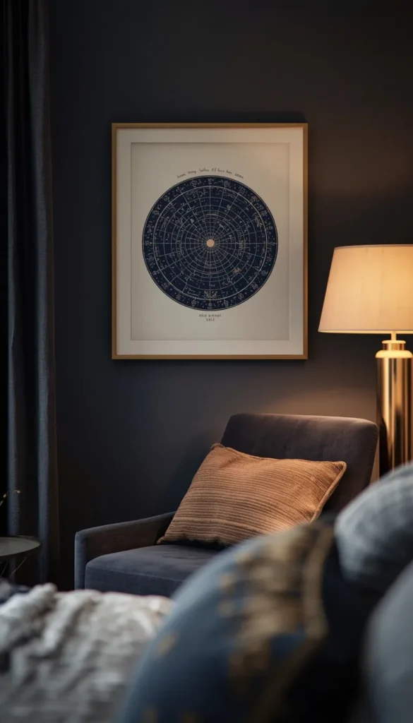
A well chosen movie poster, especially an original release style print, can anchor a room the same way a piece of fine art would. Classic film posters in particular have a graphic quality that holds up next to more traditional decor, which is why I’ve used them in eclectic and even some higher end Transitional spaces without it looking out of place.
Sun exposure is the real enemy here. Cheaper print stock fades fast in direct sunlight, sometimes within a single season if the poster hangs near a south facing window. If your room gets a lot of natural light, look for prints on heavier matte paper or keep the poster on an interior wall where it’s out of the sun’s direct path.
10. Custom and Personalized Prints
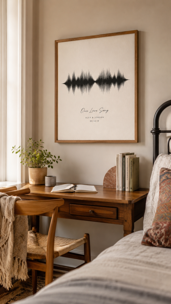
Custom prints let you put something on your wall that nobody else has, whether that’s a favorite song’s soundwave art, a map centered on a meaningful location, or a photo turned into a stylized print. They tend to cost a bit more than mass produced posters, but the emotional payoff is usually worth it for at least one piece in the room.
Cost wise, expect custom prints to run higher than off the shelf options once you factor in the design work.
- A basic custom print typically starts around twenty to thirty dollars before framing
- Framing adds another fifteen to forty dollars depending on size and material
- Rush printing services often charge a premium, so ordering with a few weeks of lead time saves money
Even one custom piece mixed in with more affordable prints can make the whole wall feel personal instead of purchased.
11. Mixed Collage or Moodboard Walls
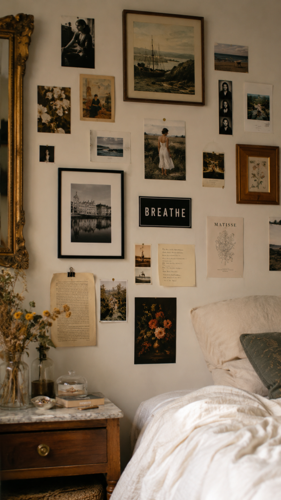
A moodboard style wall, where different sizes and styles of posters and photos overlap in a loose grid, has become one of the most requested looks I get from younger clients. Done well, it feels like a scrapbook of someone’s actual life and interests. Done poorly, it just looks like a wall nobody finished decorating.
The most common mistake I see is overcrowding, where every inch of wall space gets filled and there’s no visual rest for the eye. Leaving a bit of breathing room between clusters, and keeping a loose color theme running through the collage, is usually all it takes to pull a moodboard wall from chaotic to intentional.
12. Neutral Aesthetic Prints
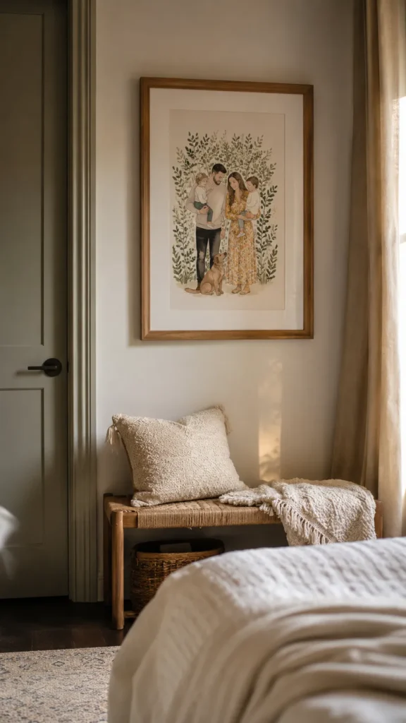
Neutral, softly toned prints, the kind you see all over Pinterest and home decor boards right now, work because they’re inherently calming and pair with almost any bedding or furniture color. Beige, cream, and muted sage tones dominate this category for good reason.
The risk with neutral prints is that they can start to feel generic if every single piece in the room comes from the same aesthetic mood board. I usually tell clients to mix in one piece with a bit more contrast or color, even if it’s small, just so the room doesn’t read as flat.
Are you more of a “one big statement piece” person or a “gallery wall with lots of small pieces” person
13. Color Matched Print Sets
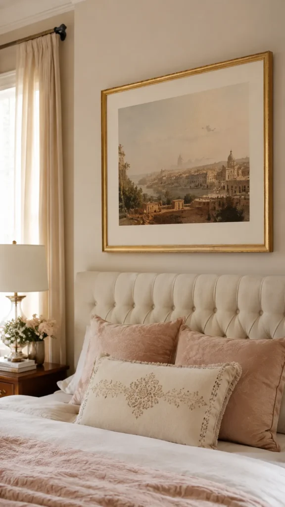
Buying or curating a set of prints that all pull from the same color story is one of the easiest ways to make a wall look professionally styled instead of thrown together over time. This works especially well for someone furnishing a whole room at once and wanting a cohesive finished look from day one.
A few ways to build this without hiring a designer:
- Pick two or three colors already in your bedding or rug and search for prints within that palette
- Stick to the same frame finish across the whole set, even if the art subjects vary
- Buy or print pieces in matching or proportionally sized frames so the grouping feels planned rather than accidental
Color matched sets are also one of the more budget friendly options on this list since many print shops sell them as bundles at a lower per piece cost than buying individually.
Which Path Is Yours?
By Budget
- Starter Pick: Abstract minimalist prints or a single vintage travel poster, no frame needed right away
- Mid Range Pick: Black and white photography or botanical line art, framed in simple thin metal
- Investment Pick: Custom and personalized prints, or a full color matched set with matching frames
By Lifestyle
- Dorm or Rental Life: Typography posters and vintage travel prints, hung with Command strips only
- Style Explorers: Abstract minimalist prints and neutral aesthetic prints, since they pair with almost anything
- Fandom Lovers: Anime posters and music posters, framed consistently so they read as curated
- Design Perfectionists: Color matched print sets, built around your existing bedding or rug palette
Frequently Asked Questions
What size poster should I get for my bedroom wall?
For most bedroom walls, an 18×24 or 24×36 print works best above a dresser or desk. Above a bed, go bigger, closer to two thirds the width of your headboard so it doesn’t look small and lost.
Will Command strips damage my walls when I move out?
No, as long as you use the correct weight rated strips and remove them slowly by pulling straight down. Cheap or overloaded strips are usually what causes paint damage, not the strips themselves.
How high should I hang posters above my bed?
Aim for the bottom of the frame to sit six to eight inches above the headboard. If there’s no headboard, center the artwork around fifty seven inches from the floor.
Do posters fade over time from sunlight?
Yes, especially cheaper paper stock in rooms with direct sun exposure. Heavier matte paper and glass framing both slow down fading significantly.
Is it cheaper to frame posters myself or buy them pre framed?
Buying frames separately is usually cheaper if you’re doing more than two or three posters. Pre framed sets save time but often cost twenty to thirty percent more per piece.
Conclusion
Your bedroom should feel like the one place in the world that’s completely, unmistakably yours, and getting there doesn’t require a full renovation or a huge budget. One poster, hung at the right height with a little intention behind it, can change how a whole room feels the second you walk in. So pick the idea from this list that made you pause, order that first print, and give one wall the attention it’s been waiting for.
