
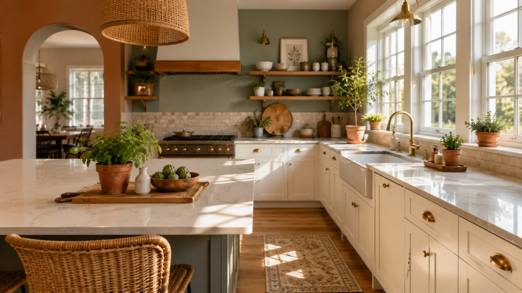
The right wall color can make your kitchen feel like the heart of your home or quietly drain every ounce of warmth right out of it. I’ve walked through hundreds of kitchens across the US, and I can tell you this: the wall color is almost always the first thing that either pulls a space together or throws it completely off. Most homeowners spend weeks agonizing over cabinet finishes and countertop slabs, then rush the paint decision at the very end. That’s a mistake I want to help you avoid. Whether you’re working with a bright, open layout in Phoenix or a narrow galley kitchen in a Chicago brownstone, these 15 kitchen wall color ideas will give you a real starting point with honest advice on what actually works day to day.
My Design Notes
A few years back, I was working with a client in suburban Chicago lovely family, north-facing galley kitchen, white laminate cabinets, and practically zero natural light. She came to me with a Pinterest board full of bright, airy kitchens and said, “I want something cozy but not cave-like.” I told her what I tell every client in that situation: the wall color isn’t just about aesthetics, it’s about how light moves through your space at 7am versus 6pm. We spent two weekends testing seven different swatches directly on her walls, watching how each one shifted under her under-cabinet LEDs and her single south-facing window. Some colors that looked stunning on the chip looked flat and sad on her actual walls. We finally landed on the right choice and I’ll share exactly what it was when we get to that section. That project is what convinced me that no homeowner should ever pick a kitchen wall color straight from a chip card alone.
15 Mastering the Art of Kitchen Wall Colors: Expert Picks for Every American Home Style
1. Classic White The Foolproof Foundation
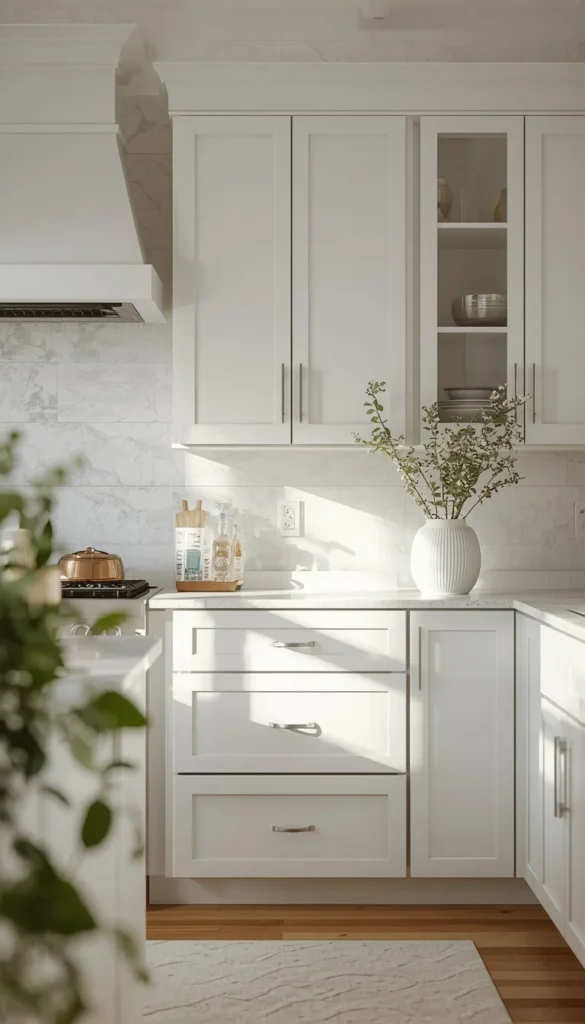
White never really goes out of style in American kitchens, and honestly, there’s a good reason for that. It reflects light beautifully, makes even the smallest spaces feel open, and works with virtually every cabinet color and countertop finish you can throw at it. But here’s what most people get wrong they assume all whites are the same. They’re not. A cool, bright white like Benjamin Moore Chantilly Lace will feel crisp and modern, while a warmer white like Sherwin-Williams Alabaster brings in that soft, inviting quality that works especially well in Modern Farmhouse kitchens.
One thing to watch out for is undertones. A white with pink undertones can clash horribly with warm wood cabinets. Always test your swatch next to your actual cabinet finish in both natural and artificial light before committing.
- Works best with: Stainless steel, brushed nickel, or matte black hardware
- Style fit: Modern, Traditional, Farmhouse, Transitional
- Maintenance reality: Shows grease splatters and fingerprints faster than you’d think a satin or eggshell finish is your best friend here
2. Warm Greige The Upgrade From Builder Beige
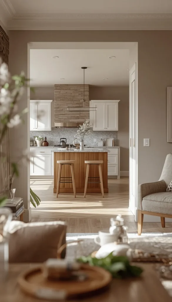
If you’ve been living with that flat, forgettable beige that came standard with your home, greige is the grown-up upgrade you didn’t know you needed. It sits perfectly between gray and beige, giving you warmth without looking dated and sophistication without feeling cold. I’ve used Sherwin-Williams Accessible Beige and Benjamin Moore Revere Pewter in more American kitchens than I can count, and both consistently deliver that “wow, this feels different” reaction without anyone being able to put their finger on exactly why.
Greige is especially powerful in open-plan layouts where the kitchen flows into a living or dining area. It creates visual continuity without being boring. Pair it with white shaker cabinets and quartz countertops and you’ve got a Transitional kitchen that will photograph beautifully and age even better.
3. Sage Green Nature’s Neutral for Modern Farmhouse Kitchens
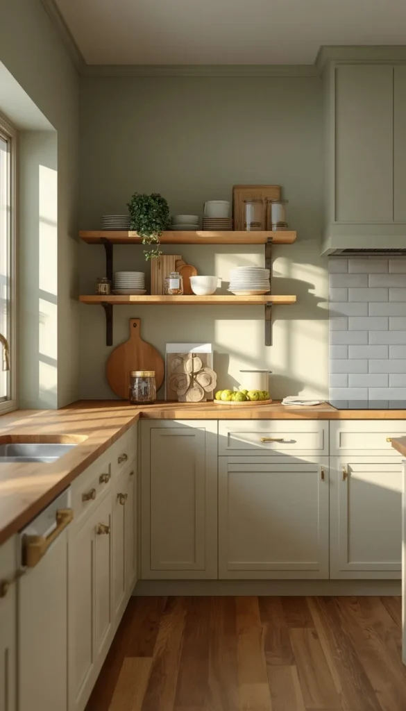
Sage green is having its moment right now, and I don’t think it’s leaving anytime soon. There’s something about this color that feels inherently calm it brings the outside in without screaming “I’m trying to be trendy.” In Modern Farmhouse kitchens specifically, sage on the walls paired with cream or white cabinets creates a layered, collected look that feels like it evolved naturally over time rather than being decorated all at once.
A quick trick I’ve learned is to go slightly lighter with your sage than you think you need to. Colors deepen significantly once they’re on four walls. What looks like a soft whisper on the chip can turn into a full statement on your kitchen walls which isn’t always a bad thing, but it’s worth knowing going in.
- Pairs beautifully with: Butcher block countertops, brass or unlacquered bronze hardware, open wood shelving
- Best for: South or east-facing kitchens where morning light can really make the green sing
- Budget note: This color hides minor wall imperfections better than whites or light grays fewer prep coats needed
4. Navy Blue Bold, Timeless, and Surprisingly Versatile
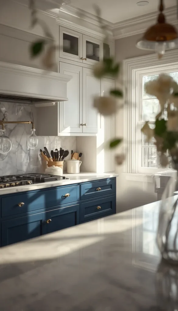
Navy is one of those colors that homeowners are nervous about until they see it done well, and then they can’t imagine anything else. It adds instant depth and character to a kitchen without tipping into moody or oppressive territory. What makes navy work so well in American kitchens is its versatility it reads as coastal in a beach house, preppy-classic in a Colonial, and genuinely contemporary when paired with modern flat-front cabinets and brass fixtures.
I worked on a kitchen in Connecticut where my client was dead set against navy. She thought it would make her already-medium-sized kitchen feel like a closet. We painted just the lower cabinets in Hale Navy by Benjamin Moore and kept the uppers and walls in a warm white. She called me two weeks after install and said it was the single best design decision in her entire renovation. The contrast did something magical to that space.
One practical note navy on walls rather than cabinets is a bigger commitment and I’d only recommend it in kitchens with strong natural light or excellent artificial lighting. Otherwise, go navy on an island or lower cabinets and let the walls breat
Which color on this list made you stop and think “that could actually work in my kitchen”?
5. Soft Gray The Safe Bet That Still Looks Sharp
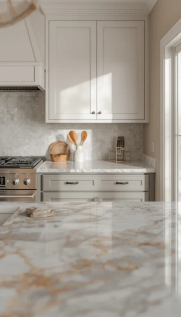
Soft gray has been the reigning neutral in American kitchens for over a decade, and while some designers are ready to move on, I’m not ready to write its obituary just yet. When it’s done right, it’s genuinely timeless. The key word there is “soft.” You want a gray that leans warm something like Sherwin-Williams Repose Gray or Benjamin Moore Stonington Gray rather than a cool, almost bluish gray that can make your kitchen feel like a hospital corridor on a cloudy day.
What I love about soft gray is how effortlessly it lets other elements in the kitchen shine. Your backsplash tile, your countertop veining, your cabinet hardware they all get to have their moment because the walls aren’t competing.
- Avoid: Gray with strong blue or purple undertones in kitchens with north-facing windows
- Best pairing: White uppers, gray lowers, and a marble or quartz countertop with warm veining
- Resale tip: Soft gray is consistently one of the safest colors for resale value it’s neutral enough to appeal to buyers without feeling empty
6. Creamy Off-White Better Than Bright White for Most Homes
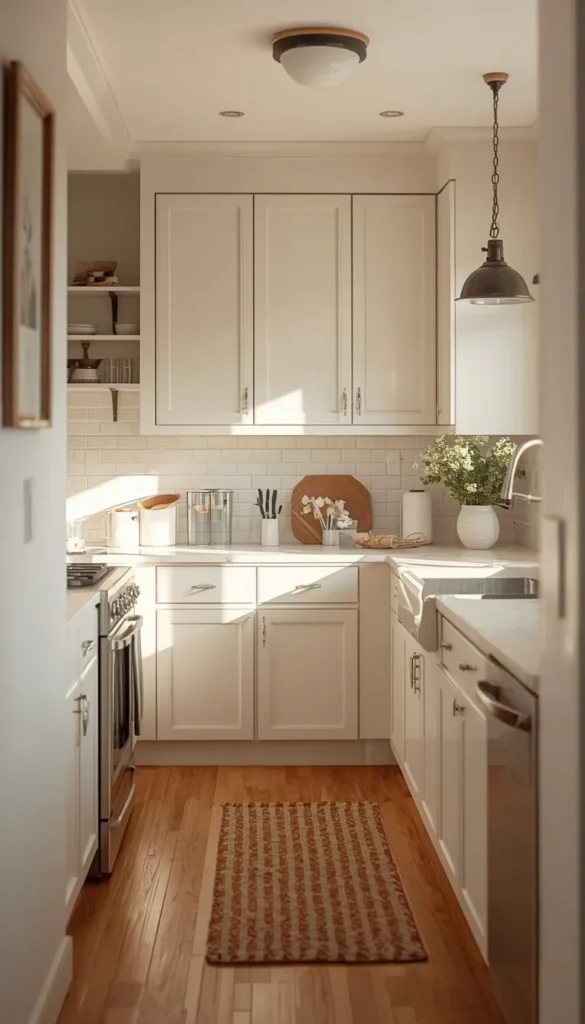
Here’s something I tell almost every client who walks in asking for a white kitchen what they actually want, nine times out of ten, is an off-white. True bright whites can feel harsh and unforgiving under the wrong lighting, especially in kitchens with warm wood tones or vintage-style fixtures. A creamy off-white like Benjamin Moore White Dove or Sherwin-Williams Antique White brings all the airiness of white with a softness that makes the whole space feel more inviting and livable.
This is the color I recommended for my Chicago client I mentioned earlier. Her north-facing kitchen needed warmth desperately, and a bright white would have made it feel even colder. The creamy off-white we chose Benjamin Moore White Dove in an eggshell finish bounced light around that galley beautifully and made her white laminate cabinets look intentionally tonal rather than mismatched.
One thing to watch out for is going too yellow with your off-white. Some creamy whites veer into buttercream territory, which can work in certain styles but tends to feel dated in more contemporary kitchens. Always test in your actual space before buying a full gallon.
Top 6 Kitchen Wall Color Ideas:
| Idea | Estimated Price | Maintenance |
|---|---|---|
| Classic White | $30 to $60 per gallon | High |
| Warm Greige | $35 to $65 per gallon | Low |
| Sage Green | $40 to $70 per gallon | Low |
| Navy Blue | $45 to $75 per gallon | Medium |
| Deep Forest Green | $50 to $80 per gallon | Medium |
| Charcoal | $45 to $75 per gallon | High |
7. Deep Forest Green The Moody Statement Color Worth the Commitment
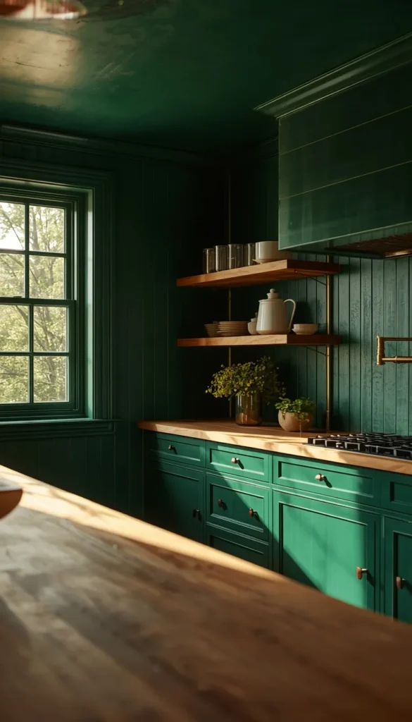
Deep forest green is not for the faint-hearted, and I mean that as a compliment. This is a color that requires commitment, confidence, and ideally a kitchen with decent ceiling height and at least one generous window. When those conditions are met, it delivers a level of richness and drama that no neutral color can touch. Think Sherwin-Williams Cascades or Benjamin Moore Forest Green colors so deep they almost shift between green and black depending on the light.
What makes this work in American kitchens is pairing it correctly. Brass or unlacquered bronze hardware is almost non-negotiable here it cuts through the depth and adds warmth. Natural wood elements like open shelving or a butcher block section help ground the look so it doesn’t feel like you’ve accidentally painted yourself into a cave.
A quick trick I’ve learned with dark colors like this paint your ceiling the same color or one shade lighter. It sounds counterintuitive but it creates an enveloping, jewel-box effect that feels intentional and luxurious rather than heavy and oppressive. I’ve done this in two kitchens and both clients said it was their favorite room in the house afterward.
8. Dusty Blue-Gray The Transitional Style Sweet Spot
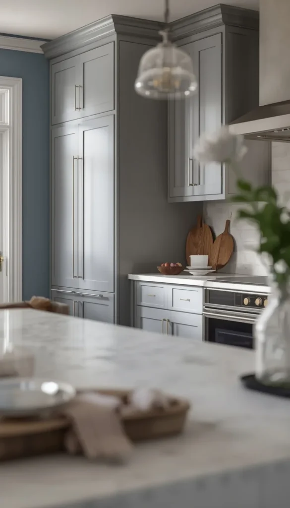
If you’ve ever looked at a color and thought “is that blue or is that gray?” congratulations, you’ve found a dusty blue-gray, and it might just be the most universally flattering kitchen wall color that exists. Colors like Farrow & Ball Parma Gray, Benjamin Moore Van Deusen Blue, or Sherwin-Williams Tidewater sit in that magical in-between space that feels simultaneously calm and characterful.
This is my go-to recommendation for Transitional style kitchens spaces that aren’t quite traditional and aren’t fully contemporary but live somewhere sophisticated in between. It pairs effortlessly with both warm and cool cabinet finishes, which is rare for a color with this much personality.
- Works with: White cabinets, greige cabinets, natural wood tones, and even soft black
- Hardware sweet spot: Brushed nickel or matte black both work this color isn’t fussy
- Style note: In open-plan spaces, dusty blue-gray flows beautifully into adjacent living areas without creating a jarring color break
Are you a safe neutral person or are you secretly tempted to go bold this time?
9. Terracotta Earthy Warmth That’s Having a Major Moment
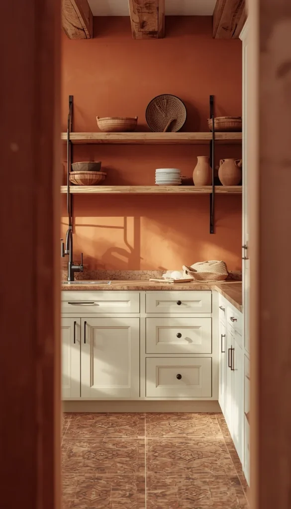
Terracotta is one of those colors that feels both ancient and completely current at the same time. It draws from Southwestern and Mediterranean influences that have deep roots in American design particularly in states like California, Texas, New Mexico, and Arizona where warm, earthy palettes feel naturally at home. But I’ve seen it work just as beautifully in a Brooklyn kitchen renovation and a suburban Atlanta home, so don’t let geography hold you back.
The secret to making terracotta work on kitchen walls is saturation control. You want something warm and grounded without veering into the orange-y territory that plagued 1970s kitchens. Sherwin-Williams Fired Earth and Benjamin Moore Pueblo are both excellent starting points they have enough warmth to feel cozy but enough brown in them to stay sophisticated.
- Pairs best with: Cream or white cabinets, black iron hardware, saltillo or concrete tile floors
- Natural companions: Woven textures, clay pottery, open wood shelving with visible grain
- Honest reality check: Terracotta can make a small kitchen feel even smaller if overdone consider using it as an accent wall behind open shelving rather than all four walls in a compact space
10. Charcoal The Sophisticated Alternative to Full Black
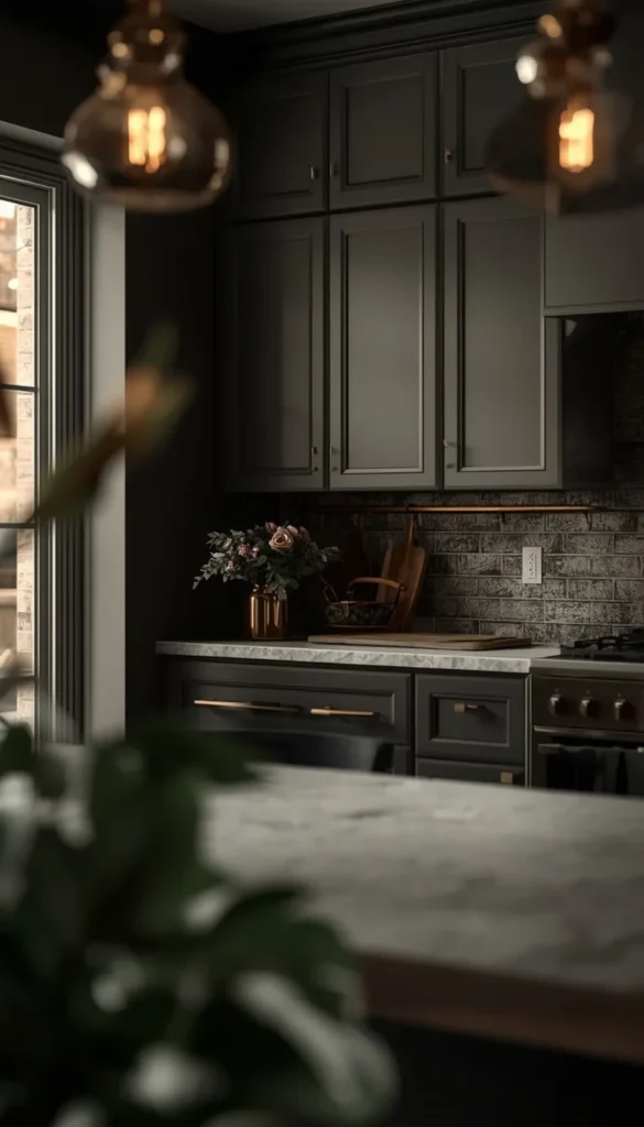
A lot of homeowners want the drama of black but are terrified of committing to it fully. Charcoal is the answer to that exact problem. It gives you depth, moodiness, and that high-end editorial quality that black deliversbut with just enough lightness to keep the space from feeling sealed shut. Sherwin-Williams Peppercorn and Benjamin Moore Kendall Charcoal are two colors I come back to again and again for this exact reason.
What I find fascinating about charcoal is how differently it reads depending on the light source. In the morning with natural light streaming in, it can look almost like a warm dark gray. In the evening under pendant lighting, it shifts into something that feels genuinely dramatic and intimate. That kind of versatility is rare in a wall color and it’s why charcoal tends to age so well it keeps revealing new dimensions the longer you live with it.
A quick trick I’ve learned is to pair charcoal walls with lighter upper cabinets rather than going dark on both. It keeps the kitchen functional and visually balanced. All-charcoal kitchens work, but they demand exceptional lighting planning and most residential kitchens simply aren’t lit well enough for that level of commitment.
11. Butter Yellow Sunshine in a Can for Dark or North-Facing Kitchens
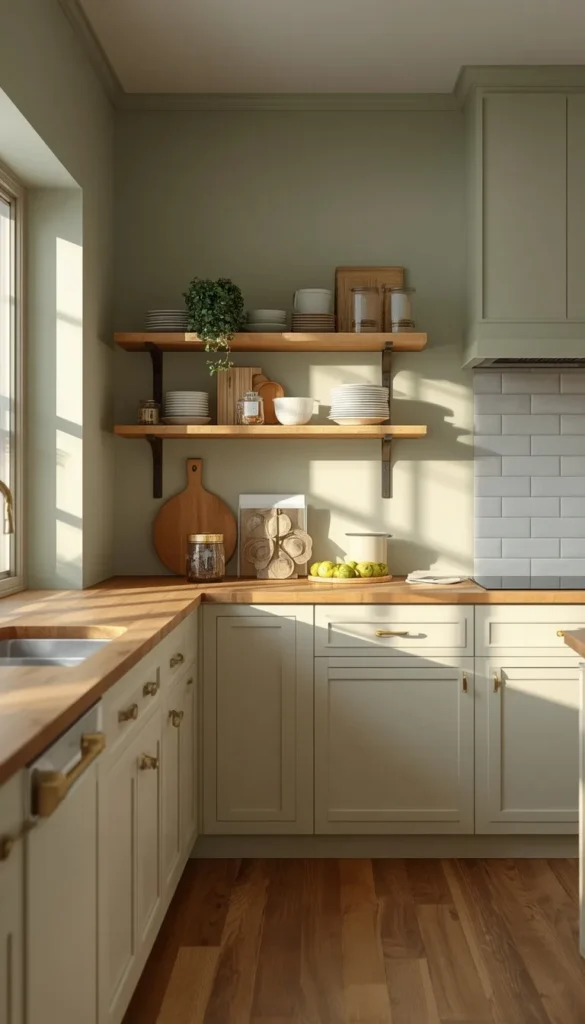
Yellow is probably the most misunderstood color in kitchen design. Most people picture the aggressively bright, almost neon yellows that dominated late 90s and early 2000s kitchens and immediately say no. But butter yellow soft, warm, almost neutral in its quietness is an entirely different conversation. Colors like Sherwin-Williams Restrained Gold or Benjamin Moore Hawthorne Yellow bring in warmth and light in a way that no other color can replicate, especially in kitchens that genuinely struggle with natural light.
This was actually the runner-up choice for my Chicago client’s north-facing galley. We came extremely close to going with Benjamin Moore Hawthorne Yellow and honestly, either choice would have been right. What ultimately pushed us toward the off-white was her cabinet color the yellow, as gorgeous as it was, competed slightly with the warm undertones in her laminate. It was a close call and a reminder that wall color decisions never happen in isolation.
Butter yellow works best in kitchens with white or cream cabinets, natural wood accents, and simple matte black or antique brass hardware. Keep your other elements quiet and let the yellow do the talking.
12. Warm Taupe The Neutral That Works With Every Cabinet Finish
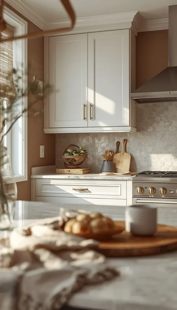
Warm taupe might be the most underrated color in this entire list. It doesn’t photograph dramatically, it doesn’t make the cover of design magazines, and it rarely generates gasps when clients first see it on a chip card. But live with it for a week and you’ll understand exactly why professional designers keep coming back to it. It has a chameleon-like quality it reads as beige next to warm wood tones, as gray next to cool whites, and as almost blush next to certain off-white cabinet finishes.
Sherwin-Williams Accessible Beige and Benjamin Moore Pale Oak are the two I recommend most often. Both have that perfect balance of warmth and neutrality that makes them work in virtually any American kitchen style from a sleek Transitional space in suburban Dallas to a cozy Traditional kitchen in a New England Colonial.
- Ideal for: Homeowners who entertain frequently and want a kitchen that photographs well in any light
- Hardware flexibility: Works with absolutely everything brass, nickel, black, bronze, even mixed metals
- Resale value: Consistently one of the top performing neutral colors in pre-sale staging scenarios real estate agents love it for a reason
What is the one thing holding you back from picking up that paint sample this weekend?
13. Slate Blue A Calming Mid-Tone for Open-Plan Spaces
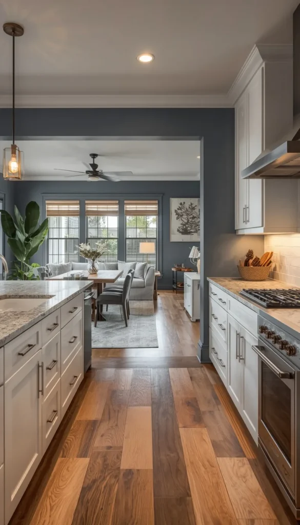
Slate blue occupies a really interesting space in the color spectrum it’s deeper than a dusty blue-gray but softer than a true navy, and that middle-ground quality is exactly what makes it so useful in open-plan American homes. When your kitchen flows directly into a living room or dining area without a wall to create separation, you need a color that can hold its own visually without creating a jarring contrast with whatever is happening in the adjacent space. Slate blue does that job better than almost anything else I’ve worked with.
Colors like Sherwin-Williams Smoky Blue or Benjamin Moore Newburyport Blue have that grounded, settled quality that feels simultaneously casual and refined. I’ve used slate blue in three open-plan kitchen renovations in the past two years alone and every single client has commented on how the color seems to make their entire first floor feel more cohesive rather than chopped up into separate zones.
One thing to watch out for is the difference between slate blue and periwinkle they can look deceptively similar on a chip card but periwinkle has a brightness that can feel jarring in a kitchen setting. Always test your swatch at eye level on the actual wall, not just held up near a window.
- Perfect for: Open-plan layouts, coastal-influenced homes, and Transitional style kitchens
- Pairs with: White shaker cabinets, warm wood accents, brushed nickel or chrome hardware
- Lighting note: Slate blue looks stunning under warm LED lighting in the evening it shifts into something almost jewel-toned that feels genuinely special
14. Black High Drama, High Reward If You Do It Right
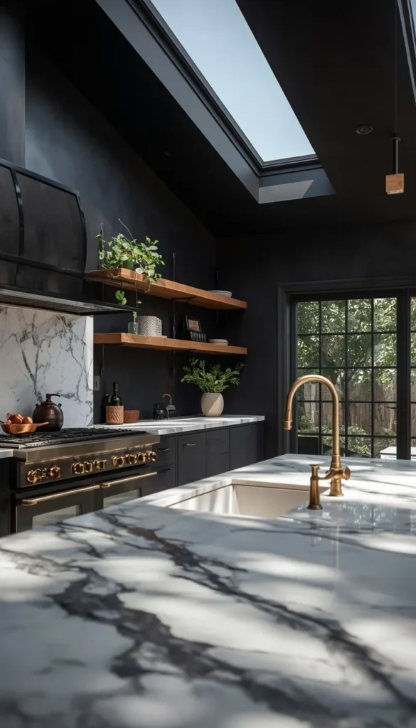
Let me be completely honest with you about black kitchen walls this is not a color for everyone and I would never recommend it without first having a serious conversation about your kitchen’s architecture and lighting situation. But when the conditions are right, a black kitchen is one of the most jaw-dropping design decisions a homeowner can make. It photographs like a magazine spread, it ages beautifully, and it has a confidence to it that no other color can replicate.
The conditions you need: ceiling height of at least nine feet, at least one generous window or skylight, excellent pendant or recessed lighting, and a genuine tolerance for showing dust on dark surfaces. That last point is something a lot of design content glosses over. Black walls show dust and certain types of cooking residue more visibly than lighter colors a damp microfiber cloth becomes your new best friend.
Farrow & Ball Off-Black and Sherwin-Williams Caviar are my two go-to recommendations here. Both have enough warmth in their base to prevent that flat, harsh quality that some true blacks can have on large wall surfaces. Pair with brass hardware and natural wood elements to keep the space feeling warm rather than industrial.
- Style fit: Contemporary, Modern Farmhouse with an edge, eclectic, and high-end Traditional
- Counter move: White or light marble countertops are essential they provide the visual relief that keeps the space from feeling oppressive
- Budget reality: Dark colors require excellent wall preparation any imperfections show dramatically under dark paint, so factor in extra prep time and possibly a skim coat if your walls aren’t perfectly smooth
15. Blush Pink The Unexpected Choice That Actually Works
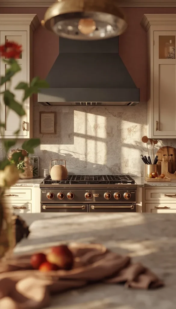
I save blush pink for last because it’s the color that generates the most skepticism in my initial client consultations and the most compliments once it’s on the wall. Done wrong, pink in a kitchen looks like a nursery experiment gone sideways. Done right with the correct undertone, the right cabinet pairing, and a genuinely light hand it creates a warmth and softness that no other color on this list can match.
The version of blush that works in kitchens is not bubblegum and it’s not millennial pink. It’s a deeply muted, almost terracotta-adjacent blush something like Benjamin Moore Pale Rose or Sherwin-Williams Romance that reads more as a warm neutral than an obvious pink until the light hits it at a certain angle and you catch that beautiful rosy glow. That subtlety is everything.
White or cream cabinets are the natural partner here, and I’d strongly encourage unlacquered brass or antique gold hardware to lean into the warmth rather than fight it. Matte black hardware can work too for a more contemporary edge but avoid anything cool-toned like chrome or brushed nickel it creates an undertone clash that will quietly bother you every single day even if you can’t immediately identify why.
A quick trick I’ve learned with blush is to bring in one grounding element a dark island, a charcoal range hood, or even just black window frames to prevent the space from feeling overly sweet. That one anchor point gives the eye somewhere to land and makes the whole color choice feel intentional and sophisticated rather than accidental.
The 2-Minute Decision Map 🗺️
By Budget
Starter and Budget Friendly ($20 to $60 per gallon)
- Warm Greige lowest maintenance, highest versatility, zero regret
- Creamy Off-White one coat coverage on most walls, easy DIY project
- Soft Gray widely available in budget brands without losing much quality
- Butter Yellow Behr and Glidden versions perform surprisingly well here
Luxury and Investment ($50 to $80 per gallon)
- Deep Forest Green worth every penny for the drama it delivers
- Blush Pink Farrow & Ball version is unmatched in depth and subtlety
- Black Benjamin Moore or Sherwin-Williams only, budget versions fall flat
- Slate Blue premium brands hold the complex undertone far better
By Lifestyle
Busy Families and High Traffic Kitchens
- Warm Taupe hides everyday smudges and scuffs better than most
- Greige wipes clean easily, forgives fingerprints remarkably well
- Charcoal surprisingly practical, crumbs and splashes disappear visually
- Avoid White and Blush if you have young kids or pets the upkeep is relentless
Open Layouts and Entertaining Spaces
- Slate Blue flows effortlessly into adjacent living and dining areas
- Dusty Blue-Gray creates cohesion across large open-plan first floors
- Warm Taupe photographed beautifully at every dinner party you’ll host
- Navy on an island only keeps drama contained without overwhelming the space
Frequently Asked Questions
What is the most popular kitchen wall color in the USA right now?
Warm greige and sage green are leading the charts in 2025. Both sit comfortably between trendy and timeless, which is exactly why American homeowners keep choosing them over bolder options.
Does kitchen wall color affect home resale value?
Yes, significantly. Neutral colors like warm taupe, soft gray, and creamy off-white consistently perform best with buyers. Bold colors like black or terracotta can actually hurt your sale price if the buyer can’t see past them.
What color makes a small kitchen look bigger?
Creamy off-white or soft gray with a satin finish will visually expand a compact kitchen. Avoid dark colors on all four walls save those for a single accent wall or island only.
Should kitchen walls be lighter or darker than cabinets?
Lighter walls with darker cabinets almost always win. It creates natural contrast and makes the space feel layered rather than flat. Matching both the same tone tends to look unintentional unless professionally executed.
How often should I repaint my kitchen walls?
Every 3 to 5 years in a high-traffic kitchen. Kitchens take more abuse than any other room grease, steam, and daily splashes break down even premium paint faster than you’d expect.
Conclusion
Your kitchen doesn’t need a full renovation to feel completely different sometimes all it takes is the right color on the walls and suddenly the whole space feels like yours again. I’ve seen a single gallon of paint turn a tired, forgettable kitchen into the room a family actually wants to gather in, and I genuinely believe that’s available to every homeowner regardless of budget or square footage. So pick one color from this list that made you stop scolling, grab a sample pot this weekend, and put it on the wall. Live with it for 48 hours before you decide anything. That’s really all it takes to start.
