
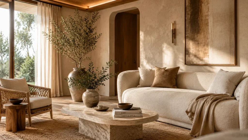
Most people think luxury requires more more furniture, more decor, more money. It doesn’t. The most stunning living spaces I’ve walked into weren’t the ones packed with expensive things; they were the ones where every single piece earned its place. Minimalist luxury living spaces hit different because they’re built on intention, not impulse. And if you’ve been scrolling past rooms that feel impossibly out of reach, I’m here to show you exactly how to get that look with real budgets, real trade-offs, and zero design-speak fluff.
My Design Notes
When I was working on a condo project in Austin, Texas, my client called me in a panic. She had a 680-square-foot living room stuffed with two sofas, a bulky entertainment center, and about forty pounds of random decor she’d picked up over the years. The space felt chaotic. Stressful, actually. The first thing I did wasn’t shop it was edit. We pulled everything out, identified three anchor pieces worth keeping, and built the entire room back up around those. I added a warm limewash accent wall, swapped the single overhead light for a three-layer lighting plan, and brought in one sculptural coffee table that became the whole personality of the room. Total spend: $3,200. Every single person who walked in asked if she’d hired a contractor. She hadn’t. That project changed the way I talk to clients about minimalist luxury living spaces because the real work isn’t finding the right things to add. It’s having the confidence to take things away.
15 Stunning Design Secrets for Mastering the Minimalist Luxury Aesthetic in Any Home
1. The Warm Neutral Foundation Room
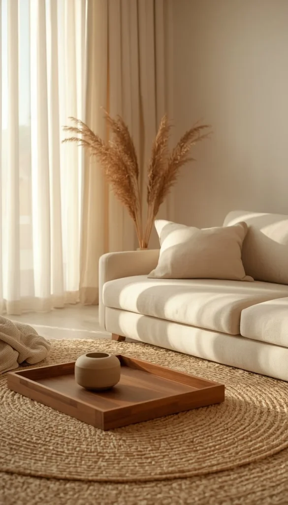
The single biggest mistake I see in American living rooms? Choosing a wall color before choosing a sofa. It sounds minor. It isn’t. Your neutral foundation the palette that ties your floors, walls, and largest furniture piece together is the backbone of every minimalist luxury living space worth saving. Get this right, and everything else becomes easier.
Warm neutrals are doing something specific here.They’re not beige for the sake of being safe. They’re creating a visual temperature that makes a room feel livable and considered at the same time. Think soft white with warm undertones, creamy linen, or the kind of greige that shifts slightly depending on the light. Benjamin Moore’s Pale Oak and Sherwin-Williams’ Accessible Beige are two I come back to constantly on US projects because they work across natural and artificial light without going muddy.
A quick trick I’ve learned: pull your sofa fabric swatch and your rug sample before you commit to any wall color. Hold all three together near your window. If they read as one cohesive family, you’re on the right track. If one fights the others, something gets returned.
- Keep your largest pieces sofa, rug, curtains within the same color temperature (all warm or all cool, never mixed)
- Introduce variation through texture, not color: boucle, linen, raw wood, matte ceramic
- One grounding dark accent a black lamp base, a walnut tray stops the room from floating
2. The Japandi Living Room Done Right for US Homes
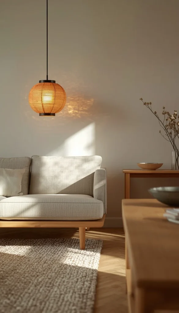
Japandi is everywhere on Pinterest right now, and honestly, most of what I see pinned doesn’t actually work in American homes. The proportions are off. The rooms are styled for Japanese square footage, not the average US living room that has to juggle a TV wall, a sofa, a coffee table, and a walkway that doesn’t feel like an obstacle course. So let me give you the version that actually translates.
The foundation is low-profile furniture with honest materials. An ash wood or white oak console. A platform sofa in undyed linen sitting closer to the floor than you’re probably used to. What this does visually is give the ceiling more breathing room a huge deal in apartments with standard 8-foot ceilings. Pair that with a paper pendant light in a warm amber tone and suddenly the room has atmosphere without a single piece of decor that isn’t functional.
One thing to watch out for is over-accessorizing in the name of “warmth.” Japandi gets its coziness from material quality, not quantity. One ceramic bowl. One low branch in a simple vase. That’s it. Americans tend to want to fill the negative space resist that impulse completely and you’ll land closer to the real thing.
3. The Boucle and Curves Setup
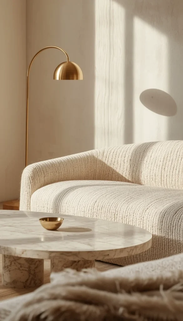
Let’s be honest about boucle for a second. It is genuinely one of the most beautiful sofa textures available right now that soft, loopy weave photographs incredibly and feels even better in person. But if you have pets, kids, or anyone in your house who eats within ten feet of the couch, you need to hear the reality check before you fall in love with it on a mood board.
Boucle snags. It pills in high-contact areas over time. And cleaning it? You’re looking at professional upholstery cleaning, not a quick wipe-down.That doesn’t mean you shouldn’t buy it it means you should buy it knowing what you’re getting into. For a home with a dog or toddlers, I’d steer toward a performance boucle or a lookalike in a tightly woven texture that mimics the look without the vulnerability.
The curves piece of this setup is where the real design magic happens. Rounded sofas, oval coffee tables, arched floor lamps they soften the hard angles of a box-shaped room in a way that straight lines simply can’t. This matters especially in apartments where the architecture gives you nothing to work with. A curved sofa isn’t just a style choice. It’s doing spatial work.
- Opt for an oval or round coffee table over rectangular if your sofa is curved the shapes need to echo each other
- Keep the rest of the room strictly angular to let the curves read as intentional, not accidental
- Budget range for a quality curved boucle sofa: $900 to $2,800 depending on brand and fabric grade
4. The Moody Dark Minimalist Space
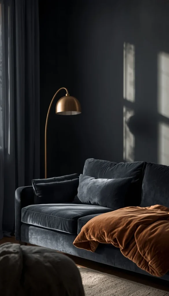
Dark rooms get a bad reputation in small apartments and I’d like to formally dispute it. A deep charcoal, forest green, or navy living room done correctly doesn’t shrink a space. It creates what designers call an enveloping effect the room feels deliberate and immersive rather than cramped. The difference between a moody room that works and one that feels like a mistake is almost entirely about lighting.
Here’s the formula I use. Keep your wall color dark, your textiles in a slightly lighter shade of the same tone, and then add warmth through brass or bronze metal accents. A brass arc floor lamp against a charcoal wall creates a contrast that feels high-end and intentional. Dark walls actually make warm-toned metals look more expensive than they are a $90 brass lamp looks like a $400 one when the backdrop is dark enough.
Natural light matters here too. If your room gets good morning or afternoon sun, going dark on the walls is genuinely low-risk the light will bring the room to life during the day, and in the evening it becomes a completely different, dramatic space. If your apartment barely gets natural light, consider going dark on just one accent wall rather than committing to all four. You’ll still get the moody effect without boxing yourself in.
Which of these 15 minimalist luxury living spaces feels most like the room you’ve been trying to create and what’s been stopping you from starting?
5. The Coastal Calm Living Room on a Real Budget
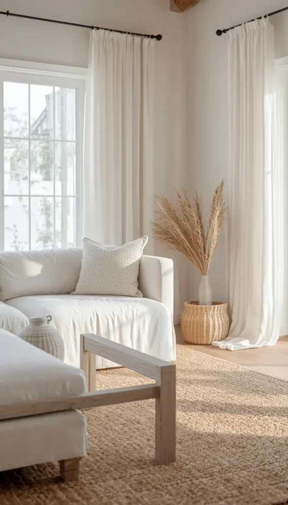
Coastal minimalism is one of those looks that feels effortless but actually requires pretty deliberate choices especially when you’re working with a real budget and not an unlimited renovation fund. The core of this aesthetic is light, air, and natural texture. White or cream slipcovered sofas, pale wood, sheer curtains that move when the AC kicks on. It’s the living room equivalent of a deep breath.
Here’s how I break it down across three budget tiers for my clients.
- Under $800: Slipcover your existing sofa in a natural white cotton slipcover, swap your curtains for IKEA’s GUNRID or any sheer linen panel, and add a jute or seagrass rug. That’s the whole transformation.
- Under $2,000: Add a pale oak or whitewashed wood coffee table, replace one lamp with a rattan or woven pendant, and bring in a set of linen throw pillows in sandy or driftwood tones.
- Splurge ($3,500 and up): Invest in a quality slipcovered sectional from Pottery Barn or Article, add plantation shutters or custom sheer drapes, and finish with a large piece of coastal abstract art in muted blues and whites.
One thing I always tell clients going for this look don’t confuse coastal minimalism with coastal maximalism. Seashells on every surface, nautical stripes, rope accents everywhere that’s a different category entirely. The minimalist version is quieter. One texture at a time. One natural material at a time.
6. The Statement Wall Without Renovation
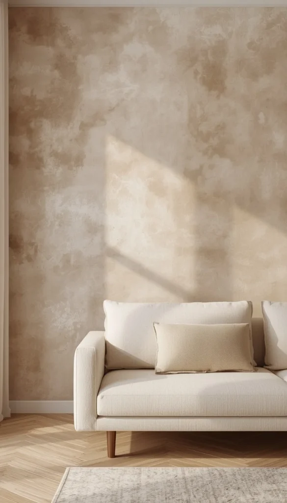
This one is specifically for renters, and I cannot tell you how many of my clients have been shocked by how much a single wall can change a room without touching the bones of the space. A statement wall in a minimalist luxury setup isn’t wallpaper covered in pattern it’s a textural moment. A color shift. Something the eye goes to first when you walk through the door.
Peel-and-stick limewash wallpaper has genuinely changed the game here. The newer versions have texture that reads as real plaster from across the room, and they come off cleanly when you move out. I’ve used Tempaper and Chasing Paper on client projects and been impressed by how elevated the results look in photographs and in person.
If you own your space, actual limewash paint brands like Portola Paints or ROMABIO gives you that soft, Old World texture for around $80 to $120 per gallon. It goes on in layers and every wall turns out slightly different, which is exactly the point. No two limewash walls look the same. That natural variation is what separates it from flat paint and makes it feel genuinely luxurious.
Panel molding is the third option and honestly the most dramatic for the least money. Standard MDF trim from a hardware store, a little wood glue, one afternoon, and a fresh coat of paint you’ve got a designer-grade wall for under $150.
7. The One Sofa Rule Room
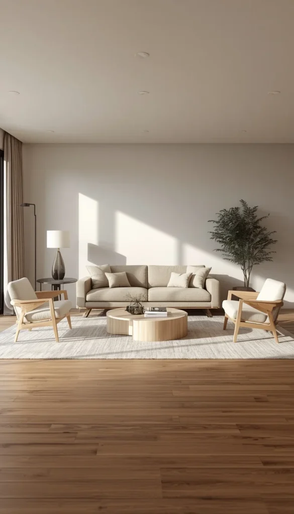
Americans over-seat. I say this with full love and zero judgment because the instinct makes sense a living room should be comfortable, welcoming, accommodating. But somewhere along the way, “comfortable” became code for “two sofas, three accent chairs, and an ottoman the size of a small country.” The room ends up feeling like a furniture showroom, not a home.
The one-sofa rule is simple. Choose one exceptional sofa well-proportioned, quality fabric, the right scale for your room and resist the urge to supplement it with a matching loveseat or a second sofa facing it. Instead, bring in one or two lightweight accent chairs that can be moved easily. Chairs with legs read as less visually heavy than sofas, which keeps the room feeling open.
What this does for a minimalist luxury space is give the sofa room to breathe. When a sofa isn’t competing with another seating piece of equal visual weight, it becomes a proper focal point. The whole room organizes around it naturally. I’ve done this in living rooms as small as 11 by 13 feet and the spatial difference is immediate.
- Choose a sofa that’s appropriately scaled in a small room, a 78 to 84 inch sofa almost always works better than a full 96 inch sectional
- Add one or two armless or slipper chairs for flexible extra seating that doesn’t crowd the layout
- Leave at least 18 inches of clearance between your sofa and coffee table it sounds like a lot until you try to walk through less
Top 6 Minimalist Luxury Living Spaces
| Idea | Estimated Price | Maintenance |
|---|---|---|
| The Warm Neutral Foundation Room | $500 – $2,000 | Low |
| The Boucle and Curves Setup | $900 – $2,800 | High |
| The Coastal Calm Living Room | $800 – $3,500 | Low |
| The Layered Lighting Plan | $150 – $800 | Low |
| The Hidden Storage Minimalist Setup | $800 – $8,000 | Medium |
| The Warm Wood Accent Wall Bedroom | $200 – $1,500 | Low |
8. The Sculptural Coffee Table as the Whole Vibe
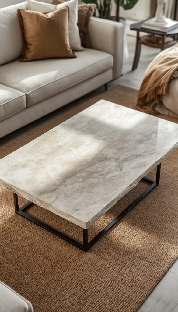
There is a version of minimalist luxury living spaces where the coffee table does all the heavy lifting and I mean all of it. No gallery wall, no shelf styling, no decorative objects scattered around the room. Just one genuinely beautiful coffee table in the center, and everything else stripped back to support it.
This works because a sculptural coffee table operates like furniture and art at the same time. A raw travertine slab on metal legs. A curved marble oval with a waterfall edge. A live-edge walnut piece with visible wood grain running the full length. These aren’t just surfaces to put your coffee on they’re objects with enough visual presence to anchor an entire room.
The styling rule I follow: if the table is the statement, the sofa behind it should be quiet. Neutral fabric, simple silhouette, no tufting or nailhead trim competing for attention. The floor underneath should be equally restrained a solid or very subtly textured rug in a tone that lets the table pop rather than fight it.
A quick trick I’ve learned with travertine specifically seal it immediately and reseal it every year. It’s porous, it stains, and a red wine ring on an unsealed travertine table is a very expensive mistake. The material is worth it, but it needs maintenance commitment upfront.
9. The Layered Lighting Plan
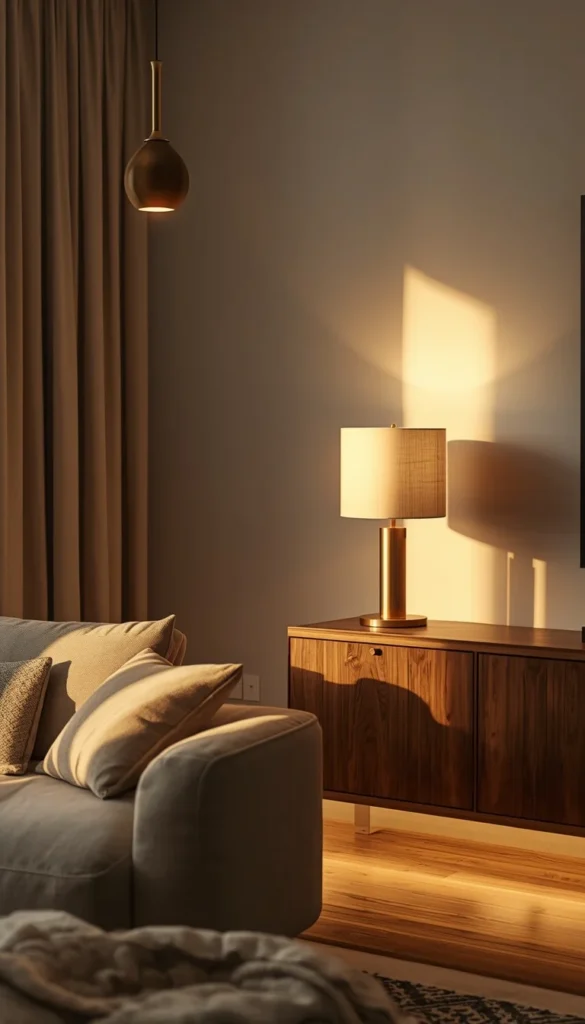
If there is one thing that separates a room that looks designed from a room that just looks decorated, it is lighting. Not the fixture itself the layering. Most American living rooms run on a single overhead light, maybe a floor lamp in the corner, and call it done. That setup flattens a space completely. It washes out your materials, kills your shadows, and makes even beautiful furniture look ordinary.
The three-layer formula is ambient, task, and accent. Ambient is your general overhead source a pendant, a flush mount, a chandelier. Task is your functional light a floor lamp by the reading chair, a table lamp on the console. Accent is your mood layer LED strip lighting behind a TV console, a small uplighter behind a large plant, under-shelf lighting in a built-in unit. You need all three working together before a room starts to feel genuinely luxurious.
Dimmers are non-negotiable. I put them on every circuit I can when I’m working on a project, and I recommend them to every single client regardless of budget. A $25 dimmer switch from the hardware store changes the entire personality of a room. Your living room should be able to go from bright and functional at noon to warm and atmospheric at 8pm without you changing a single piece of furniture.
- Aim for light sources at three different heights ceiling, eye level, and floor or low shelf
- Warm white bulbs in the 2700K to 3000K range are the standard for living rooms anything cooler reads clinical
- Never rely on a single overhead recessed light as your only source, no matter how good the fixture is
If you could only change one thing in your living room this weekend, what would it be the lighting, the layout, or the clutter?
10. The Hidden Storage Minimalist Setup
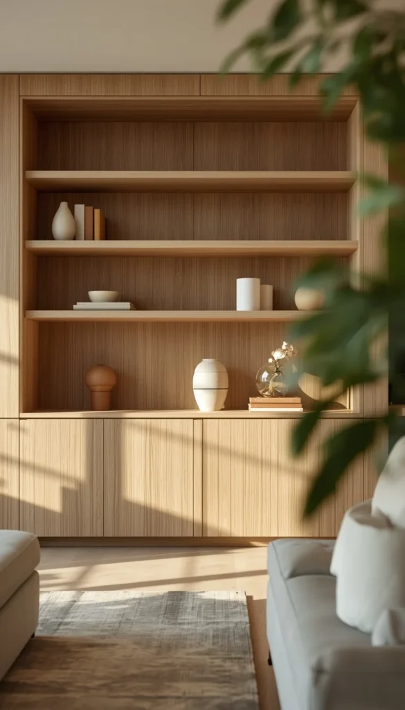
Minimalism and real life have a tension that nobody on Pinterest talks about honestly. Real life has TV remotes, charging cables, throw blankets that don’t fold themselves, stacks of books, and approximately forty things that don’t have a home. A minimalist luxury living space doesn’t eliminate all of that it hides it extremely well.
Built-in storage is the gold standard here. A floor-to-ceiling unit built around your TV wall with closed lower cabinets and a few open upper shelves gives you the best of both worlds concealed chaos below, curated display above. The cost varies significantly depending on whether you go custom ($3,000 to $8,000 for a full wall) or use IKEA’s BESTA system as the foundation and finish it with custom door fronts from a company like Semihandmade ($800 to $2,200 total). The finished results are genuinely difficult to tell apart at a glance.
For renters or anyone not ready to commit to built-ins, freestanding is absolutely workable. The key is choosing pieces with closed storage doors, not open shelving and keeping the top surface completely clear except for one or two deliberate objects. An empty surface reads as intentional. A surface covered in random objects reads as clutter regardless of how nice each individual item is.
One thing to watch out for with open shelving specifically it requires constant maintenance. Those perfectly styled shelves you see in design magazines were styled by a professional the morning of the shoot. In real life, open shelves collect dust, accumulate random additions, and drift toward disorder within weeks. Closed storage is more forgiving and frankly more honest about how people actually live.
11. The Warm Wood Accent Wall Bedroom
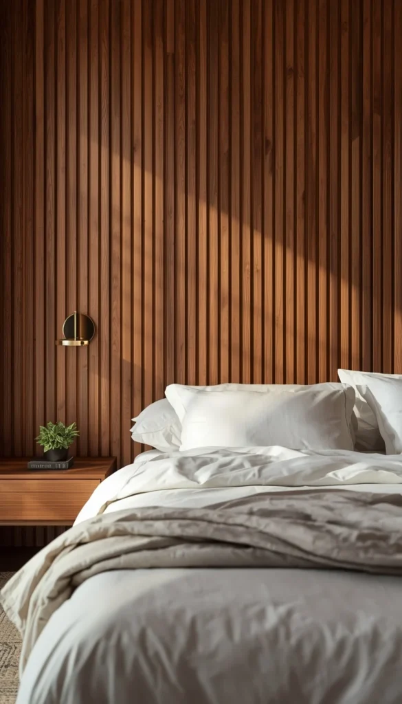
Wood accent walls have been trending long enough now that I want to give you the version that actually holds up not the shiplap-on-every-surface farmhouse interpretation, but the warm, paneled, genuinely sophisticated approach that belongs in a minimalist luxury bedroom and will still look current in five years.
The direction of your panels matters more than most people realize. Vertical panels draw the eye upward and make ceilings feel taller a critical visual trick in any bedroom with standard 8-foot ceilings. Horizontal panels elongate a wall and make a narrow room feel wider. If your bedroom is small and square, vertical paneling on the wall behind your bed is almost always the right call.
Material choices here are everything. Real wood veneer panels are beautiful but expensive and require professional installation. MDF slat panels the kind you see from brands like Oshome or similar on Amazon have gotten dramatically better in quality over the last two years and install with basic tools in a single afternoon. Finish them in a warm walnut stain or a deep espresso and the result photographs as genuine wood from any normal viewing distance.
- Keep bedding strictly neutral when the wall is doing the heavy lifting white, cream, or warm oatmeal linen only
- Low platform beds work better against a wood panel wall than taller bed frames the horizontal line of a low bed echoes the paneling and feels cohesive
- Add one small brass or black sconce on each side of the bed instead of table lamps it keeps the nightstands clear and the look intentional
12. The Monochrome Small Living Room
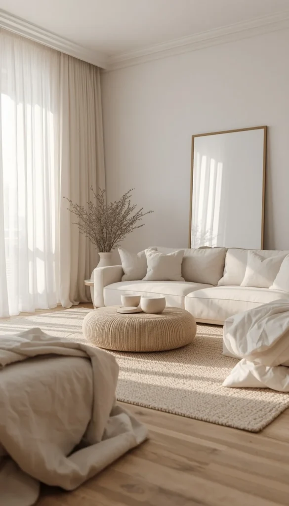
A monochrome palette in a small living room isn’t a design compromise it’s actually one of the most sophisticated and spatially intelligent moves you can make. When there are no strong color breaks for the eye to catch on, the room reads as one continuous, expanded space. It’s a visual trick that designers have been using in small New York and San Francisco apartments for decades, and it works every single time when executed correctly.
The version I love most uses whites, warm grays, and soft greiges layered together through texture rather than contrast. A creamy white wall, a warm gray sofa in a slightly different shade, a natural fiber rug that sits somewhere between the two the room feels cohesive and rich without a single bold choice. The secret is that all three tones need to share the same undertone. Mix a cool gray with a warm white and the palette will fight itself constantly depending on the light.
Specific paint colors I return to for this look in US projects: Benjamin Moore White Dove for walls, Sherwin-Williams Agreeable Gray for larger furniture pieces or an accent wall, and Restoration Hardware’s Cloud fabric line for sofas if budget allows. These three together are essentially a foolproof monochrome foundation.
Wall-mounted sconces instead of table lamps free up your nightstand or side table surface completely in a small room that visual breathing room is worth more than you’d think. And a large, simple mirror on one wall isn’t just decorative. It doubles the perceived depth of the room in a way that no amount of furniture rearranging can match.
13. The Art Led Minimalist Room
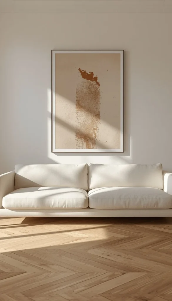
One oversized piece of art will do more for a minimalist luxury living space than an entire gallery wall ever could. I know gallery walls are still popular, and I understand the appeal you get to display everything you love at once. But in a minimalist room, a gallery wall reads as noise. Your eye doesn’t know where to land, and the wall ends up feeling busy rather than considered. One large piece, properly scaled and properly hung, creates a focal point that organizes the entire room around it.
Scale is the part most people get wrong. The artwork should feel slightly larger than comfortable that mild sense of “is this too big?” is usually exactly right. As a general rule, your art should span roughly two thirds of the width of the furniture below it. If your sofa is 84 inches wide, you’re looking for a piece somewhere in the 54 to 60 inch range minimum.
Sourcing oversized art without gallery prices is genuinely possible. Society6, Minted, and Desenio all carry large format prints that reproduce beautifully. Have them printed at a local print shop on heavyweight matte paper rather than buying the framed version online you’ll save 40 to 60 percent and get a better quality result. A simple natural wood or thin black metal frame from IKEA’s YLLEVAD line finishes the look cleanly without competing with the image itself.
- Hang art so the center of the piece sits at eye level approximately 57 to 60 inches from the floor, which is the museum standard
- Lean oversized pieces directly on a console or mantel instead of hanging them if your walls are rental-restricted it reads as intentional and editorial rather than lazy
- Abstract pieces in muted warm tones or soft neutrals integrate most easily into a minimalist luxury palette without dating quickly
Are you more of a warm neutrals person or do you secretly want to go dark and moody with your walls?
14. The Indoor Outdoor Flow Apartment
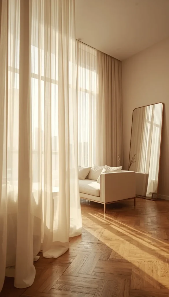
Natural light is the single most underutilized design element in American apartments. Most people treat their windows as a practical feature something you cover with blackout curtains and think about only when the sun gets in your eyes. But in a minimalist luxury living space, windows are the whole point. They’re your connection to the outside, your free source of warmth and depth, and the reason certain rooms feel expansive even when the square footage says otherwise.
If you have sliding glass doors or a balcony, orient your furniture toward them rather than away. This sounds obvious but I walk into apartments constantly where the sofa faces the TV wall and has its back to the best natural light source in the room. Flip that layout and the entire energy of the space changes. You’re not just watching television you’re living in a room that feels connected to the world outside it.
For apartments without a balcony or significant window situation, the approach shifts slightly. Sheer curtains hung from ceiling to floor not just window frame to sill create the illusion of floor-to-ceiling windows and make natural light feel more generous than it actually is. IKEA’s HANNALILL and H&M Home’s linen sheers are two budget-friendly options that hang beautifully and photograph as though they cost three times the price.
Mirrors placed across from windows are doing double duty here they reflect light deeper into the room and create the impression of an additional opening in the wall. In a dark city apartment this single move can genuinely change the mood of the space from morning to afternoon.
15. The Quiet Luxury Edit What to Keep What to Remove
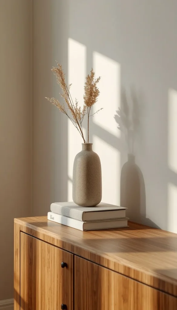
This last one isn’t a decorating style so much as a framework and honestly it might be the most useful thing in this entire article. Because the gap between a room that looks like a minimalist luxury living space and one that just looks like a room with less stuff comes down to the quality of the edit. Removing things randomly doesn’t create luxury. Removing the right things does.
Here is the room audit I walk every client through before we ever discuss buying anything new. Stand in the doorway of your living room and give yourself thirty seconds. Whatever your eye goes to first that’s your focal point, intentional or not. If it’s something beautiful and deliberate, great. If it’s a pile of cables, a mismatched lamp, or a piece of furniture that’s simply taking up space, that’s your starting point.
Everything in the room then gets sorted into three categories. Keep means it’s earning its place it has visual weight, function, or genuine meaning. Store means it’s useful but doesn’t need to be visible. Remove means it’s neither beautiful nor functional and it’s been there so long you stopped seeing it. Most rooms I walk into have at least eight to twelve items in that third category without the homeowner realizing it.
- Every surface should have a maximum of three objects on it and those three should vary in height, material, and scale
- If you can’t explain why a piece is in the room in one clear sentence, it probably shouldn’t be there
- Quality always reads louder than quantity one $200 ceramic vase does more for a room than six $30 decorative objects arranged together
The quiet luxury edit is not about having less for the sake of it. It’s about making sure that what remains is genuinely worth keeping. That’s the whole philosophy of minimalist luxury living spaces, distilled into one question you can ask yourself in any room, at any time: does this belong here, or am I just used to seeing it?
Your Minimalist Luxury Shortcut
By Budget
Starting Out ($500 – $2,000)
- Begin with the Warm Neutral Foundation Room lowest risk, highest impact
- Add the Layered Lighting Plan next biggest return for smallest spend
- Use the Statement Wall Without Renovation for a designer look without contractor costs
- Shop the One Sofa Rule first sell what you have, reinvest in one quality piece
Investment Level ($2,000 and up)
- Prioritize the Hidden Storage Minimalist Setup it changes how the whole room feels
- The Sculptural Coffee Table as the Whole Vibe is worth the splurge if you’re keeping everything else minimal
- The Warm Wood Accent Wall Bedroom adds permanent value to owned spaces
- Japandi and Boucle setups reward quality investment budget versions rarely land the same way
By Lifestyle
Renters and Small Space Dwellers
- Statement Wall Without Renovation no damage, no lost deposit
- Monochrome Small Living Room works in any square footage
- Indoor Outdoor Flow Apartment maximize what light you already have
- Coastal Calm on a real budget achievable under $800 with existing furniture
Homeowners and Long Term Spaces
- Built-in Hidden Storage is worth every dollar in an owned space
- Warm Wood Accent Wall adds resale appeal alongside daily beauty
- The Quiet Luxury Edit framework apply it room by room over time
- Layered Lighting with dimmers wire it in once and enjoy it for years
Frequently Asked Questions
What is the best color palette for a minimalist luxury living room?
Warm neutrals are your safest foundation think soft whites, warm greiges, and creamy linens. Benjamin Moore Pale Oak and Sherwin-Williams Accessible Beige are two I recommend constantly for US homes.
How do I make a small apartment look luxurious on a budget?
Start by removing, not buying. Edit your room down to three anchor pieces, add a layered lighting plan, and hang one oversized art print. Most clients spend under $500 and see dramatic results.
Is boucle furniture worth it for everyday use?
Yes, but only if you’re realistic about upkeep. Boucle snags easily and needs professional cleaning for homes with pets or kids, a performance fabric that mimics the look is the smarter call.
How many decorative objects should a minimalist living room have?
Three per surface, maximum. Vary the height, material, and scale of each grouping so it reads as curated rather than cluttered.
Can renters achieve a minimalist luxury look without renovating?
Absolutely. Peel-and-stick limewash wallpaper, ceiling-height sheer curtains, and one quality sofa will do more than any permanent renovation for a fraction of the cost and zero deposit risk.
Conclusion
You don’t need a bigger apartment, a larger budget, or a complete overhaul to live in a space that genuinely feels good. You need one clear decision made today. Clear a shelf, return the lamp that never belonged, or finally order that paint sample you’ve been saving in seventeen browser tabs. Your home is where your nervous system resets every single day, and it deserves the same intention you give everything else in your life. Start with one corner, one surface, one honest edit and watch how quickly the rest of the room follows.
