
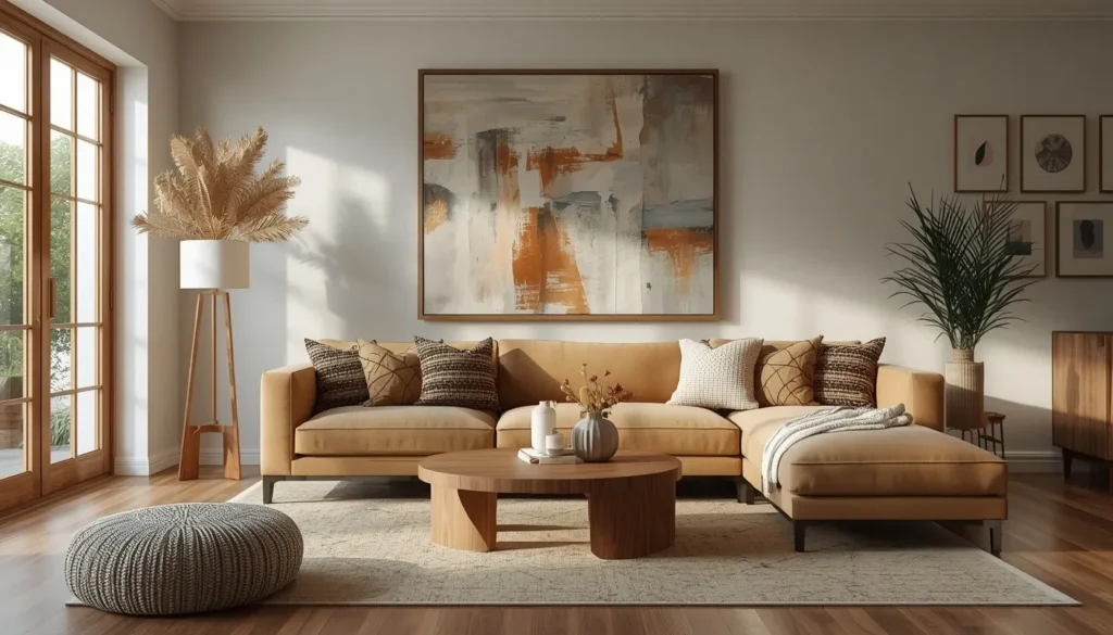
Your sofa is comfortable, your lighting is dialed in, and yet something about the room still feels unfinished. Nine times out of ten, that missing piece is what’s on the walls. Blank walls make even a well furnished living room feel like a rental, while the right art pulls everything else in the space into focus. I’ve walked into countless living rooms where one oversized print or a well planned gallery wall was the only thing standing between “nice” and “wow.” Let’s get into the ideas that actually make that shift happen.
My Design Notes
A few years back, I was working on a living room for a client just outside Chicago who had this massive sectional and one tiny 16×20 canvas floating awkwardly above it. It looked like the art was apologizing for being there. We swapped it for an oversized two panel piece that stretched almost the full width of the sofa, and I dropped the hanging height a few inches lower than what felt “safe.” The second we stepped back, the whole room clicked into place. My client actually said the sofa looked bigger, which made no sense until I explained that scale does that. It’s a mistake I see constantly, and it’s almost always an easy fix once you know what to look for.
16 Stunning Strategies to Elevate Your Living Room Wall Art
1. Go Oversized With One Statement Piece
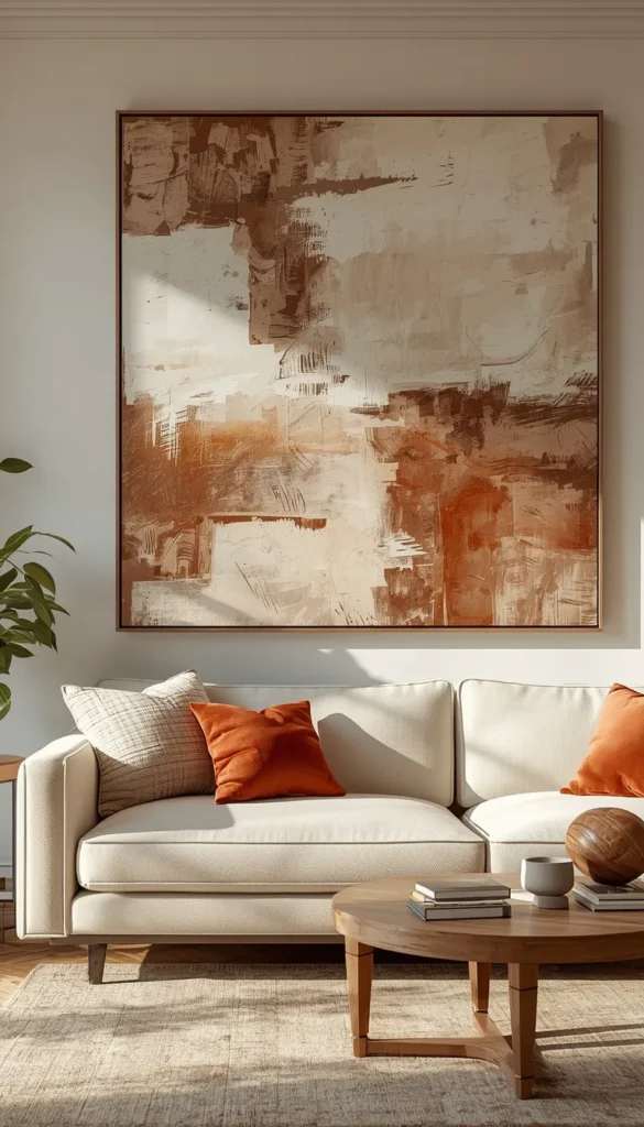
If you only take away one thing from this list, let it be this: bigger almost always looks better than you think it will. A single oversized print, painting, or photograph does more heavy lifting than three or four small pieces scattered around trying to fill the same space. It anchors the room instantly. When I’m sourcing one big piece for a client, I look for something with enough contrast or color depth that it holds its own from across the room, not just up close.
One thing to watch out for is going too small out of nerves. Most people underbuy art the same way they underbuy rugs, and the result is a piece that looks stranded on a huge wall instead of commanding it.
2. Curate a Gallery Wall With Real Spacing Rules
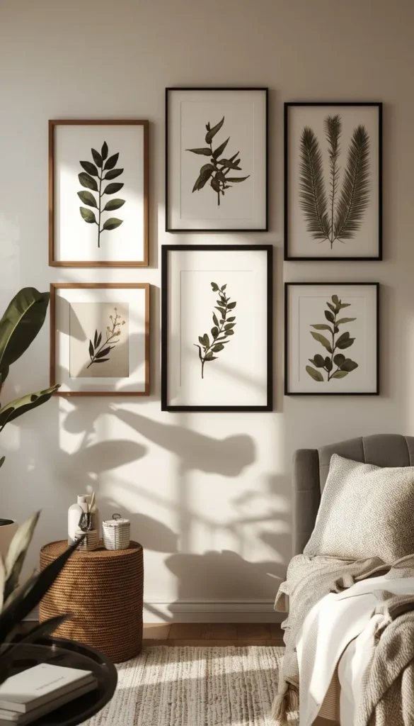
Gallery walls get a bad reputation because most people wing it and end up with something that looks cluttered instead of curated. The fix is almost mathematical. Keep two to three inches between frames, no more, no less, and the eye reads the whole thing as one cohesive piece instead of a scattered collection.
A few things make this work every time:
- Mix frame finishes, like black metal with natural wood, but keep at least one element consistent across all pieces (matting color works well)
- Lay the arrangement out on the floor first, then trace it on kraft paper before a single nail goes in the wall
- Start from the center piece and build outward, not top down
Skipping the floor layout step is the single most common reason gallery walls go wrong.
3. Follow the 57 Inch Rule for Hanging Above a Sofa
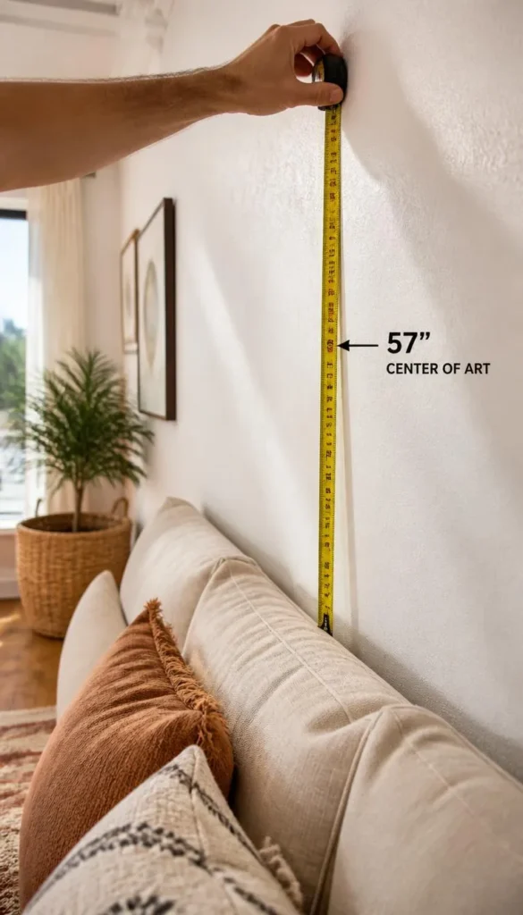
Museums have used this trick forever, and it works just as well in a living room. The center of your artwork should sit at 57 inches from the floor, which is roughly eye level for an average adult standing in the room. Above a sofa, that usually lands the frame six to eight inches above the back cushions, close enough to feel connected to the furniture instead of floating off on its own.
A quick trick I’ve learned is to measure from the floor, not from the sofa itself, since sofa heights vary so much that using the furniture as your reference point throws the whole thing off.
4. Lean Instead of Hang for a Renter Friendly Look
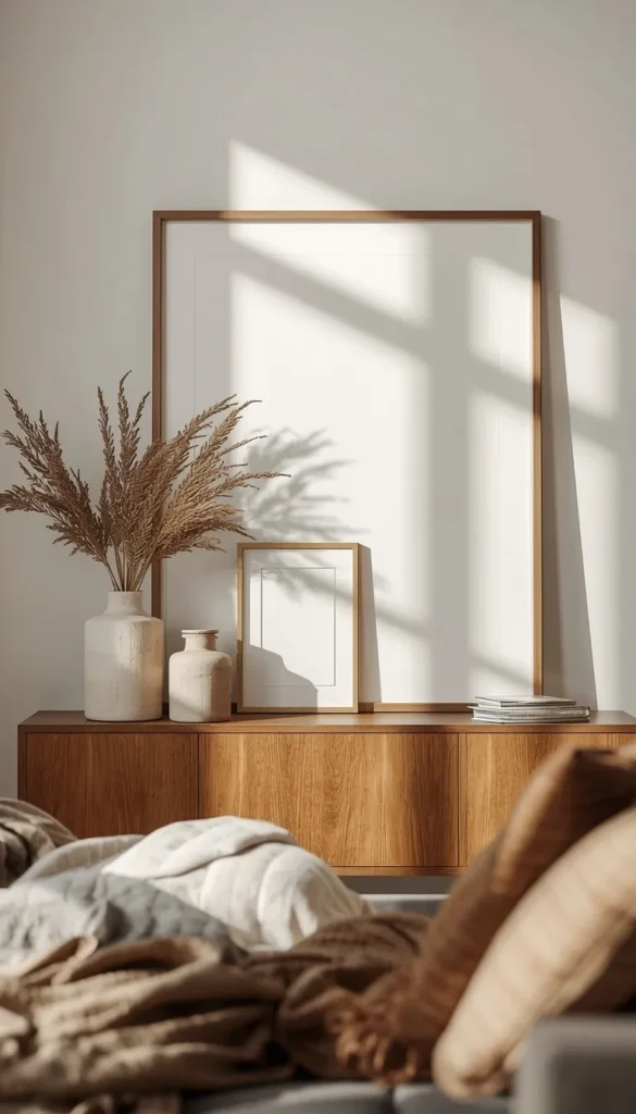
Not everyone can drill into their walls, and honestly, even homeowners are leaning into this look on purpose now. Propping an oversized piece against the wall on a shelf, console, or even the floor gives a room this relaxed, gallery studio feeling that hung art just can’t replicate.
It works especially well layered, with a smaller frame propped in front of a larger one so you get depth without any hardware at all.
What’s on your living room wall right now, and does it actually reflect who you are?
5. Mix Frames and Metals Without Looking Chaotic
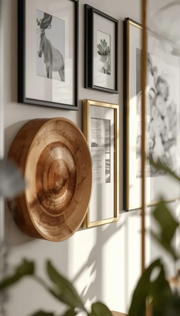
Matching every frame in a room feels safe, but it also tends to feel flat. The rooms that actually hold your attention mix black metal, warm wood, and the occasional brushed brass or gold accent. The trick is picking one metal to repeat at least twice in the space so your eye has an anchor to come back to, whether that’s a lamp base, a picture frame, or a mirror edge.
I usually tell clients to pick a dominant tone and a supporting tone, then stop there. Once you introduce a third or fourth metal finish, the mix starts reading as accidental instead of intentional.
6. Choose Abstract Art for a Minimalist Space
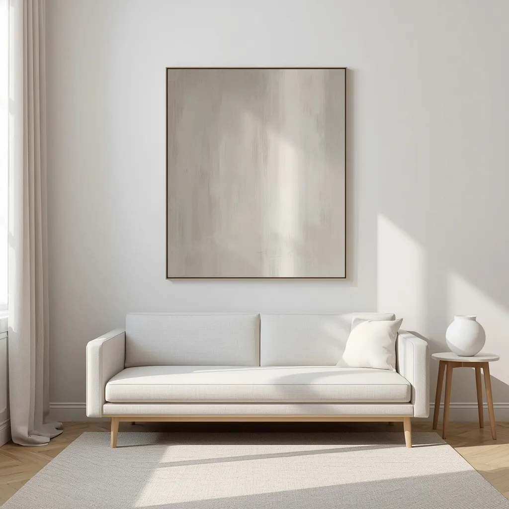
Abstract pieces are forgiving in a way that literal art just isn’t. A landscape or portrait needs the right lighting, the right room tone, the right everything to feel cohesive. Abstract work, especially anything in a neutral or tonal palette, tends to blend into almost any color scheme without a fight.
For a Scandinavian or minimalist living room specifically, look for pieces with soft edges and muted color blocking rather than anything sharp or graphic. It keeps the whole space feeling calm instead of busy.
Top 6 Living Room Wall Art Ideas
| Idea | Estimated Price | Maintenance |
|---|---|---|
| Oversized Statement Piece | $150 to $600 | Low |
| Curated Gallery Wall | $300 to $900 total | Medium |
| Statement Mirror | $100 to $450 | Medium |
| Black and White Photo Wall | $80 to $350 | Low |
| Floating Shelves Display | $60 to $200 per shelf | Medium |
| DIY Canvas Art | $30 to $120 | Low |
7. Use a Statement Mirror as Wall Art
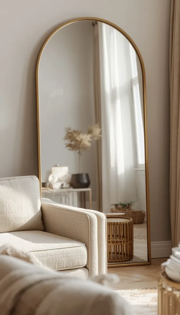
A large mirror does something two dimensional art simply cannot. It bounces light around the room and makes the whole space read as bigger than it actually is, which is part of why designers reach for one so often in smaller living rooms.
One thing nobody mentions is glare. Before you commit to a spot, check what the mirror will actually reflect at different times of day. A mirror facing a window can wash out the room with harsh light in the afternoon, and one facing a busy hallway can end up reflecting clutter instead of anything flattering.
8. Bring in Botanical and Nature Prints
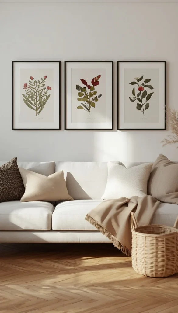
Botanical prints have staying power in a way trendier art doesn’t, mostly because green and earthy tones pair with nearly every existing color scheme. A set of three matching botanical prints, evenly spaced, brings texture and warmth into a room without competing with your furniture or rug.
- Vintage style botanical illustrations lean traditional and work beautifully in transitional spaces
- Large scale leaf photography feels more modern and pairs well with minimalist rooms
- Pressed flower art in thin black frames sits right in between, casual but still polished
If your living room already leans neutral, this category is one of the easiest ways to add life without adding clutter.
If you had to pick just one wall in your home to fix this week, which one would it be?
9. Build a Black and White Photography Wall
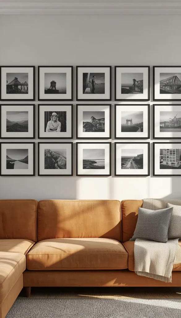
There’s a reason black and white photo walls never really go out of style. Removing color from the equation means every piece automatically coordinates with your existing furniture, no matter what palette you’re working with. A mix of family photos, travel shots, and even a few purchased prints can sit side by side without ever looking mismatched.
Keep frames uniform here, ideally all black or all white, so the consistency in color does the visual work while the photos themselves stay the star.
10. Add Boho Textiles and Macramé Hangings
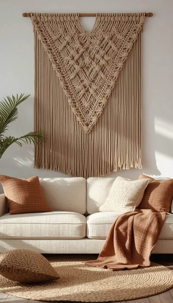
Textile art brings something flat prints can’t, which is actual texture you can see change with the light throughout the day. A woven macramé piece or a textured wall hanging softens a room in a way that feels lived in rather than staged, and it pairs surprisingly well with more structured, modern furniture as a contrast piece.
My advice is to treat these as a single statement rather than layering several together. One well proportioned piece, centered on a wall or flanking a window, tends to read as intentional. Several scattered pieces can start to feel like clutter fast.
11. Style Floating Shelves as Flexible Art Display
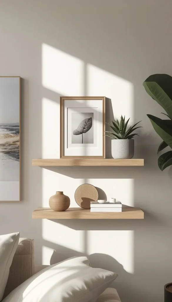
Floating shelves solve a problem hung art can’t, which is commitment. Instead of picking one piece and living with it, you get a surface you can restyle whenever the mood strikes. Lean a small canvas against the wall, prop a framed photo in front of it, add a small plant or object for depth, and you’ve got a display that never feels static.
A few things that make this look pulled together instead of random:
- Vary the height of objects across the shelf rather than lining everything up flat
- Leave visible negative space so the shelf doesn’t feel overstuffed
- Repeat one material, like wood or ceramic, across a couple of items to tie it together
This is one of the lowest commitment ways to add art to a rental or a room you know you’ll want to change often.
12. Try DIY Art That Doesn’t Look DIY
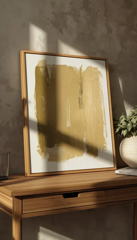
DIY art has a reputation problem, mostly because a lot of it does look homemade in the wrong way. The pieces that actually work tend to be simple by design. Think a single bold brushstroke on a large canvas, an abstract color block piece, or even a well framed textile remnant. Complexity is usually where DIY art goes wrong, not simplicity.
One thing I always tell clients attempting this themselves is to spend the money on a quality frame or canvas stretch, even if the art itself was inexpensive to make. A great frame makes even a simple piece look intentional, while a cheap one can undercut something that was actually well executed.
Are you more of a bold statement piece person, or do you lean toward the quiet, curated gallery wall look?
13. Know When Printable Art Works (and When It Looks Cheap)
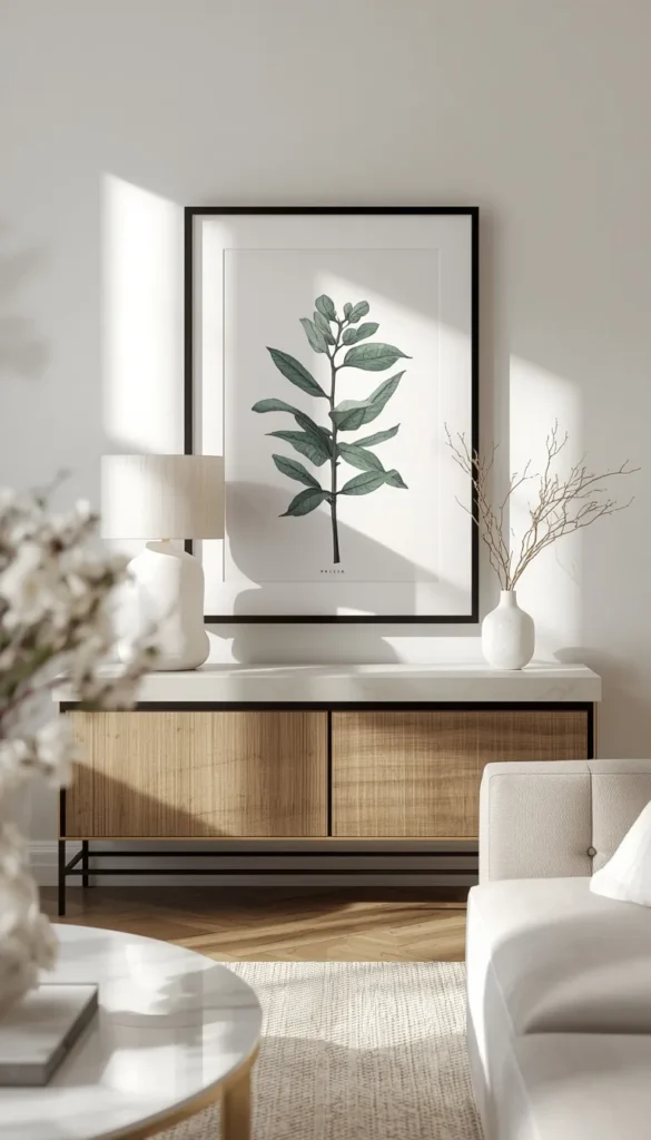
Printable art has gotten a bad reputation, but the truth is it’s less about the concept and more about execution. A high resolution file printed at the right size, on quality paper, in a real frame with proper matting can look every bit as polished as something you’d pay hundreds for. The failure point is almost always low resolution files stretched too large, which come out pixelated and flat under real lighting.
If you’re going this route, stick to prints designed for larger formats and don’t skip the mat. It adds just enough separation between the art and the frame to make it read as considered rather than printed at home in a rush.
14. Size Art Correctly Above a Sectional
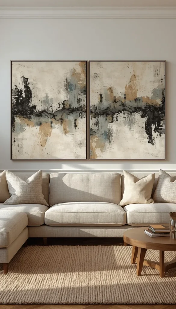
Sectionals throw people off because they’re so much longer than a standard sofa, and a single piece of art sized for a regular couch ends up looking lost above one. As a general guide, your art or arrangement should span roughly two thirds of the sectional’s total width, which usually means going bigger than feels comfortable at first.
For an L shaped sectional specifically, I like anchoring the main piece over the longer run and letting it be the visual weight of the room, rather than trying to center something over the corner where there’s no natural focal point.
15. Budget Smart Across Every Price Tier
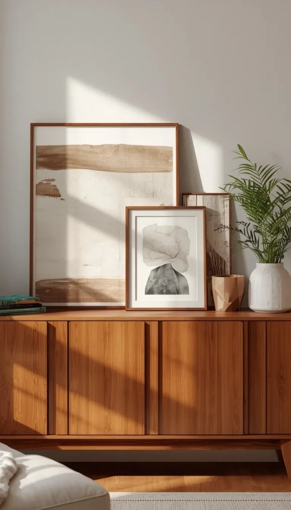
Good wall art exists at every price point, but knowing where to actually spend makes the difference between a room that looks put together and one that looks like it’s trying too hard.
- Under 100 dollars, printable art in a solid frame or a curated thrift find can go a long way
- In the 200 to 500 range, look at canvas prints from independent artists or well made framed photography
- Above 500, this is where an oversized original piece or a custom framed statement work earns its price tag through scale and quality alone
The mistake I see most often isn’t overspending, it’s spreading a small budget across too many mediocre pieces instead of putting it all into one piece that actually makes an impact.
16. Avoid the Most Common Wall Art Mistakes
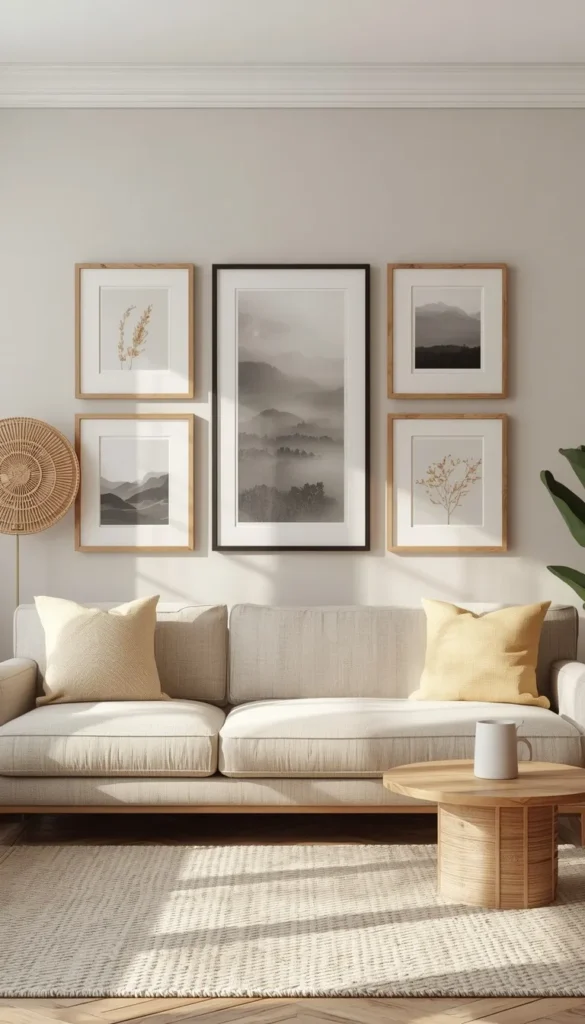
After enough living rooms, the same handful of mistakes show up again and again. Hanging art too high is probably the biggest one, since most people compensate for tall ceilings by pushing everything upward instead of keeping it at eye level. Going too small for the wall is a close second, and mismatched frame styles without any unifying element rounds out the list.
The good news is that every one of these is an easy fix once you know to look for it, which is really the whole point of working through a list like this one in the first place.
Which Path Is Yours?
By Budget
Starter and Budget Friendly
- Printable art in a solid frame
- DIY canvas or color block piece
- Thrifted mirror or vintage find
- Single botanical print set
Luxury and Investment
- Oversized original painting
- Custom framed statement photography
- Full curated gallery wall with mixed mediums
- Large scale sculptural or metal wall art
By Lifestyle
Small Spaces and Apartments
- Lean art instead of hanging it
- One statement mirror to open up the room
- Floating shelves for flexible, swappable styling
- Skip anything oversized that overwhelms the wall
Open Layouts and Larger Rooms
- Go oversized with one true statement piece
- Full gallery wall to fill long stretches of wall
- Art sized to two thirds of a sectional’s width
- Mix metals and frame finishes for visual depth
Busy Families
- Black and white photo wall using real family photos
- Low maintenance pieces like canvas prints
- Durable materials that hold up near foot traffic
- Skip fragile leaning displays kids can knock over
Minimalists
- Single abstract piece in a muted palette
- One botanical print instead of a full gallery
- Clean frame lines with no ornate detailing
- Negative space left intentionally bare
Frequently Asked Questions
How high should I hang wall art in my living room?
Ideally, the center of the piece should sit at 57 inches from the floor. That’s standard eye level and it works whether you’re hanging solo or above furniture.
What size wall art should I get for a large sectional?
Aim for roughly two thirds of the sectional’s total width. Anything smaller tends to look stranded on a wall that big.
Is printable wall art actually worth buying?
Yes, but the resolution matters more than the price. Get a high quality file, print it large, and always frame it with a mat.
How do I arrange a gallery wall without it looking messy?
Keep two to three inches between frames and lay it out on the floor first. That one step prevents almost every common mistake.
How much should I budget for living room wall art?
Most homeowners land somewhere between 150 and 600 dollars for a strong single piece. Gallery walls run higher since you’re buying multiple pieces at once.
Conclusion
Your walls have been waiting for you to notice them, and now you know exactly what to do about it. This is your home, the place you come back to every single day, and it deserves more than blank space and good intentions. You don’t need to redo the whole room this weekend. Pick one wall, clear it off, and try just one idea from this list.
