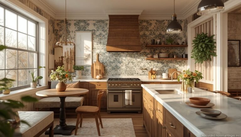
16 Kitchen Countertop Styling Tips for a Clean and Expensive Look
Your countertops are the first thing guests notice and the last thing most homeowners actually style with intention.
A cluttered counter can make even the most expensive kitchen feel chaotic, while a well-styled one can make a builder-grade space look like it belongs in Architectural Digest. I’ve worked with dozens of homeowners across the US who were convinced they needed a full renovation, when all they really needed was a smarter approach to what sits on their counters. These 16 kitchen countertop styling tips will help you create that clean, expensive look you’ve been saving on Pinterest no contractor required.
My Design Notes
A few years ago, I got a call from a client in suburban Nashville, Tennessee a busy mom of three with a beautiful white quartz kitchen that felt anything but beautiful. Every surface was buried. A toaster here, three random candles there, a fruit bowl competing with a coffee maker, and somehow a pile of school permission slips had claimed permanent real estate next to the stove.
She didn’t want a renovation. She wanted her kitchen to finally feel like her kitchen.
We spent exactly $67 at HomeGoods and two focused hours editing what was already there. No new cabinets. No new countertops. Just intentional styling decisions, a tray from the clearance aisle, and a firm rule about what earned counter space and what didn’t.
When her husband walked in that evening, he genuinely thought we’d done a remodel.
That project changed how I approach every kitchen I work on. My “tray-first, edit-second” method was born in that Nashville kitchen, and it’s the backbone of everything I’m sharing with you today.
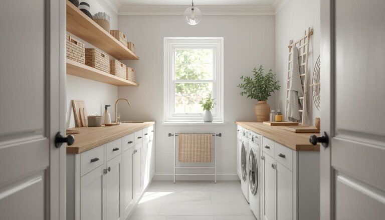
Mastering the Art of Kitchen Counter Styling for a Stunning and Elevated Everyday Space
1. Start With a Clean Slate Literally
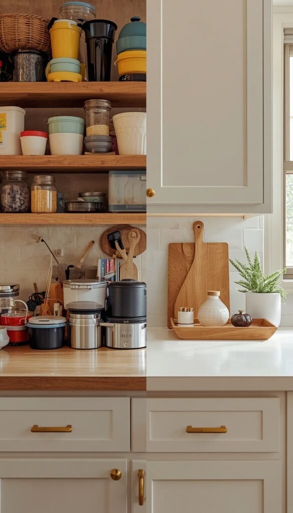
Before you buy a single decorative object, edit what’s already there. This is the step most homeowners skip, and it’s exactly why their counters never quite look “done.” I always tell my clients: styling on top of clutter is like putting on perfume without showering first.
Pull everything off your counters. Every appliance, every random bottle, every piece of mail that somehow migrated to the kitchen. Once the surface is completely bare, you’ll finally see what you’re actually working with the color, the veining, the material. Your countertop is part of the decor too, and it deserves to be seen.
Then, before putting anything back, ask yourself three honest questions:
- Does this item get used at least four times a week?
- Does it have a home somewhere else in the kitchen?
- Does it add to the look, or just exist on the counter by habit?
Only what earns its place goes back. Everything else finds a drawer, a cabinet, or a donation box.
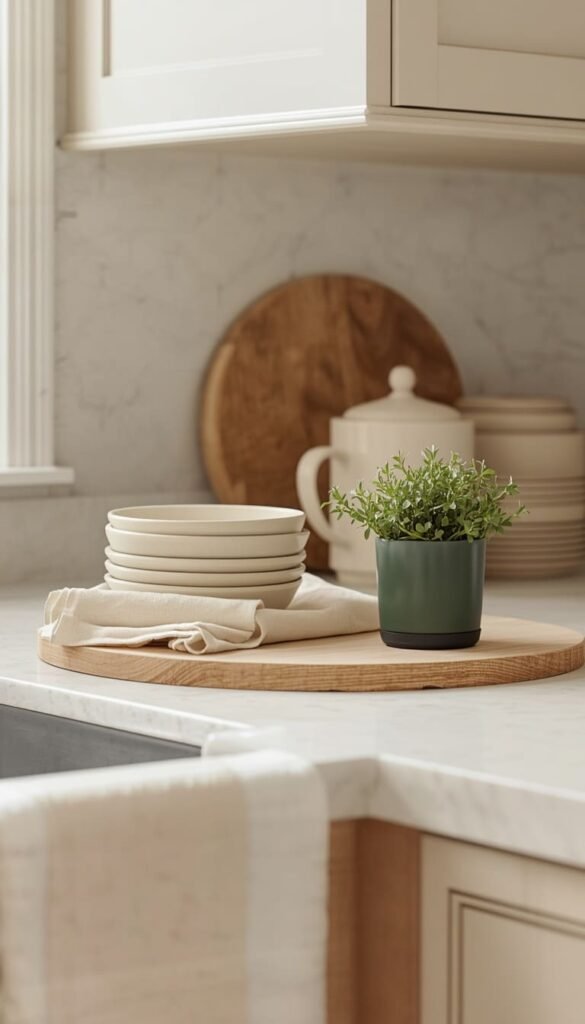
2. Use the Rule of Three for Every Counter Zone
Designers have used this principle for decades, and it works just as beautifully on kitchen counters as it does on bookshelves. The rule is simple group objects in odd numbers, preferably three, because the human eye finds odd groupings more natural and visually interesting than even ones.
Think of it this way: one candle looks forgotten, two looks deliberate but flat, three looks styled. A ceramic jar, a small plant, and a wooden cutting board propped against the backsplash. That’s a vignette. That’s what makes people ask, “Who decorated your kitchen?”
One thing to keep in mind is that the rule of three works best when you vary the height of your objects. More on that in Tip 7, but for now, just start grouping in threes and notice how quickly your counter goes from random to intentional.
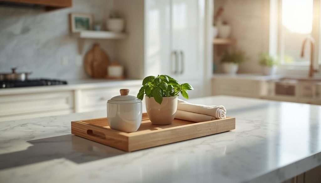
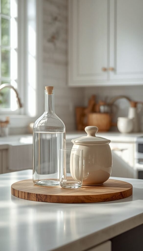
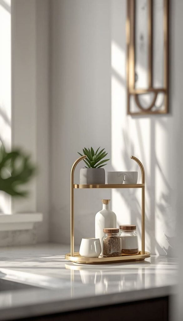
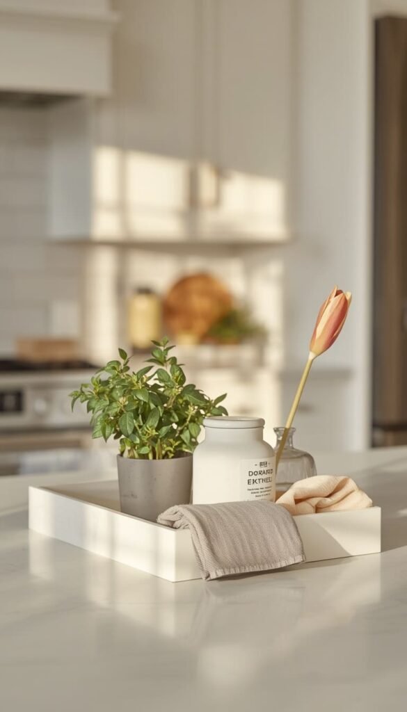
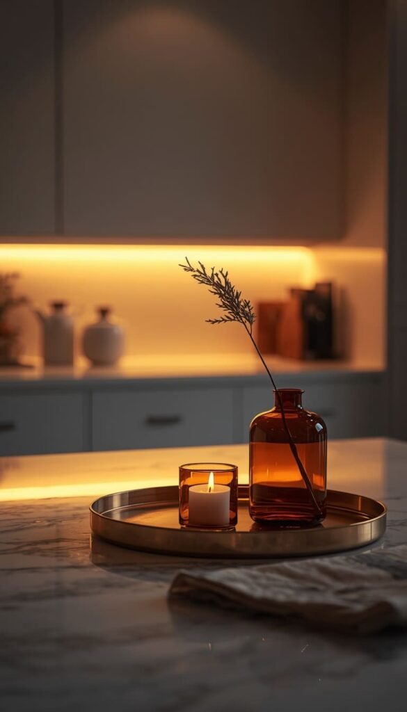
3. The Tray Trick That Makes Everything Look Intentional
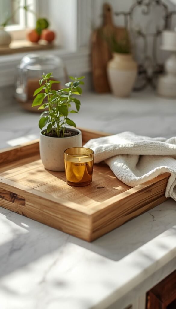
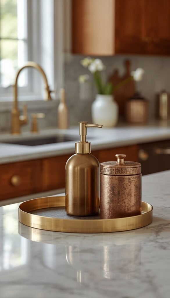
If there is one single styling tool I would recommend to every homeowner in America, it is a tray. A good tray is the great equalizer it takes three unrelated objects and makes them look like they were always meant to live together. It creates a visual boundary that signals, “This is styled, not just stored.”
The key is matching your tray material to the mood of your kitchen:
- Light wood or rattan works beautifully in farmhouse, coastal, or transitional kitchens
- Marble or white ceramic feels elevated and clean in modern or minimalist spaces
- Black metal or brass-edged trays add that luxury edge to contemporary kitchens
Size matters more than most people realize. A tray that’s too small looks like an afterthought. I generally recommend going one size larger than your instinct tells you it grounds the grouping and gives each object room to breathe.
4. Match Your Decor Metals to Your Faucet and Hardware
This is the rule that separates a well-designed kitchen from one that just has nice things in it. Mixed metals can absolutely work, but only when they’re done with intention. What never works is accidentally mixing metals because you bought a gold soap dispenser, a chrome paper towel holder, and a brushed nickel fruit bowl without thinking about how they’d coexist.
My approach with every client is always the same walk up to your faucet and your cabinet hardware first. Those are your anchors. Every metal finish you bring onto that counter should either match or deliberately complement those two things.
If your hardware is matte black, lean into black accents on the counter. Brass fixtures? Bring in warm gold or aged bronze touches. It’s a small discipline that creates a surprisingly powerful sense of cohesion across the whole kitchen.
Top 6 ideas:
| Idea | Estimated Price | Maintenance |
|---|---|---|
| Tray Styling Setup | $12 to $35 | Low |
| Coffee Station Vignette | $20 to $50 | Low |
| Fresh Herb Pot Display | $4 to $12 | Medium |
| Appliance Editing + Garage | $80 to $200 | Low |
| Under Cabinet LED Lighting | $25 to $60 | Low |
| Seasonal Decor Swaps | $15 to $30 per season | Medium |
5. Neutral First Accent Second
Here’s something I wish more homeowners understood before they started shopping for kitchen decor: neutral is not boring. Neutral is the foundation that makes everything else look expensive.
When I style a kitchen counter, I always build the base layer first whites, creams, warm beiges, soft grays, natural wood tones. These are the materials and colors that never fight with each other. A white ceramic canister, a light linen dish towel folded neatly at the edge, a pale wood cutting board. That’s your foundation.
Then, and only then, do you bring in your accent. One color. Maybe two if they’re in the same family. A small pot of deep green herbs, a cobalt blue bowl, a terracotta vase. The accent pops precisely because everything around it is calm. When everything is an accent, nothing stands out and that’s when counters start looking busy instead of styled.
6. Treat Your Coffee Station Like a Vignette
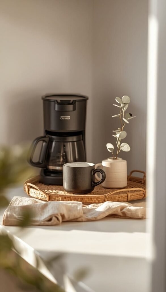
The coffee station is the most visited corner of the American kitchen, and it is almost always the most chaotic. Pods everywhere, a damp dish towel draped over the machine, three different sweetener packets, and a mug that belongs in the cabinet. I’ve seen this in $800,000 homes and $180,000 homes alike.
Here’s how to fix it for good. Contain everything on a tray your machine, one or two mugs you actually love, and a small jar for pods or stir sticks. Add one small element that’s purely aesthetic:
- A tiny potted plant or a sprig of eucalyptus in a bud vase
- A small framed print or a single cookbook propped behind the tray
- A linen napkin folded underneath the mugs for texture
That’s it. The coffee station should feel like a little moment something that makes you smile at 6:30 in the morning before the day starts pulling at you.
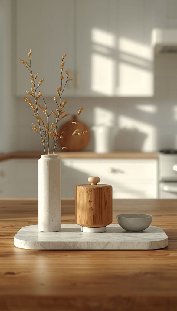
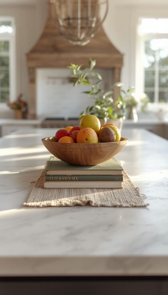
7. Height Variation Is Everything
A flat counter where every object sits at the same level will always look underwhelming, no matter how beautiful the individual pieces are. Height variation is what gives a styled counter that layered, magazine-worthy quality that’s hard to put your finger on but impossible to ignore once you know about it.
The formula I use is simple: tall, medium, low. In every grouping, aim to have at least one object that reaches up, one that sits at mid-height, and one that hugs the counter surface. A tall glass bottle or slender vase, a medium ceramic canister, and a flat wooden board or small dish at the base. The eye travels up and down naturally, and the whole thing feels alive rather than static.
A quick trick I’ve learned over the years if you don’t have a naturally tall object, a cookbook stood upright does the job beautifully and adds a personal, lived-in touch that purely decorative objects sometimes can’t.
8. The One Living Thing Rule
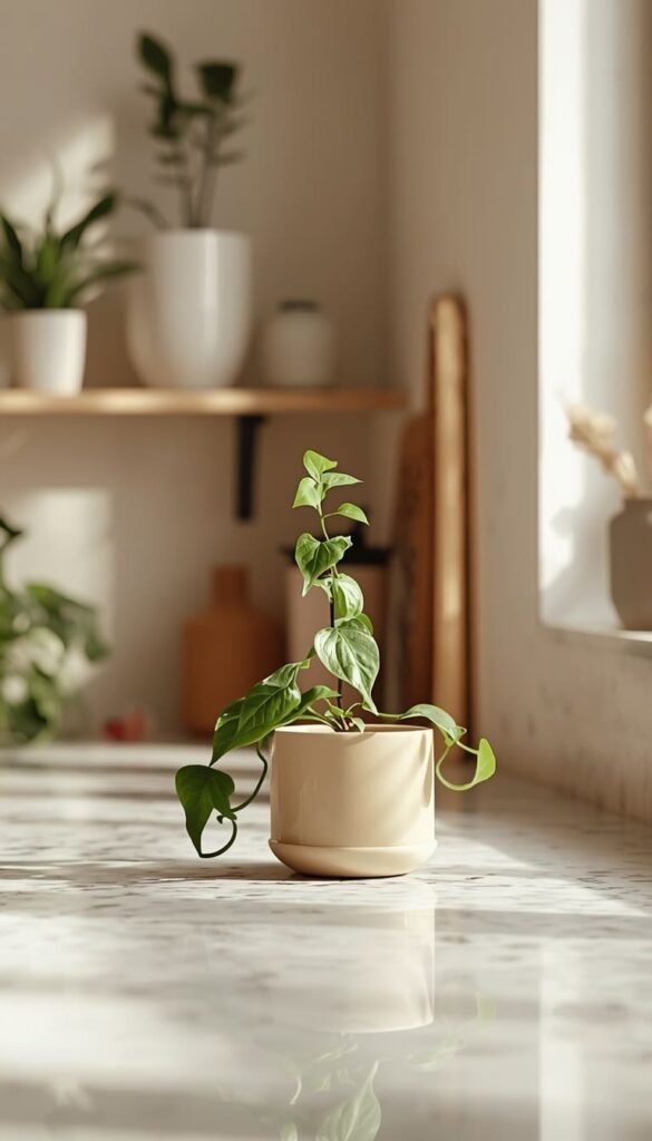
There is something about a living element on a kitchen counter that no faux plant or printed botanical can fully replicate. It brings warmth, softness, and a quiet kind of energy that makes a kitchen feel genuinely inhabited rather than staged for a photo shoot.
My rule is simple every kitchen counter needs at least one living thing. It doesn’t have to be elaborate or expensive:
- A small pot of fresh basil or rosemary near the window pulls double duty as decor and ingredient
- A single stem in a bud vase, swapped out weekly, keeps things feeling fresh for almost nothing
- A trailing pothos in a ceramic pot adds softness to an otherwise hard, linear counter surface
One thing to watch out for is overcommitting to plants you won’t maintain. A wilting, yellowing plant does more damage to your counter’s aesthetic than no plant at all. Start with one hardy option basil is forgiving, pothos is nearly indestructible and build from there once you’ve got the habit down.
Which one of these tips feels most doable in your kitchen this weekend the tray trick or the appliance edit?
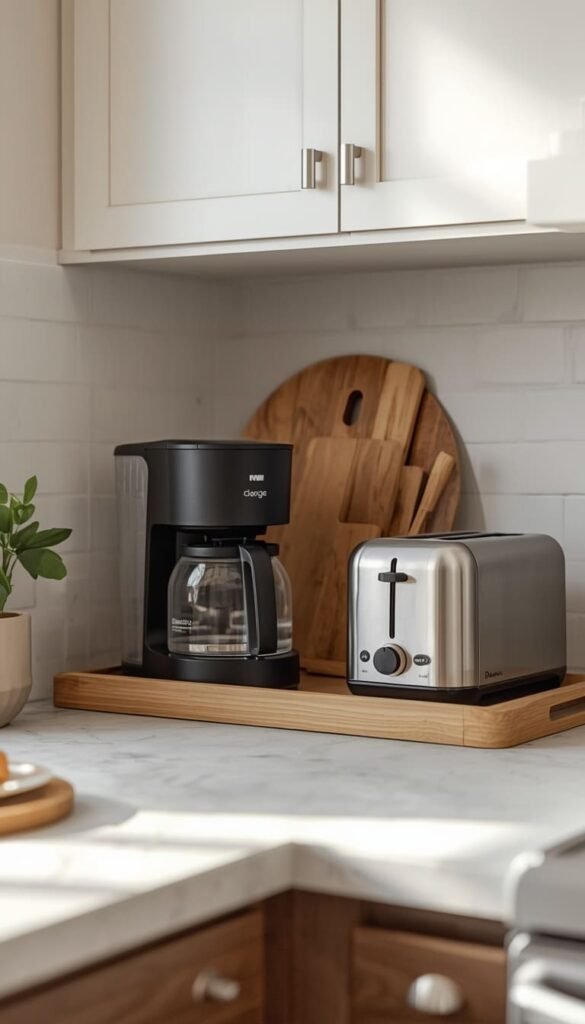
9. Appliance Editing What Stays on the Counter and What Doesn’t
Let me be straightforward with you here not every appliance deserves counter real estate, even if you use it regularly. This is one of the most emotionally charged conversations I have with clients because people feel genuinely attached to the convenience of having everything within arm’s reach. But a counter lined wall to wall with appliances, no matter how high-end they are, will always look cluttered.
Here’s the honest framework I use:
- Daily use appliances like your coffee maker, toaster, or electric kettle earn their spot — but they should be styled around, not just plopped down
- Three to four times a week appliances like an air fryer or stand mixer are borderline — consider a dedicated appliance garage or a lower cabinet with easy pull-out access
- Weekly or less use appliances like waffle makers, juicers, and food processors belong in a cabinet, full stop
The other factor nobody talks about is color. A black coffee maker next to a stainless steel toaster next to a red stand mixer is a visual argument happening on your counter every single day. If you can’t match your appliances in finish, contain each one within its own styled zone using trays or defined counter sections so they stop competing with each other.
10. Small Kitchen Counter Styling Tricks That Actually Work
Styling a small kitchen counter is genuinely different from styling a sprawling open-plan kitchen, and I think a lot of generic advice fails small kitchen owners because it doesn’t account for that reality. When you have 18 inches of usable counter space, every single object carries more visual weight.
The single most effective thing you can do in a small kitchen is go vertical. A slim tiered stand, a small wall-mounted magnetic knife strip, or a narrow floating shelf just above the counter line pulls your eye upward and frees up precious surface space below. It sounds simple because it is but it works every time.
A few other small kitchen rules I stand by:
- Keep your counter palette to two colors maximum — visual noise shrinks a small space faster than physical clutter does
- Choose one statement piece and keep everything else quiet around it
- Reflective surfaces like a small mirrored tray or a glossy ceramic piece bounce light around and make the space feel larger than it is
And please resist the urge to style every inch of a small counter. Negative space is not wasted space. In a small kitchen, an intentionally empty stretch of counter actually makes the whole room breathe.
11. How to Style a Kitchen Island Differently From Perimeter Counters
Your kitchen island is not just a bigger counter it is the centerpiece of your kitchen, and it deserves to be treated that way. I always tell clients to think of the island as the dining table of the kitchen world. It should feel curated, almost like a vignette you’d find in a living room, while the perimeter counters handle the functional, everyday styling.
On an island, you have more freedom to be intentional and a little more decorative. A oversized wooden bowl filled with seasonal fruit, a stack of two or three beautiful cookbooks with a small plant resting against them, a long narrow tray running down the center with candles and a linen runner beneath it these are island moments. They’re designed to be seen from multiple angles since people move around an island in a way they don’t move around a wall counter.
The perimeter counters, on the other hand, should prioritize function dressed up beautifully. Your coffee station, your prep zone, your dish drying area these spaces should look good but work hard. The island gets to be the showpiece. Let it.
12. Luxury Looks on a Budget The $50 Counter Refresh
One of my favorite things to tell clients who are convinced they need to spend thousands to get a high-end looking kitchen is this the most expensive-looking kitchens I’ve ever styled cost almost nothing to decorate. The luxury is in the editing and the intentionality, not the price tag.
Here’s a real $50 counter refresh breakdown that I’ve used with clients and recommended countless times:
- A simple white or natural wood tray from Target or TJ Maxx: $12 to $18
- One good-looking canister or ceramic jar for utensils: $10 to $15
- A small potted herb or trailing plant from your local grocery store or Home Depot: $4 to $8
- A linen dish towel in a neutral color folded at the counter edge: $6 to $10
- One bud vase with a single stem — even a grocery store flower works: $5 to $8
That’s a fully styled counter for under $50. The secret is restraint. Five well-chosen, cohesive objects will always look more expensive than fifteen random ones. Shop with your countertop color and your existing hardware finish in mind, and you will be genuinely surprised at what a small budget can do.
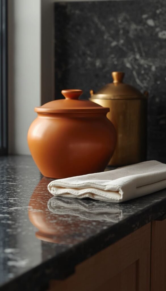
13. Coordinate Your Countertop Color With Your Decor Objects
This is a styling detail that most homeowners completely overlook, and honestly, it’s one of the fastest ways to make a counter look pulled together without changing a single thing about the kitchen itself. Your countertop color is not just a background it’s an active participant in your decor, and what you place on top of it either harmonizes or fights with it.
White and light gray countertops are the most forgiving. Almost any accent color pops beautifully against them deep greens, warm terracottas, navy, even blush. If you have white quartz or light marble, you have the most flexibility, so use it. Bring in one strong accent color through your plant pot, your tray, or your canister set and let the rest stay neutral.
Dark countertops — charcoal granite, black soapstone, deep walnut butcher block are a different conversation entirely. Here’s what works:
- Light and warm tones like cream ceramics, natural wood, and aged brass feel rich and intentional against a dark surface
- White objects create a clean, graphic contrast that reads as very modern and deliberate
- Avoid dark-on-dark groupings unless one element has significant texture or sheen to differentiate it
Warm-toned counters like butcher block or honey-colored quartzite love earthy companions linen, terracotta, olive green, matte black. They’re less suited to cool grays or stark whites, which can feel disconnected from the warmth of the wood underneath.
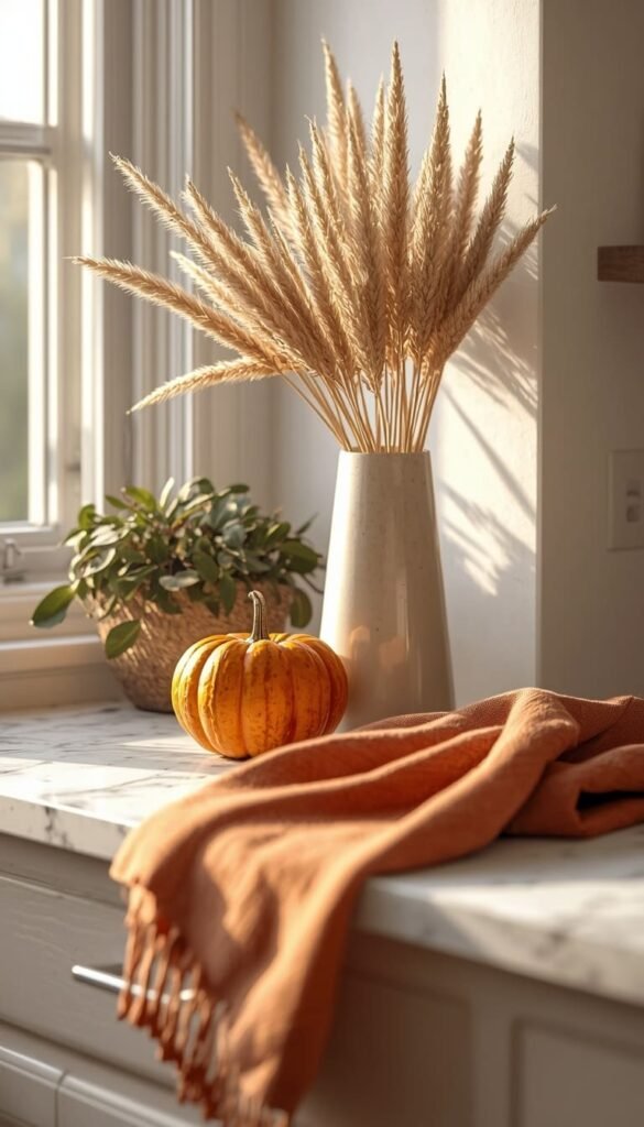
14. Seasonal Styling Swaps That Keep Your Kitchen Fresh
One of the things I genuinely love about kitchen counter styling is that it doesn’t have to be permanent. Unlike a renovation, you can completely refresh the feel of your kitchen four times a year with minimal effort and almost no budget. This is something I encourage every single one of my clients to build into their home routine because it keeps a kitchen feeling alive and current without ever feeling dated.
The framework is simple anchor pieces stay year-round, and accent pieces rotate with the seasons. Your tray, your canisters, your primary plant those are anchors. Your seasonal swap items are things like:
- A small pumpkin or bundle of dried wheat in fall, swapped for a pine sprig or metallic candle in winter
- Fresh tulips or a lemon-filled bowl in spring, replaced by a bright herb garden or a bowl of limes in summer
- A linen towel in a warm rust tone for October, a crisp white one for January
The whole swap should take twenty minutes and cost under $20 if you’re shopping smart at places like Trader Joe’s, IKEA, or your local farmers market. A kitchen that changes with the seasons feels curated and lived-in in the best possible way like someone actually loves and tends to that space.
15. Lighting and Countertop Styling The Connection Nobody Talks About
Here’s something I bring up with almost every client that genuinely surprises them your counter styling can look completely different depending on your lighting, and ignoring that relationship is one of the most common reasons a styled counter looks great in the afternoon and oddly flat at night.
Natural light is your best friend during the day. If your counter gets good morning or afternoon sun, lean into reflective and light-colored objects that catch and move that light around. A glass bud vase, a polished marble tray, a glossy ceramic canister these come alive in natural light in a way that matte objects simply don’t.
After dark, the game changes. Under-cabinet lighting is genuinely one of the highest-impact, lowest-cost upgrades you can make to a kitchen, and it transforms how your counter styling reads in the evening hours. Warm LED strips installed under upper cabinets cast a soft glow across your countertop surface that makes even simple styling look intentional and intimate. If you don’t have hardwired under-cabinet lights, plug-in LED puck lights from Amazon work surprisingly well and cost less than $30 for a set.
One quick trick worth knowing if your overhead kitchen lighting is cool or bright white, add warmth to your counter styling through materials. Warm wood tones, amber glass, brass or gold accents, and natural linen all push back against harsh overhead light and keep your counter from feeling clinical.
And honestly, what’s the one thing sitting on your counter right now that you know deep down doesn’t belong there?
16. The What NOT to Do Counter Styling Mistakes
Every article gives you the “dos” and calls it a day. I think the “don’ts” are where the real education lives, so let’s be honest about the mistakes I see over and over again in American kitchens even beautiful, well-intentioned ones.
The biggest offender is over-styling. More is not more on a kitchen counter. A counter packed with ten decorative objects, three appliances, a cookbook, and a fruit bowl is not styled it’s just organized clutter with better taste. Edit ruthlessly and then edit again.
The second mistake is ignoring scale. A tiny bud vase on a long stretch of dark granite disappears completely. A massive fruit bowl on a small 24-inch counter section overwhelms everything around it. Scale your objects to your counter space the same way you’d scale furniture to a room.
A few more honest ones worth calling out:
- Paper towel rolls left out in plain sight instantly cheapen the look of any counter, no matter what’s around them decant into a holder or tuck them away
- Mismatched plastic containers sitting out “temporarily” have a way of becoming permanent; they never look intentional
- White rugs or mats near the sink look stunning in photos and are an absolute nightmare in real life, especially with kids or pets go for a darker pattern if you want the layered look without the constant cleaning
- Candles that have never been burned with dusty wicks sitting in a grouping read as prop, not decor light them, use them, let them look lived-in
A styled kitchen counter should feel like a reflection of how you actually live, just the most elevated, intentional version of it. That’s the difference between a counter that looks expensive and one that just looks decorated.
Your 2-Minute Counter Styling Cheat Sheet
By Budget
Starter Style ($0 to $50)
- Edit and declutter first — costs nothing and changes everything
- Use a tray from Target or TJ Maxx to anchor your grouping
- Add one fresh herb pot from the grocery store
- Fold a neutral linen towel at the counter edge for instant polish
- Swap seasonal accents from Trader Joe’s or the dollar section at Target
Luxury Styling ($100 to $300+)
- Invest in a large-format marble or slate tray as your counter anchor
- Choose matching appliances in a single finish — matte black or brushed gold
- Add a designer canister set in ceramic or stoneware
- Layer in under-cabinet LED lighting for evening ambiance
- Style your island with a oversized artisan bowl as a focal centerpiece
By Lifestyle
Busy Families and Pet Owners
- Skip white trays and light-colored mats — go for darker, patterned surfaces
- Keep counter objects minimal and weighted — nothing that tips or breaks easily
- Store appliances in an appliance garage to protect surfaces from daily chaos
- Choose washable linen towels in darker neutrals that hide everyday use
Minimalists and Empty Nesters
- Stick to three objects maximum per counter zone — no exceptions
- Let your countertop material be the star — style around it, not over it
- One living plant, one tray, one functional beautiful object — done
- Negative space is your most powerful styling tool — use it fearlessly
Frequently Asked Questions
What is the easiest way to make kitchen counters look expensive?
Start with a tray. Group three objects of varying heights on it, keep your metals matching, and remove everything that doesn’t earn its place. Restraint is the real luxury.
How do I style a small kitchen counter without making it look cluttered?
Less is genuinely more here. Pick one focal object, go vertical with a slim tiered stand, and leave intentional empty space. Two colors maximum on a small counter always.
What should I always keep off my kitchen counters?
Paper towel rolls, mismatched plastic containers, and rarely used appliances. If it’s not used four times a week or doesn’t add to the look, it belongs in a cabinet.
How often should I change my kitchen counter decor?
Seasonally four times a year is the sweet spot. Swap only your accent pieces and keep your anchor items like trays and canisters consistent year-round.
Do kitchen countertop colors affect how I should decorate them?
Absolutely yes. Dark counters need light or warm-toned objects to create contrast. Light counters can handle bold accents. Always style with your countertop color in mind, not against it.
Conclusion
Your kitchen doesn’t need a renovation it needs intention. Start with one counter, one tray, and the willingness to edit ruthlessly, and I promise you’ll be shocked at how different that space feels by the end of an afternoon. I’ve watched a $67 HomeGoods run completely change the way a family experiences their home every single morning. That kind of shift is available to you right now, today, without a contractor or a big budget.
Clear one shelf, group three things you already own, and see what happens. Small moves, made with purpose, add up to a kitchen that finally feels like yours.
Now I want to hear from you which of these 16 tips are you trying first, and what does your counter situation look like right now? Drop it in the comments below!