15 Neutral Classroom Decor Ideas for a Cozy Classroom
The most effective classrooms I’ve ever walked into didn’t look like classrooms at all. They felt calm, intentional, and almost residential the kind of space where students actually want to settle in and focus. Neutral classroom decor does exactly that. It strips away the visual noise, replaces it with warmth and texture, and creates an environment where both teachers and kids can breathe. These 15 neutral classroom decor ideas are practical, budget-friendly, and genuinely beautiful no Pinterest fantasy budgets required.
My Design Notes
A few years ago, I took on a 3rd-grade classroom redesign in Austin, Texas, and the constraints were real. The teacher had a $400 budget, district rules banned wall paint entirely, and every single thing we installed had to come down cleanly in June. I remember standing in that room thinking bare cinder block walls, flickering fluorescents, and mismatched brown furniture this is a hard starting point. But we worked with what we had. Peel-and-stick shiplap panels went up along the reading corner wall. We brought in two IKEA KALLAX units, dressed them with beige woven baskets, and used command strip hooks to hang a simple sage green fabric panel above the reading nook. The whole palette landed on warm sand and soft sage. On the first day back, three kids walked through the door and one of them said, without any prompting, that it felt like a coffee shop. My client the teacher teared up a little. That moment is exactly why neutral classroom decor matters more than people think.
Stunning Ways to Master a Warm and Welcoming Neutral Classroom Environment
1. Warm Sand Walls with a Sage Green Reading Corner
If your district allows painting, this is the single highest-impact change you can make to a classroom full stop. Warm sand on the main walls reads neutral without feeling cold or sterile, and a sage green accent wall around the reading corner creates just enough contrast to feel intentional. I’ve used Benjamin Moore’s “Pale Oak” and Sherwin-Williams “Accessible Beige” in elementary classrooms across Texas and Tennessee, and both land beautifully under natural light.
The color psychology here is real. Cool greens support focus and reduce visual stimulation, while warm beiges create a grounded, unhurried feeling in the room. Together, they signal to students without a single word that this is a place to slow down and think.
For teachers in districts that ban wall paint, peel-and-stick wallpaper in a muted sage linen texture is a genuinely good workaround. Brands like Chasing Paper and RoomMates both carry options under $40 per roll, and they remove cleanly without damaging cinder block or drywall. One thing to watch out for: sage can pull muddy under harsh fluorescent lighting. Always test a swatch during actual school hours before committing to the full wall.
2. Greige and White Minimalist Desk Setup
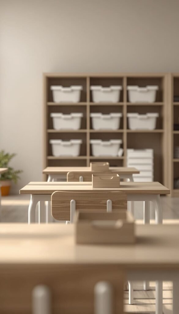
Greige is criminally underused in American classrooms. That perfect gray-beige blend works with every accent tone charcoal, terracotta, black, sage and it never competes with student artwork on the walls. Pair it with white desks and light wood chair frames and the whole room immediately feels cleaner and more composed.
Keep desk surfaces intentional:
- One small supply caddy per student white, kraft paper, or natural wood
- No loose papers, extra supplies, or decorative clutter on desk surfaces
- A single pencil cup in a neutral tone pulls the whole setup together
At IKEA, the MICKE desk in white runs around $80 and holds up well in classroom settings. A quick trick I’ve learned over the years white contact paper over existing brown laminate desks is surprisingly effective and costs almost nothing. The maintenance reality though: white surfaces show pencil scuffs within the first week. A Magic Eraser handles most of it, but go in with realistic expectations, especially with younger grades.
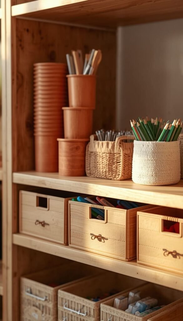
3. Natural Wood Shelving with Woven Basket Storage
Nothing moves a classroom from institutional to intentional faster than natural wood tones. The grain, the warmth, the organic texture it does the heavy lifting so everything else in the room can stay calm and quiet. Open shelving in birch or light oak is the foundation, and what you place on those shelves matters just as much as the shelves themselves.
Woven baskets are the move. Label them simply with a kraft paper tag or a small chalkboard clip, and suddenly your storage system looks like it belongs in a boutique studio rather than a school supply closet. Your eye stops jumping between thirty different colored plastic bins and finally gets to rest.
IKEA’s KALLAX unit is the gold standard here around $200 for a 4×4, and it genuinely holds up to years of hard classroom use. The DRONA basket inserts in beige or gray finish the look perfectly. One practical note worth mentioning: avoid dark-stained wood in rooms with limited natural light. It absorbs light and makes the space feel smaller than it actually is. Always go lighter when the room is working against you.
4. Soft Linen Bulletin Boards Instead of Bright Bordered Boards
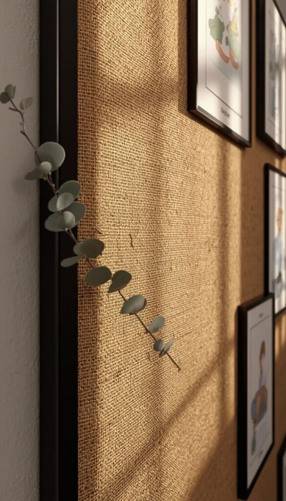
This is the swap I recommend first, every single time, without exception. Traditional bulletin boards with neon scalloped borders and bright backing paper are visually exhausting they fight with student work instead of framing it. Switching to a neutral linen or burlap backing costs almost nothing and completely changes how the board reads in the room.
Natural burlap from Hobby Lobby or JOANN is inexpensive and staples directly over existing board surfaces. For a cleaner finish, a linen-look fabric from Amazon drapes beautifully and sits wrinkle-free within a day. Swap the plastic scalloped border for one of these alternatives:
- Thin black trim for a modern, gallery-wall feel
- Brown kraft paper folded into a clean straight edge for a budget-friendly neutral look
- Simple rope trim stapled along the border for a slightly coastal, organic touch
The honest trade-off with burlap: it frays at the edges over time and is harder to staple through cleanly. Use a heavy-duty stapler and trim any fraying with fabric scissors every couple of months. Small effort, massive visual payoff.
Top 6 ideas:
| Idea | Estimated Price | Maintenance |
|---|---|---|
| Warm Sand Walls with Sage Green Corner | $40 – $120 | Low |
| Natural Wood Shelving with Woven Baskets | $80 – $220 | Low |
| Neutral Boho Rug | $60 – $150 | Medium |
| Cozy Reading Nook with Canopy | $100 – $200 | Low |
| Flexible Seating Arrangement | $80 – $250 | Medium |
| Warm Toned Window Treatments | $15 – $60 | Low |
5. Neutral Boho Rug to Anchor the Classroom Floor
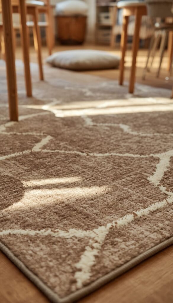
Vinyl and linoleum classroom floors are the enemy of cozy. They’re cold, loud, and visually flat and no amount of wall decor fully compensates for a harsh floor. A well-chosen neutral rug changes the entire energy of a room, especially in a reading area or morning meeting space. It signals that this corner of the classroom is different. Softer. Worth slowing down in.
For a boho-leaning neutral palette, look for rugs in cream, oatmeal, warm gray, or terracotta with low-contrast geometric or diamond patterns. The pattern adds visual interest without breaking the calm. A quick trick I’ve learned avoid pure white rugs in any classroom setting regardless of how beautiful they photograph. Twenty-five kids and a glue stick situation will end that relationship fast.
Size matters more than most teachers realize:
- For a reading corner, a 5×7 rug is the sweet spot
- For a full morning meeting area, go 8×10 minimum so no one is sitting half-on, half-off
- Rug tape or a non-slip pad underneath is non-negotiable on smooth floors
Ruggable makes washable options that are genuinely classroom-friendly, starting around $100. For tighter budgets, IKEA’s STOENSE and Amazon’s stone-wash collection both deliver the neutral boho look under $60.
Which neutral classroom decor idea from this list feels most like your teaching style the cozy reading nook, the minimalist desk setup, or the Scandinavian calm down corner?
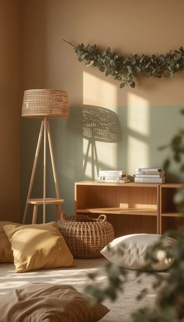
6. Warm White String Lights for Soft Ambient Glow
Fluorescent ceiling lights are one of the biggest reasons classrooms feel stressful. They’re harsh, they flicker, and they cast that particular shade of blue-white that makes everyone look slightly unwell. You probably can’t remove them but you can layer over them with something warmer.
Warm white string lights tucked along a bookshelf edge, draped above a reading nook canopy, or wound through a plant display add an entirely different quality of light to the room. The effect is immediate. The space feels calmer, more residential, and genuinely inviting in a way that no bulletin board redesign can match on its own.
Stick with bulbs in the 2700K to 3000K range that’s the warm golden tone, not the cool daylight white. A 66-foot LED strand from Amazon runs under $15 and is more than enough for a full reading corner setup. Battery-operated options work well in classrooms without accessible outlets near display areas. One thing to watch out for: string lights do require an outlet or battery swap to maintain, so factor that into your setup before committing to a placement that’s hard to reach.
7. Beige and Cream Flexible Seating Arrangement
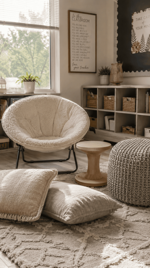
Flexible seating is one of those ideas that sounds great in theory and falls apart in execution when the aesthetic isn’t considered. Mismatched wobble stools in five different primary colors, a lime green bean bag, and a purple floor cushion do not create a calm classroom they create visual chaos with good intentions. The key is committing to a cohesive neutral palette across every seating option in the room.
Beige, cream, warm gray, and natural wood tones are your range. Stay inside it. Here’s how I typically layer flexible seating in a neutral classroom without it looking like a furniture showroom accident:
- Low floor cushions in linen or canvas fabric for the reading corner
- One or two saucer chairs in cream or warm gray near the windows
- Wobble stools in natural wood finish at small group tables
- A boucle or waffle-knit floor pouf near the calm down corner
The honest reality of flexible seating: it requires explicit student routines and consistent expectations to function well. The decor part is easy. The management piece takes real investment. Build in the time to teach students how to use each seating option before the novelty becomes a distraction.
Amazon, Walmart, and Target all carry neutral-toned floor cushions and saucer chairs in the $20 to $60 range. You don’t have to buy everything at once build the collection intentionally over a semester.
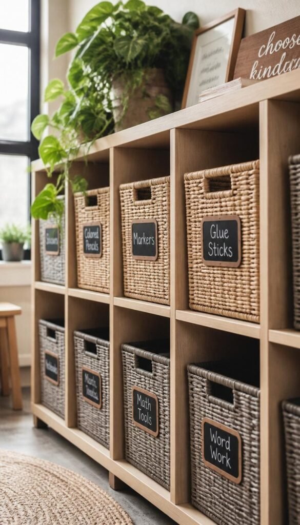
8. Earth Tone Classroom Supply Organization System
A classroom can have the most beautiful neutral walls and furniture in the building and still feel chaotic if the supply organization system is a rainbow of mismatched plastic containers. This is the detail most classroom decor articles skip entirely and it’s one of the most impactful things you can fix on a small budget.
Earth tone organization means pulling every visible supply container into the same warm neutral family. Think kraft paper pencil cups, terracotta-toned supply trays, beige fabric drawer organizers, and natural wood caddies for marker sets and scissors. When every container on every surface shares the same visual language, the room reads as calm even when it’s busy.
A few products I reach for consistently:
- IKEA SOCKERBIT bins in white for shelving units
- Amazon Basics fabric cube organizers in gray or tan
- Kraft paper magazine files for student folders and paper storage
The swap doesn’t need to happen all at once. Start with the most visible surfaces the teacher desk, the front supply station, and the top shelf of your main storage unit. Those three areas make up the majority of what students and visitors see when they walk through the door. Get those right first and the rest follows naturally.
9. Simple Wood and Black Chalkboard Label System
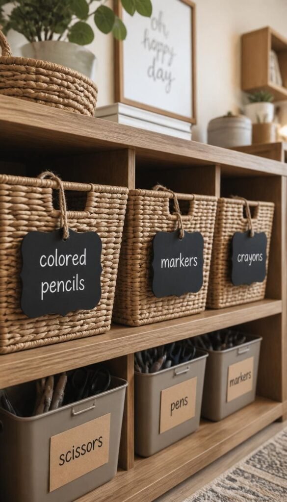
Labeling in a classroom is one of those necessary evils that most teachers handle with bright colored tape and a laminator and the result is always the same. A wall of mismatched neon labels that quietly undermine every neutral design decision made everywhere else in the room. A cohesive label system is what separates a classroom that looks intentional from one that looks like it tried and gave up halfway through.
Wood and black chalkboard labels are the cleanest solution I’ve found for neutral classrooms. Small chalkboard tags on a jute string, kraft paper labels with black handwriting, or printed labels in a single neutral font on cream cardstock all work beautifully. The consistency across every bin, basket, shelf, and drawer is what makes the room feel designed rather than decorated.
For teachers who prefer typed labels over handwritten ones, one simple trick: print everything in a single serif font Playfair Display or Lora work well in dark brown or black on cream cardstock. Laminate, trim with a straight edge, and attach with a mini binder clip to basket handles. Clean, repeatable, and takes about an hour to set up for an entire classroom.
The one honest con here is flexibility. Chalkboard and handwritten labels are harder to update quickly when supplies change or bins get reorganized mid-year. Keep a small chalk marker and a few blank tags on hand specifically for quick swaps
10. Muted Plant Decor with Snake Plants and Pothos
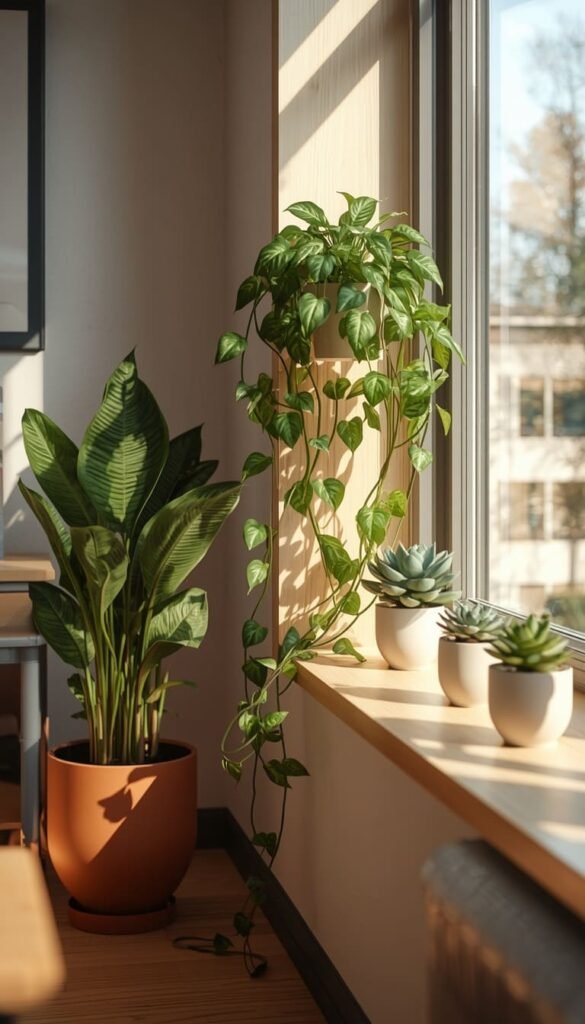
Every neutral classroom I’ve designed that felt genuinely alive not just aesthetically calm but actually warm and breathing had plants in it. Not fake plastic arrangements in neon pots. Real plants, or high-quality faux ones, in clay, ceramic, or woven basket planters that belong in the same visual family as everything else in the room.
Snake plants and pothos are my go-to recommendations for classroom environments specifically because they’re nearly indestructible. Snake plants tolerate low light and infrequent watering without complaint. Pothos trail beautifully along a shelf edge and grow fast enough that students actually notice the change week to week which becomes its own quiet lesson in patience and observation.
Placement matters as much as plant choice:
- A tall snake plant in a clay pot beside the teacher desk grounds the front of the room
- A trailing pothos on top of a KALLAX unit softens the hard edges of the shelving
- A small succulent arrangement on the windowsill adds life without taking up functional space
For classrooms with no natural light whatsoever, high-quality faux plants from IKEA’s FEJKA line are genuinely convincing and require zero maintenance. Nobody and I mean nobody will know the difference from a distance. Keep planters in terracotta, matte white, or natural woven textures to stay inside the neutral palette.
If you could change just one thing in your classroom tomorrow morning, what would it be the lighting, the storage, or the bulletin boards?
11. Driftwood or Coastal Neutral Teacher Desk Makeover
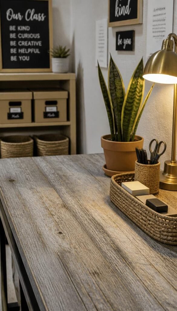
The teacher desk is often the most visually chaotic spot in the entire classroom. It collects papers, supplies, coffee cups, sticky notes, and approximately seventeen things that were placed there temporarily six weeks ago. Getting the teacher desk under control both organizationally and aesthetically matters more than most teachers realize because it sits in the direct sightline of every student facing the front of the room.
A coastal neutral makeover for the teacher desk doesn’t require buying new furniture. Weathered wood contact paper applied to the desk surface runs under $20 and completely transforms a scratched brown laminate top. Pair it with a small woven tray for frequently used supplies, a single clay pot with a snake plant, and one warm-toned desk lamp instead of relying solely on overhead fluorescents.
Keep the desktop intentional with just three visible zones:
- An active work zone with only today’s materials
- A small supply caddy in natural wood or woven texture
- One personal touch a small plant, a neutral candle, or a framed photo in a simple wood frame
The organizational reality is worth being honest about. A beautifully styled teacher desk lasts about eleven days into the school year without a daily reset habit. Spend two minutes at the end of each day returning things to their designated zones. That small routine is what keeps the aesthetic alive through June.
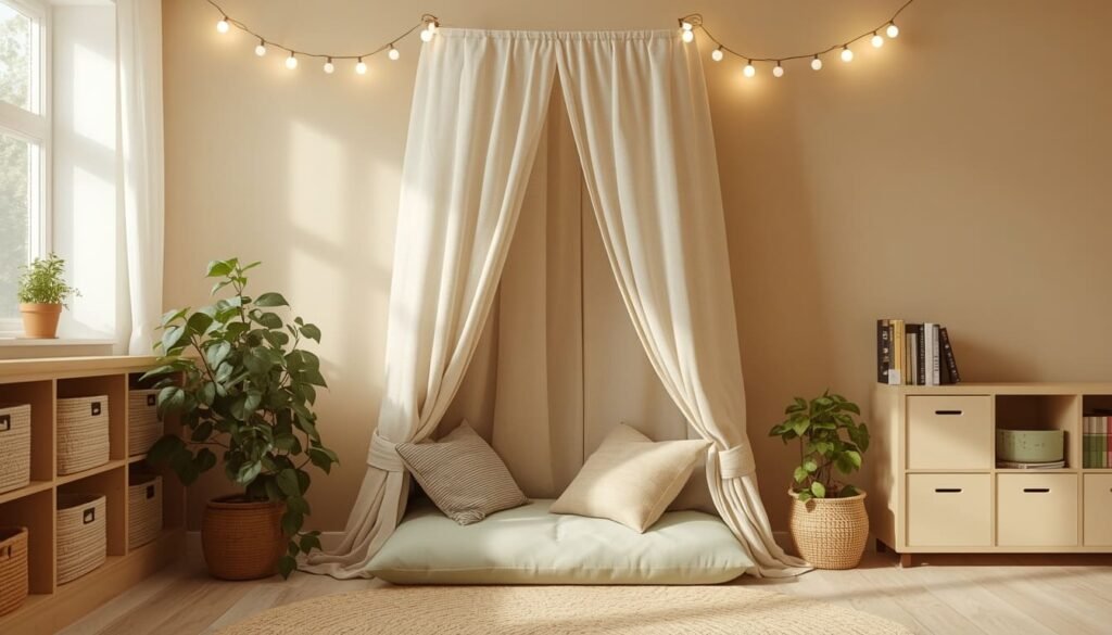
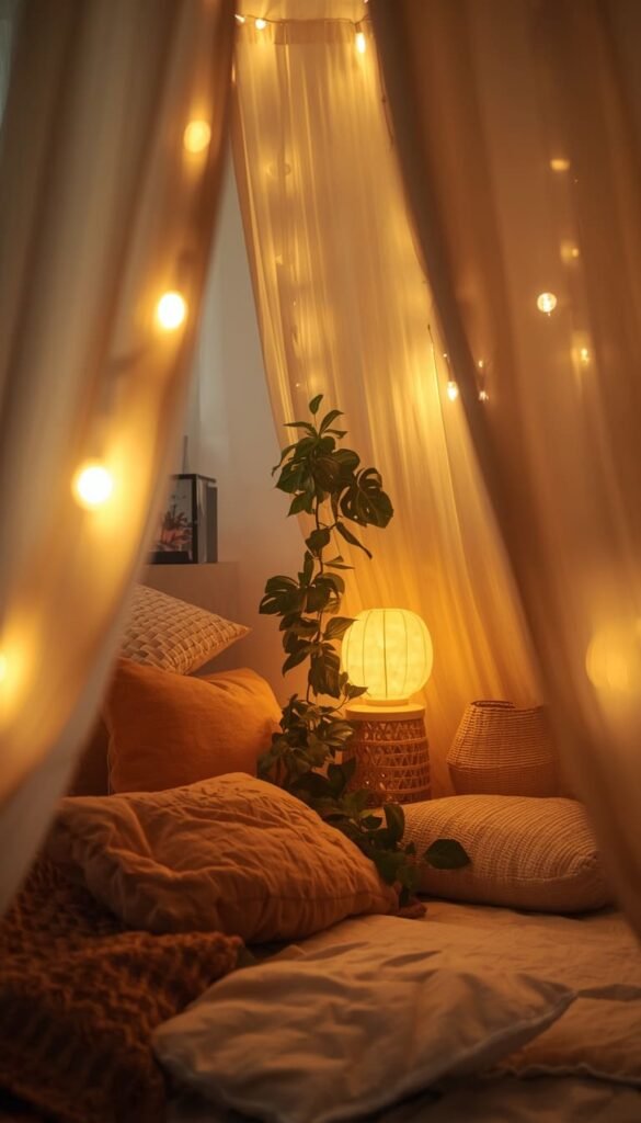
12. Cozy Reading Nook with a Canopy and Floor Cushions
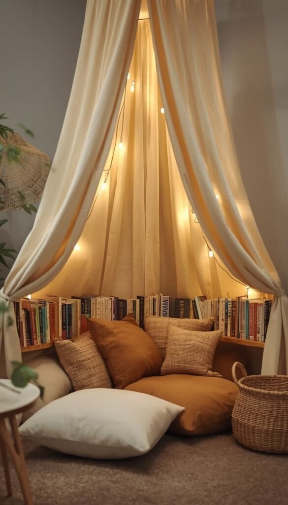
Of all the neutral classroom decor ideas on this list, a well-executed reading nook creates the most immediate emotional response from students and from every adult who walks through the door. There is something about a defined, canopied space with soft cushions and warm lighting that signals safety and calm in a way that no poster or bulletin board ever could.
The canopy is the anchor. A simple cream or oatmeal fabric canopy hung from the ceiling with command hooks or draped over a tension rod mounted in a corner immediately defines the space as different from the rest of the classroom. Below it, layer two or three large floor cushions in linen or canvas fabric, a low book ledge with covers facing outward, and a battery-operated warm string light tucked into the canopy fabric above.
What makes this work in a neutral palette specifically is restraint. Keep every element canopy, cushions, rug, baskets within the same warm cream to tan range. The moment you introduce a bright colored pillow or a patterned blanket that falls outside the palette, the whole nook loses its cohesion. I learned this the hard way on a classroom project in Nashville where a well-meaning teacher added a bright teal throw pillow “just for a pop of color.” It pulled every eye away from the student work displayed nearby and toward itself instead.
A full reading nook setup can come together for under $150 using Amazon floor cushions, an IKEA canopy, and a string light strand. Add a small woven basket beside the nook for book returns and the whole corner functions as beautifully as it looks.
13. Scandinavian Inspired Calm Down Corner
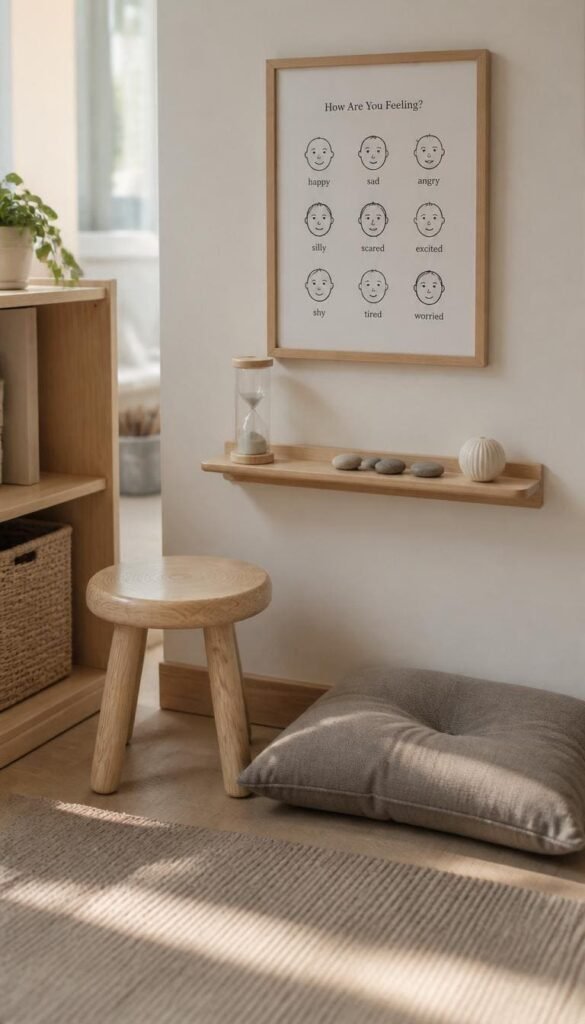
Every classroom needs a designated space where students can self-regulate a corner that communicates, without a single word, that it is safe to feel overwhelmed and that tools exist to help. Most calm down corners I’ve seen are well-intentioned but visually busy: bright posters, colorful fidget tools spilling out of bins, emotion charts in primary colors that clash with everything around them. A Scandinavian-inspired approach solves all of that.
Think clean lines, pale wood tones, and a palette of white, warm gray, and soft sage. A small birch stool or a low natural wood bench. A single linen floor cushion. A slim wall-mounted shelf holding three or four carefully chosen sensory tools in neutral packaging a sand timer, a smooth stone, a small squeeze ball in gray or cream. A simple printed emotion chart in black ink on cream cardstock in a thin wood frame.
The restraint is the whole point. A calm down corner that is visually calm actually helps students calm down. One thing I always tell teachers: edit the corner ruthlessly. If a tool isn’t being used regularly, remove it. Clutter in a calm down corner defeats the entire purpose of the space.
For the wall above the corner, a simple phrase in black vinyl lettering “Take a breath. You’ve got this.” adds warmth without introducing color chaos. Amazon carries pre-cut vinyl wall quotes for under $10. Keep the font clean and sans-serif to match the Scandinavian aesthetic.
14. Neutral Gallery Wall with Student Artwork Frames
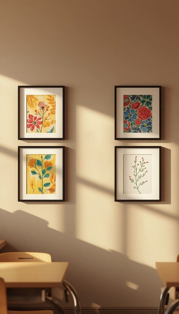
Student artwork deserves better than a staple through the corner and a crooked hang on the bulletin board. Framing student work even in the most basic sense communicates to kids that what they create has real value. And when every frame on the wall shares the same neutral finish, the artwork itself becomes the visual focal point rather than the frames competing for attention around it.
Black frames, natural wood frames, and thin white frames all work beautifully in a neutral classroom. The key is consistency pick one and use it everywhere on that wall. A gallery arrangement of eight to ten matching frames along a single wall creates a display that genuinely looks curated. Swap student work in and out through the year without ever changing the frames themselves.
A few things that make this work practically:
- Use binder clips inside each frame instead of tape so swapping artwork takes seconds
- Arrange frames in two clean rows rather than a scattered salon-style hang for a more modern look
- Include one or two frames with simple nature-themed prints between student pieces to fill gaps when work is being rotated
Target’s threshold frame line and IKEA’s RIBBA frames both run between $3 and $8 per frame. A full gallery wall of twelve frames costs under $80 and transforms a blank wall into the most compelling visual in the room.
Are you starting your classroom makeover from scratch this year, or are you working with what you already have and just refreshing the look?
15. Warm Toned Window Treatments to Soften Harsh Light
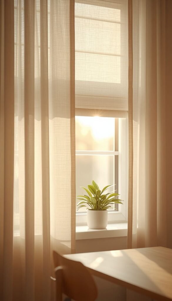
Windows are one of the most underutilized design elements in classroom spaces. Most teachers leave them bare or work around whatever institutional blinds came installed usually a depressing shade of beige that has yellowed over fifteen years of sun exposure. The right window treatment does two things simultaneously: it softens the quality of light entering the room and it adds a layer of warmth and texture that no other single element can replicate.
Sheer white or cream curtains are the most versatile option for neutral classrooms. They diffuse harsh afternoon sunlight without blocking it entirely, and they add an immediately residential quality to the room that students respond to even if they can’t articulate why. Layer them over existing blinds rather than replacing them you get light control from the blinds and softness from the curtains without losing functionality.
For hanging without permanent hardware, tension rods inside the window frame are a clean solution that leaves zero damage. A standard tension rod from Walmart runs under $8 and supports lightweight sheers with no issue. If the windows are too wide for a tension rod, removable adhesive curtain rod brackets from Command hold surprisingly well on painted walls and cinder block surfaces when installed according to instructions.
The palette anchor here matters. Cream and warm white sheers keep the room feeling bright while adding softness. Avoid bright white under certain lighting conditions it reads almost blue and pulls the warmth right out of a neutral palette. One set of well-chosen curtains, repeated consistently across every window in the room, ties the entire classroom design together in a way that is quiet, elegant, and completely intentional.
Your 30-Second Classroom Styling Cheat Sheet
By Budget
Starter Classroom ($0 – $100)
- Swap bulletin board borders for burlap or kraft paper first
- Add warm white string lights to the reading corner
- Use contact paper on existing furniture surfaces
- Label everything with a consistent chalkboard or kraft paper system
- One neutral boho rug from IKEA or Amazon transforms the floor instantly
Investment Classroom ($100 – $400+)
- IKEA KALLAX units with DRONA beige basket inserts as your storage foundation
- Full flexible seating setup in cream, oatmeal, and warm gray tones
- Matching neutral gallery wall with RIBBA frames for student artwork
- Sheer cream curtains layered over existing blinds on every window
- A proper reading nook with canopy, linen cushions, and a warm floor lamp
By Classroom Style
The Minimalist Teacher
- Stick to greige walls, white desks, and zero visible clutter
- One plant, one rug, one lamp — repeat nothing twice
- Labels and signage in a single font, single color, zero exceptions
The Boho Naturalist
- Layer textures freely — jute, linen, woven baskets, wood tones
- Mix floor cushions, poufs, and saucer chairs without matching exactly
- Dried pampas, trailing pothos, and clay pots are your best styling tools
The Function-First Teacher
- Start with the organization system before touching anything decorative
- Earth tone supply bins and a labeled shelving wall do 80% of the work
- Add soft touches — a rug, a canopy, a plant — only after storage is solved
The Cozy Classroom Creator
- Prioritize lighting above everything else — warm bulbs and string lights first
- Build a reading nook that students actually fight over sitting in
- Every textile in the room should feel soft — no hard plastic, no cold surfaces
Frequently Asked Questions About Neutral Classroom Decor
What is the best neutral color for a classroom?
Warm sand, soft greige, and pale sage are the top three. They reduce visual stress without making the room feel cold or clinical.
How do I make my classroom look neutral on a tight budget?
Start with burlap bulletin board backing and kraft paper labels both cost under $15 total. Those two swaps alone shift the entire mood of the room before you spend another dollar.
Are neutral classrooms better for student focus?
Yes, and research backs it up. Overstimulating environments with bright competing colors increase anxiety and reduce attention span, especially in younger students.
What plants work best in a neutral classroom with low light?
Snake plants and pothos are your safest choices. Both survive fluorescent-only environments, irregular watering, and the general chaos of a school week without complaint.
Can I create a neutral classroom without painting the walls?
Absolutely. Peel-and-stick wallpaper, fabric panels hung with command hooks, and neutral bulletin board backings do most of the visual heavy lifting without touching a single wall permanently.
Conclusion
Your classroom deserves to feel as good as the effort you pour into it every single day. You don’t need a massive budget or a full weekend renovation pick one idea from this list, order one thing, move one piece of furniture, and see how it shifts the energy of the room. Small changes compound fast when they’re intentional. Start with the bulletin board swap or a single neutral rug, and I promise the momentum will carry you the rest of the way.
So tell me which of these neutral classroom decor ideas are you tackling first, and what’s the one thing in your classroom right now that you’re most ready to replace?